Danielle Man, Edwin Zhang, Harihar Subramanyam, Tami Forrester
View the chart here
Data
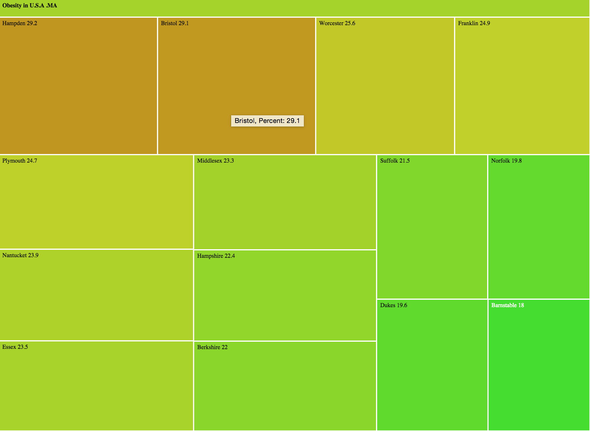
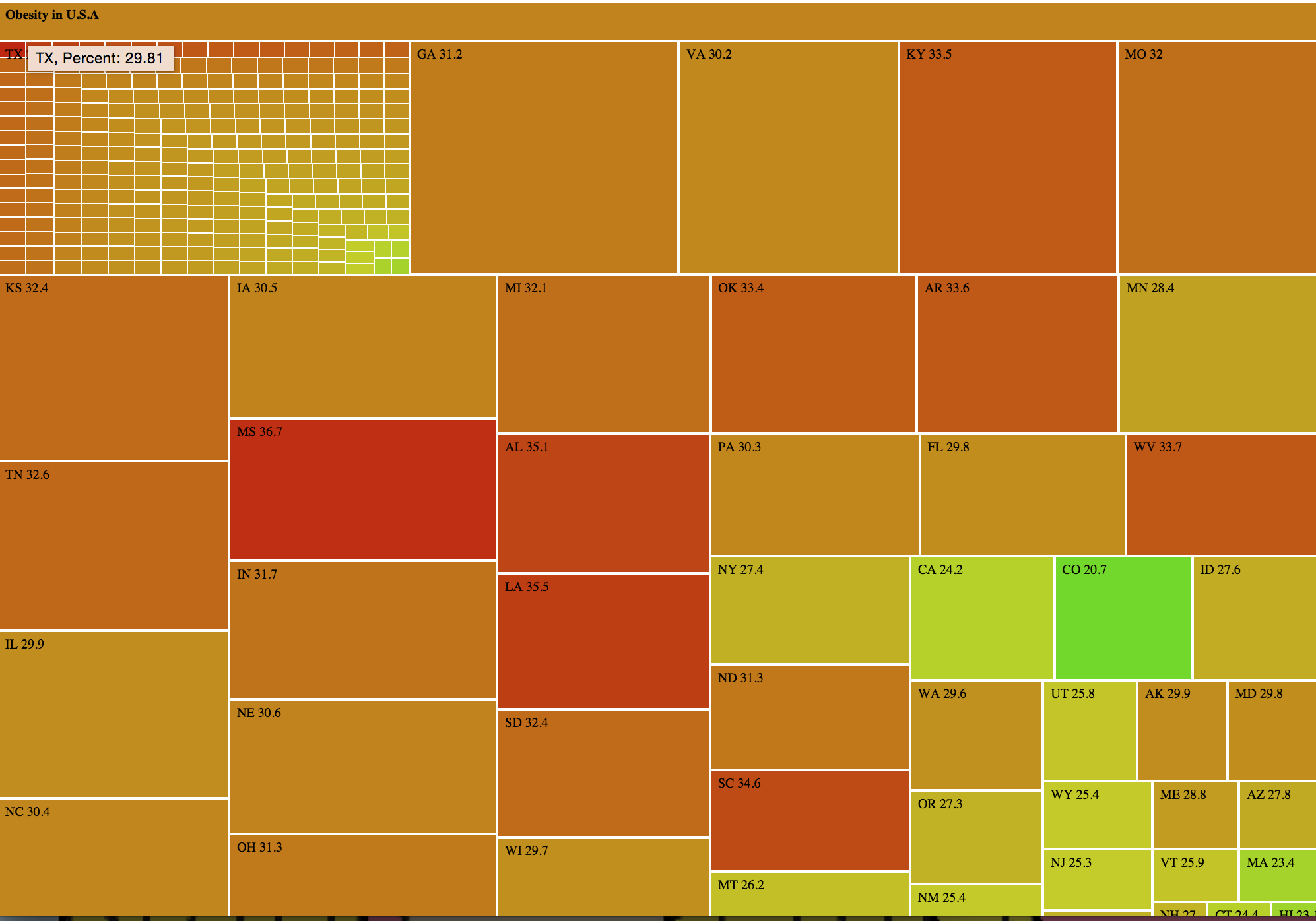
We looked at the USDA Food Environment Atlas, which provides various metrics about food availability, health, and more for each county in the U.S. Specifically, we aimed to understand the severity of obesity around the U.S. and identify the states/counties in which obesity is particularly severe.
Chart
For each county, we looked at the percentage of obese adults (in 2010). We turned this into a nested treemap using d3. The advantage of the nested treemap is that we can quickly glance to see the percentages by state, and we can drill down to see the percentages by county. One way a treemap is better than a geographic map is that in the treemap counties/states are similar in size, whereas in a geographic map small counties/states may not be noticeable.
Audience
While the visual can be understood by a general audience, we are particularly interested in people from counties/states with high obesity levels. We hope they are interested by their county/state’s location on the chart and try to learn why some places have higher obesity levels than others (a question that we hope to address in our project).
Goals
Our goals with this chart are to
- Show how obesity is spread throughout the U.S.
- Allow viewers to see the prevalence of obesity within their county
- Have a tool our group can use when we investigate the link between poor neighborhoods and food insecurity
Treemap drilldown