How much water goes into a meal?

a super awesome chart by Alyssa and Nolan

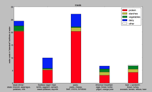
DATA: We looked at a spreadsheet from a LA Times article on the amount of water consumed or polluted in the creation of many different kinds of food.   We then transferred that data into another Excel spreadsheet to turn the original data, presented in cubic meters of water per ton of food, into a more easily conceptualized metric: bathtubs of water per serving.  For the sake of expedience we estimated a 100-gram serving, which is reasonable for most foods, and determined that a “standard” bathtub was about 25 gallons.

CHART: For a few example meals that a college student might eat, we wanted to show what foods consumed the most water.  Unsurprisingly, meat consumes quite a lot of water, but so do dairy products in some cases.  Vegetables, however, don’t really need that much water for the most part.  We generated this graphic using Python’s numpy and matplotlib modules.

Screen Shot 2015-04-16 at 1.59.07 PM


GOALS: 

-Make people realize what the environmental impact of their dietary choices is.

-Help them understand where the bulk of their environmental impact is (meat and dairy products)

-Hopefully the visual impact of this chart will make them think a bit when shopping for food.


AUDIENCE: This might be useful to post in a grocery store or dining hall so people buying food can pause to reflect as they are planning meals for the week.  Since we explain water use in terms of bathtubs and the graph is helpfully color-coded and labeled, and since most Americans are fairly chart-literate, the barrier to understanding what this chart says is not great.  For greatest impact, it might be most useful to show to college students, who are still building their food purchasing and meal planning habits, so they have that in the back of their minds as they plan meals and form their dietary habits.

nltk: all the computational linguistics you could ever want, and then some

What can you do? 

nltk is a Python module that contains probably every text processing module you’ve ever had a vague inkling of a need for.  It contains corpuses of language for machine learning/training; word tokenizers (splits sentences into individual words or ngrams); part-of-speech taggers; parse parts of speech in sentences (with trees!); and much, much more.  It’s good for analyzing lots of text for sentiment analysis, text classification, and tagging mentions of named entities (people, places, and companies).

How do you get started?

The creators of nltk have published a book for free online that explains how to use many of the features nltk has.  It explains how to do things like access the corpora that nltk has; categorize words; classify text; and even build grammars.  Basically, the best way to get started is install nltk, then go through the book and try the examples they present.  They include code examples in the book so you can follow along and practice using different functions and corpuses.  There’s also a wiki attached to the github and stackoverflow, where programmers go when they’re lost, is of course a useful (but often very specific) resource.  The learning curve required to become comfortable leveraging the different functions available is fairly steep because they are so many and so specialized, and in my opinion the best way to gain that comfort level is to simply play around with nltk and build cool things to gain experience.  Simply reading the book, while interesting, won’t be enough to become good at using nltk.

How easy or hard is it?

Well, it’s certainly easier than writing all of this from scratch, no matter how competent a programmer you are.  The one thing that can be difficult with Python modules is that you’re not entirely sure what’s under the hood unless you get cozy with the source code.  That means you might not be sure what’s causing a performance issue, why it doesn’t like your input, or why your output looks a certain way.  Also, figuring out exactly which function to use for a specific task might be somewhat confusing as well unless you have a certain amount of experience in machine learning or know exactly what you want (it’s hard to go wrong with tokenization).  For example, the built-in classifier is only as good as the features you feed it; giving it too many high-dimensionality items might result in overfitting or just horrendously slow code, and giving it low-dimensionality items might mean it can’t classify the items effectively.  Experience with Python datatypes and object-oriented programming is also very, very important; if you don’t understand what a function is, what list comprehensions look like, and how Python dictionaries work, the example code given in the book will be incomprehensible.  Even though the printouts from the example code look very nice and fancy and clean, the knowledge behind their creation (how do you print things that look nice? what is a development set? how do you use/leverage helper functions like tokenizer and the nltk function that gets the n most common words/letters? how do decision trees work?) is far from simple.  Anyone with programming experience can use the simpler functions very effectively and the less simple functions with probable success, but in my opinion knowing how classifiers and parsers work is important to use them well.  The bottom line is that they’re only as good as what you feed them, and understanding how definitive or accurate their output is requires a degree of understanding of what’s under the hood.

Would I recommend this to a friend?

If that friend had a similar programming background to me (can write Python code pretty well; knows a little bit about machine learning) I’d recommend it with little reservations other than a warning about the learning curve and the overwhelming abundance of options.  I’d still suggest they at least skim the book and keep stackoverflow close at hand (although that’s true for most programming projects that venture into unknown territory).  If my friend wasn’t comfortable with machine learning, I’d suggest they read up on Wikipedia about whatever classifiers they use so they have an idea of why the classifier misbehaves, if it does, or what errors it’s likely to make.  And if they weren’t comfortable with programming, I’d suggest they look into other natural language processing tools.  This is a tool that’s made by programmers and scientists, and it shows in the documentation, the resources, and the wealth of options available to those who know how to use them.

tl;dr: nltk has a ton of really cool natural language processing tools.  However, they are by no means idiot-proof, and you will be sad if you don’t know Python.  One does not simply download nltk and spit out useful results in five minutes.  


design process

I really enjoyed the emphasis we placed on narrative throughout the data mural design process; I think Colin Ware is correct when he says the purpose of a visualization should be to “capture the cognitive thread of the audience” (12).  Our mural does so by combining simple visual language (people receiving food; trucks carrying food), which conveys concrete ideas best explained through pictures, with the more complicated language of metaphor.  Some ideas are hard to illustrate from first principles but easily explained using figurative language; the tree metaphor we use, with suppliers at the roots and Food For Free trucks delivering food to people at the tree’s leaves, uses a universal visual symbol (the tree) to explain Food For Free’s business model.  As with regular language, the grammar of visual metaphor is generative-we can combine it with other units of meaning to make a larger, still meaningful structure. As in the example on p. 7, we combine spatial logic (food moving from roots to leaves) with visual logic (the roots and leaves are linked by the roads the trucks travel) to explain how the food is transported from suppliers to those who need it.  We are using a single-frame narrative for our mural, with the result that we, the authors, are responsible for indicating a narrative thread within the finished product as we would not need to do with a film, slideshow, or comic strip.  However, we also have the freedom to include elements outside a single narrative without creating subsequent frames; we can add framing elements to fill in details of the story so the reader can explore the mural on their own terms once they have familiarized themselves with its overall arc, as Segel and Heer suggest.  Overall, our mural incorporates many elements of good visual design and, I hope, will be able to capture people’s attention and understanding.

a day of data: 2/5/15

-8:30: my “eat breakfast, you degenerate” alarm goes off. my phone is synced with the cloud and collects metadata about my usage.  I grudgingly wake up and check my email while lying in bed (server access data; gmail usage; reply/deletion actions are recorded, and whoever I reply to knows I wake up around 8:30).

-8:50: i use the bathroom; i assume East Campus’ water usage is monitored in aggregate, so mine becomes part of the total.  to avoid waking my roommate, i do my hair and makeup in the communal bathroom instead of our room. my aim is to avoid creating any stimulus that will wake her, whether that be light or sound.  does that count as data?

-9:00: breakfast. i recycle the empty soymilk container and the box of cereal i just finished; to an enterprising investigator, trash could be considered a form of aggregate data about my hall’s eating habits.

-9:20: i head to class with my friend.  we leave footprints in the snow; my shoe size, footprint, and gait pattern are probably individually identifiable.  my phone has GPS enabled because my friends and i installed an app that pings my location to them, but i have (as i often do) left my phone in my bed.

-10:00: i ask a question in class. the girl next to me writes down the professor’s answer in her color-coded latex-ed notes.  i am also knitting a hat in class; its length is a linear function of time spent not completely engaged in class. one of my friends sitting near me sends me an email about my hat.

-11:00: i arrive at 6.046 lecture, which is being taped.  i spend the lecture knitting.  i don’t think i’m in the camera’s field of vision, though.

-12:30: i go to the course 6 lounge, using my ID to access, and make coffee.

-1:00: Japanese class.  i take a quiz; my score will presumably live in a spreadsheet somewhere and be used to calculate my grade.

-2:00: finally, a break.  i use my MIT ID to access my dorm, check my email, reblog a few posts on tumblr, and access facebook.  i don’t like anything, but i do click several links.  i leave my dorm and use my debit card to buy food at the food truck by MIT Medical.

-3:00: i head to CMS.631.  I check out links on my computer (internet browsing data), contribute points and ideas to the posters on the walls, which are going to be used to shape the course of the class.

-4:30: i go home (ID for access again).  my roommate is still asleep.  our electrical usage, which i have heard is tracked by room, is negligible except for the heater and various chargers for the day.

-5:00: i browse the internet and eat random food that belongs to me and i found in the freezer.  it has been a fixture in the freezer for a long time; the next person looking for food might be perplexed that a landmark they’ve come to rely on is gone.  there’s probably a ton of browsing data, tumblr reblogging, and email replies/deletions/reads.

-6:00: i decide it’s a great idea to work out instead of taking a nap. i used to use an app that tracked the miles i ran and the speed at which i ran; since it encouraged me to run as far as i could (and therefore get overuse injuries) i bring my phone with me only to listen to music. GPS is enabled, so my friends, if they wanted to know, are aware of my location.

-6:50: i have a 7 pm class.  i grab clothes from the shelves.  my roommate, if she was nosy (she’s super awesome and probably wouldn’t pry into my life that much), could deduce that i’ve worked out (gym clothes in my laundry bag and the shelves where my clothes live are a mess because i couldn’t find pants)

-7:00: i attempt to get into the Media Lab. i don’t have card access.  someone somewhere knows i tapped my card unsuccessfully about 3 times.  someone with access lets me in.

-7:45: my hat is longer. i’ve clicked several links on the class subreddit.

-8:30: we attempt to eat dinner with the housemaster.  card access to the west parallel of east campus.  all the food is gone. he is perplexed to see us.

-8:50: my friend invites me to dinner at maseeh.  i tap my ID again.

-10:00: i begin to attempt homework. many, many wikipedia pageviews, mostly linear classification and the perceptron algorithm. somehow i also end up reading up on the use of singular “they,” gender in news reporting, and ethics….meanwhile i’m listening to music on either pandora or youtube, who are definitely collecting data about my listening patterns and preferences, which are way more mainstream than i’ll ever admit to.  my youtube homepage is deeply embarrassing.

-12:00: i write out Japanese vocabulary on the chalkboard in the hallway.  people walking by after i go to sleep will know i was studying the meaning of “to see, honorific” and “space alien,” probably for a quiz tomorrow, because i talk a lot about how terrible i am at studying vocabulary.

-1:30: more tumblr; likes and reblogs. the books scattered on my desk explain, roughly, what i’ve been working on tonight. i write myself notes on my hand about the things i need to get done tomorrow. i set alarms to wake tomorrow, reply to some last emails, and fall asleep. the fact that the light is off in the room and the person-shaped lump in the corner inform my roommate that i’m trying to sleep, so she’s super stealthy when she comes in. those are the best kinds of data-driven decisions.
 

the gini coefficient

Over the past month, I’ve done an unholy amount of work with demographic data from the U.S. Census API.  Specifically, I was looking at what characteristics of a community affect broadband access in that community.  One of the features I looked at was economic inequality, which can be measured by the Gini coefficient.  Briefly, the Gini coefficient measures how equally incomes are distributed across a population.  The visual presentation is pretty intuitive, as you can see here:

(image source: wikipedia)

A perfectly equal community (everyone’s income is the same) will essentially trace the line of equality, and the greater the difference between the area under the line of equality and the cumulative share of income (y is the share of total income earned by the bottom x% of earners), the greater the inequality.


News organizations seem to love using the Gini Index to talk about the effects of taxation and relative economic inequality worldwide, just to name a few. It’s a really universal, powerful way to talk about inequality.  Here’s an example from the Washington Post, presumably for the internationally curious.

This is pretty interesting; since the countries and continents aren’t labeled, the authors of the map likely assumed basic geographic and historic knowledge; if you don’t know that the big dark red landmass in Asia is China and China is ostensibly a Communist country, for example, you won’t have the “huh” moment where you reflect on the way China’s brand of Communism has evolved to its present-day capitalist form.  Similarly, someone without a grasp of the history of colonialism in Africa, particularly the social woes of Southern Africa, might find the incredible economic inequality there anomalous. This map would succeed best in telling its story with expert commentary, some level of mathematical competence (to know what the Gini index is), and historical context; for that reason it’s probably speaking to a well-educated audience with the patience to pore over the map for at least a few minutes.  The problem, though, is that the map by itself places the onus on the audience to tell the story.  Sure, the Gini index is a powerful measure of inequality, but inequality is the result of many forces, both cultural and historical.  Without that context, and with so many stories, anonymous here, waiting to be told, the data isn’t as compelling as it can be, and that’s really a shame.


(source: http://organizingentropy.typepad.com/blog/)

Now here’s our old friend the bar graph.  One of the things taxation can do is even out the distribution of wealth a little bit.  Scandinavian countries and, to a lesser extent, Western Europe, appear to employ taxation as an equalizing method.  Again, without being conversant with the paradigm a country uses to govern itself, this doesn’t mean much.  Nor do we know what the effects of this policy–which countries have a better quality of life? how many people live in poverty?  This is just one picture in a story about inequality that is rich in detail and nuance, all written in the same language thanks to the Gini coefficient.