Boston’s Urban Orchards

The dataset we looked at was a record of fruit-bearing trees available for urban foraging (with the caveat that you should ask for permission before foraging). The dataset included the GPS coordinates of the tree and the address near where it was found, as well as the organization responsible for the tree in cases where such an organization existed; the species of the tree; and its condition.

The data questions we came up with were primarily about the characterization of neighborhoods containing more fruit trees. One interesting thing we noticed was that many of the trees were near schools (the location label included a school name); maybe this was a consequence of many schools having gardens. We found the following school locations and school gardens datasets (from data.cityofboston.gov) that would help answer this question- we could color or highlight the locations of school trees, or use overlaid heat maps of school density and tree density in order to show these relationships. We also wondered whether there was a correlation between fruit tree density and income, specifically whether higher income neighborhoods were more likely to have more fruit trees, and found the following economic characteristics of Boston dataset. However, we discovered an even easier way to get economic and population data within the Tableau Public app.

TreesIncome

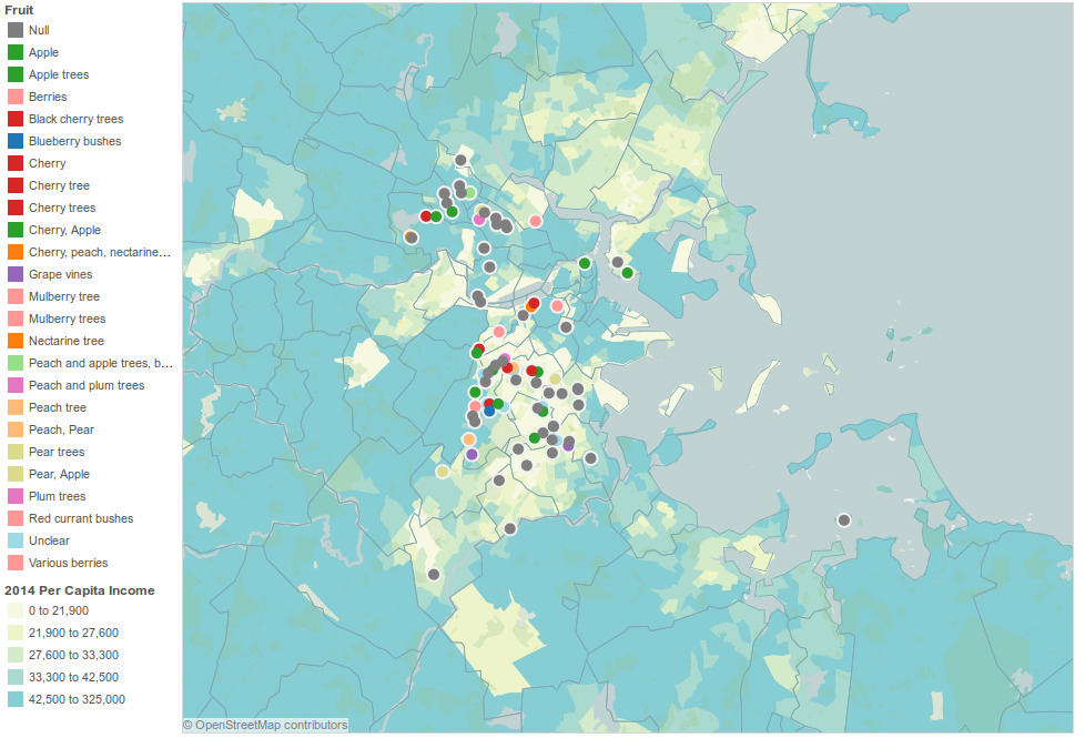
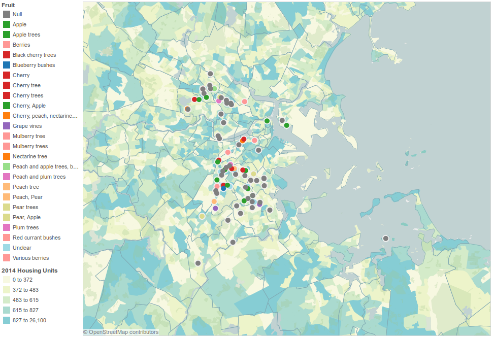
We mapped the Urban Orchards data using Tableau Public, coloring the trees by fruit and overlaying maps of per capita income and also the density of housing units. We found, surprisingly, that per capita income appeared to be negatively correlated with the presence of fruit trees; this could be a result of selection bias, or the that schools and other public community buildings in Boston are not in high income residential neighborhoods, or other reasons we have not thought of. As expected, we see few fruit trees in very densely populated residential areas, and we see that the areas with lower income and fewer trees appear to have lower housing density as well, suggesting neighborhoods that may have been designed to be low-cost public housing.

TreesDensity


Data mural process

The data mural we designed was, in the words of Colin Ware, a “single-frame narrative.” It did not have to deal with information flow across multiple panels, and the complex and agonizing layout and continuity concerns described in the Segel & Heer article. We seem to have skipped over many of the most challenging aspects of narrative design by choosing to portray snapshots of data rather than a process that has a beginning and end.

It’s not that we didn’t try to tell stories of change over time; we wanted to show the growth of FFF, its impact in the community, and the flow of food from sources to sinks. But we did this by overlaying information into a single image, rather than trying to represent different states with arrows or other flow control tools. For example, we overlaid increasing widths of the central trunk of the road-tree to show the flow of food increasing over the years.

I thought this was appropriate for a few reasons: 1) because we were trying to convey a symbolic message more than to explain the details of a technical process, which might have been done more clearly with panels, arrows, etc., and 2) (much more wishy-washily) because dividing up our space with barriers or blanks seemed out of line with the themes of togetherness/community/cyclic-ness we were trying to cultivate. Our goal did not have to explicitly include simplicity/good pedagogy, since we picked a pretty small set of data to represent, and the process we were representing was also not a complicated one. Therefore, we could pack information quite densely into the space allotted to us without fearing confusion or loss of our audience, and make a single image meant to spin out all of the desired cognitive threads in our viewers.

We ended up focusing most of our energies on integrating symbols with each other in an intuitive and evocative way, working at least one level of abstraction up from the actual creation of symbols; designing symbols is a hard problem in itself, and we had limited time and artistic skills. For a few-hour design exercise, I thought we did a good job of creating an image that conveys positive and pertinent messages at all levels of viewer attention; the tree in a circle, visible at a glance, evokes sustainability; the trucks traveling up the tree trunk convey succinctly what the organization does; and the people benefiting from the tree (picking fruit, playing in its branches) evoke community.

Daily Data Log

Data log, starting at 12:20 am on February 6, 2015 and ending at 2:13 pm on February 6, 2015.

I am currently generating this document.
You are currently reading this document, probably in a browser which is keeping track of all of the sites you have visited in a while, on a computer that is continuing to send packets to a router to stay connected to the internet, and even more packets to a server when you refresh/load/interact with a page. This page is probably keeping track of how many visitors it has seen. Through you, I am generating data.

Before going to sleep, I wrote the following in a note (another generated document) on my phone’s S Memo app:
I charged my phone, consuming a fairly small amount of power that was recorded by Nstar, which provides my apartment with electricity.
I turned up the heat before going to bed; the gas used is also being recorded by Nstar.
Sleep time and duration could have been observed (by myself or an outsider) and recorded; before sleep, I set an alarm. Upon wake, I turned off an alarm after it rang twice. The music it emitted was also data that could have been collected.

I used an amount of water to brush my teeth.
I followed a schedule that exists online, using Google Calendar.
It took me a certain amount of time to walk to campus; my cell phone sent GPS requests to GPS satellites as I walked.
There may have been a cell tower handoff if I switched coverage zones; it is always possible to track me to within some radius if my cell phone is on.

I used a credit card to purchase a quesadilla for lunch at Anna’s.
My bank statement records most meals I have, and also most meals I miss.
My Firefox browsing history keeps track of all of the sites I have visited in the past year.
My current tabs (which are also available on my phone) keep track of what I’ve been interested in over the past week.
I googled some queries, which was recorded by Google.
I scribbled my homework solutions in a green notebook.

Mike Bostock: Visualizing Algorithms

Mike Bostock’s algorithm visualizations were not my first thought in response to the phrase “data presentation.” He also does a lot of standard data presentations, too, that I could have chosen to talk about. But his algorithm visualizations are among my favorite things to look at, and arguably highlight (as well as leave out) aspects of data presentation that might merit some meta-inspection, so I thought they’d be worth examining anyway.

Algorithms are often used to process data, but also to generate it. There are quite a few algorithms featured in the essay, but my favorites are the three described for generating a uniform-looking random sampling of points throughout a space. So, it’s definitely geared towards computer science enthusiasts in its content, but still attractive enough to engage the less geeky among us. It’s able to paint a less technical macro picture as well as a more detailed micro picture.

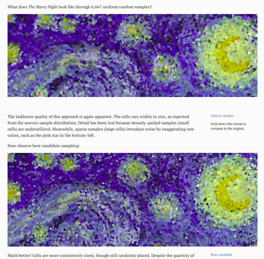
The motivating illustrative examples are the three versions of Starry Night, produced by using each algorithm to sample points, and then coloring the area closest to each point the same color as the point- a kind of compression of the image. This division of the space into cells defined by the point they are closest to is called a Voronoi diagram. But even without knowing precisely what that means, from the pictures it is easy to get an intuitive sense both for what the sampling does to the image, and why we would want to do it. The point of the article and the images is not to teach the reader what a Voronoi diagram is, especially when they are likely to already know or look it up if they care, but to give insight into the algorithms, and perhaps more importantly, to describe by example how visualizations can be used to teach and learn about algorithms.
starry1

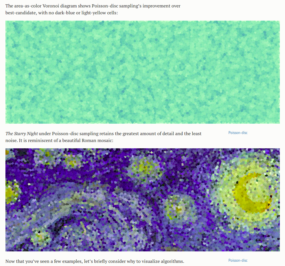
What thrills me more than the Starry Nights though, as an engineer interested in ways to make important details obvious, is the set of blue-green Voronoi diagrams below that compare the performance of the three algorithms. The cells in these diagrams are a lighter color when smaller and darker when larger, to accentuate the non-uniformities in size between cells- details already in the image, but that would otherwise have been much harder to see. It shortens the search our eyes have to make for those much larger or smaller cells. It immediately makes clear which of the algorithms creates the most uniform sampling.
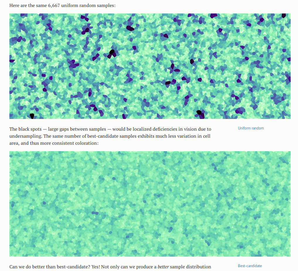
green1

starry2

Of the animations in the essay, the Poisson disc is my favorite- not just because it is the best-performing algorithm, but because of its mesmerizing beauty. I stared at it for a long while before beginning to understand what it did, and the color cues were the most helpful at the start. I noticed that there were nodes that started out red and turned black, or “off,” and the process of discovering the algorithm amounted to answering the question “under what conditions does that happen?” It stimulated all the right questions, and then answered them. I also liked that the animation had processes noticeable at different time scales; I felt that the animation was a bit fast for me at first (without reading the accompanying text), and perhaps I latched onto the color change because it was occurring at a speed that allowed me to think in between changes. Being familiar with the algorithm now, all of the processes appear to be happening at a nice pace- but only because I know what to look for.
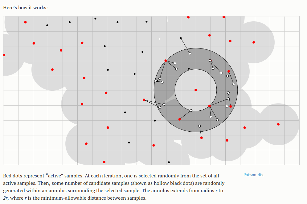
 

poisson-disc2

Finally, another note on relevance: the data that these algorithms generate are clean; there is little noise in the typical sense and relatively few confounding factors involved. However, the visuals help us realize the flaws and patterns that are there. The visibly inferior demonstrations of the completely random algorithm highlight the important fact that a “uniformly random” probability distribution does not lead to a uniform result, but also suggests the powerful role of the random number generator in creating any patterns that do appear in the set of generated points. Bostock later describes the role and idiosyncrasies of various random number generators, in the context of sorting algorithms, but I feel he could have done this earlier; or maybe the long foreshadowing was an intentional device to create more of an aha moment at the end for the learner.