Food Sec Sim

Team: Mary Delaney and Stephen Suen

What: we are interested in understanding and presenting the trade-offs that people receiving SNAP benefits face, in terms of their time, their budget, and their other resources. To do this, we want to create a game that combines datasets that include characteristics of SNAP participants, cost of food, nutrition, and the cost of other resources to simulate the choices faced by a SNAP participant. To ground this experience further, we are going to focus on local data and base everything else off that, though given more time we could make it a tailored experience based on what location you were playing from.

Who: Our audience is non-SNAP participants interested in learning more about the program and its participants. Our game could also be used by classes, allowing players to get a better understanding of the realities of food insecurity.

Why: Our primary goal is increase awareness and empathy around the issue of food security.

We hope to educate the food secure about the challenges of food insecurity, including those that may not be immediately obvious. It is our hope that players, with their increased knowledge and empathy, will also be compelled to take action and help the food insecure.

How: We have discussed both single- and multi-player games and digital and physical games. We are currently undecided between a very immersive, narrative digital single-player game (likely to be made in Twine, a text-based choose-your-own-adventure game engine), which seeks to increase empathy and impel action, and a physical card-based multi-player game, which seeks to facilitate discussion of the issues faced by SNAP participants. We plan to build and playtest prototypes of both games to see which strategy will be most effective to pursue.

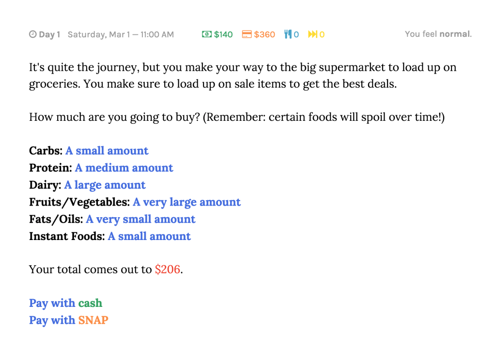
Playtesting Food Sec Sim: “It’s Like the Game of Life, But With Food”

In playtesting our game, we asked participants to budget their food expenditures before and after to see how their perspectives changed, as specified in our original design. Additionally, we asked the playtesters two questions to tie the game back to the real world:

  • What are some challenges that people facing food insecurity have to deal with?
  • What can we do — whether it’s as individuals or as a broader community/society/nation — to help with those challenges?

During this process, we saw the game was successful in getting people to think and talk about food security as an issue but the gameplay needs to be fleshed out significantly to better achieve its goals (i.e. building empathy). The overall design worked — among three playtesters, two under-budgeted on food by only using the SNAP money and ended up allocating more money to food at the end of the game. The third playtester didn’t change her budget (though she was already allocating more than the SNAP amount) because she thought it was livable. “I’ll just have to do it in real life,” she said, perhaps hinting that the game wasn’t effective in representing the challenge of subsisting on so little money per day.

The random events were pretty effective in illustrating some of the challenges faced by people on SNAP (though the “positive” events didn’t really do much). One playtester got injured and couldn’t work for a week, losing 1/4 of her income; as a result, she ended up losing too much money and couldn’t pay the amount originally allocated for food. Housing turned out to be far too expensive (since the dataset used was based on average rent prices, not the rents that SNAP participants are probably paying), so participants chose either to live in public housing/a homeless shelter or crammed their entire family into a one bedroom unit.

The responses to the post questions showed an increase in awareness (but not necessarily empathy — we might need to come up with a better metric to measure this) of the conditions surrounding food insecurity. One playtester noted that living on such a tight budget “would require a lot of planning, and if you’re on food stamps, you might not have the time to do that.” Another acknowledged the volatility of poverty: “The biggest challenge is emergencies — if someone gets injured or they don’t have a good health plan, they might have to take out a loan.” In terms of potential action items, playtesters proposed producing suggestions for food purchases with nutritional value (ironic, given that this is the methodology for actually figuring out SNAP benefits), organizing communal trips to the grocery store, and holding community meetings around the issue.

From an actual gameplay perspective, there needs to be more player agency and choice. One playtester said the game is “like one of those BuzzFeed quizzes — it’s like this, this, or this, and then here you go, the end — with the little description.” One way to solve this would be to add more detailed character biographies to increase the sense of role-playing, immersing players deeper in the experience and raising the stakes on an empathetic level. Another approach would be to change the granularity of the game — rather than running the game week by week, we could have it operate per day, with more decisions (meals, whether to go to the grocery store, etc).

Another issue was that — even though the game was designed as a multiplayer experience — there was little to no interaction between the players. Certainly, having multiple people made the conversations more fruitful, but actually having gameplay interactions between them would have probably made it more interesting. Finally, to address the issue raised by our second post-question, we could introduce other characters/events to the game perhaps to illustrate ways in which we can help the food insecure (e.g. maybe you could go to a food pantry/bank as a “lifeline”). This would give playtesters tangible action items to take away from the game.

Food Security Simulator

In creating this game, we used the USDA’s report on SNAP participant characteristics to understand the types of people who participate in SNAP and the budgetary choices they face, combining it with datasets on average monthly rent in Massachusetts, consumer goods prices, and some of the previous SNAP data we’ve worked with.

Audience

This game is targeted at the general public, especially those who do not know much about SNAP and who SNAP participants are. We estimate this game to be appropriate for groups of 3-4, but it can easily be adapted to accommodate different numbers of people, though the mechanics (particularly the scoring system) probably need to be refined with further playtesting.

Goals

The goal of this game is to give people a better understand of who participate is SNAP and some of the challenges they face. This is presented as a role-playing game, giving each player a persona that not only defines their financial constraints but also provides some emotional grounding. In presenting this information in a personal way, we hope to increase the empathy that people feel toward SNAP participants and even compel them to take action.

Game Description

See all cards here:
https://docs.google.com/document/d/1g9vWCH7c012bANVJdRLbYHQP4SbMPxgKfKHhb5-5Xsc/edit

At the beginning of the game, each person draws a character card. This card gives them information about who they are and how much money they can spend.

In the first round, each player must decide how much of their money to allocate towards food. They are given no direction, and allowed to come up with their own numbers and told to write them down on a sheet of paper. This sheet of paper is then turned over and set aside.

Each player then draws an Event Card. Event Cards can be positive or negative changes in the character’s life – for example, it could be something like a work-related injury (resulting in medical fees or reduced productivity) or getting money from relatives. Blank Event Cards indicate that nothing of significance happened to the player in this round.

In the second round, players are given housing options to choose from. They are given concrete options, each with a set price and any additional associated costs, such as transportation and utilities, provided to them.

After this round, each player again draws an Event Card.

In the third round, players are given additional options for things to buy, such as clothes, toys, cell phone, etc. They may choose to buy as many of these as they want — these provide bonus “happiness” points.

Again, each player draws an Event Card.

At this point, players are scored based on how well they met their needs (food, housing, and other purchases) and stayed within budget. As a post-game reflection activity, the players are again asked to decide how much money they would like to spend on food, revising their estimates based on how well they did in the previous round. Finally, players are asked to compare their initial and final food budget allocations.

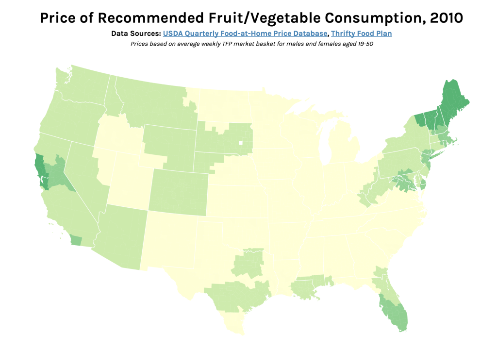
Price of Recommended Fruit/Vegetable Consumption, 2010

Screen Shot 2015-04-28 at 3.23.05 PM

Interactive version: http://s2tephen.github.io/qfahpd/map/

This map takes the two data sets we worked with previously — the Quarterly Food-at-Home Price Database (for the small multiples of fruit/vegetable prices) and the Thrifty Food Plan (for the SNAPables data sculpture) — and attempts to synthesize them to tell a single data story. In our presentation of the food price data, one of the criticisms we received was that price per 100g of food was not an intuitive way to think about food consumption. The Thrifty Food Plan, the bare minimum of an adequate diet (and the basis for calculating SNAP benefits), actually includes the breakdowns of its market baskets by weight (pounds). This meant that we could actually calculate the real price of the Thrifty Food Plan around the United States, factoring in regional price differences.

Most of our time was spent cleaning and synthesizing multiple data sets, so once again we only had time to focus on the fruit/vegetable food group. However, the next step for this map would be to calculate the combined price of all food groups (i.e. the entire Thrifty Food Plan market basket) and compare this to the SNAP amount. This is because the cost of the Thrifty Food Plan is based on the assumption of uniform food prices across the nation — however, as the Quarterly Food-at-Home Price Database shows, this is simply not the case. We could then identify which regions’ SNAP benefits may be over- and underestimated.

As such, the audience for this graphic would be the researchers and policymakers responsible for creating the Thrifty Food Plan and setting the SNAP benefits. The goal of the combined map would be to advocate for a new SNAP benefit methodology, based on actual local food prices. For this iteration, we only included data for those from age 19-50, but one could imagine an even more interactive version of this graphic, where someone might specify their age/sex and weekly spending on food — the map could show them the weekly required spending for an adequate healthy diet, allowing them to compare those numbers.

In terms of data visualization, this choropleth was created in D3.js/TopoJSON and uses quantile classification to subdivide the different weekly spending amounts on fruit and vegetables. ColorBrewer was used to generate the colors, but the large area of yellow is kind of hard to see (perhaps we could have used a different color ramp or adjusted the classification buckets to improve this). Furthermore, the map would be a lot more readable (i.e. as a static graphic) with a legend — as it is currently, you only get a broad comparative view of the country and can only really zoom in on actual prices if you use the interactive version. Another minor thing is, because the data is regional and not at the county-level, having each county as an individual entity is kind of useless (the counties don’t conform to traditional political boundaries, so this was the best we could do). The other question is whether a map is actually the most appropriate visualization method — even if there are significant differences in food prices based on geography, we might need to make some hypotheses or incorporate additional data sets to explain how geography might be affecting variation in prices.

Data Sculpture – SNAP TV Dinners

One common misconception among SNAP (Supplemental Nutrition Assistance Program) participants is that food stamps are supposed to cover one’s entire food budget. However, as its name suggests, SNAP is only meant to be supplemental — the program assumes that participants are spending 30% of their net income on food. SNAP makes up the difference between that 30% and the cost of the Thrifty Food Plan, what the USDA defines as the bare minimum diet for adequate nutrition. Our data sculpture seeks to address this misconception by tangibly demonstrating the difference (both in terms of quantity and nutritional value) between subsisting on SNAP benefits and supplementing them with a portion of net income.

The primary audience of this data sculpture is SNAP participants living in Middlesex County, specifically those under-spending on food. With this data sculpture, our goal was to illustrate what a “proper” meal under SNAP should look like and convince participants who are not spending any additional money on food to do so. On another level, we also wanted to engage people who are not eligible for SNAP and show them what sorts of meals the food insecure are eating on a regular basis. With this audience, the goal was to build empathy and put them in the shoes of a SNAP participant.

In order to create the data sculpture, we used a number of datasets — first, we used the USDA’s SNAP Data System in order to determine the average monthly SNAP benefits for residents of Middlesex county: $132.29 (or $4.41 per day). This was contrasted with the 2015 projected cost of the Thrifty Food Plan, estimated at $194 per month (or $6.47 per day). Using these daily amounts, we created some sample meal plans within those monetary constraints, using data from the Thrifty Food Plan as well as Peapod/Instacart for up-to-date food prices. These represent typical meals for those who only spend SNAP benefits on food and those who use SNAP benefits as intended — as a supplement to 30% of their net income.

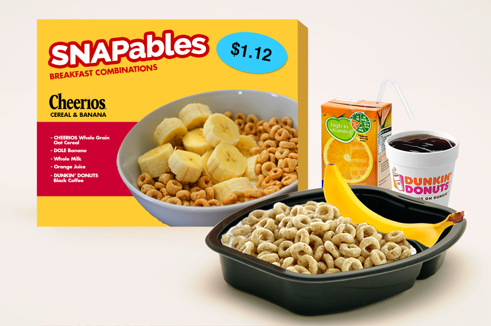
The data sculpture itself would take these meal plans and present them in TV dinner-style packaging. With this presentation method, we can make visible the relative sizes of a SNAP-only and a SNAP + 30% income meal. Moreover, price tags and nutrition facts on these packages further drive home the comparison — with an incremental increase in food spending, SNAP participants can drastically improve their nutritional intake. Using the visual language of the TV dinner — a symbol of unhealthy eating — also foregrounds the nutrition question. While we did not actually prepare said meals for this assignment, this data sculpture could be fully interactive (i.e. edible), allowing the audience to experience the difference between the two meals in the most visceral way possible: by eating them.

For the purposes of this assignment, we have mocked up an example of what the packaging might look like, and constructed three meals (breakfast/lunch/dinner) for each of the two food budgets:
snapables

SNAPables

Breakfast (Cheerios & milk, orange juice, banana, coffee)

Cost per serving 1.12
Calories 373
Fat (g) 3.7
Cholesterol (mg) 8
Sodium (mg) 206.2
Potassium (mg) 1227.4
Carbs (g) 85
Fiber (g) 6.1
Sugar (g) 49.4
Protein (g) 14.3

Lunch (PB&J, apple, water)

Cost per serving 1.53
Calories 475
Fat (g) 17.8
Cholesterol (mg) 0
Sodium (mg) 346.8
Potassium (mg) 194.7
Carbs (g) 73.1
Fiber (g) 8.4
Sugar (g) 39.9
Protein (g) 11.5

Dinner (spaghetti & meatballs, green beans, water)

Cost per serving 1.77
Calories 730
Fat (g) 23.5
Cholesterol (mg) 60
Sodium (mg) 1460
Potassium (mg) 320
Carbs (g) 103
Fiber (g) 8
Sugar (g) 13
Protein (g) 31

Daily Total (vs. recommended values)

Cost per day 4.42
Calories 1578 1500
Fat (g) 45 48.75
Cholesterol (mg) 68 225
Sodium (mg) 2013 1800
Potassium (mg) 1742.1 2625
Carbs (g) 261.1 225
Fiber (g) 22.5 18.75
Sugar (g) 102.3 28.125
Protein (g) 56.8 37.5

SNAPables Selects
(now with 30% more income!)

Breakfast (Cheerios & milk, orange juice, banana, coffee)

Cost per serving 1.12
Calories 373
Fat (g) 3.7
Cholesterol (mg) 8
Sodium (mg) 206.2
Potassium (mg) 1227.4
Carbs (g) 85
Fiber (g) 6.1
Sugar (g) 49.4
Protein (g) 14.3

Lunch (turkey, cheese & tomato sandwich, apple, water)

Cost per serving 2.91
Calories 386
Fat (g) 13.4
Cholesterol (mg) 25
Sodium (mg) 784.9
Potassium (mg) 340.7
Carbs (g) 61.5
Fiber (g) 9.2
Sugar (g) 24.5
Protein (g) 14.1

Dinner (chicken breast, green beans, carrots, rice, water)

Cost per serving 2.45
Calories 236
Fat (g) 2.3
Cholesterol (mg) 65
Sodium (mg) 563.3
Potassium (mg) 429.6
Carbs (g) 26.3
Fiber (g) 4.6
Sugar (g) 8.1
Protein (g) 29.2

Daily Total (vs. recommended values)

Cost per serving 6.48
Calories 995 1000
Fat (g) 19.4 32.5
Cholesterol (mg) 98 150
Sodium (mg) 1554.4 1200
Potassium (mg) 1997.7 1750
Carbs (g) 172.8 150
Fiber (g) 19.9 12.5
Sugar (g) 82 18.75
Protein (g) 57.6 25

See the full meal plans and nutritional data here:
https://docs.google.com/spreadsheets/d/12LvOiceZjH0smXqZlN7vZhmCwCU32xsE6_treVmatQM/edit#gid=0
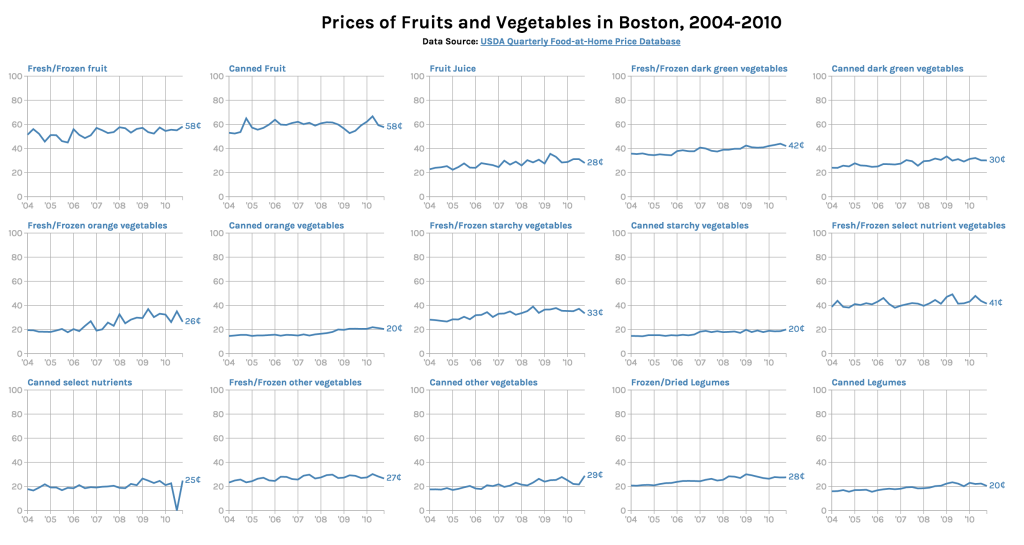
How much do fruits/vegetables cost in Boston?

small-multiples

In this chart, we chose to explore the concept of small multiples — inspired by this Quartz chart of alcohol consumption around the globe, we wanted to compare the prices of different food groups over time. To accomplish this, we used the USDA’s Quarterly Food-at-Home Price Database, which measures how much each food group costs to Americans. We specifically focused on the Boston demographic (due to time constraints we were only able to process the data for the first subset — fruits and vegetables). Using csvkit we cleaned and extracted the data we needed, then visualized everything using the D3 charting library, though the graphs are not interactive at the moment.

The audience for this graphic is people in Boston who are the primary grocery shoppers in their households — we wanted to give a perspective on how food prices changed over the 2004-2010 period (there was an invalid data point that made it through on the “canned select nutrients” graph). We can see that the price of fruits and vegetables in Boston have been increasing gradually. There are a few areas for improvement: first of all, the graphs aren’t adjusted for inflation, so we don’t have the right context for the graphic. In retrospect, we probably should not have used the same axes for all the graphs since the per unit price is pretty different between them and it’s hard to see the actual change. Moreover, 100g is kind of an arbitrary amount and might not be an intuitive unit to think about food consumption in.

See the graphic in full size: http://s2tephen.github.io/qfahpd/

Final Project Proposal – Food Security Game

Members
Stephen Suen
Mary Delaney
(…looking for more! A digital game may be out of scope for a team of two)

Topics
Economic circumstances/challenges of those faced with food insecurity and how that affects other aspects of their lives (e.g. health/nutrition)

Goals
To increase awareness and empathy around the issue of food security
To educate the food insecure on how to make better dietary choices within their economic means

Techniques
Web-based digital game, in the vein of “empathy simulators” like Cart Life or Depression Quest

Story

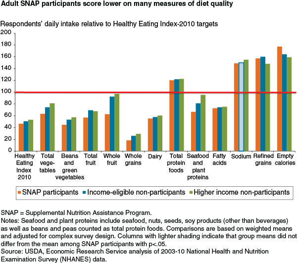
Our initial story pitch is based on this article from the US Department of Agriculture’s Economic Research Service, which took dietary intake data from the 2003-10 waves of the National Health and Nutrition Examination Survey and measured it against the Healthy Eating Index, a measurement of how closely one’s diet conforms to recommended daily intake. This analysis specifically focuses on SNAP participants, who are lagging behind in multiple HEI components (notably fruit and vegetables) compared to other Americans.

nov14_feature_mancino_fig01

In addition to these findings, the article explains how this different in dietary consumption is having real effects on SNAP participants’ health — adults enrolled in SNAP are “more likely to be overweight and suffer from diet-related health problems.” To summarize: The data say that low-income Americans are unable to eat healthy due to price, access, and storage concerns. We want to tell this story because food security is a struggle for so many people but is not tangibly understood by those not affected by it.

Expanding the story beyond the initial article, there are a number of things we could do with the data:

  • Recreate the HEI analysis using the most up-to-date NHANES data
  • Facet NHANES data by other dimensions (e.g. geography, specific income brackets) to make the game even more personal/relatable
  • Combine other USDA data sets, such as Food CPI or the Quarterly Food-at-Home Price Database to relate the HEI components to actual prices

More brainstorming will have to be done in terms of the actual game mechanics to determine what data sets might be pertinent to the final product.

Silk

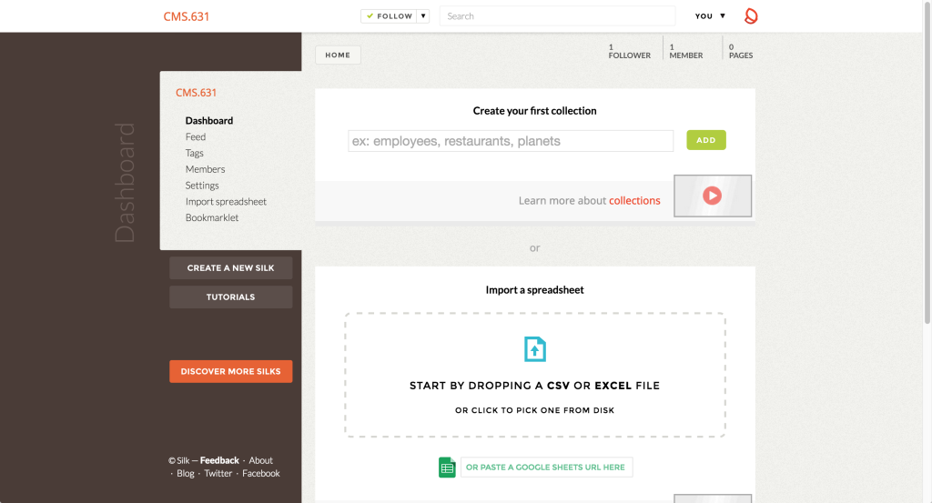
Silk, “a place to publish your data,” is an all-in-one dashboard for your datasets, letting you turn them into simple visualizations and webpages. It starts with the concept of collections (equivalent to spreadsheets, or tables in a database) — you can import data into these collections via CSV or Google Spreadsheets. A single Silk website can have multiple collections, so you can pull in data on related topics from various sources. Notably, Silk is not a tool for data cleaning; you must prep your datasets beforehand, including things like sanitization and naming/formatting. The final visualizations have some rudimentary filtering and exclusion tools, but they are not sufficient enough for major changes. Within the inverted pyramid of data journalism, Silk fits into the latter two sections: combine (figuring out how your collections fit together and what data from each is important) and communicate (actually designing and creating the presentation of that data).

Screen Shot 2015-03-31 at 1.50.11 PM

While Silk requires no coding per se, it can be an intimidating tool just starting out due to the sheer number of features. For each item in a collection, Silk auto-generates a page for it with all the information filled in, along the lines of an Amazon product page or a website’s user profile page. These pages are searchable and filterable, giving you (as well as your users — for the free plan, all pages created are also public) a front-end to explore the records in your dataset. Moreover, you can add other team members to your Silk, turning it into a collaborative data library along the lines of the PANDA Project. To facilitate this collaboration, there is a feed page where you can see all the recent events/changes made by members of your Silk. It is interesting that the tool provides all this functionality even though there are few cleaning features (you can edit field names and make edits to individual records — that’s it).

Screen Shot 2015-03-31 at 2.48.41 PM

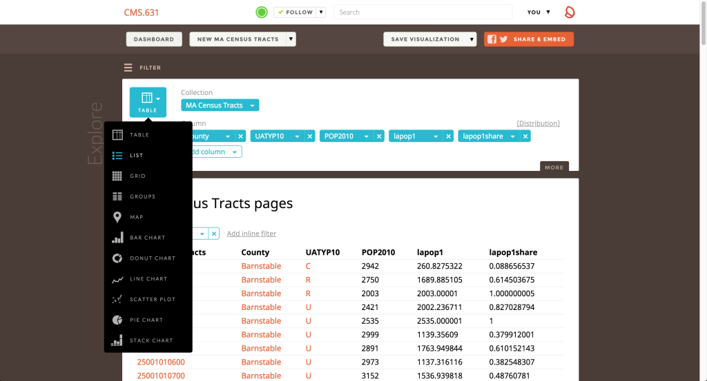
Once you’ve determined your data of interest, you can choose from a number of different visualization methods: tables, lists, grids (for datasets with images), groups (clustering based on a field), maps, and a number of charts. Depending on what presentation format you’ve chosen, Silk will try and auto-detect which columns might be relevant (e.g. geographic data for a map or numeric data for any of the charts) and plop that data in. You can do some fine-tuning in terms of what columns are displayed, how the data is sorted, and how many records to include. However, you cannot really customize the visual look and feel of the visualizations themselves — you can’t really do any sort of graphic design (e.g. color/size — everything is auto-generated) or creative variations on the defaults.

Screen Shot 2015-03-31 at 3.04.32 PM

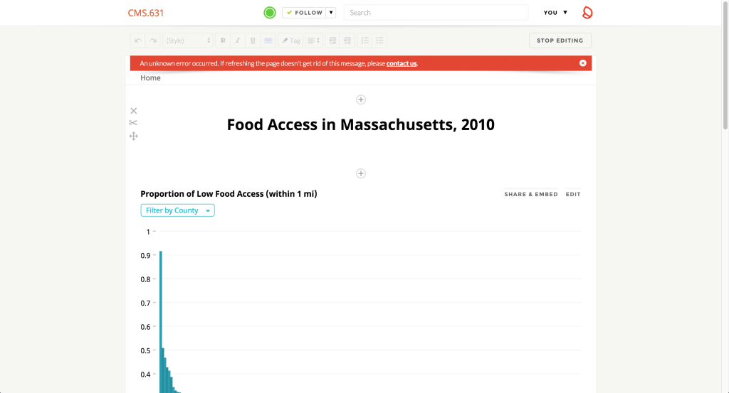
Once you’ve created all the visualizations you want, you can save them and add them to pages; these pages can be further populated with text or image content via a WYSIWYG editor, much like a blogging software or GUI-based web design applications. As such, you can create entire articles with the visualizations embedded/interspersed throughout — it’s especially nice that Silk links up everything automatically; for example, clicking a bar in the chart links to that specific item page, allowing readers to fully explore the dataset in that way.

Overall, if you can get over the initial intimidation of Silk’s huge feature set, it’s not terribly difficult to use, though some of the visualization-creation interface is quite non-intuitive. Thankfully, the Silk team has created a number of video tutorials and a FAQ section to guide you through the process. The two big gaps in Silk’s functionality are its lack of data cleaning functions and lack of customizability over visual presentation (within specific visualizations, not over the entire page). If you want a one-stop, out-of-the-box solution for managing multiple data sets and turning them into websites and those caveats don’t bother you, Silk might work.

As for myself, given that I do have code and design experience, I won’t be using Silk and wouldn’t recommend it to any friends who have opinions about those things. There are far better tools for data exploration and far better tools for data visualization; if you know enough about basic web development, you can just use those and put the results together yourself without the help of Silk.

Painting with Data

While I have prior experience designing data-driven stories, creating the Food For Free data mural was dramatically different from the design processes I was used to. As laid out in the Data Journalism Handbook, my typical process involves querying a data set to answer specific questions or identify outliers and interesting patterns. Brainstorming for the mural felt a lot less structured, more akin to the “blue sky” ideation of early stage product design (what I like to call “brain vomit”). The narratives we created — while derived from a structured typology of different data stories — were distilled to far broader big picture ideas when we translated them into visual language, perhaps because this was presented as a creative artwork rather than a quantitatively-focused chart/graph.

I did like the concept of drawing for a short period of time and then passing it on; not only did this process promote the creative “piggybacking” you see in a typical group brainstorming session, but it also allowed us to see which common thematic strands kept popping up to create a more consensus-driven design. The resulting artwork is more based on visual metaphors and symbolism rather than the design techniques of narrative visualization identified in Segel & Heer’s case studies. However, the mural still uses basic design principles of alignment, sizing, and color to achieve the more general tactics of visual narrative (structure, highlighting, and guidance).

This experience helped expand my definition of what a data visualization could be; there are definitely opportunities to be creative with the data presentation. My one criticism of the medium is that the data doesn’t always feel entirely integrated with its presentation. Sometimes, it felt like we were just adding numbers to the artwork as an afterthought. There is a distinction between the fields of art and design, and to me this mural definitely felt more like data art than data design — and not just because we were painting. That’s not to say that a mural is any less valuable or less informative, but we certainly took more artistic liberties and the result feels far more subjective than I’m used to.