SNAP Judgments Impact

Mary Delaney and Stephen Suen

One of the clear data stories that emerged from studying our data sets is that SNAP participants are forced to make trade-offs that adversely affect the health and happiness of them and their families. Based on the constraints that an average SNAP participant faces, both monetary and temporal, there is no way for a person to spend time with their family, earn enough money for food, rent, and other expenses, and adequately maintain their personal health. In addition we noticed that an easy way to alleviate some of these issues is the short term is to eat pre-packaged or fast food. However, these decisions, though possibly beneficial in the short-term have negative long-term health consequences. In short, SNAP participants have so many constraints placed on them, that many struggle to survive, much less thrive.


The goal of SNAP Judgments is to give people a better understanding of the challenges and choices faced by SNAP participants in the hopes of increasing empathy and awareness. We hope to accomplish this by incorporating the data we have found into a story, such that a person experiences that data without directly being presented with it. In addition, we decided to create a choose-your-own-adventure game so that players would be forced to actively think about the choices that SNAP participants face and make those decisions themselves.


The game’s audience is college-aged students who are not on SNAP and have limited exposure to the choices faced by SNAP participants. The data we used is local, so Boston or Cambridge based college students are the ideal target, but the storyline of the game is not unique to the Boston area. This demographic also seems to be an ideal audience for a text-based digital game, because people in this age group would likely be somewhat familiar and comfortable with games of this sort. As the goal of the game is to inform players about SNAP and increase empathy for SNAP participants, this also seems like an ideal audience. They are old enough to understand the complexities of the decisions that people face but young enough that they may be open to changing previous views they had of SNAP participants.


After talking to people who tested the game, it seems that we accomplished our intended goal. Players consistently expressed that they were much more aware of, and sympathetic to, the daily choices faced by SNAP participants. Using a time-limit choice mechanic, we were able to express why people on SNAP have to make certain decisions. The sheer difficulty of the balancing act between food, money, health, and happiness was made tangible to players through the mechanics of the game system. In addition, though there was not a direct call-to-action incorporated into the game, players expressed, both verbally and in survey responses, that they would be more likely to donate time to money to help those with food insecurity than they were prior to playing the game. This suggests that they were both more aware of SNAP and the challenges faced by SNAP participants and that they felt empathy towards them.
SNAP Judgments Methodology

Mary Delaney and Stephen Suen

SNAP Judgments is a narrative, data-driven choose-your-own-adventure game where you assume the role of a person on SNAP. The player’s objective is to make it to the end of month, trying to meet the requirements for livelihood (food, shelter, etc.) while staying within their assigned budget. From our perspective, the games goal is to give people a better understanding of the trade-offs that people to SNAP face, in the hopes of increasing empathy for SNAP participants.


To create our game, we pulled data from a number of different sources. For the food aspects of the game, we used data from the Mayo Clinic, myplate.gov, Peapod, fast food restaurants, and several research papers to get accurate information of the recommended amounts, nutritional value, and approximate costs of various types of food.


In addition to the data on food, we also used datasets on the demographics of SNAP participants to help us make the constraints that the player faces as true to life as possible. We chose a single mother of two children, the type of person who most often participates in SNAP.


For the housing component of the project, we assumed that the player character was living in subsidized Section 8 housing — as SNAP does with food, the government subsidizes housing so that low income Americans only have pay 30% of their income in rent. This was further supplemented with data from the Cambridge Housing Authority on the types of units available and where they are located, as well as information about the payment standard and utility deductions.


To prevent the food-centric aspects of the game from becoming too overwhelming, and detracting from the player’s experience, we simplified food into food groups. We simplified food into a system of units, which were normalized such that 4 units comprised a full meal for an adult and 3 comprised a full meal for a child. Using the data described above, we calculated the average nutritional value, recommended weekly amounts, and cost for each food group. A summary of the calculated data that was used directly in creating our game can be found here. When at the grocery store, players could choose how much of each food group to buy. When at home, players could choose how much food to cook, and that total amount was taken equally from each food group.


Our text-based choose-your-own-adventure game takes a player through a month in the life of a SNAP participant. To allow for decisions with longer-term impacts as well as typical daily decisions, we decided to have our game cover the course of a month, with the player experiencing selected days each week. It includes both typical decisions, which a player encounters every day, and unique choices as a result of a particular experience.


We tested the game and administered a survey to players. Playtesting allowed us to find and fix bugs in the game to improve the overall player experience. Based on our survey and talking to people who played the game, it seems as though we accomplished our goals. People agreed that they had a better understanding of SNAP, and the challenges faced by SNAP participants after playing our game. They also agreed or strongly agreed that they would be more likely to volunteer or donate to help those with food insecurity.

Water Remix

Mary Delaney

Stephen Suen


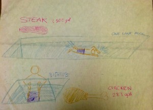
We worked on a physical way of depicting the data from the water infographic. The amount of water used in the production of some foods as compared to others, especially in the production of steak immediately jumped out to us. However, we quickly realized that neither of us knew how much the 1,500 gallons of water necessary to produce a pound of beef actually was. After some quick calculations, we figured out that 7.5 gal is about equal to 1 cubic foot, meaning that 1,500 gallons of water is about the amount of water needed to fill at 25’-long lap pool. By contrast, the amount of water needed to produce one serving of chicken, is about a bathtub-full. To emphasize the huge amount of water necessary to produce a steak dinner as compared to a chicken one, we proposed having a bathtub and a lap pool next to each other to help people really understand how much water, in absolute terms, goes into a relatively small piece of meat.


photo-40

Google Charts

Google Charts is a data visualization tool that allows for a clear and potentially interactive web-based experience between the viewer and the data. It allows for the creation of many different types of charts and graphs, including line graphs, pie charts, bubble graphs, histograms, maps, timelines, and tree maps. Because it is very versatile, it can be used to display many different types of data. Most of the visualizations generated by Google Charts display an unlabeled data point. By scrolling over an area, line, or point, the data name and value is specified. This makes Google Charts particularly useful for depicting geographic data or showing data points with a trend line, as it is fairly clear how what each point or area represents without a label. While this makes the visualization very clean, it can also make bar graphs and pie charts, when it is important to know what points or areas are representing what data, somewhat unclear.

Google Charts has extensive examples and tutorials available through https://developers.google.com/chart/interactive/docs/index. This website includes examples visualizations and sample code for over twenty-five different types of charts and graphs. The sample code seems to be the most helpful resource for learning and troubleshooting the program.

Google Charts is relatively easy to use. Working off of the sample code requires that only the data and a few parameters be modified. In addition, because it is compatible with JavaScript, the generated graphs can easily be integrated into a website. Basic familiarly with reading and writing programs is assumed to create visualizations in Google Charts. Because this tool is designed to be used largely for graphics that are integrated into webpages, this seems like a skillset that most prospective users would have. That said, the modifications that need to be made to the code to generate simple graphs, such as pie charts and bar graphs, seem like they would be very straightforward, even for someone with little or no programming background.

I would recommend Google Charts to someone with basic programming knowledge who is looking for an easy to use tool to cleanly and interactively depict their data. The pie charts and line graphs are depicted in the most user-friendly and informational way to the viewer. However, there are many tools that allow you to easily make these types of graphs. By contrast, the Geo Chart and Map displays create visualizations that do not show data labels unless you scroll over them, which can be confusing or may be beneficial, depending of the type and quantity of data being depicted. However, this tool allows for these visualizations to be made much more easily than other programs I’ve seen. Therefore, I think it could be very useful for people making these types of charts. Even for complex data sets, this may be a good tool for someone to use to initially visualize their data and uncover trends. Because Google Charts is very fast and easy to use, I will likely be using it at some point in uncovering or presenting my final data story. It is a much more effective presentation method for some datasets than others, but it is still useful as a tool to see the same data presented in different ways and to uncover trends when developing a data story.

Developing a Data Story

Instead of starting directly with data, we began our data story for the Food For Free mural by listening to a verbal narrative of the organization’s history and impact from one of its leaders. We heard about Food For Free’s beginnings, its expansion throughout the greater-Boston area, and its plans for the future. After hearing the story, we were presented with data, some of which was on a global level, some on a local level. Equipped with data and an understanding of the organization, we set out to define a story that we wanted our mural to convey. We started out with verbal stories: sentences about the organization’s history, its impact, and its community partners. These separate ideas were then combined into one cohesive short verbal narrative about Food For Free. In deciding on our narrative, we followed a method similar to that suggested by Colin Ware and sought to “capture the cognitive thread of the audience”. We wanted the audience to feel engaged in our story and compelled to action as a result of encountering it.

Next we set out to transform our words into a picture. However, as Ware points out, verbal narrative “incorporates a form of logic that is quite distinct from the logic of visual representation”. To overcome the challenge of translating words into a picture, we each drew a picture of the data story and combined the common themes. We used both literal depictions, such as trucks and food, and metaphorical depictions, such as a tree and roots, to signify the story of Food For Free. Because we are producing one still image, we are faced with the challenge of telling a narrative history without including multiple time points. In this respect, the symbolism of the growing tree serves as an effective focal point in communicating Food For Free’s story. Finally, as Ware explains the importance of, we decided to use a road to frame our picture, helping to focus the audience’s attention.

Data Log

As I started this assignment, I was skeptical about how much data I would create, especially on a day in which I was not particularly busy. However, I quickly realized that passively, just through receiving texts and emails, I was already creating a substantial amount of data. I also realized, after looking back on the data I created, that, while there was a lot of data I created, it would be easy to misinterpret some of the data and end up with a relatively inaccurate guess about how I spent my day.


Data Log from 12am to 11:59pm on February 8th, 2015


12-1am

Watched YouTube videos

Sent/received >100 texts

1-2am

Watched YouTube videos

Sent/Received ~50 texts

2-3am

Watched TV

Watched YouTube videos

3-4am

Took pictures

Sent ~25 texts

Watched YouTube videos

Sent emails to ~50 people

4-5am

Logged out of Google account

Logged into different Google account

Edited 6 Google docs

Updated MIT mailing list

5-6am

Created Google doc and spreadsheet

Sent emails to ~10 people

Showered

Plugged in computer and phone

Set alarm for 10am

6-9am

Slept

9-10am

Received phone call

Wrote note on iPhone Notes App

Sent/received ~75 texts

10-11am

Snoozed alarm 3 times

Sent emails to about 100 people

Updated MIT mailing list

Deleted note on iPhone

Received phone call

Sent ~25 texts

Made 50 phone calls

11am-12pm

Swiped into MIT Dining Hall

Logged out of Google Account

Logged into Google Account

Logged out of Google Account

Logged into Google Account

Edited 2 Google Docs

Sent/received ~50 texts

12-1pm

Left dorm (footage on security cameras)

Turned on lights in class room

Received ~10 texts

3-6pm

Swiped into dorm

Received ~10 texts

6-7pm

Swiped into MIT dining hall

Sent/Received ~75 texts

Sent emails to about 1500 people

7-8pm

Went of Facebook

Logged out of Google account

Logged into Google account

Updated Google docs/spreadsheets

8-9pm

Printed ~12 pages

Updated MIT mailing list

Sent/received ~50 texts

Sent emails to about 50 people

9-10pm

Went of Facebook

Watched YouTube videos

Sent/received ~20 texts

Sent emails to ~50 people

10-11pm

Signed into Stellar

Downloaded 2 assignments from Stellar

Submitted assignment on Stellar

Set alarm for 11:59pm

11-11:59pm

Live streamed TV

Sent/received ~25 texts

Sent emails to ~100 people

Alarm went off


Totals for day:

Texts sent/received: >500

People reached via email: ~2000

Number of emails received: ~200

Phone calls made: 50

Phone calls received: 2

Number of different Google accounts signed into: 4

The Good News on Poverty

Bono’s TEDTalk aims to inspire its audience to address extreme global poverty and explain the history of anti-poverty campaigning. He motivates his audience, who are primarily people interested in addressing poverty but skeptical of the impact that is being made, largely be presenting data. His TEDTalk includes graphs that highlight the impact that previous interventions have had on poverty, AIDS, malaria, and child mortality.

One way in which he makes his presentation of data particularly effective is that he manipulates it to show statistics over short- and long time-scales. For example, when discussing child mortality rates, Bono presents the statistics on number of lives saved on a daily basis, making the impact seem much larger and much more tangible. However, when discussing the progress that can be made in reducing extreme global poverty, he shows data over large time-scales and includes projections, making it seem realistic that extreme global poverty could be ended by 2030.

The goal of showing this data seems to be to revitalize efforts to eliminate extreme global poverty. In particular, Bono aims to show that elimination of extreme global poverty is a realistic possibility within our lifetimes. In general, the way he presented his data seemed very effective. The data presentation made it clear that significant progress had already been made, and that based on what has already been done, elimination of extreme global poverty, which at first seems unrealistic, may be possible. However, the presentation could also be more effective because the examples he gives in the medical field show the amount of people whose quality of life has improved, but does not give a sense of to what extent the problem as a whole has been addressed.