Using transit to visualize income inequality and census data

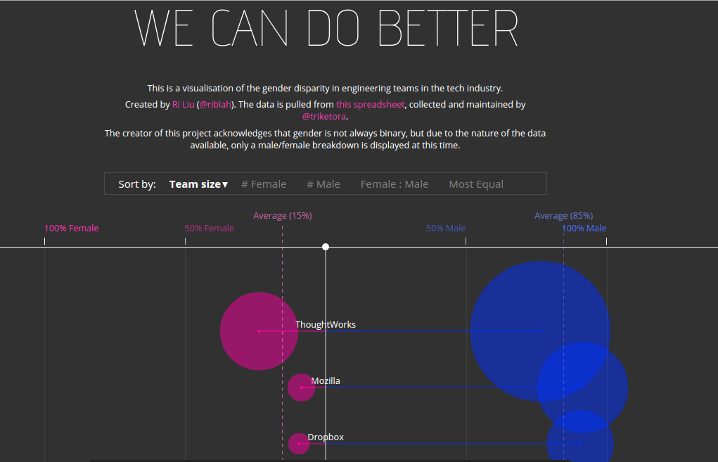
“New York City has a problem with income inequality. And it’s getting worse—the top of the spectrum is gaining and the bottom is losing. Along individual subway lines, earnings range from poverty to considerable wealth. The interactive infographic here charts these shifts, using data on median household income, from the U.S. Census Bureau, for census tracts with subway stations.”

http://projects.newyorker.com/story/subway


This New Yorker interactive is one of my recent favorites. The goal of this presentation of census income data goes beyond simply mapping income across the city. It presents income as a simple line chart, but in a more direct visual comparison than a heatmap would have done for the same information. The structure of the subway is used to orient the viewers and point them to the proximity of inequalities within the city. The differences between stops are dramatic, and their proximity is familiar to those who ride the subway.

This was a really effective presentation of data for me because of how prominently the subway system and other systems of transportation figures into our daily lives and serves to orient the way we see a city. Using only the tracts that have subways stops in them also eliminated a large part of the city. While this may seem to be a limitation at first, it actually serves to high-light income inequality, leaving a stronger impression of the data that inspires further investigation that can be applied to a larger area. It is also especially effective because it hints at the story of how infrastructure is tightly intertwined with income and that how the building of public transportation drives changes in income.

The readers of the magazine are the intended audience for this graphic, but it also expands the audience of the paper magazine to those with general interest in the city. There is a strong possibility of this visualization being used to present issues of inequality by community leaders, those interested in the changing landscape of real-estate by choose to use this format to map historical income data as well as projections of growth in the estimates given by the census.

Screen Shot 2015-02-05 at 2.56.56 PM

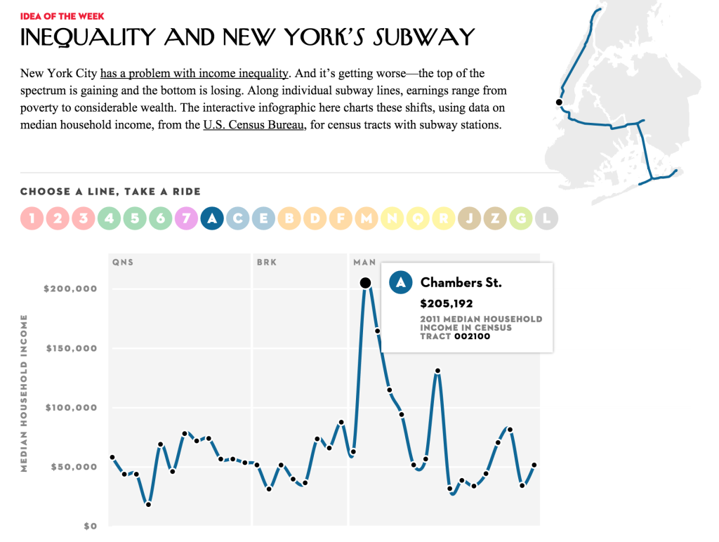
The grid in the background of this graph is categorized into the 3 boroughs that the train travels through. I think that the whole name of each borough could have been spelled out instead of using the 3 letter abbreviations. Overall the borough division shows the drastic increase in income in Manhattan versus other part of New York City and is especially effective. It would be harder to do this in other cities where inequality is less clearly delineated by geographic region.

For the L train, which bisects Manhattan before going across the river to Brooklyn(map lower right), the decline in income is especially clear(graph lower left).

Screen Shot 2015-02-05 at 3.22.33 PM Screen Shot 2015-02-05 at 3.22.38 PM


Couples Text Messages are Decoded

In a recent newsletter article sent by the Parisian website Merci Alfred, Les SMS des couples déchiffrés (can be translated by Couples Text Messages are Decoded) shows within a few infographics how texts as part of the couple new language. It gives stats and possible trends on couples texting behaviors in a humorous way. Over 100 millions text messages of couples have been analyzed with the help of Tx.to a website that allows you to print your SMS conversations.

The figures are split in Gender behaviors and questions asked are : % of sent texts according to the status of the relationship, the day of the week, length of sent texts, most frequently used words in texts, most used emojis, first ” I love you” and “make love” are said, time of response between texts, etc.

The goal of the data presentation seems to show that you will have a different behavior in your relationship according to your gender. Even though they claim a study with over 100 millions texts, the audience understands that the point is not to run a scientific study but rather show stats in a funny way. As each graph is almost always annotated to highlight that difference. For instance, when we see the time of response between texts of 2:30min for Women VS 4:30min for Men the annotation says : c‘est parce qu’on s’applique ( it is because we try harder)

The data presentation is effective because it distinguishes Gender with a different color code and show simple binear comparisons with only a limited figures per graph. Males and Females behave differently. We all know that.

Those who saw the article are the recipients of a newsletter that targets urban males living in Paris city. But it is also shown on their website. So it really aims at not a specific male audience but mostly an urban audience,  fairly young 18-35yo.

The Science Checks Out

A recent article from FiveThirtyEight, “Americans And Scientists Agree More On Vaccines Than On Other Hot Button Issues,” highlighted data from a 2014 Pew Research Center study on public attitudes towards science-related issues. In the graphic below, we can see how Democrats, Independents, and Republicans’ views compare with one another — and with those of scientists from the American Association for the Advancement of Science. This story was released in the wake of controversial statements made by Republican presidential hopefuls Chris Christie and Rand Paul that reignited the debate over whether or not children should be vaccinated. The public has much more of a (positive) consensus — both across the political aisle and with the scientific community — on the topic of vaccination compared to global warming, evolution, and GMOs.

Scientist Public-Split On Science-Related Issues

In the original opinion polls, approximately 65% of Independent and Republican respondents and 75% of Democratic respondents believed that all children should be required to be vaccinated, compared to about 85% of AAAS members. Given FiveThirtyEight’s brand of reporting, I would expect the intended audience of this graphic to be highly data-literate, and most likely closer to the scientific side of the spectrum. While the graphic isn’t explicitly partisan, it does highlight data suggesting that Republicans are less in agreement with the scientific establishment (though the responses to the GMO question invert this). As such, the graphic alone might play into a narrative about how Republican politicians like Christie and Paul are trying to pander to extremist, science-denying voters.

However, the article itself points out that plenty of the other potential Republican presidential candidates are pro-vaccination. Most voters, regardless of political affiliation, agree with science. The goal of this data presentation, then, might be to show how we’re not so different after all across the aisle — and with the exception of global warming, members of the public are more often in agreement with each other than with scientists. The graphics shown on the Pew summary and even their interactive tool doesn’t even mention politics, combining all respondents into a single group. If the goal was to show how far off Christie and Paul were in relation to the broader public (and science!), then this data presentation is effective. It demonstrates that their comments were anomalies and not representative of Republican voters.

One criticism I do have is that the line used to denote the scientists’ views is too bold, overpowering the actual tick lines. It might be misinterpreted as the 100% mark, making all the numbers seem higher than they really are. Even though there is a relative public consensus around vaccination, there is still a large number of people — a third of Republicans/Independents, a quarter of Democrats, and even a good number of scientists — who don’t believe that they should be mandatory. Another point is that there is a difference between believing that vaccinations are beneficial and believing that vaccinations should be mandatory — there are certainly other factors, such as one’s philosophy about the role of government, that are also operating in this data set.

Gender diversity at tech companies

Though several large tech companies like Google and Facebook have released numbers on gender and racial diversity in its workforce, there is comparatively little data about the workforces of smaller, fast growing companies, such as AirBnb and Github. To remedy this, last October, Pinterest engineer Tracy Chou surveyed employees at these companies directly, asking them to self-submit their data. Chou collected and aggregated the information into a public spreadsheet.

Chou’s data forms the basis of this visualization, titled “We can do better,” created by Ri Lu. Each company is represented by two circles, whose size is proportional to the number of men and women in its engineering workforce. The circles, colored pink (women) and blue (men), are placed on a horizontal axis, where a 100% female workforce is on the leftmost end, and a 100% male workforce on the rightmost end.

wecandobetter

Based on the title, “We can do better” and the use of the term “gender disparity,” it’s clear that the goal of this visualization is not only to highlight the gender imbalance in engineering teams at these tech companies, but also to suggest the companies do something about it.

The visualization is effective at achieving the first goal. There is a noticeable difference in sizes of the two circles and most of them are closer to the right side of the axis, showing a clear skew in the number and percentage of men.

However, I think this visualization lacks context around why this gender imbalance occurs and what people can do to help. In the absence of clear, persuasive advocacy, perhaps with supplementary text, people may walk away with the idea that this imbalance is not a real problem, or that there is no solution.

Additionally, because the data was self reported, it may not be 100% accurate, but this fact is mitigated by the clear trend that manifests. The visualization also acknowledges the limitation that gender is not binary, though it only displays a M/F breakdown at this time. Finally, gender is only one aspect of diversity of a company. A more complete visualization, or set of visualizations could include information about race, class, etc.

Star Wars Inflection Point

I originally was trying to locate a more “data-y” xkcd comic I’d seen recently, but ran into this one first and was struck by the timeline visualization and its context.

http://xkcd.com/1477/


Screenshot from 2015-02-05 14:18:02


I believe the audience of this comic is broader now than when it first launch, but I would suspect it is more science/math oriented, younger, and male that the general population.  I think the intended audience for this particular strip is probably people in their 20s-30s, with the assumption that they follow basic pop culture science fiction.

I think the bigger message of the comic is that we often misread/misestimate the passing of time and the timeline is a visual reinforcement of that message.  The use of present day benchmarks is very effective in conveying this. I suspect most people reading his comic have seen both of this movies (in “real time” or not) and these were fairly memorable benchmarks in their lives.  Additionally, people probably have a notion when these points in their life occurred and the timescales between them, providing perhaps a “shocking” comparison.

I think the combination of text and simple visuals is very effective here.  The inclusion of (basic) people and emotion words make it stronger as well I think.  The timeline was the first thing I saw and read in the comic, which let me “process” the reality of the time gap, before getting hit with the text about it.  I think this let the text have more emotional impact, since I already believed it, and didn’t have to mentally “check the facts.”

Wind Map

Wind is a source of energy that is readily available worldwide. When harnessed properly, it can provide continuous energy to households irrespective of the time of day (as is the case with solar power.) The limiting factor to the utility of wind power is wind availability at certain geographic locations. In some locations wind is abundant, while in other locations, it is not. Moreover, the velocity of the wind at a given location greatly affects the operating speed at which wind turbines are functional, as high wind speeds can damage the generators in the rotors of these machines. The figure below shows a visualization of the location and speed of surface winds in the US, in real-time. The surface wind data is from the National Digital Forecast Database (NDFD.) The authors specifically state that the data is not to be used to fly planes, sail boats or fight wildfires!

Screen Shot 2015-02-05 at 2.24.59 PM

This information is crucial in the planning, siting, and sizing of wind farms. Wind farms are useless if they are located in areas with intermittent or variable wind patterns. This data visualization can also play an important role in city planning. For example, city planners could utilize such data in determining where to, locate a new high-rise development or park, as wind speeds can be detrimental to development.

This visualization communicates the overall picture in a meaningful way; however, a better picture can be depicted. For instance, the addition of color scale could immediately communicate where best suited sites for wind farms based on location.


Source: http://hint.fm/wind/

Mike Bostock: Visualizing Algorithms

Mike Bostock’s algorithm visualizations were not my first thought in response to the phrase “data presentation.” He also does a lot of standard data presentations, too, that I could have chosen to talk about. But his algorithm visualizations are among my favorite things to look at, and arguably highlight (as well as leave out) aspects of data presentation that might merit some meta-inspection, so I thought they’d be worth examining anyway.

Algorithms are often used to process data, but also to generate it. There are quite a few algorithms featured in the essay, but my favorites are the three described for generating a uniform-looking random sampling of points throughout a space. So, it’s definitely geared towards computer science enthusiasts in its content, but still attractive enough to engage the less geeky among us. It’s able to paint a less technical macro picture as well as a more detailed micro picture.

The motivating illustrative examples are the three versions of Starry Night, produced by using each algorithm to sample points, and then coloring the area closest to each point the same color as the point- a kind of compression of the image. This division of the space into cells defined by the point they are closest to is called a Voronoi diagram. But even without knowing precisely what that means, from the pictures it is easy to get an intuitive sense both for what the sampling does to the image, and why we would want to do it. The point of the article and the images is not to teach the reader what a Voronoi diagram is, especially when they are likely to already know or look it up if they care, but to give insight into the algorithms, and perhaps more importantly, to describe by example how visualizations can be used to teach and learn about algorithms.

starry1

What thrills me more than the Starry Nights though, as an engineer interested in ways to make important details obvious, is the set of blue-green Voronoi diagrams below that compare the performance of the three algorithms. The cells in these diagrams are a lighter color when smaller and darker when larger, to accentuate the non-uniformities in size between cells- details already in the image, but that would otherwise have been much harder to see. It shortens the search our eyes have to make for those much larger or smaller cells. It immediately makes clear which of the algorithms creates the most uniform sampling.

green1

starry2

Of the animations in the essay, the Poisson disc is my favorite- not just because it is the best-performing algorithm, but because of its mesmerizing beauty. I stared at it for a long while before beginning to understand what it did, and the color cues were the most helpful at the start. I noticed that there were nodes that started out red and turned black, or “off,” and the process of discovering the algorithm amounted to answering the question “under what conditions does that happen?” It stimulated all the right questions, and then answered them. I also liked that the animation had processes noticeable at different time scales; I felt that the animation was a bit fast for me at first (without reading the accompanying text), and perhaps I latched onto the color change because it was occurring at a speed that allowed me to think in between changes. Being familiar with the algorithm now, all of the processes appear to be happening at a nice pace- but only because I know what to look for.


poisson-disc2

Finally, another note on relevance: the data that these algorithms generate are clean; there is little noise in the typical sense and relatively few confounding factors involved. However, the visuals help us realize the flaws and patterns that are there. The visibly inferior demonstrations of the completely random algorithm highlight the important fact that a “uniformly random” probability distribution does not lead to a uniform result, but also suggests the powerful role of the random number generator in creating any patterns that do appear in the set of generated points. Bostock later describes the role and idiosyncrasies of various random number generators, in the context of sorting algorithms, but I feel he could have done this earlier; or maybe the long foreshadowing was an intentional device to create more of an aha moment at the end for the learner.

Food Safety For the Travelers

As I started to gather some tips for my trip to France, blogs and guidebooks bombarded me with the pictures of elegant French dishes and long lists of the “Must-Try” restaurants.  Similarly, when I prepared for my trip to China, every resource talked about food–the diverse style of cooking in China, what to try on the Markets, what spices are used, what I must try and what I must not, etc.  It seems like traveling cannot be talked about without talking about food, and I believe that goes pretty much the same with life..!  As an enthusiastic eater and “eye-eater” on food blogs, I recently found this poster that alerts travelers about their food safety.


food-water-whats-safer


This poster categorizes common foods any traveler encounters during their trips into ‘safe’ and ‘not safe’.  It displays actual pictures of the food and successfully grabs its audience’s attention (and appetite).  It must have been hard to skip over this page, if it were on magazines such as ‘Budget Travel’ and ‘Travel & Leisure’.  The poster informs the international travelers that fresh food such as salad, raw fish/sushi and fruits are more dangerous than dry food such as canned tuna and cooked meals such as boiled eggs and grilled vegetables.  It also suggests that while bottled water is reliably safe, tapped water should be avoided or drank with caution, depending on the countries they are travelling.

This poster successful grabs the readers attention by using actual pictures of the food, instead of simply listing the safe and unsafe items.  It also does a good job of pairing the counterparts (for example, bottled water vs. tapped water, cooked steak vs raw meat, boiled egg vs. not-fully cooked scrambled eggs).

Climate Change: The State of Science

One of the biggest problems facing our generation and those to come is climate change. This topic has sparked political debates, religious debates, industry changes, and is something that I’m particularly interested in because I spent IAP in a city where the pollution causes the visibility on sunny and foggy days to be equivalent.

The data being shown in this video is nothing new, it’s something that our teachers, parents, and peers talk about: the ice caps are melting, the carbon in the air is increasing. What I think the video does well is it provides a visual to this that elicits an emotional response from the watcher. The video shows a time lapse of earth over the next hundred years, where we can actually see what it will look like when our planet is no longer capped with white and when Florida is no longer a dry piece of land.

The video tries hard not to offend watchers and place blame, but at the same time it tries to scare watchers into action. Did you know that the acidity of the ocean has increased 26% since the industrial revolution? Did you know that if nothing changes, the earth will be 4 degrees warmer in 80 years? The video ends with earth being depicted as a ticking time bomb.

The visualization of the data allows even the least technical person to understand. The technique of showing change over time is similar to what Rosling does in his Ted Talk; however, instead of showing past measured data, the video shows projected data if nothing about humanity’s current carbon footprint changes. I think that the presentation is very effective, and that the audience is just your average Joe.

Mapping Poverty in America

Data from the Census Bureau show where the poor live.

Mapping Poverty in America is an interactive recently published by the New York Times that visualizes data about poverty from the Census Bureau. It does so by presenting it on an interactive map that colors regions based on the percent of people that live below poverty thresholds, which is quantified for people that don’t know what the poverty threshold is.

Upon loading, the site asks for your location, and (if given) displays the data for your general location, as well as previews of other major cities in the US. Hovering over a colored region will display an info-box with that region’s poverty rate and the amount of poor people in that region. The interactive also has two different views, which visualize either regions colored by poverty rate or circles representing the amount of poor people in a region.

(source: New York Times)

This interactive aims to visualize data that would otherwise not be seen by the general public, especially since the NYT has such a large readership. Though the interactive makes no politically charged statements, you can’t help but think that this was made with the intention of sparking conversation about poverty in the US. This interactive shows that poverty is indeed still a problem that is faced by many regions of the US, and by making this information available, easy to understand/visualize, and localized to each individual reader, hopefully this problem will no longer be ignored.