Data Story Design for Food for Free

We blended a number of different techniques to facilitate our exploration of the data story behind Food for Free’s mission. In contrast to the paradigm of “start with the data, finish with a story” that is described by the Data Journalism Handbook, we started the design process for our data mural by listening to Sasha Purpura, Executive Director of Food for Free, talk about the ethos and mission behind Food for Free, and the impact that the organization has had thus far in the local community. By listening to her first-hand account of the story behind “Food for Free”, we seeded our data exploration with a big picture idea of how Food for Free operates and its role in addressing a well-defined and critical piece of the broader issue of Food Security.

After that, we jumped into a few collaborative design exercises to openly explore the available data and hone the data story that we are directly expressing through our data mural. First, we employed a framework to develop data stories through identifying interesting factoids/outliers within the data, examining surprising correlations and interactions between different data points, analyzing how the data changes over time, revealing comparisons within the data, and also leveraging what we know about our local community to infuse the data story with personal experiences. These techniques are very similar to those described in the Data Journalism Handbook for developing context for data stories.

As a class, we discussed the individual data stories that emerged from our exploration, and developed visual designs through a group drawing exercise. Similar to some of the design strategies highlighted by Segel & Heer in their framework for narrative data visualization, we eventually developed a cohesive design to visually structure the data story, and highlighting specific motifs and patterns within the data itself. Since our data mural fits within the author-driven genre of narrative visualization, it provides a visual metaphor telling a focused story about Food for Free. It differs from many of the the case studies presented by Segel & Heer since it lacks the aspects of interactivity and transition that are typically present in data visualizations presented with a more reader-driven perspective.

A Day’s Worth of Data

I wake up at 9:00a, make breakfast, snap a picture of it on my phone and post it to Instagram with relevant hashtags. [Data generated: photographic data – which is also synced between my Dropbox as well as my iCloud, timestamp data, and social engagement data via likes on Instagram – note: I do not choose to geotag my photos, although who knows what data Instagram is actually relaying to its servers…] In the meantime, I catch up on the day’s headlines on NYTimes Now – creating data on the articles that I read, and the links that I click through.

I receive a few texts from a friend, as well as from a colleague who is going to meet up with me this morning to film some short scenes for a documentary. I reply to the texts, creating metadata (timestamp, to/from) and content within the texts – all donated to my wireless carrier and iMessage.

I meet up with the colleague, and we film around my neighborhood – her camera records video and time data. We also take a bus, and I swipe my Charliecard as I board, creating a few more data points on my bus usage – the stop I got on at, and perhaps how many times I’ve swiped within this month (I have a monthly pass instead of a top-up card).

After filming, I return home to answer emails, and work on rescheduling many meetings and other engagements that have been cancelled due to the snow storm. In the process, I generate data through my email conversations (text content + metadata + geolocation through my ip), and through my calendar updates (schedule content and time data on when changes are made).

Once I get hungry, I make lunch and Instagram it, again generating more photographic data, timestamp data, and social engagement data.

I return to working on my laptop, editing documents and spreadsheets on Google docs while collaborating with other students on a research project. I leave behind a data trail of my document edits – both the content and timing of the edits. In the process, I also get in touch with my collaborators via Gtalk – generating more text data and metadata.

Taking a small break before transitioning to my next work-related task, I log into Pinterest (a guilty pleasure!) and browse for a bit. I notice that Pinterest is now showing me suggested posts (instead of only the posts curated by the people I choose to follow), and I update my settings to suppress these superfluous pins. I realized that no user setting will get rid of the “picked for you” pins, and I use Google to attempt to find another workaround (creating search data) – however, this effort is not successful and I end up closing all of the tabs that I opened related to this break – and in the meantime, generating more browser history data.

Later on, I finalized a paper submission – this created a few updates to my Dropbox history as I completed some last minute document and content edits, and reformatted a few images. I submitted the paper, and generating data about my submission – both the actual content submitted, as well as the metadata of when I submitted, the file names and types that I submitted, etc.

I take another break to watch an episode of “Modern Family” on Hulu, creating data (linked, unfortunately, to my Facebook account – since at some point in history I had linked my Hulu and Facebook accounts together) on my viewing behavior, on which ads I watched, and also on my click behavior, as well as adding more to my browser history data.

I go back to emails again, sending more emails and generating more email and conversation history as I confirm the meetings that I have tomorrow.

Finally, as I’m writing this blog post, I’m generating data via the hyperlinks that I add, and also the content that I’m generating (metadata on the post category, revision data, as well as the actual text)!

Feeding the World

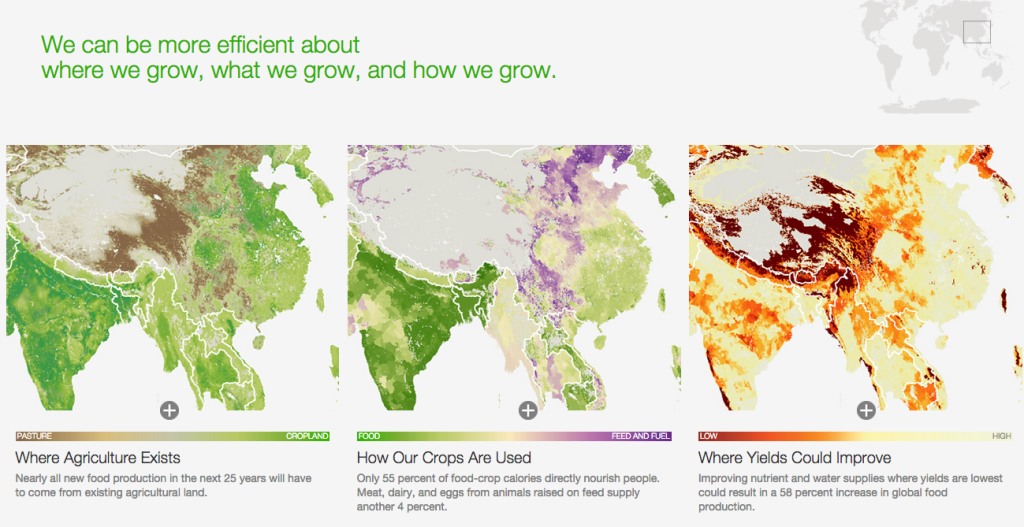
This article takes a data-driven approach to tell the story behind addressing the global challenge of sustainably feeding the growing world population. The presentation is geared toward both educating general audiences about the food challenges connected with population growth, and persuading policy makers to adopt certain strategies for mediating the global supply and demand for food.

The data presentation uses both qualitative and quantitative data – using photos to document the diversity of food producers around the world and the impact of our agricultural footprint, and visualizations to convey key statistics that are central to the story – namely, mapping the global agricultural footprint and visualizing the projected need based on population growth.

Screen Shot 2015-02-05 at 1.02.55 AM


Screen Shot 2015-02-05 at 1.01.27 AM

In general, this data presentation uses a blend of techniques to effectively meet the goals of both educating a general audience, and conveying a set of high level strategies for policy makers to consider in the context of addressing this global food challenge. The use of interactive visualizations encourages the audience to explore the data, while the curated images and static charts depict very deliberate and specific data points that help to support the narrative of the article. The types of visuals are intuitive to interpret and do not require a high level of audience data literacy, and they can be taken both within the context of the article, or as standalone pieces. The structure and techniques employed within this data presentation are effective in empowering the audience to engage with the data presented while also reinforcing the key strategies proposed within the article.