SNAP Judgments Impact

Mary Delaney and Stephen Suen

One of the clear data stories that emerged from studying our data sets is that SNAP participants are forced to make trade-offs that adversely affect the health and happiness of them and their families. Based on the constraints that an average SNAP participant faces, both monetary and temporal, there is no way for a person to spend time with their family, earn enough money for food, rent, and other expenses, and adequately maintain their personal health. In addition we noticed that an easy way to alleviate some of these issues is the short term is to eat pre-packaged or fast food. However, these decisions, though possibly beneficial in the short-term have negative long-term health consequences. In short, SNAP participants have so many constraints placed on them, that many struggle to survive, much less thrive.


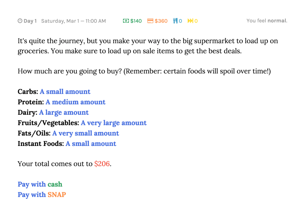
The goal of SNAP Judgments is to give people a better understanding of the challenges and choices faced by SNAP participants in the hopes of increasing empathy and awareness. We hope to accomplish this by incorporating the data we have found into a story, such that a person experiences that data without directly being presented with it. In addition, we decided to create a choose-your-own-adventure game so that players would be forced to actively think about the choices that SNAP participants face and make those decisions themselves.


The game’s audience is college-aged students who are not on SNAP and have limited exposure to the choices faced by SNAP participants. The data we used is local, so Boston or Cambridge based college students are the ideal target, but the storyline of the game is not unique to the Boston area. This demographic also seems to be an ideal audience for a text-based digital game, because people in this age group would likely be somewhat familiar and comfortable with games of this sort. As the goal of the game is to inform players about SNAP and increase empathy for SNAP participants, this also seems like an ideal audience. They are old enough to understand the complexities of the decisions that people face but young enough that they may be open to changing previous views they had of SNAP participants.


After talking to people who tested the game, it seems that we accomplished our intended goal. Players consistently expressed that they were much more aware of, and sympathetic to, the daily choices faced by SNAP participants. Using a time-limit choice mechanic, we were able to express why people on SNAP have to make certain decisions. The sheer difficulty of the balancing act between food, money, health, and happiness was made tangible to players through the mechanics of the game system. In addition, though there was not a direct call-to-action incorporated into the game, players expressed, both verbally and in survey responses, that they would be more likely to donate time to money to help those with food insecurity than they were prior to playing the game. This suggests that they were both more aware of SNAP and the challenges faced by SNAP participants and that they felt empathy towards them.

SNAP Judgments Methodology

Mary Delaney and Stephen Suen

SNAP Judgments is a narrative, data-driven choose-your-own-adventure game where you assume the role of a person on SNAP. The player’s objective is to make it to the end of month, trying to meet the requirements for livelihood (food, shelter, etc.) while staying within their assigned budget. From our perspective, the games goal is to give people a better understanding of the trade-offs that people to SNAP face, in the hopes of increasing empathy for SNAP participants.


To create our game, we pulled data from a number of different sources. For the food aspects of the game, we used data from the Mayo Clinic, myplate.gov, Peapod, fast food restaurants, and several research papers to get accurate information of the recommended amounts, nutritional value, and approximate costs of various types of food.


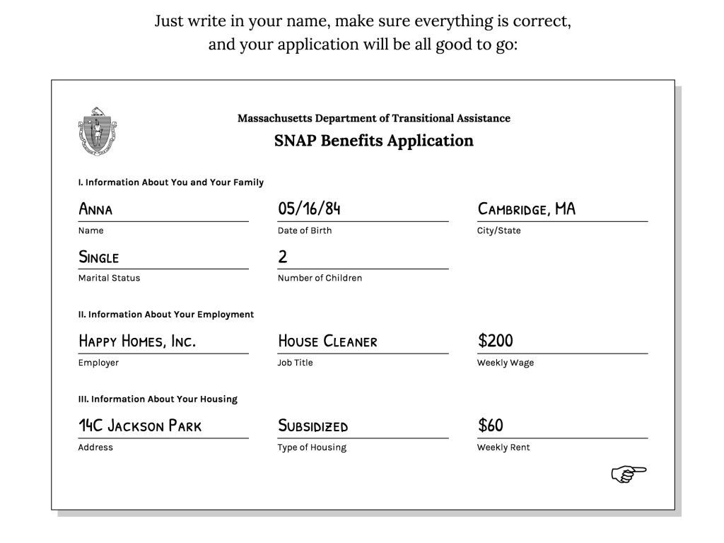
In addition to the data on food, we also used datasets on the demographics of SNAP participants to help us make the constraints that the player faces as true to life as possible. We chose a single mother of two children, the type of person who most often participates in SNAP.


For the housing component of the project, we assumed that the player character was living in subsidized Section 8 housing — as SNAP does with food, the government subsidizes housing so that low income Americans only have pay 30% of their income in rent. This was further supplemented with data from the Cambridge Housing Authority on the types of units available and where they are located, as well as information about the payment standard and utility deductions.


To prevent the food-centric aspects of the game from becoming too overwhelming, and detracting from the player’s experience, we simplified food into food groups. We simplified food into a system of units, which were normalized such that 4 units comprised a full meal for an adult and 3 comprised a full meal for a child. Using the data described above, we calculated the average nutritional value, recommended weekly amounts, and cost for each food group. A summary of the calculated data that was used directly in creating our game can be found here. When at the grocery store, players could choose how much of each food group to buy. When at home, players could choose how much food to cook, and that total amount was taken equally from each food group.


Our text-based choose-your-own-adventure game takes a player through a month in the life of a SNAP participant. To allow for decisions with longer-term impacts as well as typical daily decisions, we decided to have our game cover the course of a month, with the player experiencing selected days each week. It includes both typical decisions, which a player encounters every day, and unique choices as a result of a particular experience.


We tested the game and administered a survey to players. Playtesting allowed us to find and fix bugs in the game to improve the overall player experience. Based on our survey and talking to people who played the game, it seems as though we accomplished our goals. People agreed that they had a better understanding of SNAP, and the challenges faced by SNAP participants after playing our game. They also agreed or strongly agreed that they would be more likely to volunteer or donate to help those with food insecurity.

Drought Debunkers Impact

Val Healy, Nolan Essigmann, Ceri Riley

For reference, here is a link to our final project (we might need to host it somewhere besides c9 for others to view it) and here are our final project presentation slides.

Goals

The ultimate goal of our web scroller is to reveal how humans are exacerbating the social, economic, and environmental impacts of drought because of the current structure of industrial agriculture and government subsidies that reduce the cost of meat and dairy products. We wanted to create a more unique narrative, a story that extends beyond the ‘shock factor’ of revealing water footprint data concerning meat and certain crops.

As such, we introduced the link between drought and the water footprint of foods and debunked the idea that refraining from eating meat – an individual lifestyle choice – will have an effect on the industrial food system and massive daily amounts of agricultural and livestock water use. We wanted to emphasize that:

  1. lifestyle politics are a good symbolic choice, but not necessarily a practical act of activism (especially if you cannot afford to make the choice due to food costs).
  2. government subsidies systemically reduce the cost of meat and dairy products, such that their financial cost doesn’t necessarily reflect the environmental cost (the water footprint) that goes into raising the animals
  3. anyone who wants to be more engaged and enact change should keep updated with information about industrial agriculture water use, government subsidies, and other organizations who are actively trying to reduce wasteful water use in the US

Audience

The audience for our data story is college freshmen, and we gathered the bulk of our feedback from several individuals in our living groups. We selected college freshmen because the demographics of the group vary greatly – people come from different locations, backgrounds, high school education styles, and levels of community/regional/global engagement and awareness. The independence and immersion in a new, open college environment encourages individuals to question their inherent biases and beliefs, and generally incites a desire to be more aware of how they can affect the world in the long run.

As such, college freshmen are an ideal audience with whom we can discuss a popular topic like drought (which they have likely heard of, even vaguely, in the news) and they will be receptive to discussion about how individuals can help (or fail to) influence local water use through their lifestyle choices and activism. Students also may face the dilemma of purchasing cheap, easy-to-prepare food on a budget or may experiment with different diets for health or sociopolitical reasons. In addition, every college freshman presumably has some desire to continue learning, so they may benefit from our educational ‘call-to-action’ and become interested in different organizations that address national water use and/or be more willing to seek out more information on the subject of drought and food.

Reaction

Types of questions we asked:

  • Have you heard about drought in the US before this project? What about it?
  • What do you think about taking shorter showers (or similar actions) to save water?
  • What about changing what foods you eat?
  • Did you know that food comprises most of your daily water use?
  • What are your feelings towards crop and livestock subsidies?
  • Did they change at all after scrolling through this narrative? Why?
  • Did you learn anything about drought/do you have any desire to learn more about drought? Or different forms of water use?
  • Do you want to get more involved in reducing US water consumption? Your personal water use?

All the freshmen we talked to (approximately 6) had mainly read popular news stories about the California drought, and two of them had grown up in the midwest and heard about the devastating effect of drought on crops. They knew that drought was affecting  families, either people they knew who were involved in agriculture or by water bans in California. Overall, there were mixed opinions ranging from “Drought isn’t really a problem where I come from” to “my home county is basically a desert so I’ve pretty much constantly lived in or near drought” to “my grandparents live in California so I probably should know more about it.” They thought the small multiples map was interesting, and were curious about what the different colors/levels of drought actually meant beyond “red = bad.”

When we talked to them about lifestyle politics, most people thought that personal actions like shorter showers could have an impact on water use — “I believe that shorter showers could save water… but I’m not sure how short to take” and “Shorter showers would save water in theory, right? But I don’t do it.” After talking and reading the scroller narrative, they thought it was interesting how a lot of public policies focus on low flow toilets and showerheads when really they don’t make that much of a difference.

All but one of them were semi-regular meat eaters (the one was pescatarian on personal/ethical grounds), and were either surprised by the fact that food is a majority of your daily water use or anticipated it — “It makes sense that food contributes so much to your daily water use… because agriculture,” “Don’t almonds take a lot of water? I didn’t buy them last week on principle,” “Food? Really? cool.”

However, besides the one person that didn’t buy almonds at the grocery store recently, they wouldn’t feel motivated to change their diets because of their daily water use, or say that they might unintentionally be saving water — “I already go several meat-free days a week because I’m lazy and don’t want to cook it, so I probably wouldn’t make more changes.” And they weren’t sure if they would radically change their food habits if meat were more expensive either — “it’s hard to imagine how my shopping trips would change, and I always buy groceries on a budget… I’d probably just buy some meat anyway and get less of something else.”

Not many people knew about the impact of government subsidies on making the cost of food disproportionate to the water cost of that food, especially when it comes to livestock — “it’s weird to think about the relationship between water, government funding, and livestock… it’s not an immediate connection I would make.”

But, overall, they did not feel like the visualization motivated them to make any sort of lifestyle change or get involved with activism. It helped some of them solidify the idea that lifestyle changes are a personal decision and are mostly symbolic (whether they’re ethical, religious, political, etc. beliefs) rather than impactful — which made some people feel “kind of hopeless… because we can’t really do anything personally to affect industrial agriculture [or capitalism!] without joining a huge movement.”

It encouraged some people to learn a bit more about drought — “maybe I’ll pay more attention to drought in the news.” But nobody would really want to get involved with water conservation/awareness activism — “I would get involved if it was easy to get involved,” “I have no desire to get involved,” “No, I don’t want to be more involved.”

Overall, it seems like our scrolling visualization helped people learn a couple new things about drought, lifestyle politics, government farm subsidies, and the relationship between food and water. It worked as an educational tool, but didn’t necessarily motivate people to enact change in the world, which is probably okay given the scope of the project.
Drought Debunkers Methodology

Val Healy, Nolan Essigmann, Ceri Riley

The goal of our web scroller is to reveal how humans are exacerbating the social, economic, and environmental impacts of drought because of the current structure of industrial agriculture and government subsidies that reduce the cost of meat and dairy products (which have large water footprints).

Our initial research involved laying out possible questions that interested us and focusing on the link between drought and food security. After we had a general idea of the story we wanted to tell, we researched a bunch of potentially useful datasets and compiled a document with at least 15 sources for data and 17 news articles (containing narrative ideas as well as links to alternate data sources) that we could use as starting points for our project sketches. As we iterated through versions of our final project, we created a hand-drawn rough sketch of the scroller, an abbreviated document including datasets we would still need for our revised story and tentative visualization ideas, a near-final version of our project entitled ‘Where is the Water Going’ (the black text and associated citations located in this document), and a final two revisions based on feedback from Rahul and discussions with our peers (the green and red texts located in this same document).

The very basic prototype of our visualization was the creative chart based on 2010 California Water Use data. This dataset led us to a report of 2010 United States Water Use data, where we extracted data about Domestic, Industrial, and Agricultural water use to compare water withdrawals between states and nationwide (spreadsheets located in this folder, among others). We eventually narrowed down the visualization to a visual area comparison of these three daily water consumption metrics, including a calculation about approximately how many gallons of water each person uses per day.

As we experimented with other sketches, we used map data from the U.S. Drought Monitor in addition to manually copied/pasted tabular data monitoring the weekly severity of drought across the entire United States and in all 50 individual states.This information was used to make regional maps of drought to include in our final scroller. In addition, we researched qualitative information explaining the causes of drought to help us write the narrative hook that leads into the remainder of our story. This Github repository contains the data for our west coast drought map, and this folder contains all the images that comprised our small multiples map.

In order to research the water cost of foods, we used water footprint statistics for both crops and farm animals, in addition to supplemental information from Angela Morelli’s water visualization, some statistical data from a report on The Water Footprint of Humanity, and information from the Mekonnen and Hoekstra paper entitled A global assessment of the water footprint of farm animal products. We focused on pages 24-29 of the report and manually transcribed data about the total water footprints of different animal meats and food products, the total water footprints of different feed crops, and data comparing the water footprint of animal products to their nutritional breakdown (with a focus on protein). Although we analyzed data regarding the nutritional content of different food options, we ended up omitting it in our final scroller in order to tell a more succinct story focused on the water costs of meats and crops. We also read and extracted data from part of the paper on The green, blue and grey water footprint of crops and derived crop products in order to analyze the different water footprint of specific crops both globally and in the US and create an interactive small multiples visualization with cleaned data that can be found in the ‘usfoodwaterusage’ file within this folder (some of our data analysis was compiled on c9.io and the downloadable file format is .gz for some reason).

In order to support the end of our narrative, making the connection between the water footprint of meat and the fact that the symbolic choice not to eat meat isn’t feasible for many people, we did a quick analysis on SNAP data, specifically focusing on the average monthly participation table. In addition, we researched census information about poverty in the United States and estimates of people who were in poverty at a national level. We used this information to create a visualization with data that can be found in the ‘data’ file within this same folder.

Lastly, we researched data on farm subsidies across the United States and cleaned the data such that it just presented information about food products, taking out information like disaster payments or incentive programs. We specifically used this information to create a visualization of the different food subsidies and a visualization describing the price of meat with and without subsidies. The cleaned data can be found partially in this spreadsheet and partially in the ‘viz’ file within this same folder .

We also collectively invested a lot of time in learning basic web programming and how to implement skrollr.js and D3 to create our scroller and visualizations. None of us came into this class with very much programming experience in anything but Python, so there was definitely a learning curve when developing the final project and a lot of experimentation with different scrolling webpage tools.

Links to additional cleaned datasets:

  • This other folder contains some of our excel spreadsheets with downloaded/cleaned/analyzed data about drought, US crops and associated revenue (by state), US water use, California water use (by national classification and crop/land), and SNAP participants.
  • As you can see in the bottom half of our final planning document, we initially did work analyzing data about personal water use (such as showers or sprinkler systems) and additional analysis on industrial water use data before cutting the information and narrowing our narrative to focus on agriculture.
  • Our c9 workspace, which has restricted access (but we can grant access, I believe), and several of our cleaned datasets in the original file format (not .tar.gz)

Somerville Resources Impact post

Team: Tuyen Bui, Hayley Song, Deborah Chen

Our goal was to raise awareness of food insecurity in Somerville and highlight ways in which people can help. We focused on the Somerville Backpack program and the Somerville Growing Center.

We had a discussion around who to target as our audience – either food insecure youth or a more general audience. In the end, we decided we could create a bigger impact by inviting people in Somerville to understand how they can get involved with organizations that work toward alleviating food insecurity. The main impact would be if the video inspired people who didn’t know about these places to get involved or donate. Additionally, one of the organizations we featured, the Somerville Backpack program, emphasized that they wanted to stay very low key to the kids they delivered meals to, as they do not interact with them outside of their teacher, but always needed more private donations and volunteers!

Link to video: https://tuyen.makes.org/popcorn/320m

To evaluate it, we first send a draft of our video to the Backpack program to get their feedback – our criteria for success is if they would find it an effective tool for outreach. They suggested we separate out the footage to make it easier to share. For our opening scene, we inadvertently sent the wrong message by unintentionally showing a “dirty fridge,” which could promote stereotypes of food insecurity. The Somerville Growing center liked the macro introduction to food insecurity at the beginning, but wanted to see a longer, more detailed introduction.

We also surveyed members of our “general audience” to see if the video would inspire them to volunteer. Here is the pre and post survey. In some cases, we recorded the responses in person.

Jay, divorced 45, 2 kids, who does not have enough time to volunteer, but believes in food pantries and shelters for food resources. He liked the video and thought we could be more clear about identifying the type of people that care about food insecurity.

Irene, 70 was willing to volunteer for the Somerville Backpack program after watching our video. However it turned out us introducing the program to her probably played a larger role – perhaps the video is better suited for jumpstarting a conversation in person.

Overall, we believe that the work we’ve done has potential, and initial feedback from the organizations we featured were encouraging. However, there’s work to be done before sending it out to a wider audience.

Somerville Resources Methodology Post

Team: Tuyen Bui, Hayley Song, Deborah Chen

The goal of our project was to raise awareness of food insecurity in Somerville and highlight ways in which people can help. To this end, we created an interactive video that we hope can be shared and inspire people to volunteer at the organizations we featured, or ones that have similar goals. Our end project has a focus on qualitative data that we collected ourselves, but the story we wanted to tell was motivated by the data.

The first step in our project was to follow-up with Lisa from the Somerville Health Alliance and take a deeper dive into the survey and dataset she brought up in class. The survey asks youth in Somerville about their level of food insecurity, where they get food, and what would help them better access the food they want or need. We also looked at the Rapid Assessment Response and Evaluation of Food Insecurity in Somerville of 2012.

To make sense with this data, we used Excel, Tableau and Google Sheets to make quick visualizations, slicing the answers to various questions by different demographics to see if there were any interesting trends there. By far, the biggest differences were in the responses from food secure and food insecure youth. Using Media Meter’s word counting tool, we analyzed the frequencies of words for questions such as  “What foods would you eat more often if you could?” or “If there weren’t enough food to eat at home, what would you do?” This told us there was a gap of understanding between the food secure and insecure.

Here’s the data we worked off: link.

We next met with Lisa and her team at the Somerville Homeless Coalition and talked about our impressions of the data and possible stories. Here, our conversation turned to resources that help address food insecurity. We learned there were many organizations including food pantries, mobile farmers markets, and community meals that were available as resources of the lower-income food insecure population, but many people were either unaware of them, or knew about them but did not go there. For example, 36% of the food insecure youth survey were not aware of food pantries, and 28% were aware, but did not go there. At the same time, many people expressed the desire to help, but did not necessarily know where to go.

In the end, we decided to focus on the raising awareness of food insecurity and Somerville and highlighting ways people can get involved. We believed we could make a bigger impact this way, and one of the organizations we spoke to underscored the need for more volunteers. By making a video, we hoped that visually seeing these resources would inspire people to go there. We chose to use Popcorn Maker, an open source video editor, to allow us to embed pop-ups and links in our video. Our call to action is to learn more about the organizations and ideally volunteer.

We documented our experience and volunteered when possible. We interviewed volunteers at the Backpack program in Somerville who gather every Friday morning to prepare meals. That Friday, there were 6 volunteers and dedicated an hour and a half of their morning to pack the meals at Connexion Church in East Somerville and deliver to the 3 schools around who ordered 75 meals in total. We took video and asked them questions about their experience. We also visited the Somerville Growing Center and talked to youth who were part of an afterschool program.

SnapSim Impact

Danielle, Edwin, Harihar, Tami

SnapSim is an interactive text-based narrative in which a player takes on the role of a single parent on SNAP shopping for food for themself and their two children. Each food item has a story indicating its importance to the family, and the narrative forces the player to forgo some foods in order to stay within budget.

The goal of the project is to evoke empathy in our audience by simulating some of the challenges faced by a family shopping on SNAP. We chose this goal because, as we did our weekly mini-assignments, we found that publicly available datasets and visualizations failed to capture the challenges faced by the individual family on SNAP, but instead focused on aggregates (ex. obesity percentages by state). Therefore, we aimed to make a data story which would humanize the data and effectively illustrate the sacrifices that families on SNAP make in a way that numbers could not. We hoped that such a data story would cause the player to feel empathy for such families.

Our target audience was people who were not SNAP participants and who were from middle-class or rich households because they were least likely to be experiencing the same challenges as those faced by families on SNAP. Because MIT students were readily accessible participants, our study focused on them.

We created two variants of our interactive narrative. We tested each variant with four different players. We each sat with the players and guided the experience. At the end of the narrative, we tied it back to reality by showing the player a map indicating SNAP participation around the country. Then, each player completed a survey giving feedback on the experience.

Based on interaction with players and the feedback in the surveys, we made a number of observations. First, all of the players remarked that SNAP does not give enough money to families (see quotes below). However, some of the player responses may have been due to prior belief rather than SnapSim.

“I have always been pretty skeptical of SNAP as giving people enough money to eat “

“Just learned about SNAP. its a good idea but [it] doesn’t seem like a lot of money to buy groceries”

“86 dollars is really low for three people”

Six of the players indicated that $100-$150 (rather than the allotted $86) would be more reasonable to buy groceries.

In addition, all but one player indicated that SNAP requires sacrifices.

“Yes. I felt bad buying things that were unhealthy because I knew that I wouldn’t have enough money to buy both. At the same time, I didn’t want to buy food that would go bad because the kids won’t eat it.”

“Well I had to get rid of half of my groceries soooo. I didn’t like having to get rid of all the things my kids like. I also didn’t like that I had to choose all or nothing on each item – I couldn’t alter the amounts or exchange chicken breast for thighs, etc.”

“When I started I added lots of stuff to cart because I thought I needed them. I spent over 100 dollars and had to give up a lot of stuff”

Finally, after showing the map of SNAP participation rates and food banks, every player said that they would be interested in volunteering or donating to a local food bank some time in the future. While showing players how they can help is valuable, we can’t know whether they actually will volunteer.

It is difficult to measure empathy, but the results of our testing seem promising. The players were able to recognize that shopping on SNAP requires some difficult sacrifices,, and that they would be interested in helping out a food bank.

Methodology: Art Crayon Toolkit

Team: Laura Perovich & Desi Gonzalez

presentation

cleaned data

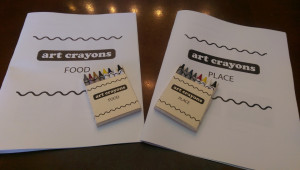
We created the Art Crayon Toolkit, an artistic toolkit that engages kids with famous artworks and gives them opportunities to create their own art. The toolkit consists of: (1) two packs of art crayons, each including four artwork-based crayons and four supplementary colors, (2) crayon packaging (labels & boxes), and (3) an informational creative workbook. The artwork-based crayons serve as physical bar graph of data in each work of art: the height of each color corresponds to the amount of that color found in the painting.

IMAG2641

Data for the art crayons came from online sources. We browsed a number of museum repositories to obtain images of the artworks, including Tate, Museum of Modern Art, Whitney Museum of American Art, Brooklyn Museum, Museum of Fine Arts in Boston, Phoenix Museum of Art, and Madison Museum of Contemporary Art, among others. Artworks were initially selected to fit within thematic categorizations, such as food, place, animals, and female artists, that we thought would be a good hook to pique our audience’s interest. We further aimed to include lesser known works, diverse artists, and a variety of artistic styles within each theme.

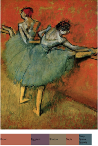
Next, we ran our initial set of artworks through a python script that returned an html file with an image of the artwork and its Crayola color mappings (for example). Many artworks were not well-represented in Crayola color; either the five color limit did not accurately capture the essence of the painting or color mappings seemed to miss the mark (for example, Degas’ Dancers at the Bar [1888, Phillips Collection] yielded brown and sepia colors, while we perceive the background of this image as a bright orange). Based on the color mapping results, we selected four works of art for each of two categories: Place and Food. These categories and artworks suited all of our criteria: the five Crayola colors accurately represented each painting or print, the artwork fit within the thematic category, the artwork had accessible and compelling backstory that would be interesting to children, and the full set of works were diverse in style, fame, and artist demographics. Additional background information on the artists and artworks was found through by researching on museum and artist websites.

Screenshot from 2015-05-14 13:35:53

Using this data, we created created the crayons, packaging, and workbooks (Place and Food). To make the crayons, we first created a two-piece mold using Oomoo, silicone rubber compound. We then collected the corresponding crayons colors for each artwork and broken off piece of the appropriate ratios. Each crayon piece was melted with a heat gun and poured into the mold one at a time in decreasing order of color prevalence. Crayon wax had to be fully melted in order to create a structurally sound crayon.

We designed labels and boxes in Adobe Illustrator based on the basic format of existing products so as to be familiar to users. Workbook content and design was based on existing models of art education and engagement for children such as MoMA’s Art Cards, didactic materials for kids to respond to works of art while in the museum’s galleries. We included information such as what the images represent, what style they were made in, and relevant content about the artist. The workbook also includes prompts to draw with the art crayons, both within the context of the corresponding artwork and more freely.

The Art Crayon Toolkit exposes children to artworks of familiar relevant content (e.g the food and place themes), providing short facts, stories, and information that helps deepen their connection to the works, making artworks more accessible by presenting the color deconstruction of artworks, and prompting children to develop a curious eye for art by creating their own pieces. We believe this combination of information and active participation provides a number of diverse routes to increase children’s art engagement.