By Team Aartvark (Desi + Laura)
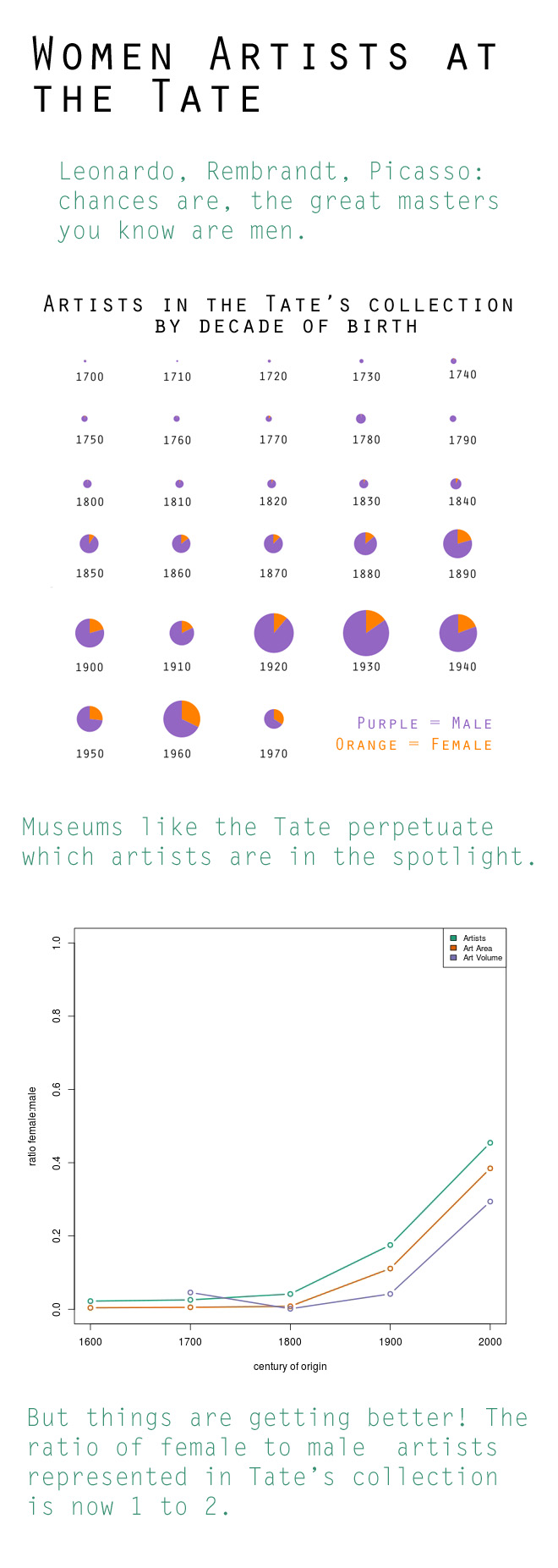
For the chart assignment, we made a infographic with two types of charts. On the top of the infographic, we includes rows of pie charts that demonstrate the men and women artists represented in the Tate’s collection by decade of birth. This visualization was inspired by the “small multiples” that Tufte recommends (and that Rahul showed in class). The second chart is a traditional line graph that shows how the ratio of artists represented in the Tate’s collection changes over time. The chart is intended for a general audience that is interested in art. Our goal was to reveal how museum collections are biased toward male artists, but that their biases are slowly changing, and that museums today are now endeavoring to have a more equitable gender distribution in their collections.