Ceri Riley and Val Healy
For our map project, we decided to make several small choropleth maps to illustrate where selected foods are grown and compare them to where drought is located. Unfortunately, Google Fusion Tables maps do not allow for changes in color, so all of our maps are green, though we would, if allowed, choose to use brown for the farmed animal maps, green for the crop maps, and red for the drought map.
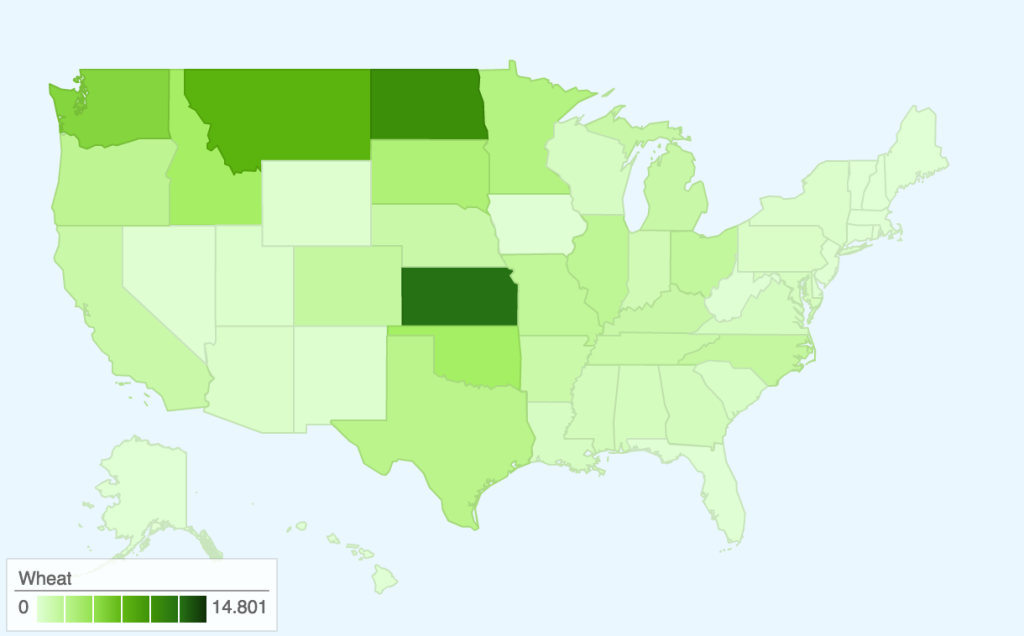
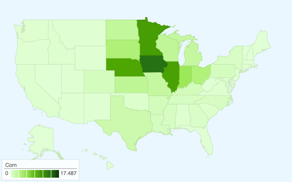
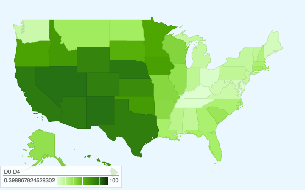
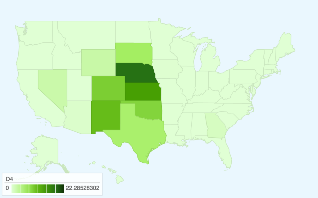
These maps were produced using 2013 USDA Datasets on Cash Receipts for crops and averaged 2013 Weekly Drought Data. Drought conditions have since become more serious, but the data on agricultural production by state is only confirmed through 2013 so we chose to focus on this year.
Here are links to the maps for interactivity:
As you can see, there is a moderate amount of drought throughout the central/western part of the United States, with the most severe drought focused in the midwest around Nebraska.
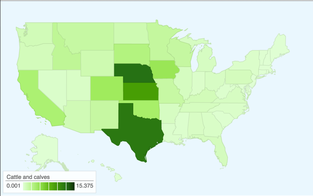
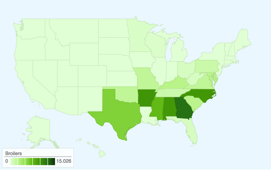
The majority of the cattle industry is located in a region where there are more serious levels of drought, while chickens (the ‘broilers’ map) are located further East. Cattle farming also requires more water than chicken farming, though, so perhaps this correlation is partially due to the large water footprint that feeding/watering cattle leaves.
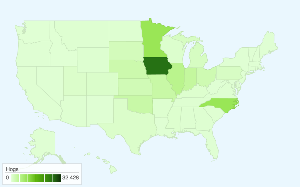
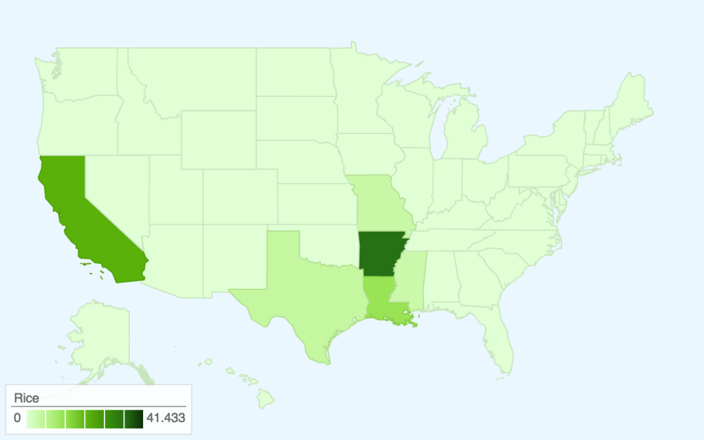
Rice, wheat, and corn are three of the most prevalent grains in the United States, and the maps show areas where the drought regions overlap with the agricultural regions in addition to states that were relatively unaffected by drought. This allows an audience to explore different states’ contribution to US agriculture, beyond what is normally reported in mass media (recently, California agriculture). For example, the more serious drought in California might affect 26% of the rice crops, but 41% of rice is also grown in Arkansas. However, a lot of the states that grow corn are also affected by some level of drought.
Audience
Our audience is those who wish to see which types of crops or animal agriculture might be most affected by drought.
Goals
Our goal for this project is primarily internal; we wanted to make these maps to aid us in finding areas of food production most affected by drought. We hope we can use information gleaned from this small project in our final project, as our datasets covered more information than shown here.
In addition, these maps could demonstrate that there are significant levels of drought and crop production in the United States outside of California, even though most of the media focus is on the one state.