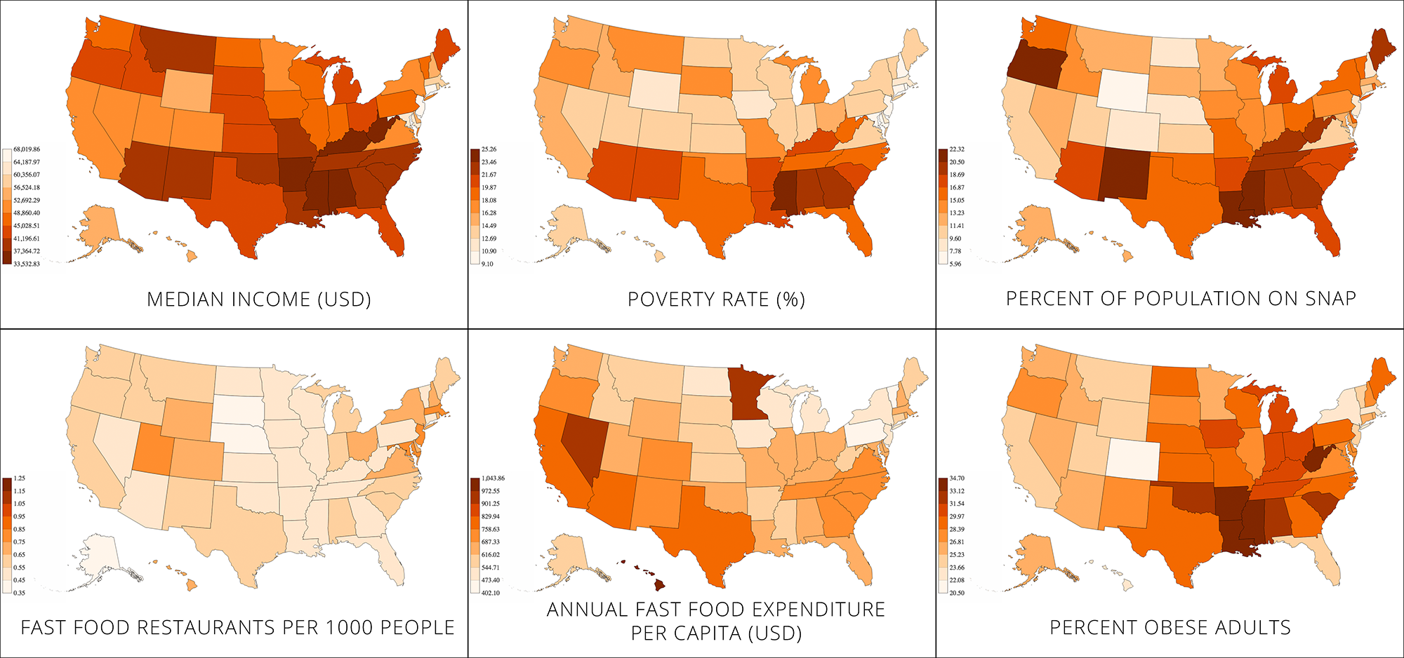
You can see the choropleths here as well.
NOTE: We inverted the axis on the median income map because we wanted to make use of the people’s tendency to associate red with danger. Had we not inverted the axis, the wealthiest states would be dark red, which may be confusing (we hope that the inverted axis is less confusing than the dark red on wealthy states would have been).
Audience
General public, especially people from middle-class or rich households.
Goals
While other sources have pointed out the link between obesity and poverty, we wanted to see it for ourselves and illustrate it geographically using multiple metrics.
The maps are geared towards people from middle-class or rich households, because they may not be aware of this connection.
We aim to show that the poorest states are also the ones most prone to obesity. In addition, we aim to identify the states in which the poverty/obesity link is most severe. To do this, we generated a number of choropleths and presented them in the “small multiple” style.
Extra
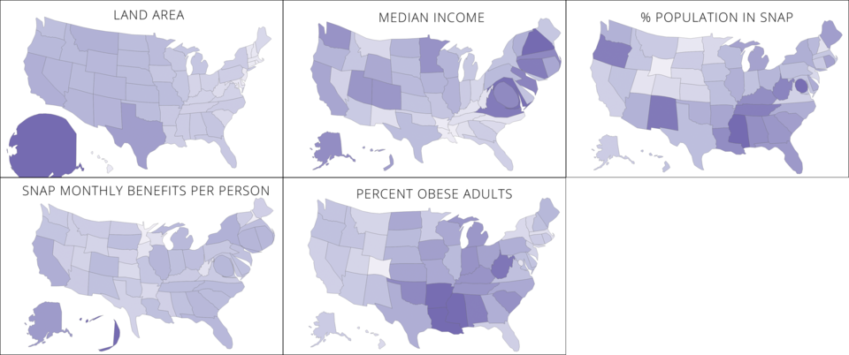
We also tried making some cartograms, but they were a bit confusing to read. Here’s what they looked like.

