Our Visual Design Process

Our story-finding process began with looking at a bunch of data connected by the fact that it related to Food For Free, and we needed to construct a meaningful message about their organization, supported with their actual impact on the local communities. This initial search was summed up in something the Data Journalism Handbook briefly mentioned — “key terms don’t always give you what you want, sometimes you have to sit back and think about what  you’re really asking for.” We couldn’t just look at the data and pull out the biggest numbers or the most shocking facts, although that was a starting point to get ideas flowing in groups. Eventually, we had to step back and see how the data was interconnected to create a larger, more powerful story; one where someone who sees our mural “should almost be able to read the story without having to know that it comes from a dataset.”

When we were actually designing the mural, it felt like our group work revolved around the design principles in the Segel & Heer reading without actually mentioning them by name. In brainstorming the words and associated symbols, we figured out visual mechanisms to highlight particular story elements and how much messaging to include in our final mural design (solely pictures or which statistics to include). When we did the pass-along drawings and gathered as a group to work out a draft for the final design, we figured out how to combine different elements to visually structure both the mural and the narrative to make sure we were conveying the story effectively.

I’d be curious as to what other people think about the author-driven/reader-driven nature of designing a mural, because it seems to be a little bit of both. On the one hand, we curated its development and created the story we wanted to tell — the community viewing the mural isn’t going to see the pages of data about Food for Free unless they actively search for them. On the other hand, once the mural is painted, it is entirely out of our hands and is up to the viewers’ interpretation. Even though we tried to highlight certain ideas, it’s up to the people who look at the mural to notice the details (or not) and start conversations about it (or not).
 

Data Log (ceriley)

Sunday, February 8th 12:00am to Monday, February 9th 12:00am

Italicized are the activities that didn’t produce data that were recorded digitally, but they’re activities that I would report if someone asked me to fill a survey about my day. Everything is chronological but times are approximate.

  • 12:00am — used computer, connected to MIT wifi (Tumblr, Gmail)
  • 12:20am — read Yes, Please 
  • 1:20am — used water to brush teeth, etc.
  • 1:30am — went to bed
  • 10:15am — woke up without an alarm
  • 10:30am — used water to brush teeth, etc.
  • 11:20am — made a 33 minute phone call home
  • 12:00pm — used water and electric stove to cook lunch
  • 12:30pm — mobile google search: amazon hamburger earmuffs
  • 1:00pm — used computer, connected to MIT wifi (Stellar, MIT Admissions Blogs, Gmail)
  • 1:00pm — sent an email
  • 1:10pm — new Adobe InDesign document
  • 1:30pm — google search: worldview
  • 1:30pm — replied to an email
  • 2:00pm — used water to wash dishes
  • 3:00pm — used computer, connected to MIT wifi (Tumblr, Twitter)
  • 3:00pm — sent an email
  • 3:05pm — skimmed Wikipedia article (Japanese mobile phone culture)
  • 3:10pm — google search: prerecorded
  • 3:10pm — google search: ENT
  • 4:00pm — mobile google search: how much milk in a milk shake
  • 4:05pm — called dorm elevator and rode it down 11 floors
  • 4:10pm — paid for ice cream and milk with TechCash
  • 4:15pm — scanned my MIT ID at 2 card readers to gain access to dorm, called dorm elevator and rode it up
  • 4:20pm — used electric blender to make milkshakes
  • 4:30pm — sent 4 text messages
  • 4:30pm — sent a snapchat
  • 5:00pm — used computer, connected to MIT wifi (Stellar, Meyer Lab, MIT+K12 Videos)
  • 5:30pm — updated InDesign document and saved
  • 6:00pm — exported a video from Adobe Premiere and uploaded to shared Dropbox folder
  • 6:15pm — replied to an email
  • 6:20pm — read printed book chapters and took notes
  • 8:45pm — used computer, connected to MIT wifi (Tumblr, YouTube, Facebook, Twitter, MIT Emergency)
  • 9:00pm — watched 4 new YouTube videos in my subscriptions
  • 9:20pm — watched and liked a video on Facebook
  • 9:30pm — read printed articles and took notes
  • 10:00pm — used computer, connected to MIT wifi (Gmail)
  • 10:05pm — replied to 2 emails
  • 10:10pm — google search: academic calendar 2015
  • 10:15pm — wrote in 2 events in my planner, checked off to-do list items
  • 10:20pm — wrote in notebook
  • 10:30pm — checked mailbox, read letter
  • 10:35pm — mobile: sent an email
  • 10:40pm — baked cupcakes using water, oven, and electric mixer
  • 11:20pm — played Bananagrams (in Spanish and English) and Blockus

In total: received 36 emails and deleted 20; reblogged 2 Tumblr posts (7 more were posted from queue), liked 9, queued 16

Invalid Arguments: Climate Change

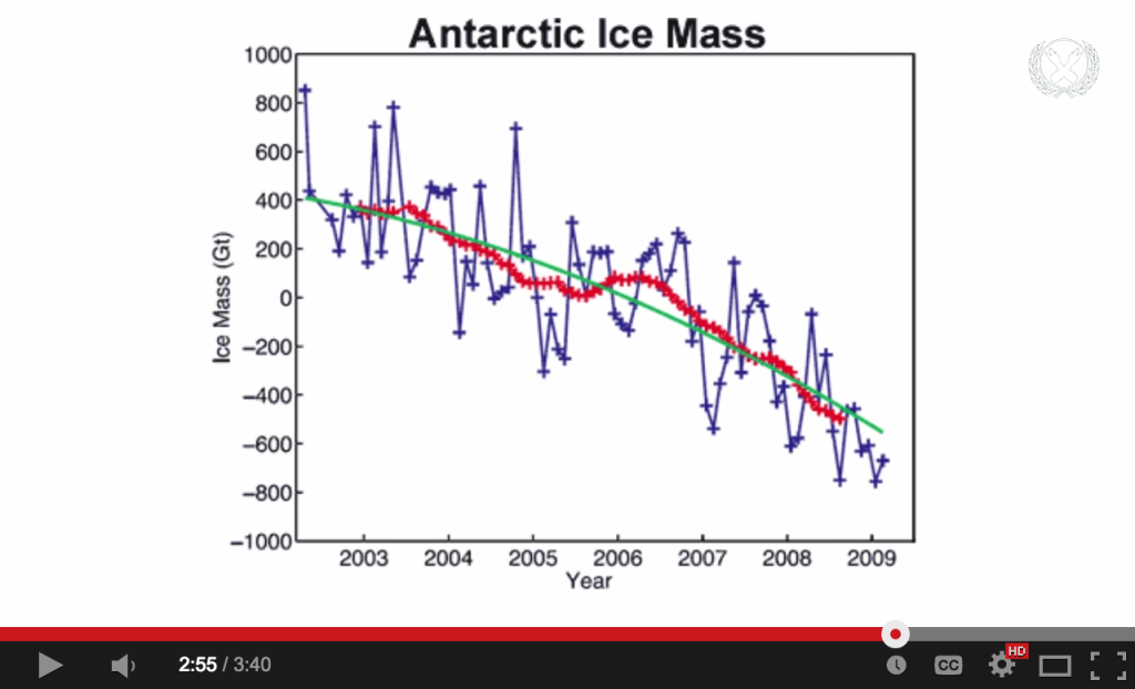
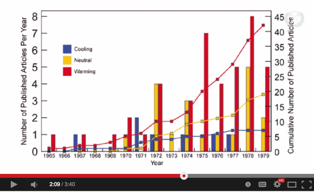
This Vlogbrothers video was published in September 2013 and is one in which Hank Green provides counterarguments to common ideas that people who don’t believe in climate change use to defend their standpoint. He begins the video by describing what climate change is and why it’s a problem that we, as humans currently living on this earth, should care about. And then he contextualizes his arguments with data and figures from peer-reviewed scientific papers. All of these papers are linked in the video description, so viewers can read about The Myth of the 70s Cooling Consensus or A Reconciled Estimate of Ice-Sheet Mass Balance, showing that the land ice mass (as opposed to the sea ice mass) of Antarctica is decreasing with time.

Papers

Antarctica

The audience is primarily the Nerdfighter community (those who regularly watch Vlogbrothers videos), which vary from teenagers to adults in their 40s who accept Hank Green as a reliable host and generally are open to listening to his opinions. As with all YouTube videos, though, his ideal target audience is anyone on the website. This video is accessible and well-made enough for many types of people to find it at least somewhat engaging, from those who are familiar with vlogs and many formats of online video, to those looking solely for entertainment, to those who use YouTube for educational videos, etc.

Overall, I think the video is effective for an audience that either 1) agrees with climate change 2) slightly disagrees with climate change for no really strong reasons or 3) a casual audience who has very little knowledge about the subject. The fact that he uses figures from scientific papers to back up his verbal claims and summarizes the rest of the literature in his argument works for this medium, a <4 minute YouTube video for people (especially younger audiences) who just want to get more informed.

However, this video will probably fail to persuade firm believers in “global cooling” that climate change exists. I’m assuming that these types of people are less likely to do further reading in the suggested papers and might not even listen to the entire video before starting discussions, productive or otherwise, in the comments. At best, this video might persuade them to doubt one or two of the misconceptions they have about climate change, which might count as having successful impact.