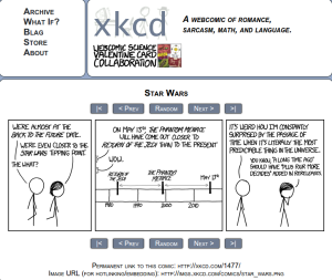
I originally was trying to locate a more “data-y” xkcd comic I’d seen recently, but ran into this one first and was struck by the timeline visualization and its context.
http://xkcd.com/1477/
I believe the audience of this comic is broader now than when it first launch, but I would suspect it is more science/math oriented, younger, and male that the general population. I think the intended audience for this particular strip is probably people in their 20s-30s, with the assumption that they follow basic pop culture science fiction.
I think the bigger message of the comic is that we often misread/misestimate the passing of time and the timeline is a visual reinforcement of that message. The use of present day benchmarks is very effective in conveying this. I suspect most people reading his comic have seen both of this movies (in “real time” or not) and these were fairly memorable benchmarks in their lives. Additionally, people probably have a notion when these points in their life occurred and the timescales between them, providing perhaps a “shocking” comparison.
I think the combination of text and simple visuals is very effective here. The inclusion of (basic) people and emotion words make it stronger as well I think. The timeline was the first thing I saw and read in the comic, which let me “process” the reality of the time gap, before getting hit with the text about it. I think this let the text have more emotional impact, since I already believed it, and didn’t have to mentally “check the facts.”
