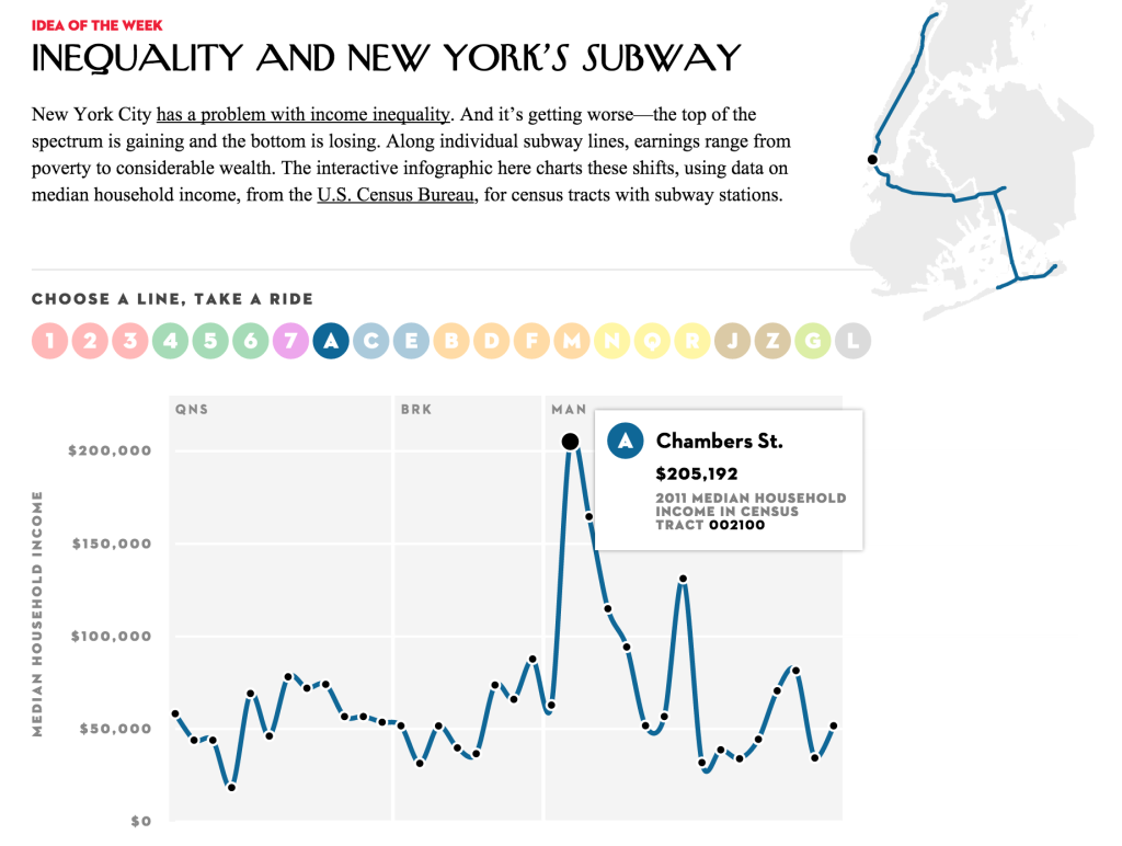
“New York City has a problem with income inequality. And it’s getting worse—the top of the spectrum is gaining and the bottom is losing. Along individual subway lines, earnings range from poverty to considerable wealth. The interactive infographic here charts these shifts, using data on median household income, from the U.S. Census Bureau, for census tracts with subway stations.”
http://projects.newyorker.com/story/subway
This New Yorker interactive is one of my recent favorites. The goal of this presentation of census income data goes beyond simply mapping income across the city. It presents income as a simple line chart, but in a more direct visual comparison than a heatmap would have done for the same information. The structure of the subway is used to orient the viewers and point them to the proximity of inequalities within the city. The differences between stops are dramatic, and their proximity is familiar to those who ride the subway.
This was a really effective presentation of data for me because of how prominently the subway system and other systems of transportation figures into our daily lives and serves to orient the way we see a city. Using only the tracts that have subways stops in them also eliminated a large part of the city. While this may seem to be a limitation at first, it actually serves to high-light income inequality, leaving a stronger impression of the data that inspires further investigation that can be applied to a larger area. It is also especially effective because it hints at the story of how infrastructure is tightly intertwined with income and that how the building of public transportation drives changes in income.
The readers of the magazine are the intended audience for this graphic, but it also expands the audience of the paper magazine to those with general interest in the city. There is a strong possibility of this visualization being used to present issues of inequality by community leaders, those interested in the changing landscape of real-estate by choose to use this format to map historical income data as well as projections of growth in the estimates given by the census.

The grid in the background of this graph is categorized into the 3 boroughs that the train travels through. I think that the whole name of each borough could have been spelled out instead of using the 3 letter abbreviations. Overall the borough division shows the drastic increase in income in Manhattan versus other part of New York City and is especially effective. It would be harder to do this in other cities where inequality is less clearly delineated by geographic region.
For the L train, which bisects Manhattan before going across the river to Brooklyn(map lower right), the decline in income is especially clear(graph lower left).

