What is it?
RAW is an online drag-and-drop tool for uploading csv data and creating common visualizations such as scatterplots, treemaps, and circle packing diagrams.
RAW is open source and provides guides for adding your own visualization types (using D3.js).
What is it good for?
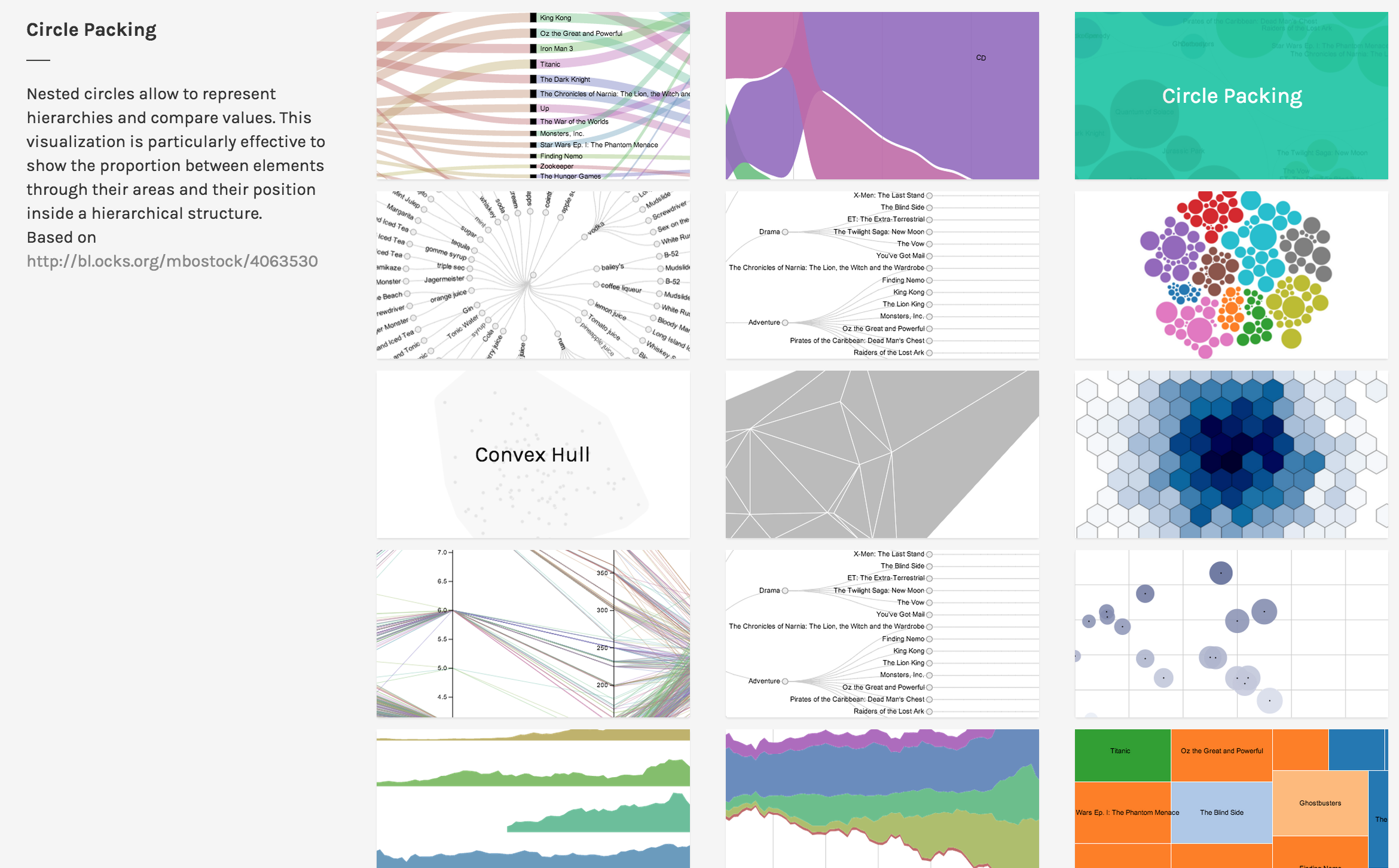
RAW has 16 visualization types which are built using drag-and-drop and can be customized to a minor degree. If you need to generate several common visualizations to support your data story, RAW can make them very quickly.
Be warned that RAW runs in a web browser and cannot handle large datasets (i.e. more than a few MB). Furthermore, since many of the visualizations display all the data points, a visualization produced from a large dataset will be cluttered and unreadable.
Thus, RAW is good for stories that require several simple visualizations built on a dataset consisting of small to medium sized csv files.
How do you get started?
Since RAW is simple to learn, you can jump right in and start using it. For a quick intro, consult the video tutorial. For further information, consult the Github wiki.
If you are a developer trying to add a new chart type to RAW, consult the developer guide.
Is it easy? What skills do you need?
RAW guides you step-by-step through building the visualization. Therefore, it’s easy to learn. Beyond understanding what each visualization means, RAW requires no additional skillset, which makes it very easy to use.
The primary challenge in using RAW is understanding each type of visualization. For example, if you don’t know what a Voronoi Tessellation is, then RAW gives you no guidance on how to interpret the visualization.
For developers, extending RAW requires a knowledge of the JavaScript language and the D3.js library. Familiarity with Scalable Vector Graphics (SVG) and Angular.js may also be useful.
Would I recommend it?
I would highly recommend RAW as a tool for building visualizations to support a data story or for finding possible stories. Visualizations can be built quickly with RAW, so it’s useful for exploring your dataset by building visualizations. Furthermore, since the visualizations can be exported as SVG, HTML, PNG, and JSON, it’s easy to embed them into an article or similar data story.
If you are working with a large dataset (ex. several MB or more), RAW may not be able to handle all your data. Furthermore, the visualizations may be too cluttered.
If you want precise control over your visualization, RAW may be too restrictive for you. Although it’s possible to add features to the code, it may be quicker to build the visualization using a different tool.
Would I use it?
I think I will use RAW to help me generate ideas as I peruse my datasets. Since I am interested in maps, games, and interactive data stories, I don’t think I will use RAW to create my final product.
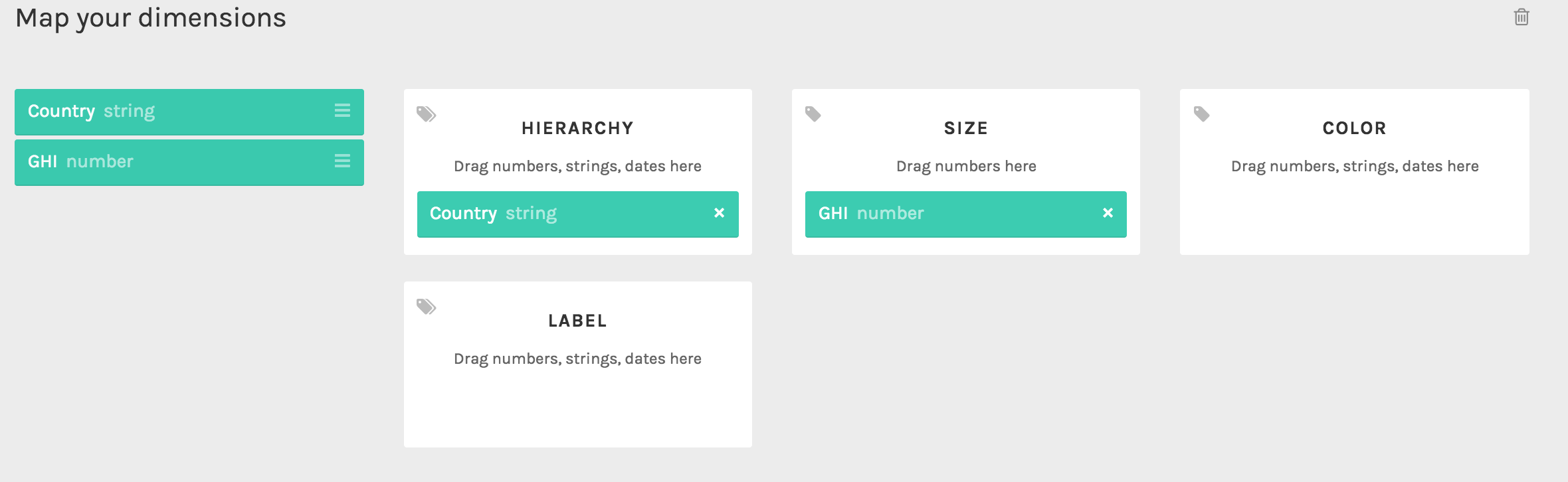
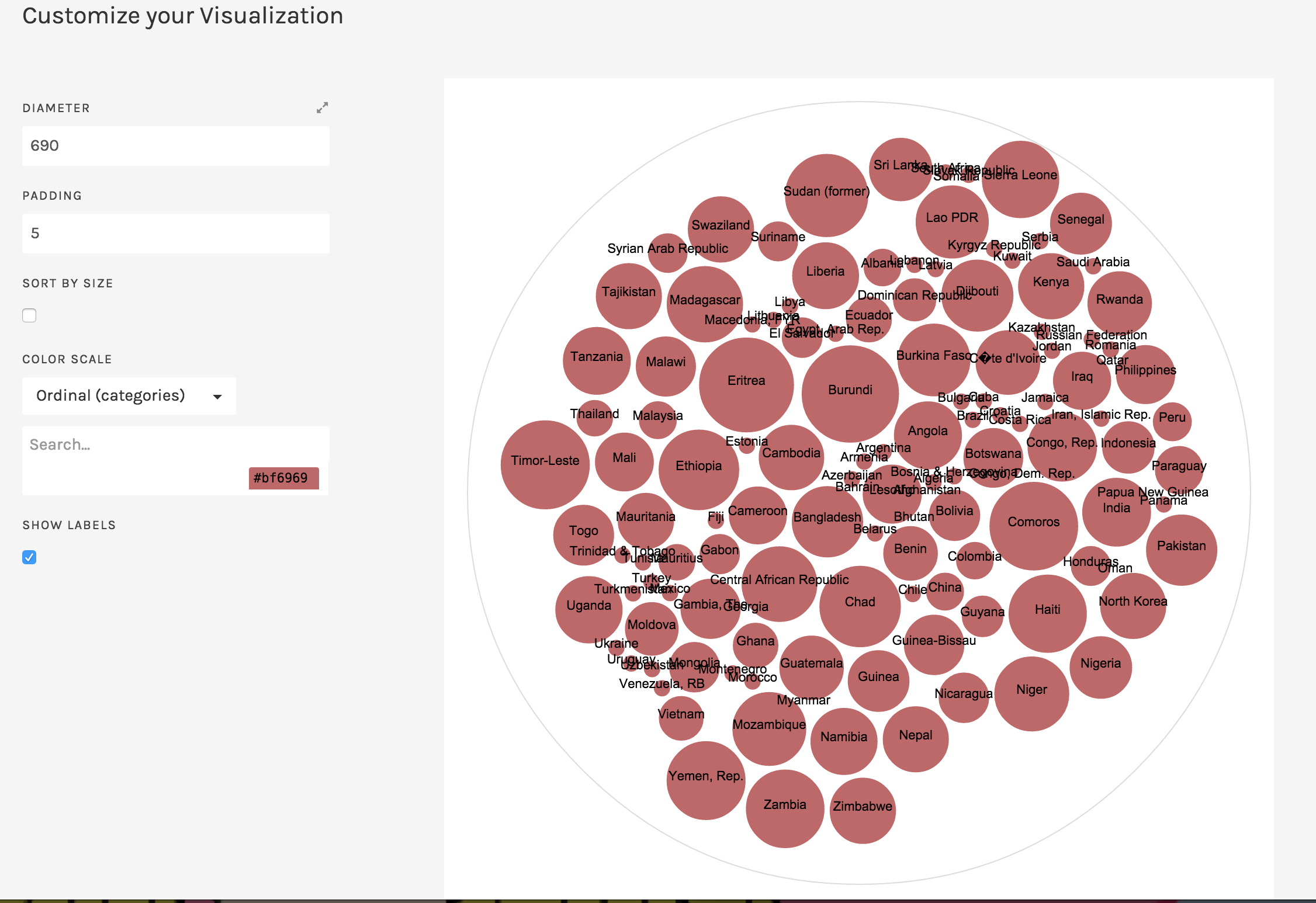
Usage
Here’s how RAW can make a circle packing diagram using a dataset about the 2014 Global Hunger Index around the world.

International Food Policy Research Institute (IFPRI); Welthungerhilfe (WHH); Concern Worldwide, 2014, “2014 Global Hunger Index Data”, doi:10.7910/DVN/27557 International Food Policy Research Institute [Distributor] V1 [Version]