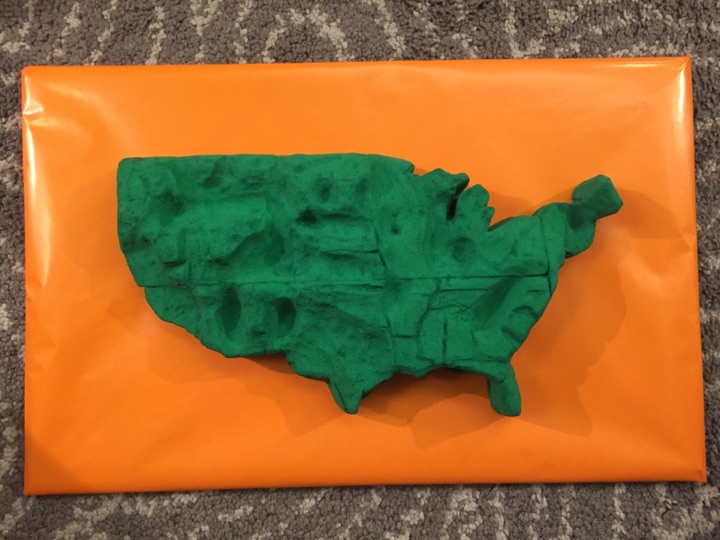
We decided to create a twist on the traditional colored map, and literally add depth to our data. Using obesity percentage data at the county level, we carved into the contiguous United States to create valleys that indicate lower obesity and mountains that indicate higher levels of obesity.
Because of the range of possible values, our map delivers sometimes smooth and sometimes abrupt transitions that can be physically felt by moving your fingers across them. One can also observe that there is nowhere that is 0% obesity, which would be a hole through the sculpture.
We created this for a general audience, and had the goal to show the transitions of obesity at a greater resolution than at just the state level and to make that demonstration interactive.
Team: Danielle Man, Edwin Zhang, Harihar Subramanyam, Tami Forrester


