Food Sec Sim

Team: Mary Delaney and Stephen Suen

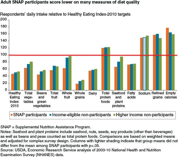
What: we are interested in understanding and presenting the trade-offs that people receiving SNAP benefits face, in terms of their time, their budget, and their other resources. To do this, we want to create a game that combines datasets that include characteristics of SNAP participants, cost of food, nutrition, and the cost of other resources to simulate the choices faced by a SNAP participant. To ground this experience further, we are going to focus on local data and base everything else off that, though given more time we could make it a tailored experience based on what location you were playing from.

Who: Our audience is non-SNAP participants interested in learning more about the program and its participants. Our game could also be used by classes, allowing players to get a better understanding of the realities of food insecurity.

Why: Our primary goal is increase awareness and empathy around the issue of food security.

We hope to educate the food secure about the challenges of food insecurity, including those that may not be immediately obvious. It is our hope that players, with their increased knowledge and empathy, will also be compelled to take action and help the food insecure.

How: We have discussed both single- and multi-player games and digital and physical games. We are currently undecided between a very immersive, narrative digital single-player game (likely to be made in Twine, a text-based choose-your-own-adventure game engine), which seeks to increase empathy and impel action, and a physical card-based multi-player game, which seeks to facilitate discussion of the issues faced by SNAP participants. We plan to build and playtest prototypes of both games to see which strategy will be most effective to pursue.

Final Project

Team

Hayley Song

Deborah Chen

Topic

We are interested in comparing prices at local grocery stores/farmers markets to see how far one’s money can go on food and which ones are the most/least expensive.

Technique

We aim to build an interactive web application that allows people to put in their budget for food, select a basket of goods, and compare how much food they can buy in different places. The prices will be from data in various Boston area supermarkets.

Goals

Many news outlets and individuals have done their own stories to help readers determine the cheapest place to shop.We’d like to make use of that information, and allow people to find out what the cheapest place to shop for them is based on their own basket of goods. Even if one is committed to shopping where they are, the tool will allow them to quantify how much money one is saving/not saving.

Data/Story

We looked at various sources of data for supermarket prices:

  • Instacart
  • NH Public Radio: http://nhpr.org/post/how-low-are-market-basket-prices-really
  • Farmers markets: http://thefoodproject.org/sites/default/files/lightner-2011.pdf

The data shows that for certain defined baskets of goods, some stores are cheaper than others. For example, the report on farmers markets compared the average prices in the farmers markets to those in other supermarkets.  The report concluded that, contrary to the common belief that farmers markets would be more expensive, the prices in the farmers markets were competitive to those in the supermarkets.


Final Project Proposal – Food Security Game

Members
Stephen Suen
Mary Delaney
(…looking for more! A digital game may be out of scope for a team of two)

Topics
Economic circumstances/challenges of those faced with food insecurity and how that affects other aspects of their lives (e.g. health/nutrition)

Goals
To increase awareness and empathy around the issue of food security
To educate the food insecure on how to make better dietary choices within their economic means

Techniques
Web-based digital game, in the vein of “empathy simulators” like Cart Life or Depression Quest

Story

Our initial story pitch is based on this article from the US Department of Agriculture’s Economic Research Service, which took dietary intake data from the 2003-10 waves of the National Health and Nutrition Examination Survey and measured it against the Healthy Eating Index, a measurement of how closely one’s diet conforms to recommended daily intake. This analysis specifically focuses on SNAP participants, who are lagging behind in multiple HEI components (notably fruit and vegetables) compared to other Americans.

nov14_feature_mancino_fig01

In addition to these findings, the article explains how this different in dietary consumption is having real effects on SNAP participants’ health — adults enrolled in SNAP are “more likely to be overweight and suffer from diet-related health problems.” To summarize: The data say that low-income Americans are unable to eat healthy due to price, access, and storage concerns. We want to tell this story because food security is a struggle for so many people but is not tangibly understood by those not affected by it.

Expanding the story beyond the initial article, there are a number of things we could do with the data:

  • Recreate the HEI analysis using the most up-to-date NHANES data
  • Facet NHANES data by other dimensions (e.g. geography, specific income brackets) to make the game even more personal/relatable
  • Combine other USDA data sets, such as Food CPI or the Quarterly Food-at-Home Price Database to relate the HEI components to actual prices

More brainstorming will have to be done in terms of the actual game mechanics to determine what data sets might be pertinent to the final product.

Art data and gender

Members: Desi Gonzalez and Laura Perovich

Topic: museum collection data

Goals: education, increased access to and engagement with museums/art, social change

Techniques: interactive visualizations, physical objects

Story: The data say male artists have a stronger presence than female artists at the Tate.  We want to tell this story because we’re interested in exposing the biases in art museum collections in order to both teach audiences about how women have been historically underrepresented in collections and possibly help shape museum collecting practices in the future.

Data:


I quickly plugged Tate artist data into Tableau and graphed artists birth date by gender. Most of the artists represented in the collection were born more recently. The artists born before 1850 are overwhelmingly male. (“Null” shows up for collectives/groups of artists, but in a few instances it seems like artists weren’t coded; it seems like collectives/collaborative artwork represented in the collection are younger/were born more recently.)


Screenshot from 2015-04-02 14:41:03


We also used R to begin to dig into the data a bit.

Overall, there are 5.6 time more male artists with work at the Tate than female artists.  Male artists at the time have 23.9 times more pieces at the Tate than female artists.  Male artists also occupy more artwork territory in than Tate than female artists: male artwork has 8.2 times more area than female artwork and 9.5 times more volume.

We further considered gender breakdowns by artist century of birth, to see if changes in gender diversity of the profession over time (exact data TBD) may be reflected in the Tate’s collection.  Finds are below:

Representation ratios (M:F) by century of birth

century artists artworks area volume
1600 45 66 252 NA
1700 39 21 186 21.8
1800 24 249 124 789
1900 5.7 9.5 9 23.9
2000 2.2 2.7 2.6 3.4


N.B.  This is an extremely rough and initial analysis of this data.  There is a significant number of NAs in the data that will have to be addressed, as well as some data inconsistencies that require further exploration.  Data has not been fully checked or cleaned.

Additionally, this data would be better understood with further context–such as collections from other museums or overall occupational statistics.

Final Project Ideas

Members

Val Healy, Ceri Riley

Topics

Current environmental/human influences on agriculture (urbanization, desertification, industrial farming/animal agriculture) and how this impacts food security

Goals

Changing behavior, educating people about agricultural impacts — both food choices and environmental/land use choices — without sensationalizing the information

Techniques

Simple interactive/web visualization or infographic

Data/Story

Food Environment Atlas – USDA

This dataset contains a lot of information, but we chose to look at the fact that 50.54% of Farmers Markets in the United States sell fruits & vegetables, while 46.94% sell animal products, and 50.66% sell ‘other’ (presumably flowers and other non-edible products). We wanted to look at the story surrounding farmers markets nationwide to see how local farms/agriculture might help provide different types of food choices to people.


Game/Visualization about Food Supplies

Team

Danielle Man
Edwin Zhang
Harihar Subramanyam
Tami Forrester

Topic

We are interested in the makeup of food supplies (ex. meat, produce) in countries around the world.

Technique

We aim to build a data game or an interactive visualization to teach people how countries’ food supplies are structured and to encourage them to improve their diets.

Data

We look at the following dataset by the Food and Agriculture organization of the United Nations.

http://faostat3.fao.org/download/FB/FBS/E

Story

The ratio of the supply of meat to vegetables is 0.97 in the U.S., 0.14 in China, and 0.05 in India – the food supply makeups of the three most popular countries are quite different! We want to food policymaking to consider these differences and we want readers to observe how this is reflected in the diets of people around the world.