Silk

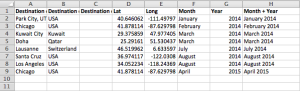
Silk, “a place to publish your data,” is an all-in-one dashboard for your datasets, letting you turn them into simple visualizations and webpages. It starts with the concept of collections (equivalent to spreadsheets, or tables in a database) — you can import data into these collections via CSV or Google Spreadsheets. A single Silk website can have multiple collections, so you can pull in data on related topics from various sources. Notably, Silk is not a tool for data cleaning; you must prep your datasets beforehand, including things like sanitization and naming/formatting. The final visualizations have some rudimentary filtering and exclusion tools, but they are not sufficient enough for major changes. Within the inverted pyramid of data journalism, Silk fits into the latter two sections: combine (figuring out how your collections fit together and what data from each is important) and communicate (actually designing and creating the presentation of that data).

Screen Shot 2015-03-31 at 1.50.11 PM

While Silk requires no coding per se, it can be an intimidating tool just starting out due to the sheer number of features. For each item in a collection, Silk auto-generates a page for it with all the information filled in, along the lines of an Amazon product page or a website’s user profile page. These pages are searchable and filterable, giving you (as well as your users — for the free plan, all pages created are also public) a front-end to explore the records in your dataset. Moreover, you can add other team members to your Silk, turning it into a collaborative data library along the lines of the PANDA Project. To facilitate this collaboration, there is a feed page where you can see all the recent events/changes made by members of your Silk. It is interesting that the tool provides all this functionality even though there are few cleaning features (you can edit field names and make edits to individual records — that’s it).

Screen Shot 2015-03-31 at 2.48.41 PM

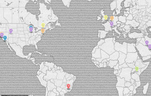
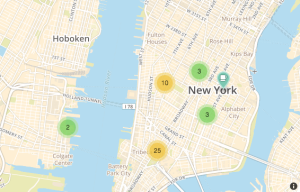
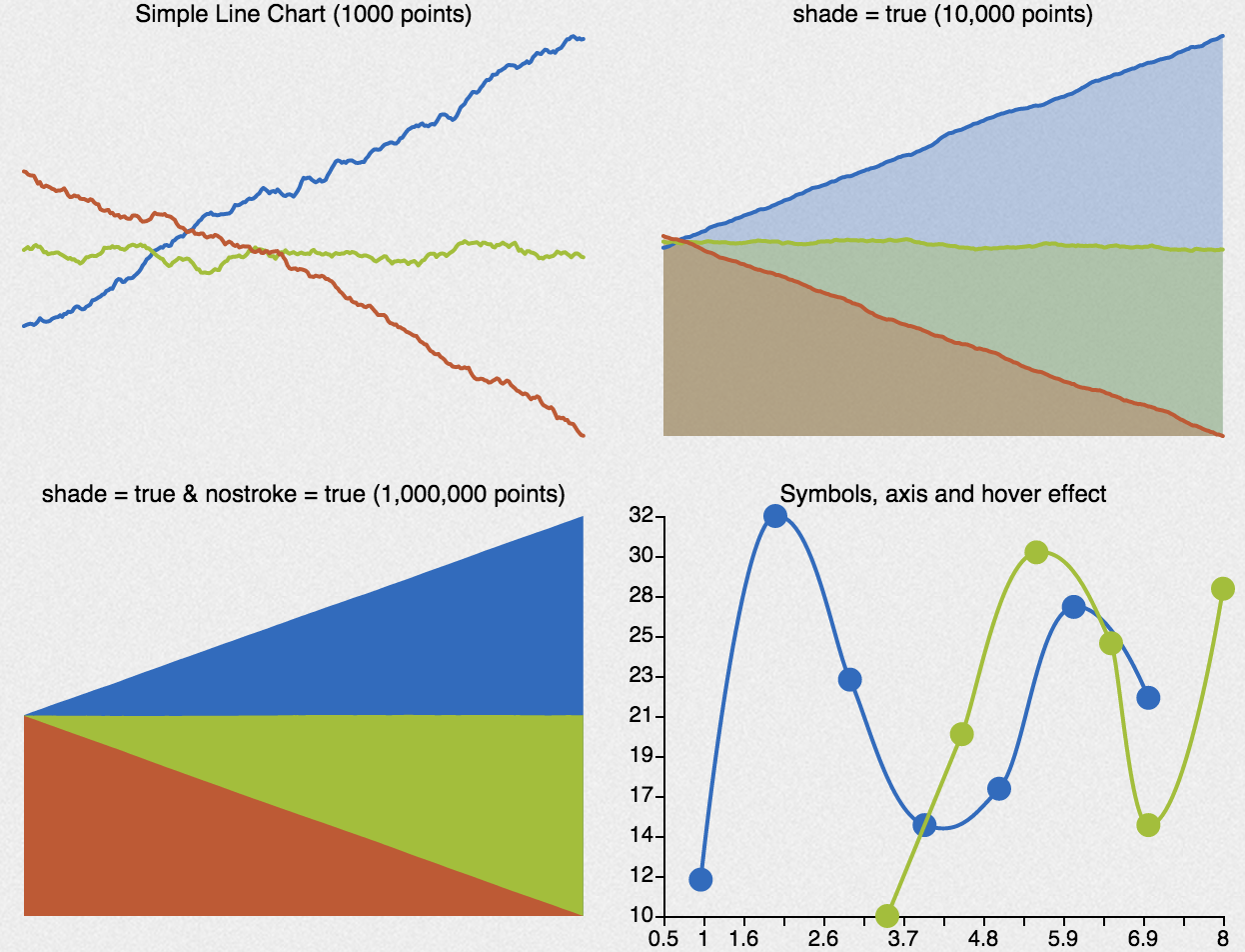
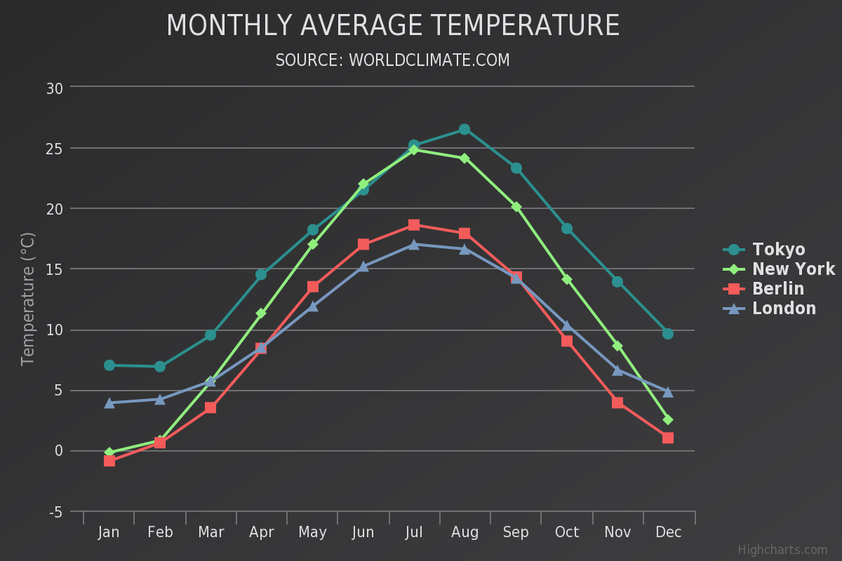
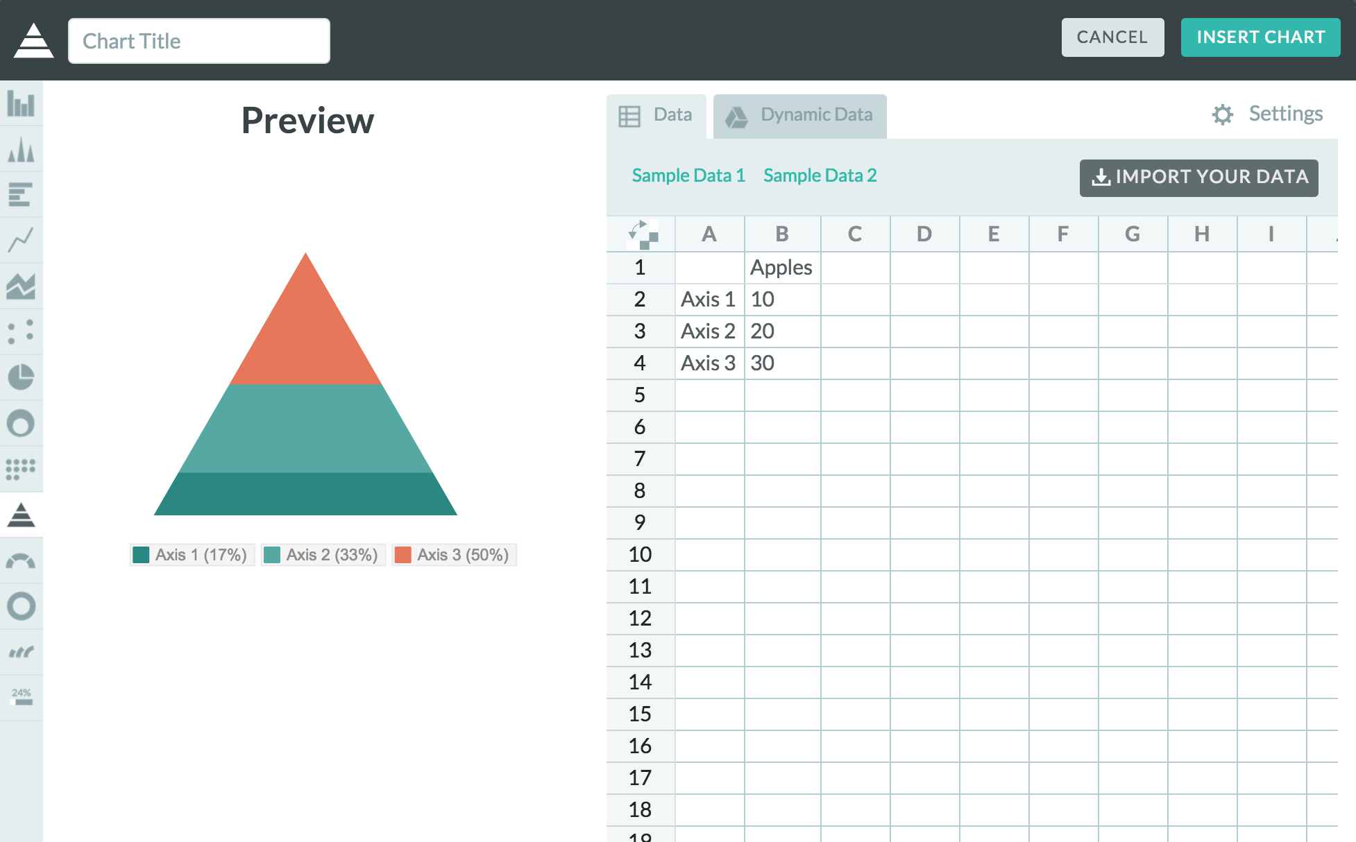
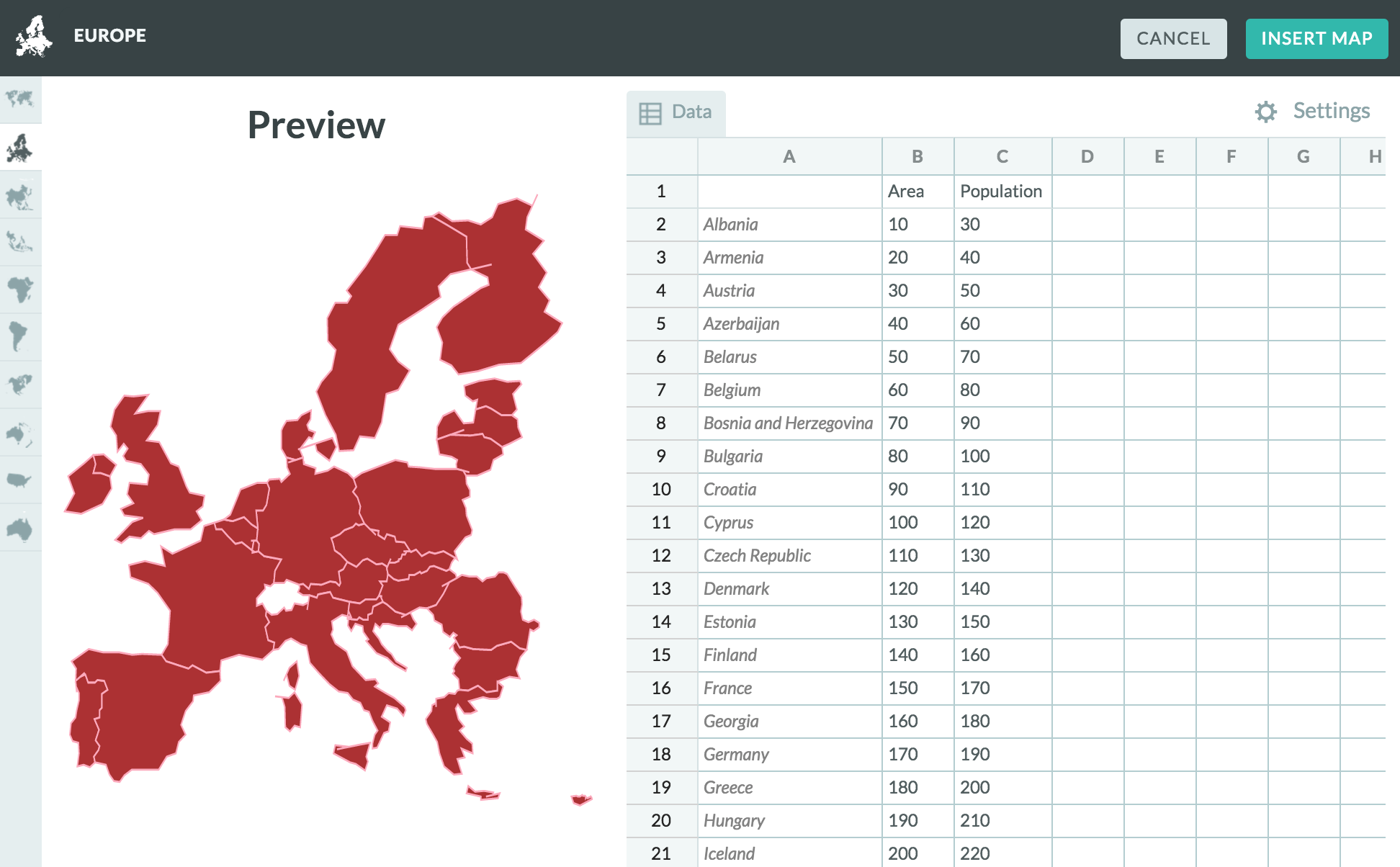
Once you’ve determined your data of interest, you can choose from a number of different visualization methods: tables, lists, grids (for datasets with images), groups (clustering based on a field), maps, and a number of charts. Depending on what presentation format you’ve chosen, Silk will try and auto-detect which columns might be relevant (e.g. geographic data for a map or numeric data for any of the charts) and plop that data in. You can do some fine-tuning in terms of what columns are displayed, how the data is sorted, and how many records to include. However, you cannot really customize the visual look and feel of the visualizations themselves — you can’t really do any sort of graphic design (e.g. color/size — everything is auto-generated) or creative variations on the defaults.

Screen Shot 2015-03-31 at 3.04.32 PM

Once you’ve created all the visualizations you want, you can save them and add them to pages; these pages can be further populated with text or image content via a WYSIWYG editor, much like a blogging software or GUI-based web design applications. As such, you can create entire articles with the visualizations embedded/interspersed throughout — it’s especially nice that Silk links up everything automatically; for example, clicking a bar in the chart links to that specific item page, allowing readers to fully explore the dataset in that way.

Overall, if you can get over the initial intimidation of Silk’s huge feature set, it’s not terribly difficult to use, though some of the visualization-creation interface is quite non-intuitive. Thankfully, the Silk team has created a number of video tutorials and a FAQ section to guide you through the process. The two big gaps in Silk’s functionality are its lack of data cleaning functions and lack of customizability over visual presentation (within specific visualizations, not over the entire page). If you want a one-stop, out-of-the-box solution for managing multiple data sets and turning them into websites and those caveats don’t bother you, Silk might work.

As for myself, given that I do have code and design experience, I won’t be using Silk and wouldn’t recommend it to any friends who have opinions about those things. There are far better tools for data exploration and far better tools for data visualization; if you know enough about basic web development, you can just use those and put the results together yourself without the help of Silk.

Mapbox

Mapbox is a cloud-based tool for publishing customizable, interactive maps. They provide maps for a lot of major services you know—Foursquare, Pinterest, and Uber are just a few. Mapbox builds on and authors a lot of open source mapping libraries; for example, their map data comes from projects like OpenStreetMap. As a freemium service, you can get a free account for limited map views, storage, and support, or pay more for premium features. One of the great things about Mapbox is that it is designed for various levels of technical expertise. If you have no coding skills, it is incredibly easy to use via the Map Editor; for developers and designer, you can add interactivity and customize the visual style using Mapbox.js and Mapbox Studio.

The Map Editor is the quickest way to create a map. Mapbox maps consist of a baselayer—the map—and overlays—the data you add onto it. You can choose many baselayer styles, from the hip and nostalgic theme “Wheatpaste” to the streamlined “High Contrast.” Data overlays take on three forms: markers (points referring to a single place), lines (the distances between two places), and polygons (areas bigger than one or two places). A user can add these features by dragging and dropping, or by importing a file (.geojson, .csv, .kml, .gpx) that includes latitude and longitude fields. You can also customize the color and icon of these data features.

Publishing your map is easy. You can view the map directly at a Mapbox URL, embed your map into a website with HTML, download data features from your map, or use your map ID to treat it like an API.

Screen Shot 2015-03-31 at 2.39.11 PM

I decided to represent where my class of 2015 student cohort in Comparative Media Studies has traveled as part of grad school experience. I prepared simple .csv files and uploaded them. Within minutes, I uploaded the data and made a map with a funky background as well as customized the markers, assigning a color per student and a letter that corresponded to his or her first name.

Screen Shot 2015-03-31 at 1.59.38 PM

Still, I ran into some problems that couldn’t be addressed just through the Editor. For example, several of us traveled to the same city, often at different times. Because the lat/long I entered for these data points were the same, the most recently added marker would always cover the others in the same location, making it seem like there was only one data point there.

The open-source Javascript library Mapbox.js is a way to sidestep these kinds of issues and add exciting, interactive features. Mapbox describes itself as “developer-focused,” championing the fact that their maps can be altered for your project’s functionality needs. For example, a short JS script could be inserted into my HTML that clusters markers together, using a numeral that indicates how many markers are in a tight space.

Screen Shot 2015-03-31 at 2.47.11 PM

Mapbox Studio is geared toward the design of the map. This platform allows you to apply your own styles, customizing everything—from roads and parks to bodies of water and location names—to your (or your brand’s) needs. The platform builds maps using vector tiles, which combine the strengths of tiling images with vector data. According to their website, vector tiles “rethink web maps from the ground up, providing a single efficient format to power raster tiles, interactive features, geojson streams, mobile renderers, and much more.” You can style maps by using the CartoCSS styling language.

mapbox

I would definitely recommend Mapbox for an data storyteller who wants to tell their story via maps. Mapbox provides great documentation and a beautiful, easy-to-use interface. The tool is easy to use for beginners, while highly customizable if you have coding or design chops.

RaphaelJS

RaphaelJS is a small JavaScript library used for work with vector graphics on the web.

raphaeljs-banner


This library can be used to create responsive and interactive animations and representations of data such as pie charts, maps, timelines, and many more. It is great for custom visualizations that allow for different types of user interaction (mousing over, clicking, etc), and offers great flexibility for implementing your ideas.

Because everything is rendered using SVG, browser compatibility is a big plus, which is pretty important depending on your target audience.

Raphael does not have a huge focus on datasets, however. Developers have built an extension to the library named gRaphael that allows for easy creation of charts, such as line charts, pie charts, etc, as shown in the following image.

gRaphael examples

How do you get started using it?

To get started, you can download the JavaScript file hosted on http://raphaeljs.com/, include it in your HTML page, and then start coding! Here’s an example taken from the site:

// Creates canvas 320 × 200 at 10, 50
var paper = Raphael(10, 50, 320, 200);

// Creates circle at x = 50, y = 40, with radius 10
var circle = paper.circle(50, 40, 10);
// Sets the fill attribute of the circle to red (#f00)
circle.attr("fill", "#f00");

// Sets the stroke attribute of the circle to white
circle.attr("stroke", "#fff");

The website also shows a few demos as shown in the picture above, and you can inspect the code used to create them by loading the page source for each demo.

A few tutorials:

– http://www.varunpant.com/posts/raphael-js-tutorial-part-i

– http://code.tutsplus.com/tutorials/an-introduction-to-the-raphael-js-library–net-7186

– http://www.lynda.com/HTML-tutorials/Real-world-example-Raphal-JavaScript-Library/80782/85035-4.html

How easy or hard is it? What skills do you need to become proficient in it?

Raphael is a bit more hands-on because it is so flexible. All you are given is a library of methods to use, and a few examples of how they are used to produce various visualizations. However, you will need to implement anything you want to show using javaScript. For that reason, knowledge or experience with coding, especially with using JavaScript in HTML5 websites, is necessary to become proficient with the library.

Running through a few tutorials will give you the basic familiarity needed to hit the ground running, but if you have little to no programming experience, you might have a bit more difficulty. The developers do provide documentation for the methods, as well as examples of the syntax, so while it shouldn’t be extremely difficult to pick up, the difficulty lies in putting the methods together to create what you want.

Would you recommend this to a friend?

Yes and no! If you a friend has an idea for a fairly complicated interactive (animations and custom charts, for example), or a clear design for what they want, but also has experience programming, then I would recommend it. However, if they don’t necessarily have the time or experience, I would recommend other WYSIWYG tools, which are much quicker to use, albeit with less flexibility.

Depending on what the friend is trying to do, I would strongly recommend using gRaphael in addition, to make it easier for working with datasets.

Will you consider using it for your final data story?

If i decide to make a web interactive, then I would likely consider it! It seems relatively simple to work with, and I’ve always been partial to creating things on my own to learn about different libraries. I also have experience working with javaScript libraries, so it wouldn’t take too long to familiarize myself with it.


Highcharts

Highcharts JS is a complex Javascript tool that helps users create a lot of different types of chart visualizations (plots, pie charts, bar graphs, etc.). It is part of a family of Javascript visualization products produced by Highsoft, a company in Vik i Sogn, Norway. Its sibling products include tools for things like mapping and imaging.

This tool is great if you want to create classic graphs that show trends over time. The types of graphs that it can produce are similar to those that one can produce in Excel, but are much more interactive. This makes for better data exploration, and often times just for a more clear representation of data in general. All of the graphs that you produce with Highcharts have interesting hover effects, such that hovering over particular data points or lines will show specific values which are useful in exploration and probably also outlier analysis. These effects bring a lot of extra life to the graphs.

chart

Since this is a Javascript tool (with great hover effects and interactivity), its graphs are meant to be displayed on the web. Lots of major companies (61/100 of the world’s greatest companies) are already using Highcharts, including Facebook, Twitter, and Yahoo. In fact, exploring most of Highchart’s demo graphs felt very familiar and intuitive to me, likely because I’ve encountered the same types of graphs before on third party websites without realizing it (like the NY Times).

This is an extensive and mature product, and therefore it has support forums in addition to support emails, Github reporting, Stack Overflow help, and a book to reference. It is free to use for non-commercial purposes. Interestingly, all the files are downloadable and therefore customizable. This is something that the company markets in particular, because users can use the existing product as a baseline and alter it to fit their specific needs.

The library can be easily incorporated into websites through simple script tags in the HTML headers and can be used in conjunction with jQuery or as a standalone tool. There are a lot of cool demos on the web, a few of them I’ve linked to here: snow depth v time and population growth by religion.

If you’re looking to create simple, classic plots for a quick visualization, this is the product for you. They have a set of standard graphs that are incredibly easy to plug data in and produce yourself.

This is a Javascript product, so basic proficiency in Javascript is a big plus; however, I don’t think that its necessary because starting from any one of their many demos, it would be easy to plug in your own data and change around label names. It is also possible to make very interesting and complex graphs – the process of moving beyond the basic graphs would be much more involved (and definitely require Javascript proficiency), but it would have a greater value yield and Highcharts has extensive support resources.

I would recommend this to a friend – it is a mature, well documented, and widely used product that can create beautiful and interactive graphs with little effort on the side of the user. I think that it is slightly more intuitive to use than D3.js, though the two products are similar, both being rooted in Javascript. Wether or not I use this tool in my final project will be highly dependent on what I choose my final project visualization to be, because this is definitely a tool for final data presentations, not for intermediate steps or data cleaning.

Google Charts

Google Charts is a data visualization tool that allows for a clear and potentially interactive web-based experience between the viewer and the data. It allows for the creation of many different types of charts and graphs, including line graphs, pie charts, bubble graphs, histograms, maps, timelines, and tree maps. Because it is very versatile, it can be used to display many different types of data. Most of the visualizations generated by Google Charts display an unlabeled data point. By scrolling over an area, line, or point, the data name and value is specified. This makes Google Charts particularly useful for depicting geographic data or showing data points with a trend line, as it is fairly clear how what each point or area represents without a label. While this makes the visualization very clean, it can also make bar graphs and pie charts, when it is important to know what points or areas are representing what data, somewhat unclear.

Google Charts has extensive examples and tutorials available through https://developers.google.com/chart/interactive/docs/index. This website includes examples visualizations and sample code for over twenty-five different types of charts and graphs. The sample code seems to be the most helpful resource for learning and troubleshooting the program.

Google Charts is relatively easy to use. Working off of the sample code requires that only the data and a few parameters be modified. In addition, because it is compatible with JavaScript, the generated graphs can easily be integrated into a website. Basic familiarly with reading and writing programs is assumed to create visualizations in Google Charts. Because this tool is designed to be used largely for graphics that are integrated into webpages, this seems like a skillset that most prospective users would have. That said, the modifications that need to be made to the code to generate simple graphs, such as pie charts and bar graphs, seem like they would be very straightforward, even for someone with little or no programming background.

I would recommend Google Charts to someone with basic programming knowledge who is looking for an easy to use tool to cleanly and interactively depict their data. The pie charts and line graphs are depicted in the most user-friendly and informational way to the viewer. However, there are many tools that allow you to easily make these types of graphs. By contrast, the Geo Chart and Map displays create visualizations that do not show data labels unless you scroll over them, which can be confusing or may be beneficial, depending of the type and quantity of data being depicted. However, this tool allows for these visualizations to be made much more easily than other programs I’ve seen. Therefore, I think it could be very useful for people making these types of charts. Even for complex data sets, this may be a good tool for someone to use to initially visualize their data and uncover trends. Because Google Charts is very fast and easy to use, I will likely be using it at some point in uncovering or presenting my final data story. It is a much more effective presentation method for some datasets than others, but it is still useful as a tool to see the same data presented in different ways and to uncover trends when developing a data story.

Google Chrome Scraper Extension

What is the Google Chrome Scraper extension?

The Google Chrome Scraper extension is a browser extension for Google Chrome that allows users to quickly and easily scrape data from websites inside the browser.

How do you get started using it?

To get started, you can download the extension from the Chrome Web Store or the scraper’s official website. The site also includes tutorials, documentations, screenshots, test sites to help first-time users practice using the tool, and links to a help forum and bug tracker. If you have no experience scraping, I recommend reading through these resources to get a sense of how to use these programs, and watching the introductory video:

If you know the basics of scraping, the documentation is still useful for getting a sense of the capabilities and specificities of the tool. For example, the scraper supports many types of selectors and methods for selecting. The extension also supports pagination, or scraping through multiple pages of a website.

How easy or hard is it? What skills do you need to become proficient in it?

This scraper is similar to many other scrapers available today. If one has experience scraping, the tool is very intuitive. If one has little or no experience scraping, the documentation is fairly comprehensive without being overwhelming, and there are plenty of opportunities for support.

However, to become proficient in the tool, one must understand the process of scraping, as well as concepts such as selector trees, different types of selectors, and pagination. Learning these concepts, as well as how to use the tool, does take some time and effort. It took me, with some prior scraping experience, about an hour to read through all of the documentation and to learn how to use the tool.

Because it is a Chrome extension, no other downloads, software, or account is required, unlike some other tools, such as import.io. The tool, much to the delight of my Linux-loving heart, has no operating system requirements. However, the extension only works for Chrome, so you must have a current version of the browser installed.

One drawback to the tool is that data can only be downloaded in csv format, so if you are looking to use it in a database– MySQL, for example– you must import it manually or find some other workaround.

I also suspect, judging it based on its simplicity, that this tool is not as powerful as some other scraper tools. However, for what it is– a free browser extension– the tool is quite powerful.

Would you recommend this to a friend?

I would recommend this to anyone looking for an easy way to scrape data from websites into a csv form easily and without obligation to create an account or download specialty software. Because the tool is a Chrome extension, acquiring the tool is simple. The documentation makes it rather easy for novices to use the tool, especially if they have a baseline knowledge of scraping.

Will you consider using it for your final data story?

I will definitely consider using this tool for my final data story. This scraper tool is free, intuitive, powerful, and requires no account. The documentation and web support are well-rounded, giving me confidence that I will be able to work out any snags I encounter.

Plotly – Collaborative Data Science

What is plotly?

Plotly is an online community that aims to make it easy to create, share, fork, and comment on one another’s plots.

What is it good for?

Plotly can be used at both the beginner and advanced level, offering multiple ways to interact with data and then present it.

At the most basic level, it operates as a web application with a graphical interface for creating plots and stylization. Basic properties like fonts and colors can be easily manipulated, with other options to manipulate margins and padding if one wishes. With very little effort, one can use plotly to quickly create bar charts, line charts, heat maps, and bubble charts, to name a few. Some operations, like adding a line of best fit to a scatter plot, are also convenient with the push of a button.

An example of a plotly workspace

More advanced users can make use of the API libraries, which allow the user to customize their graphs even further by using programming languages like python, matlab, R, node.js, or julia for more in-depth scientific graphing. Excel users can also get in on the action with an Excel plugin. Users can also have their graphs interface with hardware using Arduino, to allow for more interactive

As a data tool, plotly would work best in presenting data for presentations where stories can be told through traditional mediums, like line charts, scatter charts, or heat maps. For basic users without knowledge of programming languages, plotly offers basic charting and plots with the added flash of being easily shareable and interactive at a superficial level, with information available on hover. The community aspect is brought by an activity feed, which allows users to see other published graphs, and make comments or fork that graph and its data.

Basic usage aside, plotly’s hardware interfacing also offers the ability to tell stories that can be updated in real-time as a way of presenting dynamic data.

Getting started:

Plotly offers numerous tutorials on their website, mostly for some more basic chart types and how to create them, in both video and text format. A cursory Youtube search also reveals community-made tutorial videos on specific aspects of plotly, as well as simple introductions.

You can find a list the official tutorials, including videos, here: https://plot.ly/online-graphing/

API Documentation: https://plot.ly/api/

Hardware workshop tutorials: https://plot.ly/workshop/


Ease of Use/Necessary skills:

For basic operation, the web interface can be learned fairly quickly. Running through a tutorial or two will allow a user to quickly familiarize themselves with how to create some simple plots and change some simple properties to add custom styling.

For more advanced data manipulation, knowledge of a programming language may be extremely useful or even necessary. The web interface is mostly limited with static data that a user would import in manually, and does not have ways to easily execute very complex or custom operations on that data. With the API libraries, plots can be generated with a programming language.


Would you recommend this to a friend?

For basic graphs, I would recommend plotly to a friend. Plotly seems to excel in the creation of traditional graphs with the added flair of ease of sharing and interactivity on web. Even for those with programming experience, having an interactive and easily shareable graph that is viewable and publishable on the web is useful. With the documentation and code snippets in the API library documentation, using plotly would not be a very large hassle to learn and use.

However, for those already with programming experience, or those wishing to creating richer data visualizations that don’t involve traditional plots, I would not recommend plotly. It is also for this reason that I will not be considering plotly for my final data presentation.

Piktochart: Quick & Easy Infographics

What can you do? What kinds of stories is it good for?

Piktochart is a great tool if you want to create an aesthetically pleasing infographic easily without having to learn how to use professional software like Adobe Creative Suite or spending the time to create your own vector art (although you can upload your own images if you want). Its tagline “Easy-To-Use Infographic Creator: Discover how non-designers are creating beautiful infographics in as little as 10 minutes” is a little bit click-baity but rings true.

This tool is useful for presenting any sort of data story in a creative, graphical way. Piktochart is pretty customizable, with many different simple icons and background templates that you can insert, a variety of professional-looking fonts, and the option of generating basic graphs and maps. So, after you’ve conducted data analysis and narrowed down the key information you want to present, it’s a great tool to summarize your story in a clear and eye-catching way. (Alternatively, it can be used to make something as simple as an event flyer, because it’s basically a simplified graphic design interface).

Screen Shot 2015-03-30 at 9.39.53 PM

Screen Shot 2015-03-30 at 9.42.27 PM

However, the tool does have its limitations, as your exporting options are fewer without upgrading to the paid ‘pro’ account. The customizability is pretty broad (fonts, colors, opacity, positioning, etc.) for a user-friendly graphic design tool, though, so it should be more than enough for people to at least play around with the design.

How do you use it? 

Screen Shot 2015-03-30 at 9.39.25 PM


Before you begin making your infographic, you have to register as a user and make an account. From there, the website guides you through a selection process of a background style for your visualization (either a pre-set design or a blank page). You get a nice tour of all the tools (and can return to it by clicking on the “TOUR” icon in the lower left corner) and then can jump into creating your design by adding text, images, color, and charts/maps.

In addition to having live support to answer any questions you have, there’s an FAQ section that covers a breadth of questions you might run into.

How easy or hard is it? What skills do you need?

It’s very simple to learn and the layout is very user-friendly — everything is clearly labelled and the options (for example, ways to manipulate text) are presented clearly in the sidebar or header. Like any tool, there’s a bit of a learning curve, like figuring out how to search for icons or how to select different portions of the document, but it makes graphic design very simple for all sorts of users.

Would you recommend this to a friend?

Yes and no. I would recommend it to a friend if they want to play around with making graphics (or need to make one quickly) and don’t have the time to download/learn software, whether it’s something like GIMP or Adobe InDesign. The fact that you have to pay to get a non-watermarked and high-resolution infographic, while expected, can be frustrating if you want a very clean image for free. But overall it’s an easy way to start playing around with visualizing stories and really simple to use, so there are more positives than negatives.

Screen Shot 2015-03-30 at 11.48.04 PM

Will you consider using it for your final data story?

I might consider using it, but would prefer not to. It seems like a good platform to roughly draft ideas into an infographic, but I’m also coming into this class with some art/graphic design skills. If I’m going to be presenting a project with images, especially if it’s something like an infographic where the images are the most memorable part of it, I would MUCH rather spend the extra time to draw/create those images myself rather than using some stock icons from a website.

Yes, Piktochart can help make a simple, clean visualization, but I’d much rather practice my own digital art skills when presenting a data story I helped select. It makes it more unique and personal (maybe even a portfolio piece), rather than something just anyone could throw together with a stock background online, however professional/easy it may be to use this tool.

COWBIRD, a public library of human experience

cowbird

WHAT?
Cowbird claims in its “about” section that it is a multimedia storytelling tool.
It is a free tool and gathers a library of human experience under a simple set of storytelling tools. What they mean by tool is a combination of pictures, text, and sound to create a beautiful record of your human experience.

The idea originated from Jonathan Harris, an artist and a computer scientist. I have known the artist from this great project called The Whale Hunt.
It started in his former project called Today, as a ritual of taking a picture a day, writing a short story and posting it online before bed. From that initial project, it took Harris and a small team 2 years to build up what now has become a real library of human stories. From a personal project Cowbird has become a small company.

WHAT FOR?
So, Cowbird is a platform where you can go to tell a story that you think is worth sharing with a wider community of lovers of good stories. Good but also deep and at personal level.

The idea is for people to tell short location-tagged stories based on their own experience using text, photos and sound or a mix thereof.
The more personal and authentic your story, the more it will resonate with the still relatively small Cowbird community. They claim on the website as of today March 30th 2015: 43,654 authors from 183 countries have told 79,493 stories on 27,721 topics.

Harris claims to Cowbird have 3 objectives
+ Create a space for a deeper, longer-lasting kind of self-expression than you’re likely to find anywhere else on the Web.
+ Pioneer a new form of participatory journalism, grounded in the simple human stories behind major news events.
+ Build a public library of human experience — a kind of Wikipedia for life experience.

Capture d’écran 2015-03-30 à 15.19.14

HOW TO GET STARTED?
Well there are, I think, two types of users who can experience Cowbird.
You will have the active participant or the passive one. Being a witness for life as the tagline says. The active participant will be the one who created an account and share some information about himself/herself and start to share the kind of stories they want to tell or curate. The active user will bethe one documenting with his personal stories.

As for the passive participant, he is the one who will browse and discover, experience the perspectives through the different possible paths: search, stories, seeds, topics, places, dates, etc.

Capture d’écran 2015-03-30 à 15.21.31

cowbird1

HOW EASY?
Cowbird provides « a warm and welcoming environment » for storytelling, which is home to a global community of storytellers.
No particular skill needed to use it. I just created an account and confirmed my email. The website is beautifully designed and provides its community of users with typography, infographics and the possibility to upload photos.

The difficult part for an ‘active’ user would be the approach and the commitment. What approach to have? Finding some kind of balance between the personal and journalist challenge. It is a editorial question. How do you curate your story?
Cowbird takes time and invite people to reflect on themselves. Cowbird is “more of you than dashing off tweets from a cell phone, but we think it gives back a lot more, too” said Harris.

Capture d’écran 2015-03-30 à 17.09.23

WOULD I RECOMMEND IT?
Of course. As a passive participants first. Browse and discover the stories, is an easy and simple way to get inspiration.

WOULD I USE IT?
Yes, if I like to tell stories and share them in another platform than a blog for instance.

USAGE
I think for journalists to be, it is a great platform to help improve and connect with an authentic audience. Through the most viewed, or loved sections you can see your story becoming popular.

Personally, hearing the stories with audio with the photo is more compelling and helps to better understand the translation of the experience.

I am not sure if I would use Cowbird in my final project, but definitely to get stories and inspiration as I would consider Cowbird more like a library.

R is for everything

R is a free open-source statistical programming software descendant from S that came out of Bell Labs. Rstudio is a commonly used user interface for R. Both can be downloaded for Mac, Windows, or Linux.  R is widely used and established–it is highly unlikely that it will disappear anytime soon.
R is great for custom data visualizations and advanced statistical analysis.  It also forces you to be structured and repeatable in your data analysis–the process of interacting with your data requires explicitly writing out the steps of interaction, unlike Excel or similar approaches.  Once you have powered through the learning curve you can quickly summarize and visualize your data.
Lots (a majority?) of statisticians use R and share their most recent work through R packages that extend the functionality of “base R” (the initial installation).  Packages that I commonly use include: RColorBrewer, plyr, ggplot2, lattice, stringr, reshape2, and there are many other useful packages out there. Some additional suggestions can be found here and googling will lead to many more results.  R also offers a variety of open source datasets both as a part of a package or the purpose of the package, such as the census data.  R also includes communities supporting particular aims, such as the rOpenGov project.
R does a good job of handling situations common to real data analysis such as missing values or cleaning strings.  It can handle large data (and even Big Data) through a variety of packages such as pbdr.  It can also be used with qualitative or social science data.  It can be used to create maps.  It can be used with LaTex (via, for example, Sweave) and websites (via, for example, shiny) so your analysis can be directly embedded in your output files.  This can be very convenient and reduce errors as your data processes update or your datasets change based on new information.
R is somewhat difficult to learn, though there are extensive online resources the helps the process. Resources include:
  • The R-help mailing list.  A great resource, but use with caution–google first!  Someone has probably asked your question already (especially in the beginning).
  • A collection of R blogs.  Great for keeping up with new work in the area and getting a scan of what’s out there.
  • Blogs for starting off with R, for example or resource lists.
  • Blogs for newer R users, for example, or this, or many others.
  • R FAQ.  Useful, but not the most easily accessible document when you’re first starting.
  • The R Conference.  An intense group, but a lot of fun and very informative.
R does some fun things too, like:
I would (and have!) definitely recommend R to a friend.  I’d like to do something more physical than visual for my final data story, but I plan to use R for the initial data exploration and cleaning…and it’s possible I’ll get so sucked in to that work that I’ll end up staying the visualization space.