Art Crayon Toolkit: Impact Report

The overall goal of the Art Crayon Toolkit is to increase children’s engagement with art. Specifically, we aim to: (1) encourage children to look closely at the visual elements of art, including color, (2) spark an interest in learning about art and artists, (3) prompt children to actively create and connect art to their own lives.
photo 2The intended audience for the Art Crayon Toolkit is children from age 7 to 12. We imagine it would be used in a semi-structured educational setting such as museum workshops, art classes, or after-school programs. Independent use of the Art Crayon Toolkit is a secondary use case.

photo 1

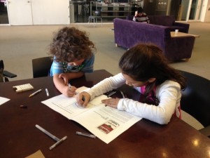
In order to evaluate the Art Crayon Toolkit, we tested it with three children: two children age 7 and one child age 4 (2 male, 1 female). The four-year-old was taken as a secondary use case, as he was outside the intended age range. We observed the children and ask them questions as they interacted with the Art Crayon Toolkit. We also asked them to talk through their reactions as they worked with the objects in order to get a better idea of their thought process. Finally, we asked a few semi-structured follow-up questions to get an overall idea of their experience. with Art Crayon Toolkit. Example questions include:
– What was your favorite part?
– What part of the workbook did you like?
– Was there anything you’d change to make it easier to play with?

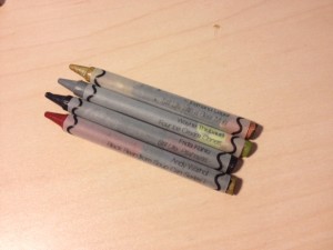
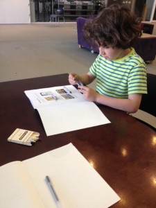
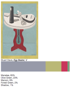
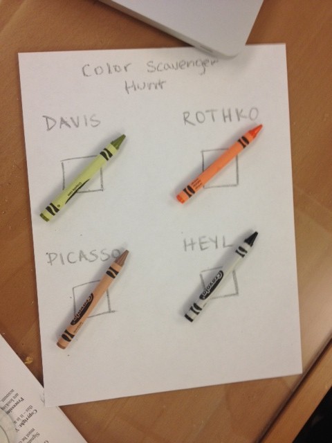
During the testing session, we first asked kids to explore the workbook and crayons on their own for a few minutes. Then, we explained that the art-based crayons were made of many colors corresponding to the hues in a painting or a print. We asked them to match the four art-based crayons in their pack to the four works of art on the first page of their workbook. Kids then picked a particular crayon or artwork and went to the relevant page to learn more about the work of art, examine the bar graph, and do the drawing activity. The first tester was more interested in looking at the works of art and figuring out how the crayon corresponded to it; the second two testers were more excited about the drawing activities.

photo 3

We found that the art crayons were an interesting way to get children to look closely at the works of art, with special attention paid to how the artists use color. Every kid was able to match at least some crayons to bar graph picture, although they found crayons with similar hues difficult to match. The seven-year-old testers reported that they understood the bar graph diagrams in the workbook and how they related to the crayons; the four year old did not understand the correlation. One kid placed the crayon next to the bar graph to line up the colors. In certain cases, very similar colors, such as sepia and brown, were adjacent in the crayon, making it difficult to distinguish between the two (one kid believed that a color was “missing”). Some of the testers read the percentages of different colors in a crayon, showing a basic understanding of how the data in the crayon relates to the images.

While color served as an initial hook to looking at the works of art, some of the kids also noticed elements beyond color. One kid was familiar with Hokusai’s Great Wave print because he had studied Japan in class, but he noted, “I never realized there was a boat right there.” Another tester realized that there is a small skeleton, or calavera, in Kahlo’s painting. The crayons and the content of the workbook served to help kids look more closely at works of art and learn more about the art and artists. Some of the testers read the artist name and artwork titles on the crayon labels, as well as the information about the artworks in the workbook. The thematic groupings were an useful way to spark children’s interest, too; one of the kids reported liking the food theme. As one kid explained, he liked the crayons because it helps him to “know what the artist used to make it. Some art it’s hard to describe what the artist used to make it.”

photo 4

The Art Crayon Toolkit also encouraged kids to create and connect art to their own lives. Two of the kids were most interested in the drawing activities; they were rapidly pulled towards these activities and later reported these were their favorite part of the entire session. The other tester enjoyed reading the activity and talking about the prompt, but seemed reluctant to color. The kids also were interested in where the crayons came from, asking how we made them. In addition to prompting an interest in artmaking, the Toolkit was a great way for kids to connect art to their everyday lives. One kid has been studying Japan in school; when he saw the Hokusai artwork, he quickly identified Mount Fuji and Kanagawa, the island in the title of the print. The corresponding prompt asked them to think an of ocean scene they’ve experienced, which led him to recount a story about his own time at Martha’s Vineyard. Another kid was familiar with Frida Kahlo and told us about how she had dressed up like the artist for a school event.

While our testers were generally enthusiastic about the Art Crayon Toolkit, they also provided feedback that could help us improve the project in the future. We noticed that the wrappers for the art-based crayons came off almost immediately because the children had trouble seeing the different colors despite the translucent labels. Kids were also interested in using the five colors in each crayon individually. Some of the kids would rub the crayon sideways to reveal the different colors, but others found it frustrating when they couldn’t draw with a color in the middle of the crayon. We found that the structural integrity of the crayons generally held up, but could be improved—a few of the color bar crayons broke when kids drew with more force. The language of the information on works of art could also be simplified for younger audiences; a challenge is balancing art-related words like “pastel” and “depicts” with the reading level of our intended audience. We are also considering changing the supplementary colors in the crayon pack; the kids were not interested in white, and would benefit from having a broader color range.

Overall, our impact study shows that fundamentally the Art Crayon Toolkit is a viable path for increasing art engagement in children ages 7 to 12 and could be further improved by iterating on the design and content.

Color Scavenger Hunt: Playtesting Edition!

Goals
Our major goals in designing this game is to make the museum visit a more active experience and to engage visitors who may otherwise not be invested in art. To that effect, we had two main questions we wanted to find out during our playtesting session:
1. How does the color matching game engage you in looking at works of art?
2. How might color data (and other kinds of art data!) enhance the experience of visiting art museums, especially for people who find art intimidating or uninteresting?

Process
As we described in our last post, we intended for our game to be played in a museum gallery. Visitors receive colorful objects that match with one of the top five colors in the paintings on view. They are asked to match the objects to the colors in the paintings, using a scanner to verify their matches.

Screen Shot 2015-05-05 at 12.03.23 PM

Since we didn’t have time to build out the infrastructure for this game, I prototyped the game in HTML page, which included images of four artworks. I gave playtesters four colors that are found in each work of art; they were asked to match these colors to the paintings. They could then click the “get results” hyperlink to be directed to a website that reveals the top five Crayola colors in the work, including the name of the colors and the percentages of each color in the painting.

Screen Shot 2015-05-05 at 12.03.00 PM

One of the major challenges in designing the game was balancing the difficulty level. We had initially included seven works of art, several of which had repeat colors (“Eggplant,” for example, showed up in three paintings). For the purposes of the playtest, we decided to simplify the game so that each color a player was given would correspond to one painting. I also tried to avoid including really ambiguous or similar colors, so one person wouldn’t feel frustrated trying to differentiate between “brown” and “raw sienna.”

photo (6)

Findings
Playtesters enjoyed the game, and reported that it made them look closely at the paintings and had them think about art in new ways. One tester said that the color matching element made them think about how a work of art is made; he would have liked to have matched multiple colors to a work of art in order to think about color in combination with others. He could imagine seeing the bar graph representing the breakdown of colors underneath a painting in a museum. Another tester enjoyed seeing the percentages of colors in each painting.

photo (7)

If we were to continue building out this game, we recommend testing out different difficulty levels with different audience groups. A next step would be to think about how to engage visitors in learning about the art beyond just matching colors. How might this game serve as a gateway into learning about art and artists?

Mapping Artists Around the World

Artists in Tate's Collection by Country of Birth

*this embed isn’t working well so go here to view its full interactivity!

For this assignment, we used Tableau to map where artists in the Tate collection were born. First, we made maps that show in which countries artists were born in by century (1500s, 1600s, 1700s, 1800s, and 1900s). Scrolling through these maps reveals how the scope of what the Tate collects changes over time: while art works by artists born in the 1500s and 1600s are limited to Europe, we see that the Tate represents artists born in the 1700s from the U.S., Canada, and Russia; that artists from the southern hemisphere begin to emerge in the 1800s; and that artists born in the 1900s represent countries from all over the world and from every continent. A final chloropleth map shows artists born in all centuries. The darker countries indicates those with more artists represented (the United Kingdom, unsurprisingly, is the most represented country in Tate’s collection); the lighter ones might only have a handful of artists in the collection.

Goals

Our goal is to give a macro-view of what is in the Tate’s collection. Often, when people are visiting museums, they focus on one object at a time; a visualization likes this can help visitors understand the larger scope of what a collection represents. Another goal is to reveal how a museum like the Tate represents the world and what biases they have toward certain geographic areas. Most of their holdings stem from the Western world (especially the United Kingdom and the United States), but we do see that more modern and contemporary art has begun to accept artists from all over the world.

Audience

People who are interested in art and artists. Visitors to the Tate (many of them international) might be interested in seeing if their country is represented in the collection.

Next steps?

We brainstormed other maps that we could undertake with our data sets but unfortunately did not have the time to fully clean the data, run scripts, and make new maps. On a very basic level, it would be great if the labels could allow you to dig into artists names per country (and possibly link you to information about them). It would be interesting to write some code that would allow users to type where they were born and be given an artist born close to them. Considering our team’s interest in analyzing color in works of art, we were thinking of finding the average or most dominant color per country and making a map that represents countries by these colors.

Women Artists at the Tate

By Team Aartvark (Desi + Laura)

For the chart assignment, we made a infographic with two types of charts. On the top of the infographic, we includes rows of pie charts that demonstrate the men and women artists represented in the Tate’s collection by decade of birth. This visualization was inspired by the “small multiples” that Tufte recommends (and that Rahul showed in class). The second chart is a traditional line graph that shows how the ratio of artists represented in the Tate’s collection changes over time. The chart is intended for a general audience that is interested in art. Our goal was to reveal how museum collections are biased toward male artists, but that their biases are slowly changing, and that museums today are now endeavoring to have a more equitable gender distribution in their collections.

womenartistsattate

Rethinking Water Consumption

waterremix

For this assignment, we were challenged to remix the Good magazine water infographic into an interactive, participatory experience. In our design, users can visualize their own water usage by selecting the activities they undertook that day.

20090318-wateruse

We found that the original infographic, organized in columns with options like “apple” vs. “orange,” or “toilet” vs. “low-flow toilet,” could serve as the interface from which a user select items. On another screen or window, a bar graph would dynamically fluctuate as the participant indicates his or her water consumption. The height of each bar is proportional to how much water each activity or product requires. We also maintained the color-coding from the original chart: bars with blue indicate direct use of water, while green indicates the water used to make that item the user the consumed. By recreating this infographic into an interactive chart, we personalize the understanding of water consumption, allowing users to apply the information in the original infographic to their own lives.

Mapbox

Mapbox is a cloud-based tool for publishing customizable, interactive maps. They provide maps for a lot of major services you know—Foursquare, Pinterest, and Uber are just a few. Mapbox builds on and authors a lot of open source mapping libraries; for example, their map data comes from projects like OpenStreetMap. As a freemium service, you can get a free account for limited map views, storage, and support, or pay more for premium features. One of the great things about Mapbox is that it is designed for various levels of technical expertise. If you have no coding skills, it is incredibly easy to use via the Map Editor; for developers and designer, you can add interactivity and customize the visual style using Mapbox.js and Mapbox Studio.

The Map Editor is the quickest way to create a map. Mapbox maps consist of a baselayer—the map—and overlays—the data you add onto it. You can choose many baselayer styles, from the hip and nostalgic theme “Wheatpaste” to the streamlined “High Contrast.” Data overlays take on three forms: markers (points referring to a single place), lines (the distances between two places), and polygons (areas bigger than one or two places). A user can add these features by dragging and dropping, or by importing a file (.geojson, .csv, .kml, .gpx) that includes latitude and longitude fields. You can also customize the color and icon of these data features.

Publishing your map is easy. You can view the map directly at a Mapbox URL, embed your map into a website with HTML, download data features from your map, or use your map ID to treat it like an API.

Screen Shot 2015-03-31 at 2.39.11 PM

I decided to represent where my class of 2015 student cohort in Comparative Media Studies has traveled as part of grad school experience. I prepared simple .csv files and uploaded them. Within minutes, I uploaded the data and made a map with a funky background as well as customized the markers, assigning a color per student and a letter that corresponded to his or her first name.

Screen Shot 2015-03-31 at 1.59.38 PM

Still, I ran into some problems that couldn’t be addressed just through the Editor. For example, several of us traveled to the same city, often at different times. Because the lat/long I entered for these data points were the same, the most recently added marker would always cover the others in the same location, making it seem like there was only one data point there.

The open-source Javascript library Mapbox.js is a way to sidestep these kinds of issues and add exciting, interactive features. Mapbox describes itself as “developer-focused,” championing the fact that their maps can be altered for your project’s functionality needs. For example, a short JS script could be inserted into my HTML that clusters markers together, using a numeral that indicates how many markers are in a tight space.

Screen Shot 2015-03-31 at 2.47.11 PM

Mapbox Studio is geared toward the design of the map. This platform allows you to apply your own styles, customizing everything—from roads and parks to bodies of water and location names—to your (or your brand’s) needs. The platform builds maps using vector tiles, which combine the strengths of tiling images with vector data. According to their website, vector tiles “rethink web maps from the ground up, providing a single efficient format to power raster tiles, interactive features, geojson streams, mobile renderers, and much more.” You can style maps by using the CartoCSS styling language.

mapbox

I would definitely recommend Mapbox for an data storyteller who wants to tell their story via maps. Mapbox provides great documentation and a beautiful, easy-to-use interface. The tool is easy to use for beginners, while highly customizable if you have coding or design chops.

Snow and Icy Sidewalks of Cambridge

Authors: Desi Gonzalez, Stephen Suen

One interesting finding from looking at the data:

We choose to look at two open datasets from the city of Cambridge: the first documented unshoveled and icy sidewalk complaints since January 1, 2008, and the second recorded snow and ice sidewalk ordinance violations since December 1, 2007. Looking at the datasets, we noticed that snowfall complaints seem to be grouped around a day or a span of a few days. This made sense, considering that these entries likely correspond to major snowfalls. However, we noticed a few entries that are unusually out of the season—one in September here, one in May there—which might be due to human error when entering data.

Are schools more likely to be closed when there are more unshoveled/icy sidewalks?

Public school closures – We found this data by using Twitter search (which was recently updated to include all historical tweets) on the Cambridge Public Schools account for “Cambridge Public Schools will be closed,” the boilerplate language the CPSD uses to announce school closings. However, these results only go as far back as the Twitter account and do not cover the entire range of the sidewalk data set.

  • (2015) Jan 27-28; Feb 2-3, 9-10
  • (2014) Jan 3, 22; Feb 5
  • (2013) Feb 8, 11
  • (2012) Oct 29 – Hurricane Sandy (not relevant)

University closures – Once again, we used Twitter search on @MIT, but this time there was no standard template so we just searched for “closed” and manually went through the tweets to include/exclude dates as appropriate. This process could be repeated for every university; another option would be to use the Twitter API to automate this given a list of university Twitter handles.

  • (2015) Jan 27-28; Feb 9-10
  • (2014) Jan 2
  • (2013) Feb 8
  • (2012) Oct 29 – Hurricane Sandy (not relevant)

How does the frequency of unshoveled/icy sidewalks relate to weather data (temperature/precipitation)?

Weather Underground has tables of temperature, precipitation, and events (e.g. “snow”) going back to 1920. The maximum query is about 13 months from the specified start date, so 7 different queries would be required to get all the data since 12/1/2007. The tables can be downloaded as CSVs and combined into a single table. At this link, we tracked down a query from 12/1/2007 to 1/1/2009.

Are the major roadways that are deemed “snow emergency routes” more or less likely than smaller streets to have snow or icy sidewalk complaints or violations?The City of Cambridge has identified several major arteries on which, during a snow emergency, cars are not allowed to park. A quick Google search led to cambridgema.gov’s map of snow emergency parking restrictions. We also found a PDF of that lists the streets from the intersection where the restriction starts until the intersection where it ends as well as whether the sides affected are the odd-numbered buildings, the evening-numbered buildings, or both sides of the streets. Neither data is easy to access or plug into visualization tools like Tableau, so we would have to do some creative copy-and-paste work or research which building numbers are included within these parameters.

Devising a Visual Vocabulary

Colin Ware opens chapter 7 of his book Visual Design for Thinking with a thought experiment. He asks the reader to try to imagine the following sentence with only images: “If halibut is more than ten euros a kilo at Good Food, go to the fish market on 5th Street.” Some things are best said with words, while others are said more aptly with pictures.

Murals have to be easy and quick to read in order to get a message across to its audience. When class met on Thursday, February 19, we had already identified the story we needed our data mural would convey, focusing on the impact that Food for Free has on food security in the Cambridge community due to the organization’s partnerships with local businesses. Our challenge, then, was how to tell this story visually.

The word web activity—in which we added words onto a network and then devised icons to represent these words—was useful in devising images to be used in our final mural. Next, the pass around activity helped us weave the imagery together. These two exercises were useful in identifying a common visual vocabulary to convey our message.

The imagery we were most drawn to was a plant metaphor, with the roots referring to the locations Food for Free rescues from, and the branches or leaves indicating the organizations that the food gets distributed to. According the Colin Ware, this is pattern perception, in which meaning is made by the relationships between the visual elements, from the roots to the leaves.

Desi’s Daily Data

Sunday, February 8, 2014

I wake up to my alarm clock at 8:45am.

I receive text messages from a friend in the Netherlands and from my family. These texts include words and images; the phone also tracks the date and time that these messages were sent and read.

I take my daily birth control pill; the empty slots in the case demarcate which pills have already been taken.

I jot down my to-do list for the next few days, and mark items as I complete them.

I read and write emails. Gmail archives these sent messages and tracks the date and time sent and who received the emails.

I write a cover letter on Microsoft Word. My computer tracks the last time this document are saved.

I  read many articles on the internet. Various websites maintain analytics about my visit, including information such as timestamp, my location, length of visit, and IP address.

Through out the day, I blow-dry my hair, turn light switches on and off, power my laptop—just some of the many ways I use electricity. My apartment’s electric company keeps track of electrical expenditure in my apartment.

I go to a coffee shop and pay for tea. The cashier hands me a receipt, which is a record of the amount I spend (and pay in cash) and the time and date of my transaction.

Back at home, I check my email and see an alert that my bank has charged me for an ATM fee from two days ago.

I transcribe interviews for my thesis, making sure to include periodic timestamps in the transcript.

I browse on Twitter, marking certain tweets as “favorites.”

I call a good friend who lives several states away; my phone keeps a record of the date, time, and length of our conversation (57:26).

I input recent shared apartment expenses into Splitwise, a website that allows for easy tracking of bills amongst roommates and friends.

I update a few upcoming meetings and events in my calendar, noting time, date, location, and brief description of each engagement.

I write up this blog post, recording the happenings of my day. As soon as I click “publish,” WordPress will generate data about visits to this post.

Visualizing What the World Eats

hungryplanet1

Norway: The Ottersland Dahl Family of Gjettum. Food Expenditure for One Week: 2211.97 Norwegian Kroner ($379.41 USD). Favorite foods: fresh baked bread with butter and sugar, pancakes, tomato soup with macaroni and cold milk, yoghurt. Photograph by Peter Menzel (source)

Husband-and-wife team Peter Menzel and Faith D’Aluisio traveled around the globe to 30 homes in 24 countries, investigating what families eat over the course of a week and how much it costs. The result was Hungry Planet: What the World Eats, a book published in 2006. With the turn of each page we see each family photographed where they dine, flanked by their week’s worth of food products.

This project came to mind when we were discussing food security during Tuesday’s class. The photos probe questions both about health and economic access to food—a perfect fit for the theme we’ll be exploring this semester.

The photographs are geared toward a generalist audience: the Hungry Planet book has had mass and viral appeal, and has been highlighted in media such as TIME and NPR. (In fact, I’m pretty certain I first heard about these photographs when an acquaintance posted a link on Facebook.) The project aims to get people thinking about what they eat, where they get their food, and how much money they spend. It illuminates the disparity of food access and health choices around the world—from the Norwegian family of five that spend almost $400 on food, much of it processed and packaged, to the family of 15 in Mali that prefers to cook traditional rice dishes and spends $26 a week.

I choose to write about these photos because of the questions they bring up about data visualization. What does it mean to present data? Here, we see the photographer present data about food consumption in the most literal form, by documenting the actual families and food. For me, eschewing the language of graphs and charts in favor of this approach is effective, leveraging the visual power of raw foodstuffs and colorful packaging to pack a visual punch.

hungryplanet2

Mali: The Natomos of Kouakourou – Food expenditure for one week: 17,670 francs or $26.39. Family Recipe: Natomo Family Rice Dish. Photograph by Peter Menzel (source)