Drought Debunkers Impact

Val Healy, Nolan Essigmann, Ceri Riley

For reference, here is a link to our final project (we might need to host it somewhere besides c9 for others to view it) and here are our final project presentation slides.

Goals

The ultimate goal of our web scroller is to reveal how humans are exacerbating the social, economic, and environmental impacts of drought because of the current structure of industrial agriculture and government subsidies that reduce the cost of meat and dairy products. We wanted to create a more unique narrative, a story that extends beyond the ‘shock factor’ of revealing water footprint data concerning meat and certain crops.

As such, we introduced the link between drought and the water footprint of foods and debunked the idea that refraining from eating meat – an individual lifestyle choice – will have an effect on the industrial food system and massive daily amounts of agricultural and livestock water use. We wanted to emphasize that:

  1. lifestyle politics are a good symbolic choice, but not necessarily a practical act of activism (especially if you cannot afford to make the choice due to food costs).
  2. government subsidies systemically reduce the cost of meat and dairy products, such that their financial cost doesn’t necessarily reflect the environmental cost (the water footprint) that goes into raising the animals
  3. anyone who wants to be more engaged and enact change should keep updated with information about industrial agriculture water use, government subsidies, and other organizations who are actively trying to reduce wasteful water use in the US

Audience

The audience for our data story is college freshmen, and we gathered the bulk of our feedback from several individuals in our living groups. We selected college freshmen because the demographics of the group vary greatly – people come from different locations, backgrounds, high school education styles, and levels of community/regional/global engagement and awareness. The independence and immersion in a new, open college environment encourages individuals to question their inherent biases and beliefs, and generally incites a desire to be more aware of how they can affect the world in the long run.

As such, college freshmen are an ideal audience with whom we can discuss a popular topic like drought (which they have likely heard of, even vaguely, in the news) and they will be receptive to discussion about how individuals can help (or fail to) influence local water use through their lifestyle choices and activism. Students also may face the dilemma of purchasing cheap, easy-to-prepare food on a budget or may experiment with different diets for health or sociopolitical reasons. In addition, every college freshman presumably has some desire to continue learning, so they may benefit from our educational ‘call-to-action’ and become interested in different organizations that address national water use and/or be more willing to seek out more information on the subject of drought and food.

Reaction

Types of questions we asked:

  • Have you heard about drought in the US before this project? What about it?
  • What do you think about taking shorter showers (or similar actions) to save water?
  • What about changing what foods you eat?
  • Did you know that food comprises most of your daily water use?
  • What are your feelings towards crop and livestock subsidies?
  • Did they change at all after scrolling through this narrative? Why?
  • Did you learn anything about drought/do you have any desire to learn more about drought? Or different forms of water use?
  • Do you want to get more involved in reducing US water consumption? Your personal water use?

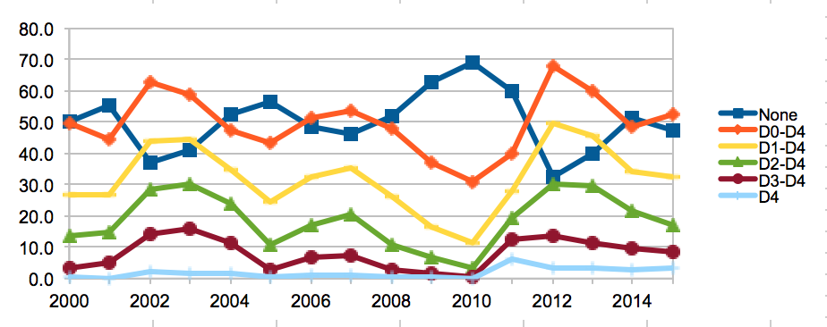
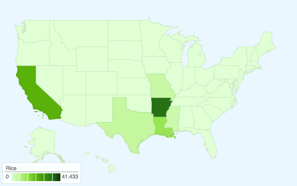
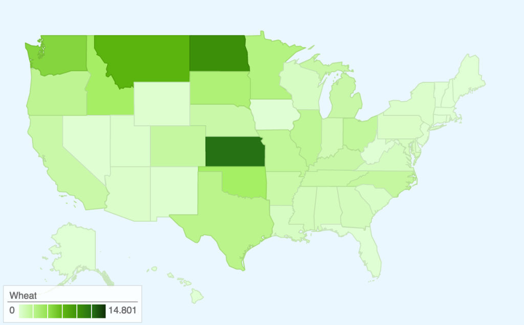
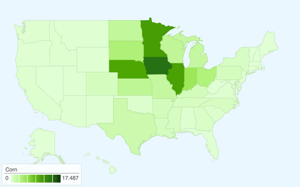
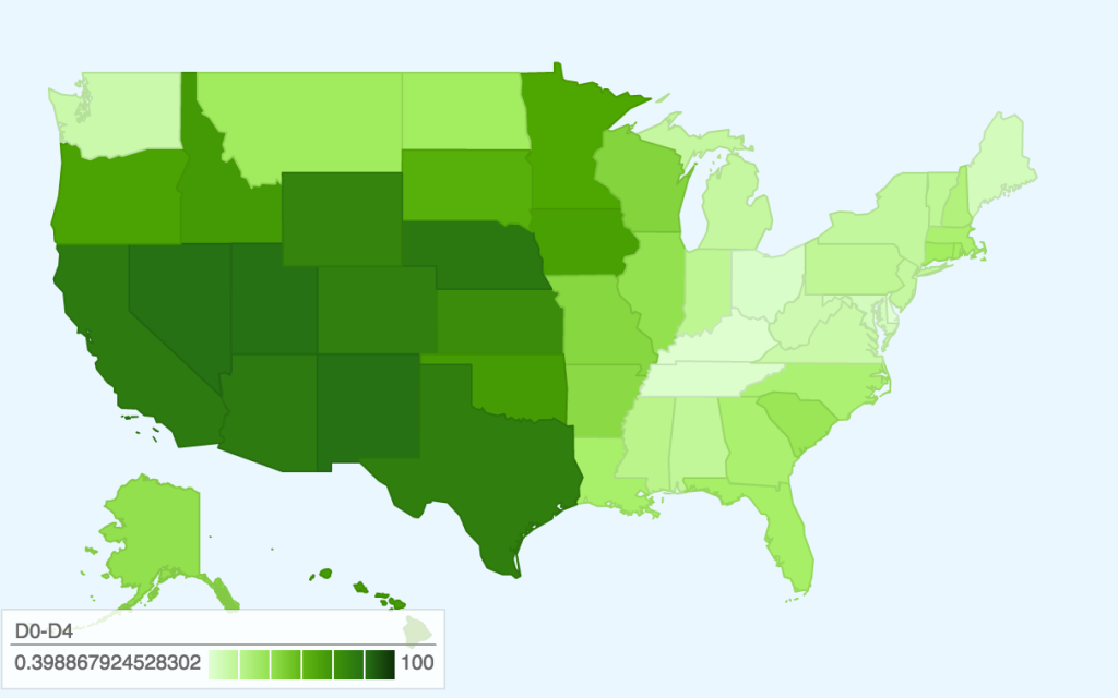
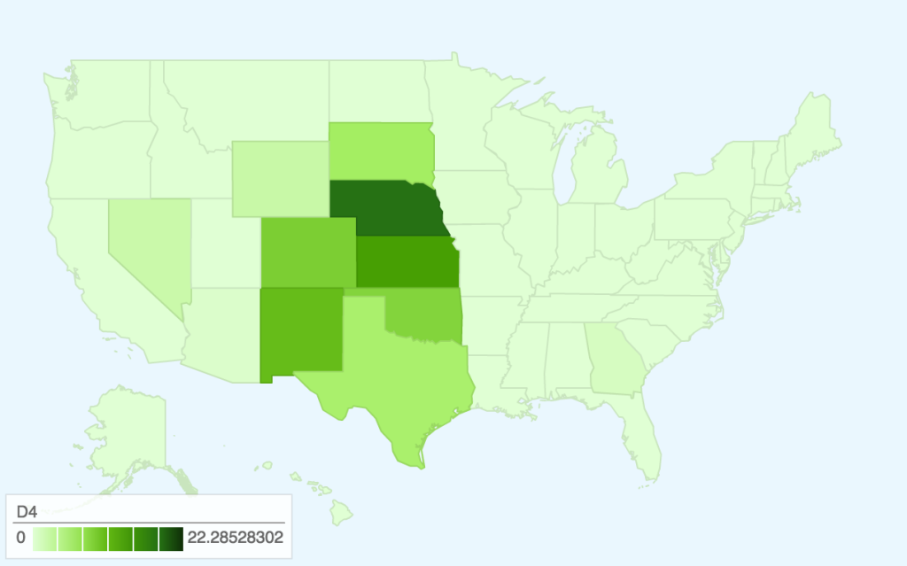
All the freshmen we talked to (approximately 6) had mainly read popular news stories about the California drought, and two of them had grown up in the midwest and heard about the devastating effect of drought on crops. They knew that drought was affecting  families, either people they knew who were involved in agriculture or by water bans in California. Overall, there were mixed opinions ranging from “Drought isn’t really a problem where I come from” to “my home county is basically a desert so I’ve pretty much constantly lived in or near drought” to “my grandparents live in California so I probably should know more about it.” They thought the small multiples map was interesting, and were curious about what the different colors/levels of drought actually meant beyond “red = bad.”

When we talked to them about lifestyle politics, most people thought that personal actions like shorter showers could have an impact on water use — “I believe that shorter showers could save water… but I’m not sure how short to take” and “Shorter showers would save water in theory, right? But I don’t do it.” After talking and reading the scroller narrative, they thought it was interesting how a lot of public policies focus on low flow toilets and showerheads when really they don’t make that much of a difference.

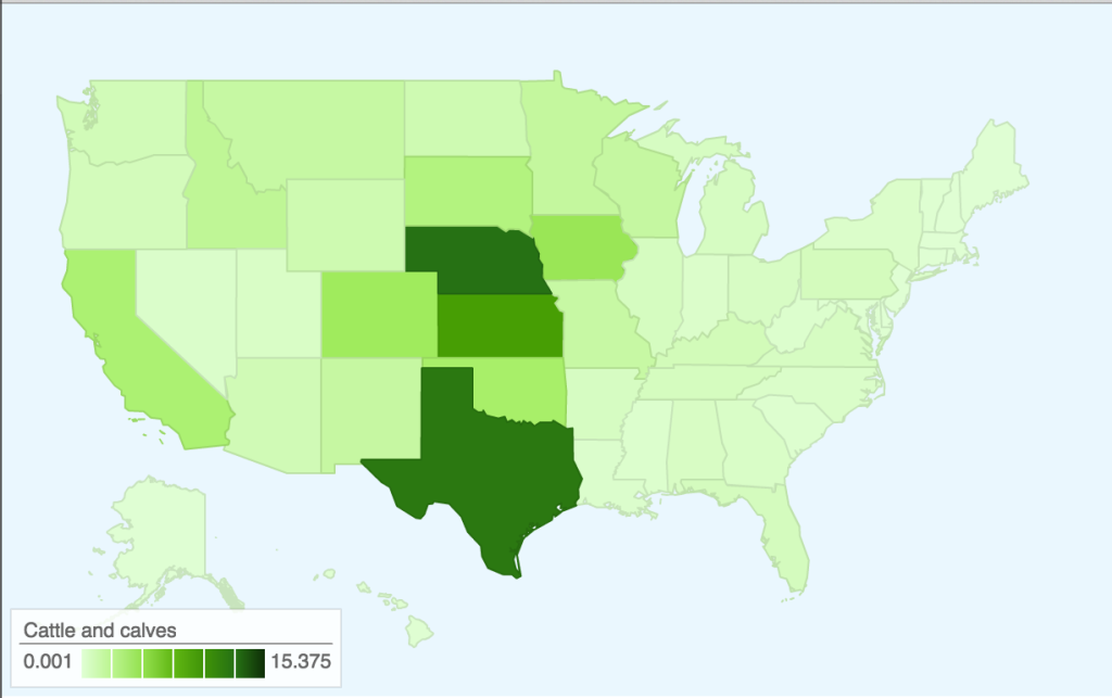
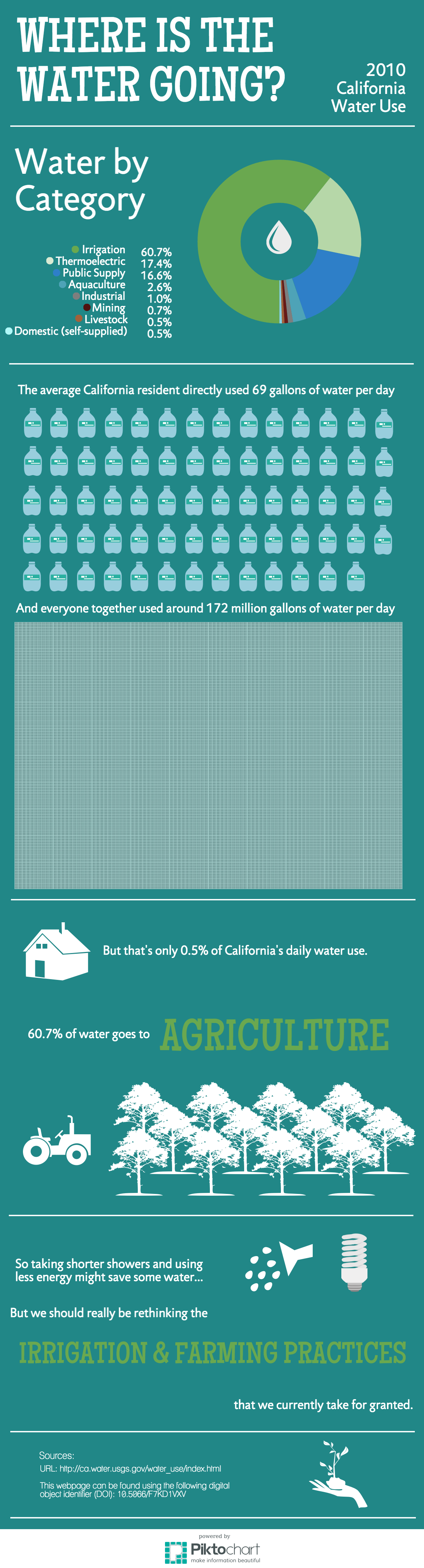
All but one of them were semi-regular meat eaters (the one was pescatarian on personal/ethical grounds), and were either surprised by the fact that food is a majority of your daily water use or anticipated it — “It makes sense that food contributes so much to your daily water use… because agriculture,” “Don’t almonds take a lot of water? I didn’t buy them last week on principle,” “Food? Really? cool.”

However, besides the one person that didn’t buy almonds at the grocery store recently, they wouldn’t feel motivated to change their diets because of their daily water use, or say that they might unintentionally be saving water — “I already go several meat-free days a week because I’m lazy and don’t want to cook it, so I probably wouldn’t make more changes.” And they weren’t sure if they would radically change their food habits if meat were more expensive either — “it’s hard to imagine how my shopping trips would change, and I always buy groceries on a budget… I’d probably just buy some meat anyway and get less of something else.”

Not many people knew about the impact of government subsidies on making the cost of food disproportionate to the water cost of that food, especially when it comes to livestock — “it’s weird to think about the relationship between water, government funding, and livestock… it’s not an immediate connection I would make.”

But, overall, they did not feel like the visualization motivated them to make any sort of lifestyle change or get involved with activism. It helped some of them solidify the idea that lifestyle changes are a personal decision and are mostly symbolic (whether they’re ethical, religious, political, etc. beliefs) rather than impactful — which made some people feel “kind of hopeless… because we can’t really do anything personally to affect industrial agriculture [or capitalism!] without joining a huge movement.”

It encouraged some people to learn a bit more about drought — “maybe I’ll pay more attention to drought in the news.” But nobody would really want to get involved with water conservation/awareness activism — “I would get involved if it was easy to get involved,” “I have no desire to get involved,” “No, I don’t want to be more involved.”

Overall, it seems like our scrolling visualization helped people learn a couple new things about drought, lifestyle politics, government farm subsidies, and the relationship between food and water. It worked as an educational tool, but didn’t necessarily motivate people to enact change in the world, which is probably okay given the scope of the project.

Drought Debunkers Methodology

Val Healy, Nolan Essigmann, Ceri Riley

The goal of our web scroller is to reveal how humans are exacerbating the social, economic, and environmental impacts of drought because of the current structure of industrial agriculture and government subsidies that reduce the cost of meat and dairy products (which have large water footprints).

Our initial research involved laying out possible questions that interested us and focusing on the link between drought and food security. After we had a general idea of the story we wanted to tell, we researched a bunch of potentially useful datasets and compiled a document with at least 15 sources for data and 17 news articles (containing narrative ideas as well as links to alternate data sources) that we could use as starting points for our project sketches. As we iterated through versions of our final project, we created a hand-drawn rough sketch of the scroller, an abbreviated document including datasets we would still need for our revised story and tentative visualization ideas, a near-final version of our project entitled ‘Where is the Water Going’ (the black text and associated citations located in this document), and a final two revisions based on feedback from Rahul and discussions with our peers (the green and red texts located in this same document).

The very basic prototype of our visualization was the creative chart based on 2010 California Water Use data. This dataset led us to a report of 2010 United States Water Use data, where we extracted data about Domestic, Industrial, and Agricultural water use to compare water withdrawals between states and nationwide (spreadsheets located in this folder, among others). We eventually narrowed down the visualization to a visual area comparison of these three daily water consumption metrics, including a calculation about approximately how many gallons of water each person uses per day.

As we experimented with other sketches, we used map data from the U.S. Drought Monitor in addition to manually copied/pasted tabular data monitoring the weekly severity of drought across the entire United States and in all 50 individual states.This information was used to make regional maps of drought to include in our final scroller. In addition, we researched qualitative information explaining the causes of drought to help us write the narrative hook that leads into the remainder of our story. This Github repository contains the data for our west coast drought map, and this folder contains all the images that comprised our small multiples map.

In order to research the water cost of foods, we used water footprint statistics for both crops and farm animals, in addition to supplemental information from Angela Morelli’s water visualization, some statistical data from a report on The Water Footprint of Humanity, and information from the Mekonnen and Hoekstra paper entitled A global assessment of the water footprint of farm animal products. We focused on pages 24-29 of the report and manually transcribed data about the total water footprints of different animal meats and food products, the total water footprints of different feed crops, and data comparing the water footprint of animal products to their nutritional breakdown (with a focus on protein). Although we analyzed data regarding the nutritional content of different food options, we ended up omitting it in our final scroller in order to tell a more succinct story focused on the water costs of meats and crops. We also read and extracted data from part of the paper on The green, blue and grey water footprint of crops and derived crop products in order to analyze the different water footprint of specific crops both globally and in the US and create an interactive small multiples visualization with cleaned data that can be found in the ‘usfoodwaterusage’ file within this folder (some of our data analysis was compiled on c9.io and the downloadable file format is .gz for some reason).

In order to support the end of our narrative, making the connection between the water footprint of meat and the fact that the symbolic choice not to eat meat isn’t feasible for many people, we did a quick analysis on SNAP data, specifically focusing on the average monthly participation table. In addition, we researched census information about poverty in the United States and estimates of people who were in poverty at a national level. We used this information to create a visualization with data that can be found in the ‘data’ file within this same folder.

Lastly, we researched data on farm subsidies across the United States and cleaned the data such that it just presented information about food products, taking out information like disaster payments or incentive programs. We specifically used this information to create a visualization of the different food subsidies and a visualization describing the price of meat with and without subsidies. The cleaned data can be found partially in this spreadsheet and partially in the ‘viz’ file within this same folder .

We also collectively invested a lot of time in learning basic web programming and how to implement skrollr.js and D3 to create our scroller and visualizations. None of us came into this class with very much programming experience in anything but Python, so there was definitely a learning curve when developing the final project and a lot of experimentation with different scrolling webpage tools.

Links to additional cleaned datasets:

  • This other folder contains some of our excel spreadsheets with downloaded/cleaned/analyzed data about drought, US crops and associated revenue (by state), US water use, California water use (by national classification and crop/land), and SNAP participants.
  • As you can see in the bottom half of our final planning document, we initially did work analyzing data about personal water use (such as showers or sprinkler systems) and additional analysis on industrial water use data before cutting the information and narrowing our narrative to focus on agriculture.
  • Our c9 workspace, which has restricted access (but we can grant access, I believe), and several of our cleaned datasets in the original file format (not .tar.gz)

Rain Storm Game Testing

Val Healy, Nolan Essigmann, and Ceri Riley

Questions: 

  • Could you hear a difference in sound levels/did it make you think anything different about US drought?
  • Where/what have you heard about drought in the news? (leading into the idea that this data was averaged/nationwide)
  • What questions do you have after playing the game? (about the game or about your role in representing drought)

Feedback:

  • It would be nice if each person/notecard represented a region of the US instead of just a percentage of the whole, so everyone could understand how their region was contributing to the whole country (they were confused by what each notecard meant individually)
  • Why no “no drought” level?
  • Made them ask questions about what factors — human or environmental — impacted the US drought after 2011, and they started talking about climate change vs. industrial water use vs farming (they had read news articles about almonds in CA and remembered stuff about the ice bucket challenge being controversial)
  • One of them was from Arizona and was like they’ve been in drought for years, but California is getting all the attention because of the crops, so they weren’t surprised that more of the US was in drought than they expected
  • People thought 15 rounds of one action might get tiring, and the people who did stomp for 15 rounds got tired
  • They’d be interested to see what it sounds like with more people because even 14 didn’t sound like enough to have a huge audible effect

Changes:

If we had more time to work on this game, we would ideally play with a large group of people and incorporate more specific data into each notecard so that each person is telling their own story (drought across a region or even a single state) in addition to contributing their sounds to the larger game (and story of drought across 15 years in the United States). Moreover, it might be interesting to try and adjust the drought levels/actions to incorporate “no drought” as stomping and D4 as silence. Maybe we could also adjust the frequency of the actions (fast stomping, slow snapping) to try and vary the sound even more between years, like the feedback in class suggested.

Human Rain Storm Game

Val Healy and Ceri Riley

For this assignment, we used averaged weekly drought data from 2000-2015 to modify a camp game where people make sounds to mimic a rain storm.

Audience 

A large group of people (the more people, the greater the effect of the game), either children or adults, who are interested in producing a sonic representation of drought over several years. This game can communicate the effects of drought to people in a more interesting/engaging way than looking at different colors on a map.

Goals

The goals of designing this game was to link the long-term impact of drought on the United States to an auditory/participatory experience, which would ideally be more memorable than looking at one of the many choropleth maps online. It sums up a large amount of data on drought (~783 weeks) in a short activity. And the activity represents how drought changes over the years, with various levels of drought (lack of water) correlating to different types of water-sound-producing actions in our game.

Game

This game works better with more people and no ambient noise/talking — the only noise should be coming from your actions.

The leader will distribute notecards to each person. These notecards will have 15 years (2000-2015) and an action next to each one that corresponds to a level of drought.

Optimized-explaincard Optimized-notecards

Then, the leader will stand at the center of the circle and have a sheet of paper with the year “2000” on it. They will walk around the inside of the circle, holding up the year, and point to each member of the circle in turn. When the leader points at you, you perform the action that your card says for that year.

After the leader will continue to walk around the circle, increasing the year by one each time, until everyone is performing their “2015” action.

Then the leader will walk around the circle one last time, pointing at everyone individually to stop performing their action. This signifies the end of the rainstorm and the activity.

Because there are only 14 people in our class, we scaled the activity to 14 notecards for the demonstration. However, we also did calculations to see what the different sound/action distributions would be if we included the “No Drought” category and if we had a larger group of 100 people all doing the activity.

14spreadsheet 100spreadsheet
Screen Shot 2015-04-30 at 3.45.24 PM


Choropleth Maps: US Agriculture and Drought

Ceri Riley and Val Healy

For our map project, we decided to make several small choropleth maps to illustrate where selected foods are grown and compare them to where drought is located. Unfortunately, Google Fusion Tables maps do not allow for changes in color, so all of our maps are green, though we would, if allowed, choose to use brown for the farmed animal maps, green for the crop maps, and red for the drought map.

These maps were produced using 2013 USDA Datasets on Cash Receipts for crops and averaged 2013 Weekly Drought Data. Drought conditions have since become more serious, but the data on agricultural production by state is only confirmed through 2013 so we chose to focus on this year.

Cattle and CalvesHogsBroilersRiceWheatCornD0-D4D4

Here are links to the maps for interactivity:

Agriculture: Cattle and calvesHogsBroilersRiceWheatCorn

Drought: D0-D4D4

As you can see, there is a moderate amount of drought throughout the central/western part of the United States, with the most severe drought focused in the midwest around Nebraska.

The majority of the cattle industry is located in a region where there are more serious levels of drought, while chickens (the ‘broilers’ map) are located further East. Cattle farming also requires more water than chicken farming, though, so perhaps this correlation is partially due to the large water footprint that feeding/watering cattle leaves.

Rice, wheat, and corn are three of the most prevalent grains in the United States, and the maps show areas where the drought regions overlap with the agricultural regions in addition to states that were relatively unaffected by drought. This allows an audience to explore different states’ contribution to US agriculture, beyond what is normally reported in mass media (recently, California agriculture). For example, the more serious drought in California might affect 26% of the rice crops, but 41% of rice is also grown in Arkansas. However, a lot of the states that grow corn are also affected by some level of drought.

Audience

Our audience is those who wish to see which types of crops or animal agriculture might be most affected by drought.

Goals

Our goal for this project is primarily internal; we wanted to make these maps to aid us in finding areas of food production most affected by drought. We hope we can use information gleaned from this small project in our final project, as our datasets covered more information than shown here.

In addition, these maps could demonstrate that there are significant levels of drought and crop production in the United States outside of California, even though most of the media focus is on the one state.

Creative Chart: Where is the Water Going?

Val Healy & Ceri Riley

Here’s a link to the online version of this infographic (it has an interactive bit that doesn’t show up in the .png version).

Our targeted audience for this infographic was around a high school age, but also understandable and relevant to adults. The goals were to communicate how much water individuals use on a daily basis but also trying to put in perspective the massive amount of water that the agricultural industry uses. Our ‘call to action,’ although it’s a little weaker/implied here rather than well-developed, is that rather than advocating solely for lifestyle changes, we should think about ways to change the institutions that take up the most water — such as by working on more efficient irrigation systems and revised farming practices (like the times at which certain crops are planted).

Essentially, we tried to use one of the online infographic tools (Piktochart) to visually represent the different ways water was used by the state of California in 2010, show what an individual’s daily water use (minus food) would look like, and then connect to the larger idea that agriculture uses tons of water and the practices should be revised.

Creative Chart 4.16

Water Remix

Val Healy & Ceri Riley

Optimized-waterremix

We remixed the water usage infographic into a map, specifically focusing on the food components rather than the appliances.

This map shows one’s breakfast, lunch, and dinner plates, scaled to represent the relative amounts of water these meals virtually use. In addition to the plates themselves being proportional to water use, the foods and drinks on the plates are also proportional to their respective water footprints. The blue pie slice of the plate represents how much water you would use if you chose the “better” option for your meal — for example, the chicken, beer, and baked potato dinner would only use about 20% of the virtual water that the steak, wine, and bread dinner would.

If we were to actually develop this visualization rather than just sketch it out, we hoped to show the old vs new plate maps for each meal. If you hovered over the blue region of a given plate, you would be shown a proportionally smaller plate with the new foods arranged on it by virtual water use. This would allow for quick visual comparison between two meal options. And, if you hovered over any given food, you would be shown the amount of virtual water (in gallons) that was required to grow it and/or its percent contribution to the total virtual water use of the meal. So our food map visualization would look simple at first, but ultimately contain a lot of the same numerical data that the original dataset included.

Final Project Ideas

Members

Val Healy, Ceri Riley

Topics

Current environmental/human influences on agriculture (urbanization, desertification, industrial farming/animal agriculture) and how this impacts food security

Goals

Changing behavior, educating people about agricultural impacts — both food choices and environmental/land use choices — without sensationalizing the information

Techniques

Simple interactive/web visualization or infographic

Data/Story

Food Environment Atlas – USDA

This dataset contains a lot of information, but we chose to look at the fact that 50.54% of Farmers Markets in the United States sell fruits & vegetables, while 46.94% sell animal products, and 50.66% sell ‘other’ (presumably flowers and other non-edible products). We wanted to look at the story surrounding farmers markets nationwide to see how local farms/agriculture might help provide different types of food choices to people.


Piktochart: Quick & Easy Infographics

What can you do? What kinds of stories is it good for?

Piktochart is a great tool if you want to create an aesthetically pleasing infographic easily without having to learn how to use professional software like Adobe Creative Suite or spending the time to create your own vector art (although you can upload your own images if you want). Its tagline “Easy-To-Use Infographic Creator: Discover how non-designers are creating beautiful infographics in as little as 10 minutes” is a little bit click-baity but rings true.

This tool is useful for presenting any sort of data story in a creative, graphical way. Piktochart is pretty customizable, with many different simple icons and background templates that you can insert, a variety of professional-looking fonts, and the option of generating basic graphs and maps. So, after you’ve conducted data analysis and narrowed down the key information you want to present, it’s a great tool to summarize your story in a clear and eye-catching way. (Alternatively, it can be used to make something as simple as an event flyer, because it’s basically a simplified graphic design interface).

Screen Shot 2015-03-30 at 9.39.53 PM

Screen Shot 2015-03-30 at 9.42.27 PM

However, the tool does have its limitations, as your exporting options are fewer without upgrading to the paid ‘pro’ account. The customizability is pretty broad (fonts, colors, opacity, positioning, etc.) for a user-friendly graphic design tool, though, so it should be more than enough for people to at least play around with the design.

How do you use it? 

Screen Shot 2015-03-30 at 9.39.25 PM


Before you begin making your infographic, you have to register as a user and make an account. From there, the website guides you through a selection process of a background style for your visualization (either a pre-set design or a blank page). You get a nice tour of all the tools (and can return to it by clicking on the “TOUR” icon in the lower left corner) and then can jump into creating your design by adding text, images, color, and charts/maps.

In addition to having live support to answer any questions you have, there’s an FAQ section that covers a breadth of questions you might run into.

How easy or hard is it? What skills do you need?

It’s very simple to learn and the layout is very user-friendly — everything is clearly labelled and the options (for example, ways to manipulate text) are presented clearly in the sidebar or header. Like any tool, there’s a bit of a learning curve, like figuring out how to search for icons or how to select different portions of the document, but it makes graphic design very simple for all sorts of users.

Would you recommend this to a friend?

Yes and no. I would recommend it to a friend if they want to play around with making graphics (or need to make one quickly) and don’t have the time to download/learn software, whether it’s something like GIMP or Adobe InDesign. The fact that you have to pay to get a non-watermarked and high-resolution infographic, while expected, can be frustrating if you want a very clean image for free. But overall it’s an easy way to start playing around with visualizing stories and really simple to use, so there are more positives than negatives.

Screen Shot 2015-03-30 at 11.48.04 PM

Will you consider using it for your final data story?

I might consider using it, but would prefer not to. It seems like a good platform to roughly draft ideas into an infographic, but I’m also coming into this class with some art/graphic design skills. If I’m going to be presenting a project with images, especially if it’s something like an infographic where the images are the most memorable part of it, I would MUCH rather spend the extra time to draw/create those images myself rather than using some stock icons from a website.

Yes, Piktochart can help make a simple, clean visualization, but I’d much rather practice my own digital art skills when presenting a data story I helped select. It makes it more unique and personal (maybe even a portfolio piece), rather than something just anyone could throw together with a stock background online, however professional/easy it may be to use this tool.

Boston Children’s Feeding Programs

Amy Yu & Ceri Riley

The primary dataset we looked at represents the locations of Children’s Feeding Programs in the Greater Boston area, ranging from after-school programs to those offered at community centers. According to the data (represented in this bar graph), there are only 19 total children’s feeding programs, many of which are concentrated in the Jamaica Plain region (4) and the Dorchester region (3).

Children's Feeding Programs

From this dataset, we came up with three questions:

1) Does the availability of children’s feeding programs correlate with outcomes such as childhood obesity rates?

Because children’s feeding programs most likely do not have the budget or resources to distribute large amounts of healthy food, we wondered if there were any regional correlations between areas with more children’s feeding programs and outcomes related to child health.

For this question, we found a dataset based on a Google search – a .pdf report about The Status of Childhood Weight in Massachusetts, 2011. Because this report resulted from a BMI screening of public school students in Boston, we can correlate the overweight/obesity statistics from schools within a certain region with the presence of children’s feeding programs. In addition, we could directly look at the difference between body mass indexes of children in a public school with a feeding program, contrasted with those of children in a nearby public school without a feeding program.

2) How does the geographic distribution of feeding programs for children compare to the distribution of food insecure households? How does it correlate with household income?

Our original dataset is also a good starting point to investigate the class question of food security, so we decided to look for data on the economic stability and food security of the various regions in the Greater Boston area. We found these datasets by searching on Google and the Boston City Data Portal.

The Report on Hunger in Massachusetts is a .pdf generated by Project Bread in 2013 that presents Greater Boston-area incomes in relation to average food costs, both of which can be correlated with the locations of the children’s feeding programs. The Food Security in US Households .pdf report was released by the USDA in 2013 to present data on food security nationwide, and we can look specifically at the Massachusetts and possibly Boston statistics to find the most relevant data. The final two relevant datasets are a spreadsheet of Economic Characteristics by Neighborhood 2005-2009 and a .pdf of Boston in Context from 2007-2011, both showing the economic status of specific regions of Boston which correspond to some of the regions where there are children’s feeding programs.

3) How many children are these programs reaching? Is there missing data that should be considered?

We wondered whether these feeding programs are located in areas where there are many children, and/or if they especially targeted areas with children that might need extra care already, for example those that have working parents. By searching on Google and the City of Boston Data Portal, we found several relevant datasets.

To find out the number and distribution of children in the Greater Boston area, we found an excel spreadsheet with the 2010 Census Data for Boston and a corresponding .pdf report describing Boston By the Numbers, Children and where most children live (Jamaica Plain is 6th out of 10 regions and Dorchester is 1st with about 4 times the number of kids). In addition, we found an excel spreadsheet of the types and locations of Day Camps in Boston, where parents might drop off their kids with or without prepared meals, to compare with the feeding programs dataset. And we also found a excel spreadsheet of all the Boston Public Schools to see how the number and locations of feeding programs correspond to the number and locations of all the public schools.