Rethinking Water Consumption

waterremix

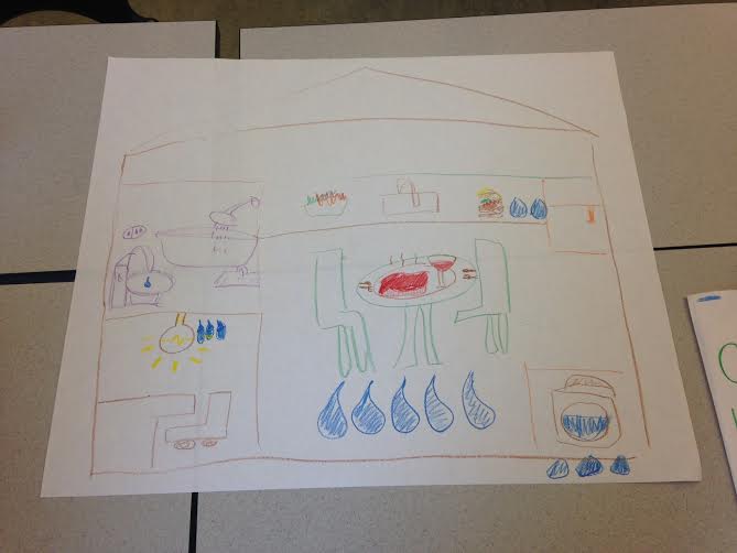
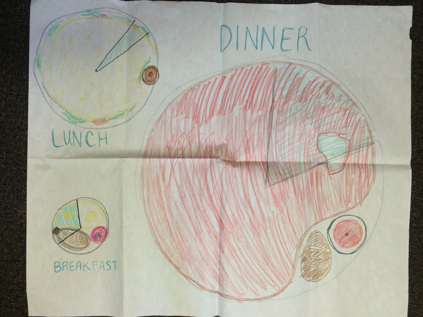
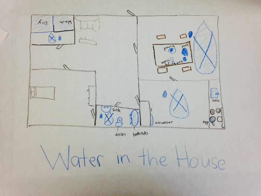
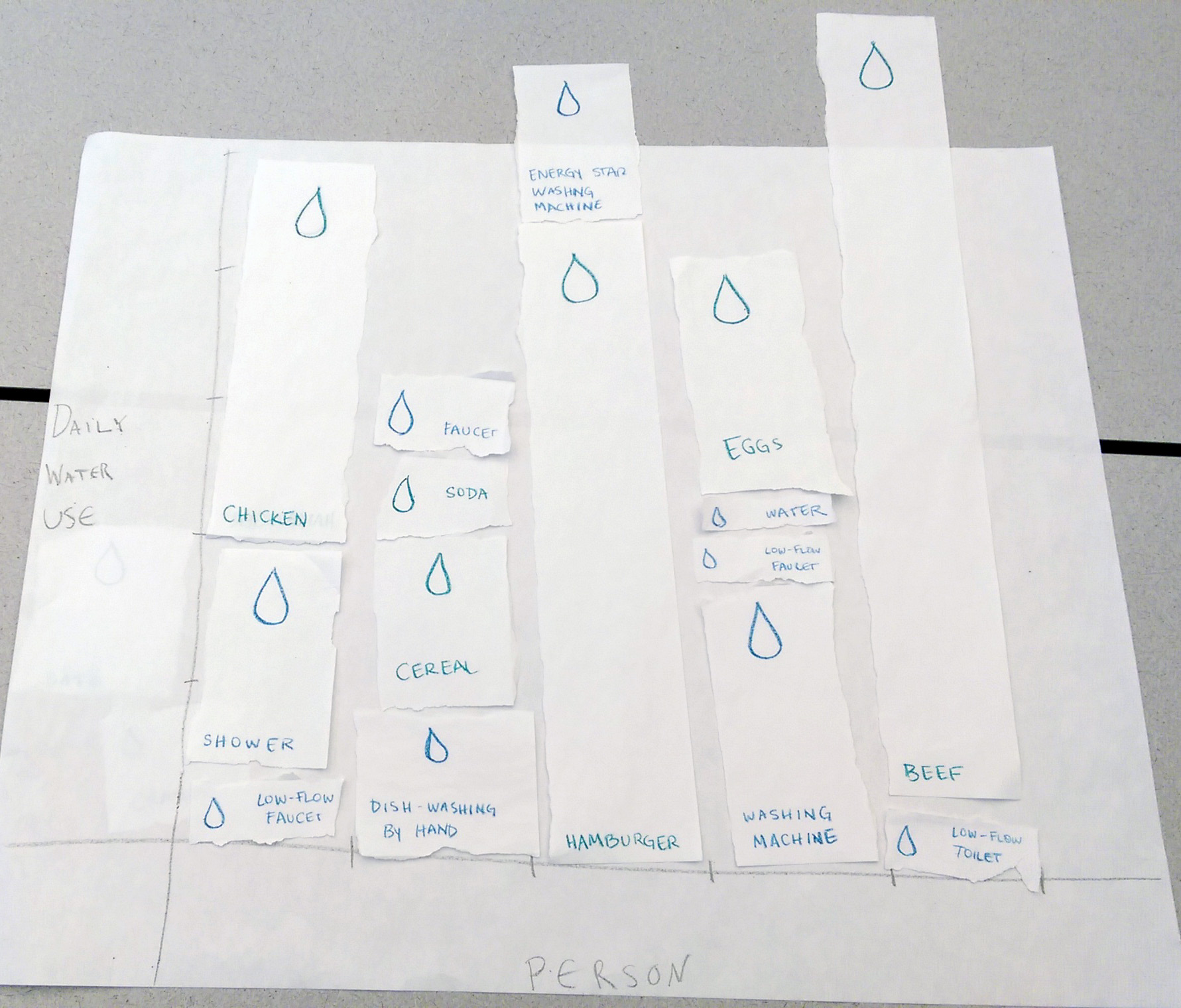
For this assignment, we were challenged to remix the Good magazine water infographic into an interactive, participatory experience. In our design, users can visualize their own water usage by selecting the activities they undertook that day.

20090318-wateruse

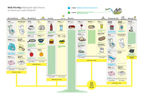
We found that the original infographic, organized in columns with options like “apple” vs. “orange,” or “toilet” vs. “low-flow toilet,” could serve as the interface from which a user select items. On another screen or window, a bar graph would dynamically fluctuate as the participant indicates his or her water consumption. The height of each bar is proportional to how much water each activity or product requires. We also maintained the color-coding from the original chart: bars with blue indicate direct use of water, while green indicates the water used to make that item the user the consumed. By recreating this infographic into an interactive chart, we personalize the understanding of water consumption, allowing users to apply the information in the original infographic to their own lives.

Water Visualization Map Remix

Team: Hayley Song, Tuyen Bui, Deborah Chen

Remix Technique: Map

We used mapping as the visualization remix method to represent various direct and indirect water consumption in a household.  To this end, we decided to draw an outline of a house and map different uses of water inside the house.

water_remix


The data shown in the original infographic was for a period of 24 hours, but we decided to construct a story by focusing on our daily actions rather than the flow of time.  Additionally, the original visualization shows a comparison of the water usage between appliances with different levels of efficiency (e.g. high efficiency washing machine vs regular), but we’ve chosen to focus just on regular usage and make this the dominant narrative.

The size of each room is proportional to the amount of water that directly or indirectly results in water waste.

Each room shows the key causes of water waste within the room. The kitchen is drawn the biggest and is placed in the center of the house to highlight it produces the most water waste in the house.  The steak and wine, in the middle of the kitchen are the major causes of indirect water waste in the kitchen.  The bathroom has a bathtub, a shower and a sink; the laundry room contains a washing machine.

We indicated the amount of waste by the size and the number of water drops under each component. Future work would involve adding the numerical quantity of how much water was used.


Water Remix

Val Healy & Ceri Riley

Optimized-waterremix

We remixed the water usage infographic into a map, specifically focusing on the food components rather than the appliances.

This map shows one’s breakfast, lunch, and dinner plates, scaled to represent the relative amounts of water these meals virtually use. In addition to the plates themselves being proportional to water use, the foods and drinks on the plates are also proportional to their respective water footprints. The blue pie slice of the plate represents how much water you would use if you chose the “better” option for your meal — for example, the chicken, beer, and baked potato dinner would only use about 20% of the virtual water that the steak, wine, and bread dinner would.

If we were to actually develop this visualization rather than just sketch it out, we hoped to show the old vs new plate maps for each meal. If you hovered over the blue region of a given plate, you would be shown a proportionally smaller plate with the new foods arranged on it by virtual water use. This would allow for quick visual comparison between two meal options. And, if you hovered over any given food, you would be shown the amount of virtual water (in gallons) that was required to grow it and/or its percent contribution to the total virtual water use of the meal. So our food map visualization would look simple at first, but ultimately contain a lot of the same numerical data that the original dataset included.

Water Remix


2015-04-07 16.30.48


Team Members:

Edwin Zhang

Danielle Man


Water Data Remix!

Our group was tasked with taking the original water usage data and providing a way to communicate it by making it interactive.

Looking at the data, we found that while some of the information involving direct water use was more obvious, the amount of water ‘virtually’ used for common products was the most surprising. In one example, an item like steak is illustrated as consuming 1500 ‘virtual’ gallons of water.

Though the virtual gallons of water are not directly used in say, feeding a cow that would later become steak, the the amount of water reported in the sheet is to envision the water used in processes that lead to the end product.

As a way to envision the amount of water involved in both the processes and the actual water used directly, we decided that it would be interesting to have an ‘exhibit.’ By filling up water balloons one at a time and exchanging them for tickets, a person could then exchange those tickets for various items. In doing so, a person could better understand the differences between the amount of water consumed for each item by engaging in an amount of work reflective of the water consumption.

Water Remix

Mary Delaney

Stephen Suen


We worked on a physical way of depicting the data from the water infographic. The amount of water used in the production of some foods as compared to others, especially in the production of steak immediately jumped out to us. However, we quickly realized that neither of us knew how much the 1,500 gallons of water necessary to produce a pound of beef actually was. After some quick calculations, we figured out that 7.5 gal is about equal to 1 cubic foot, meaning that 1,500 gallons of water is about the amount of water needed to fill at 25’-long lap pool. By contrast, the amount of water needed to produce one serving of chicken, is about a bathtub-full. To emphasize the huge amount of water necessary to produce a steak dinner as compared to a chicken one, we proposed having a bathtub and a lap pool next to each other to help people really understand how much water, in absolute terms, goes into a relatively small piece of meat.


photo-40

Map Remix

Tami Forrester
Harihar Subramanyam

We remixed the water usage visual as a map (please excuse the upside-down text – we did it just so we could both write at the same time).

It is a floorplan of the home. All water-consuming appliances or food are drawn in blue. Each room is overlaid with a water drop. The water drop would contain the total water usage of that room (by aggregating the counts in the original visual). The area of the water drop is proportional to the water usage in gallons.

WaterMap