Demographics of Boston Districts and Neighborhoods

Author: Tami Forrester

I chose to look at one dataset that showed the race distribution by city council districts in 2010, based on information from the census. Unfortunately, it was presented in pdf form, which limited interactivity, though I found it interesting that of a total population of 6.5 million, white people accounted for around 81 percent of them, and led the population totals in all but three districts – Districts 4, 5 and 7. After looking at the dataset, I thought of the following questions

  1. Neighborhoods vs Districts? Could these be mapped out?

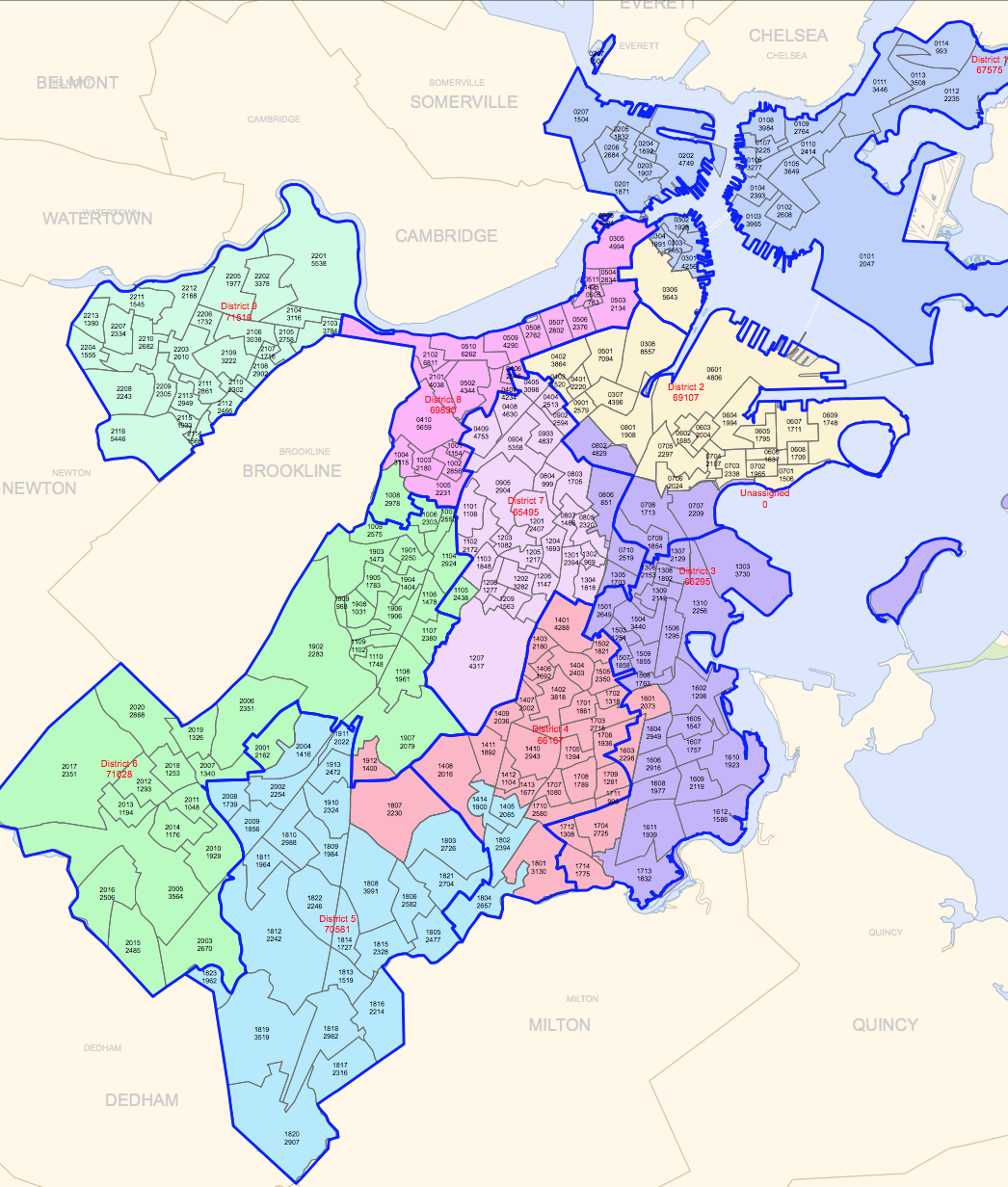
Looking through this table and other datasets left me confused as to how city council districts compared or related to neighborhoods. According to a link on the City of Boston website, the districts are mapped out as so:

Screen Shot 2015-03-10 at 1.33.17 AM


I was also able to find another map showing crowdsourced neighborhood boundaries based on a survey.

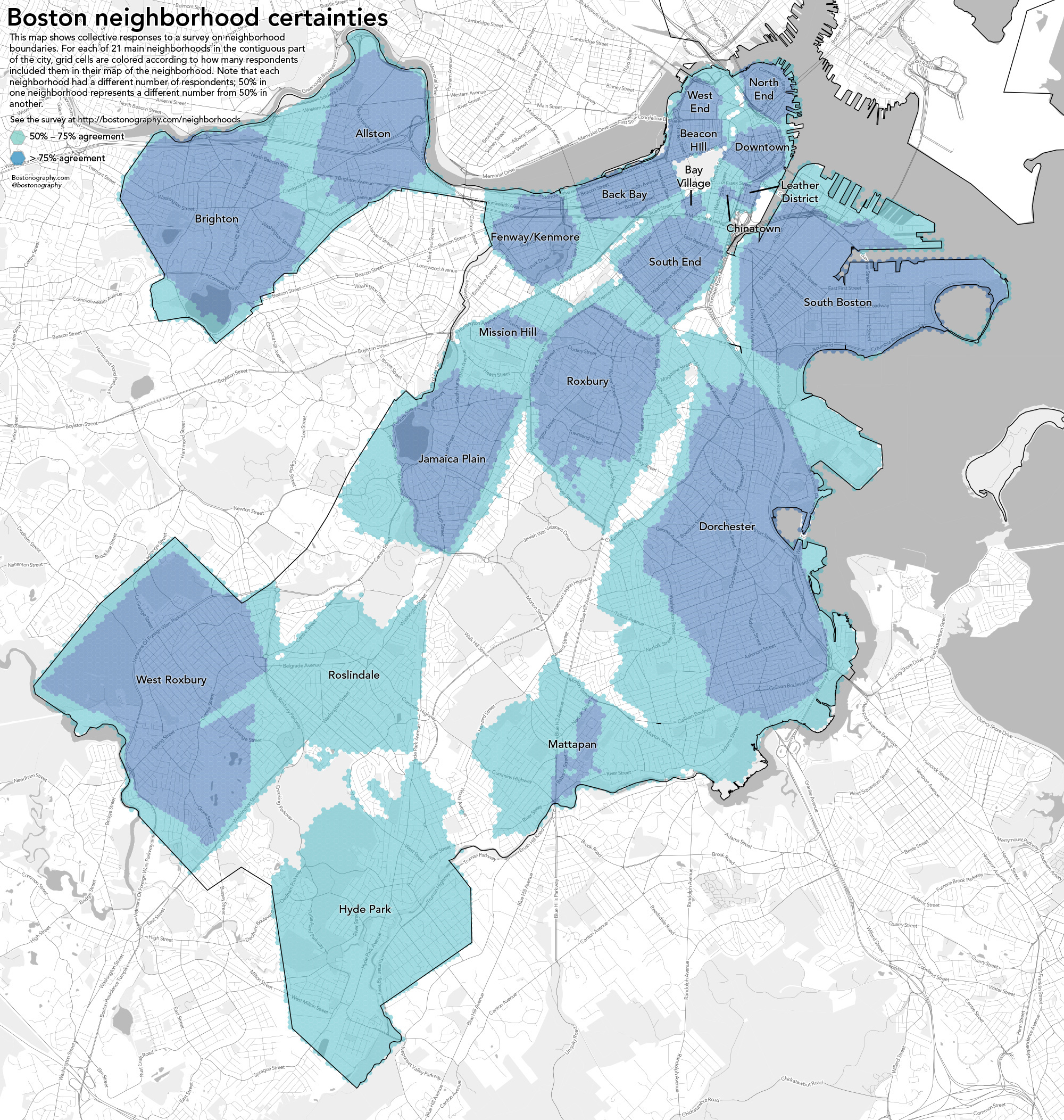
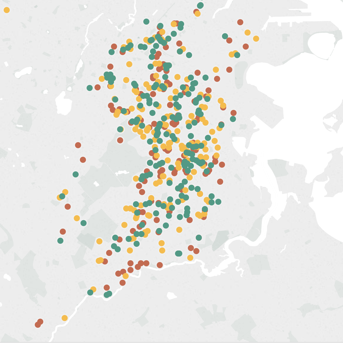
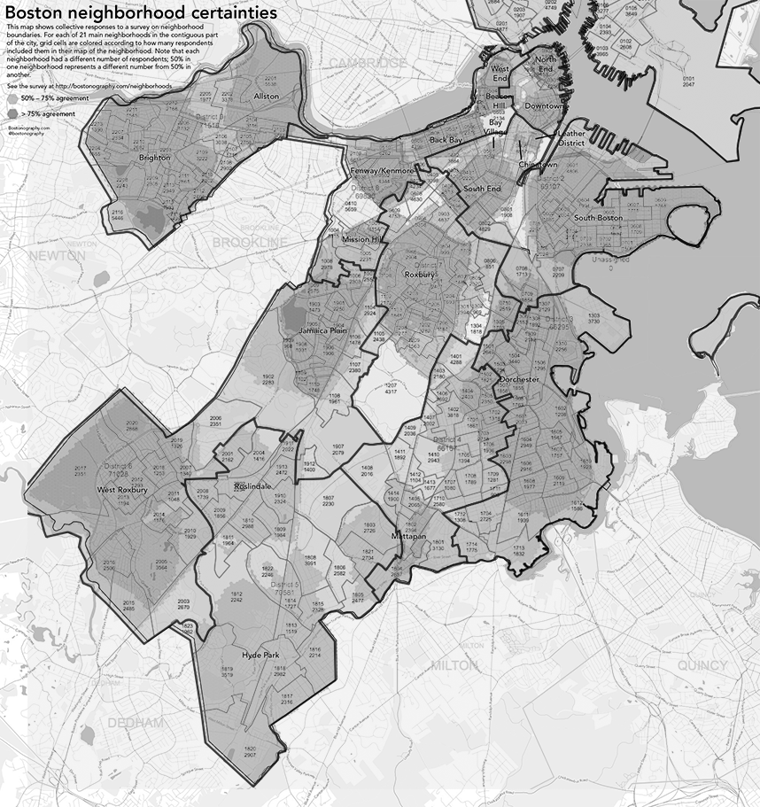
I tried to overlay the two images to see if it would make for an easy comparison, though it it mostly confusing to look at.

overlaymaps
Dark black lines refer to city council district boundaries, and shadings refer to the crowdsourced neighborhoods


I also searched through datasets on the City of Boston site, but most only contained data about neighborhoods, and didn’t show relationships between them and districts. I was able to find a document on the City of Boston site, which compared the racial distribution over both districts and neighborhoods. However, trying to convert this data into an interactive form proved very tedious because it was locked in a pdf. Even after using an online tool to convert pdfs to excel spreadsheets, the formatting made it difficult to work with in Tableau.

  1. How have these demographics changed over time?

Another google search led me to yet another pdf of data showing how racial demographics have changed for specific years 1990, 1993 and 2002. I wasn’t sure why the specific years were chosen, and I didn’t try to analyze this in tableau, but was able to look over and see trends. I found it interesting that the amount of people identifying as various races in 1993 and 2002 was exactly the same both years, though the distribution over all districts in each time were different. For example, 140,305 people identified as black in both 1993 and 2002. The amount of black people per district was not the same between both years, however.

  1. What are some characteristics of the different districts?

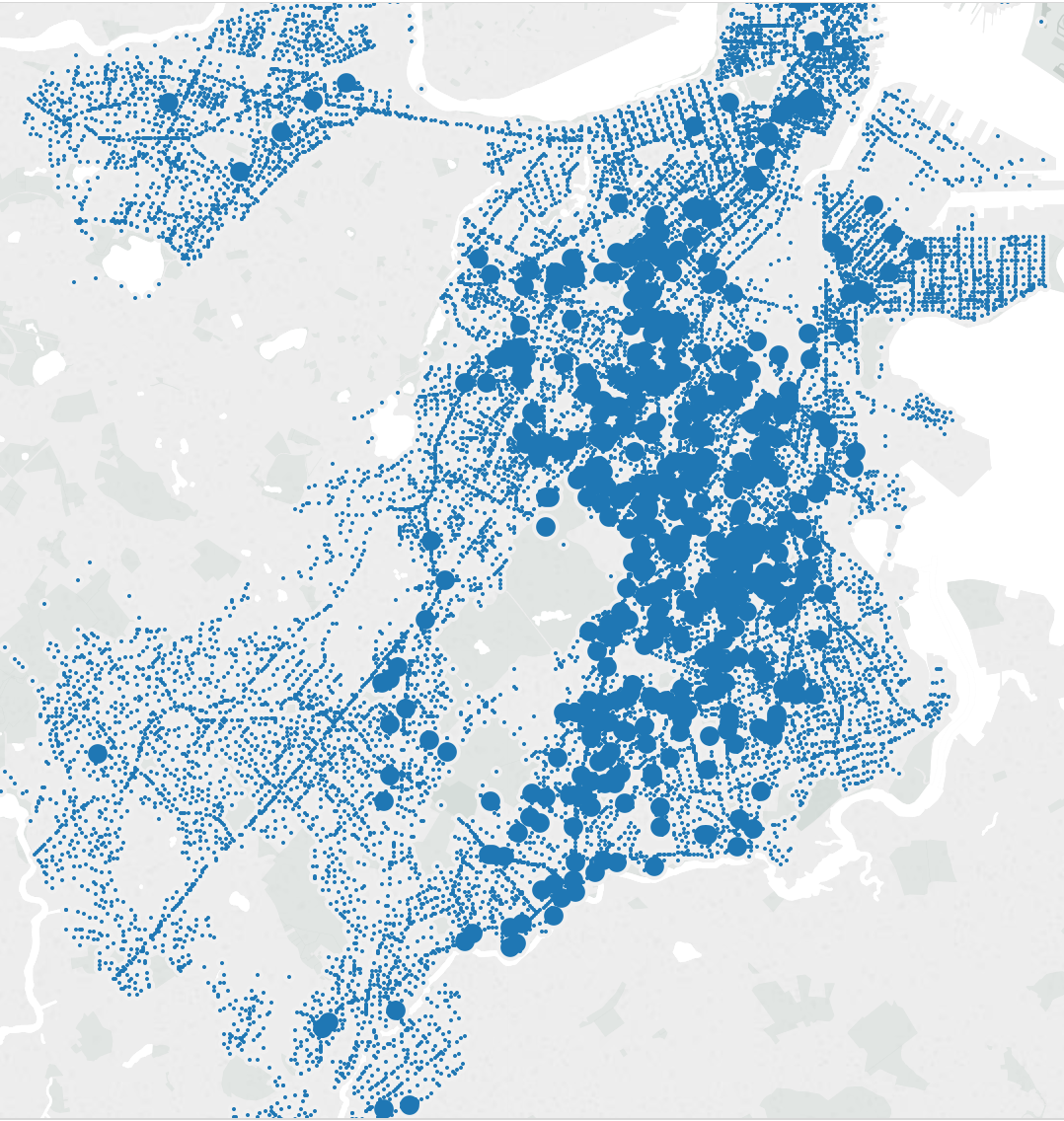
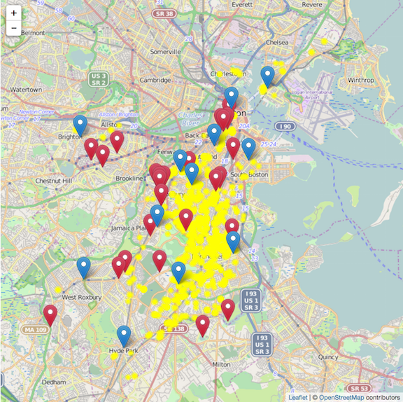
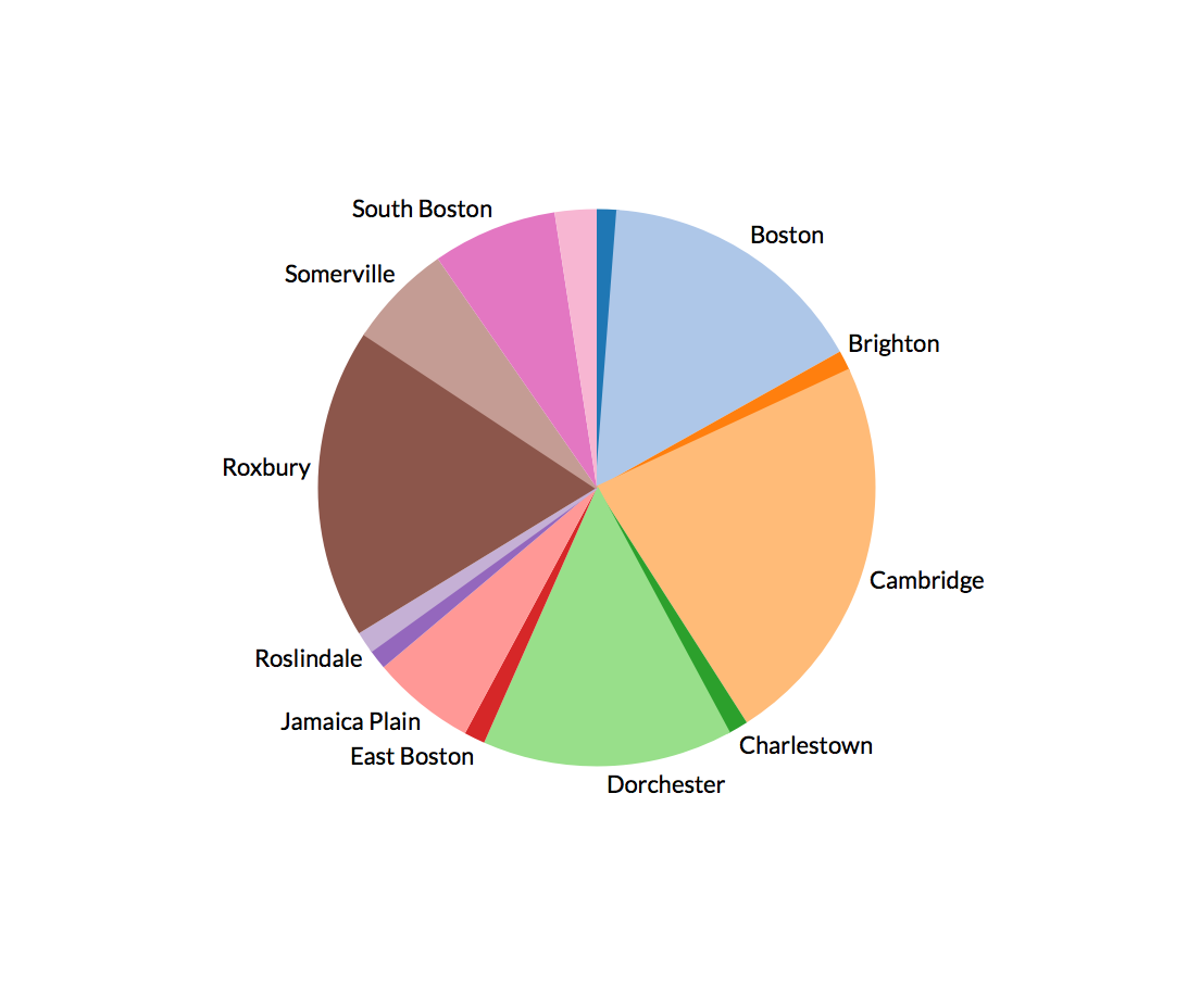
Two characteristics I looked at specifically listed the public schools in Boston, and the crime incidents as reported by Boston police in 2012. Unfortunately, the schools were not mapped to their zones, but the crime incidents also included the zip-code and region area they were reported in. Using Tableau, I mapped the number of incidents that were reported in a particular region, and created a pie chart with neighborhoods mapped to the percentage or incidents reported.

Screen Shot 2015-03-09 at 11.58.10 PM
Mapping of zip-codes colored by the number of crime incidents from Tableau. Regions that were more “green” had the most reports.


Pie chart as generated in Tableau. I couldn't figure out how to place the unlabeled sections (which did actually have regions)
Pie chart as generated in Tableau. I couldn’t figure out how to place the labels for the currently unlabeled sections (which did actually have neighborhoods)

The crime incident reports also had a field called “reptdistrict”, which was presumably another metric used to characterize a particular region, though it was unclear what it meant.

Snow and Icy Sidewalks of Cambridge

Authors: Desi Gonzalez, Stephen Suen

One interesting finding from looking at the data:

We choose to look at two open datasets from the city of Cambridge: the first documented unshoveled and icy sidewalk complaints since January 1, 2008, and the second recorded snow and ice sidewalk ordinance violations since December 1, 2007. Looking at the datasets, we noticed that snowfall complaints seem to be grouped around a day or a span of a few days. This made sense, considering that these entries likely correspond to major snowfalls. However, we noticed a few entries that are unusually out of the season—one in September here, one in May there—which might be due to human error when entering data.

Are schools more likely to be closed when there are more unshoveled/icy sidewalks?

Public school closures – We found this data by using Twitter search (which was recently updated to include all historical tweets) on the Cambridge Public Schools account for “Cambridge Public Schools will be closed,” the boilerplate language the CPSD uses to announce school closings. However, these results only go as far back as the Twitter account and do not cover the entire range of the sidewalk data set.

  • (2015) Jan 27-28; Feb 2-3, 9-10
  • (2014) Jan 3, 22; Feb 5
  • (2013) Feb 8, 11
  • (2012) Oct 29 – Hurricane Sandy (not relevant)

University closures – Once again, we used Twitter search on @MIT, but this time there was no standard template so we just searched for “closed” and manually went through the tweets to include/exclude dates as appropriate. This process could be repeated for every university; another option would be to use the Twitter API to automate this given a list of university Twitter handles.

  • (2015) Jan 27-28; Feb 9-10
  • (2014) Jan 2
  • (2013) Feb 8
  • (2012) Oct 29 – Hurricane Sandy (not relevant)

How does the frequency of unshoveled/icy sidewalks relate to weather data (temperature/precipitation)?

Weather Underground has tables of temperature, precipitation, and events (e.g. “snow”) going back to 1920. The maximum query is about 13 months from the specified start date, so 7 different queries would be required to get all the data since 12/1/2007. The tables can be downloaded as CSVs and combined into a single table. At this link, we tracked down a query from 12/1/2007 to 1/1/2009.

Are the major roadways that are deemed “snow emergency routes” more or less likely than smaller streets to have snow or icy sidewalk complaints or violations?The City of Cambridge has identified several major arteries on which, during a snow emergency, cars are not allowed to park. A quick Google search led to cambridgema.gov’s map of snow emergency parking restrictions. We also found a PDF of that lists the streets from the intersection where the restriction starts until the intersection where it ends as well as whether the sides affected are the odd-numbered buildings, the evening-numbered buildings, or both sides of the streets. Neither data is easy to access or plug into visualization tools like Tableau, so we would have to do some creative copy-and-paste work or research which building numbers are included within these parameters.

Boston’s Urban Orchards

The dataset we looked at was a record of fruit-bearing trees available for urban foraging (with the caveat that you should ask for permission before foraging). The dataset included the GPS coordinates of the tree and the address near where it was found, as well as the organization responsible for the tree in cases where such an organization existed; the species of the tree; and its condition.

The data questions we came up with were primarily about the characterization of neighborhoods containing more fruit trees. One interesting thing we noticed was that many of the trees were near schools (the location label included a school name); maybe this was a consequence of many schools having gardens. We found the following school locations and school gardens datasets (from data.cityofboston.gov) that would help answer this question- we could color or highlight the locations of school trees, or use overlaid heat maps of school density and tree density in order to show these relationships. We also wondered whether there was a correlation between fruit tree density and income, specifically whether higher income neighborhoods were more likely to have more fruit trees, and found the following economic characteristics of Boston dataset. However, we discovered an even easier way to get economic and population data within the Tableau Public app.

TreesIncome

We mapped the Urban Orchards data using Tableau Public, coloring the trees by fruit and overlaying maps of per capita income and also the density of housing units. We found, surprisingly, that per capita income appeared to be negatively correlated with the presence of fruit trees; this could be a result of selection bias, or the that schools and other public community buildings in Boston are not in high income residential neighborhoods, or other reasons we have not thought of. As expected, we see few fruit trees in very densely populated residential areas, and we see that the areas with lower income and fewer trees appear to have lower housing density as well, suggesting neighborhoods that may have been designed to be low-cost public housing.

TreesDensity


Data Hunt: Food Pantries

Team: Mary Delaney, Edwin Zhang

We began by selecting a dataset on food banks and food pantries in the city of Boston. This data set included the names, addresses, and hours for food pantries throughout the city. In total, it had eighty-three unique food pantries and food banks.

One interesting fact that we noticed in looking at the data is that many of the food pantries were centralized to a few zip codes. Over one-quarter of all the listed food pantries were located in either the 02118 or 02139 zip codes, corresponding to Boston and Cambridge, respectively.

When looking at the data, we sought to answers three questions.

  1. How are food pantries distributed geographically throughout the Boston area?
  2. How do food pantry locations compare with the locations where food is grown?
  3. How does food pantry density compare with the income of an area?

To answer the first question, we only looked at the Food Pantries dataset. We found that the food pantries were distributed among twenty-seven zip codes. However, further examination showed that twenty-three of the eighty-three food pantries are localized to two zip codes, and fourteen zip codes had only one food pantry. On average, there were about three food pantries per zip code.

Answering the second question required finding an additional dataset that contained information about where food is grown. We found this data in the Urban Orchards dataset on the Boston City Data Portal. Urban orchards aren’t intended for large-scale food production, but rather indicate a community emphasis on growing fruit trees for learning or preservation.

We then reduced the data to the number of food banks and the number of urban orchards in each zip code. Using zip code for location revealed that that urban orchards were also largely localized to a few zip codes, much like food pantries were. However, urban orchards and food pantries were centralized in different locations. In addition, five zip codes that contained food pantries did not have any urban orchards.

By graphing the data, we can also see a vague relationship with the number of urban orchards and the number of urban orchards by area. Generally, areas with more food pantries have urban orchards.


Screenshot 2015-03-03 12.58.08


This seems to also indicate that food pantries also exist where a sense of community is more prevalent – as the upkeep of both urban orchards and food pantries take the willpower of a community.

We looked at getting income information by zip code from city-data.com, which provides information like median household income and population around Boston and Cambridge. While the page exists as a map, the information is provided also in text form and can be scraped and then compared to both the data on urban orchards and food pantries.


Sources:

Food Pantries (https://data.cityofboston.gov/Health/Food-Pantries/vjvb-2kg6)

Urban Orchards (https://data.cityofboston.gov/Health/Urban-Orchards/c7cz-29ak)

Boston Income (http://www.city-data.com/zipmaps/Boston-Massachusetts.html)


Data Hunt

Group: Val Healy, Tuyen Bui, Hayley Song

    For our data hunt, we chose to examine the 2013 Boston Employee Earnings dataset (https://data.cityofboston.gov/Finance/Employee-Earnings-Report-2013/54s2-yxpg). This dataset includes city workers’ names, title, department, earnings (broken down by type), and zip code.

One interesting finding is the seeming correlation between department and earnings. We (tentatively) found, by looking at the data, that Boston Police workers tend to be the highest paid city employees overall, with 44/50 of the highest paid workers being from that department. However, much of their earnings came from sources other than their regular pay, such as overtime, ‘other’, ‘detail’, and ‘quinn’.

We came up with three questions of the data, which are detailed below:

  1. How is the budget earnings allocation per department? Where is the money spent on people? Even though we noticed Boston Police workers seemed to be the “better paid”, when we look closer at the dataset, we can see that the Boston earnings budget is spent on Public Schools employees with over $600M VS $345M for the Boston Police Department. One way to understand it is that the Public Schools budget is high because it has to pay a higher number of employees (over 50,000 people).
  2. We were also curious about the relationship between the incomes and places of residency.  We conjectured that different income levels would contribute to where people choose to live; we would like to see the distribution of locations of residency grouped by the income levels.  The report provides us enough information to answer this question: total earnings and zip codes.  First we need to sort the data by income and group them into four income levels: low, low-middle, middle-high, high.  We need to have some context in order to set the breakpoints for these four categories. We realized that it would be helpful to have data on Massachusetts’s annual average or median income in 2013.  We were able to find the data by querying U.S. Census Bureau’s database. Using the data, we can establish the range for each category. Then, we can scatter-plot the distribution of each group on the map of Greater Boston Area.  The map can be easily found online, but we prefer to use python’s Basemap and Matlibplot libraries with the appropriate longitude and latitude to display the distribution.
  3. Lastly, we were interested in visualizing the breakdown of the Boston Police employees’ wages, as much of their earnings were comprised of earnings outside of their regular pay. What percentage of their pay is due to overtime or other sources? Does this percentage vary by position? How do they compare? To accomplish this, we would take the data from all police employees, add up the numbers in each category, and produce a pie chart of the results. If we wished to break the numbers down further, we could separate the data by position and create a set of pie charts. All of this data can be sourced in the original data sheet.

School Gardens

Jia Zhang and Laura Perovich

The primary dataset we chose to investigate is the “School Gardens” (https://data.cityofboston.gov/Facilities/School-Gardens/cxb7-aa9j) dataset from the boston data portal. This dataset lists all schools in the Boston area that has a school garden.

 1. What is a school garden?(Rahul)

 We were wondering this ourselves. What does this dataset actually mean? It is helpful to created a visual dictionary of what school gardens are and for this we created a google map to zoom in on the different schools. It is hard to locate gardens, but what we found instead is that while the visual setting of these schools are diverse, we see a particular pattern. High schools are surrounded by parking spaces, middle schools by colorful markings on concrete.  With few exceptions, schools are enclosed buildings very much separated from the outside communities, they look protective. Some are even shaped so that buildings surround an inner outdoor play place.

A set of ground-level Images of the listed school gardens would further enhance the visual dictionary of school gardens.  These images could be requested from the schools, collected in person, or acquired online through school blogs, Google Image search, new articles, or Google street view. For example images of the Boston Latin School garden are available through a google images search leading to a press article:

http://blog.mass.gov/energy/education/boston-latin-school-honored-for-sustainability-health-environmental-education/

Without cleaning the data much, we made this preliminary map to better see the schools: Screen Shot 2015-03-02 at 9.29.11 AMhttp://www.mapcustomizer.com/map/schools%20with%20gardens

This map includes some obvious mistakes, but it is still very helpful for us to navigate and understand the data quickly. We have highlighted some of the interesting landscapes surrounding schools in the post itself.

Some interesting data/images(all from google maps):

At Boston Arts Academy, school gardens and community gardens are the most prominent in the school’s surroundings.

Screen Shot 2015-03-02 at 9.29.41 AM

At other school garden locations, the larger environment makes the schools look more isolated. Overall schools are L or U shaped concrete buildings with playgrounds for middle and elementary schools, parking lots for high schools and a line of trees at the borders of the property.

Screen Shot 2015-03-02 at 9.40.49 AMScreen Shot 2015-03-02 at 9.42.07 AMScreen Shot 2015-03-02 at 9.39.37 AMScreen Shot 2015-03-02 at 9.37.16 AMScreen Shot 2015-03-02 at 9.41.42 AMScreen Shot 2015-03-02 at 9.38.42 AMScreen Shot 2015-03-02 at 9.38.25 AMScreen Shot 2015-03-02 at 9.38.17 AMScreen Shot 2015-03-02 at 9.38.01 AM


Potentially we could analyze these images if we standardize the scale and zoom level to measure the percentage of greenery and gray concrete in each school’s environment. We could go beyond the idea of school gardens to address school settings in general.

2. Context – What % of schools have gardens and how do school gardens relate to other urban planting?

We saw right away that many of the schools on this list were elementary schools. We decided that it would helpful to get the context of school gardens by comparing our list to the list of public schools in Boston found at http://bostonpublicschools.org/.

We also thought it would be helpful to find how school gardens fit into the other urban planting around the city. Both community gardens (https://data.cityofboston.gov/Health/Community-Gardens/cr3i-jj7v) and urban orchards (https://data.cityofboston.gov/Health/Urban-Orchards/c7cz-29ak) are listed in the data portal and could provide context in how school gardens fit into the city’s greenery landscape.  Information on environmentally or ecologically focused businesses and non-profits in the area would also provide interesting contextual information.  A list of non-profits sorted by category can be found at

Screen Shot 2015-03-02 at 2.07.31 PM

http://www.mass.gov/anf/docs/hrd/policies/leave/nonprofit/approved-nonprofit.pdf.


3. Is a school garden an useful indicator of quality of education in a school?

In order to see if school gardens are built in schools with particular economic and academic profiles, we felt that it is helpful to compare the garden locations with both standardized testing scores and income data for the areas the schools are located. Although standardized testing is a heavily disputed measurement of the quality of education, we felt that it did offer a reasonable comparison to the garden data we found because of its comprehensive coverage. MCAS results by school can be procured online at: http://profiles.doe.mass.edu/.  This site also provides detailed information on the student demographics (race, gender), class sizes, student to teacher ratio, and teacher qualifications.  It also sorts schools by type–public, charter, private, etc.  This brings up an interesting question as to whether school gardens are useful indicators of the type of education offered at a school; from an initial scan it seemed that a number of schools on the list are charter schools. 

Similarly with income data, we felt the coverage and standardization of the census data on area income could be a helpful complementary dataset. The American Fact Finder’s (http://factfinder.census.gov/) income data by houshold can be found by selecting by area, and then by category at it’s data portal.
These datasets, starting with school gardens, but expanding to school environments in general would be helpful in potentially determining whether there was a correlation between the quality of education, wealth, and the quality of the school environment.

Boston Children’s Feeding Programs

Amy Yu & Ceri Riley

The primary dataset we looked at represents the locations of Children’s Feeding Programs in the Greater Boston area, ranging from after-school programs to those offered at community centers. According to the data (represented in this bar graph), there are only 19 total children’s feeding programs, many of which are concentrated in the Jamaica Plain region (4) and the Dorchester region (3).

Children's Feeding Programs

From this dataset, we came up with three questions:

1) Does the availability of children’s feeding programs correlate with outcomes such as childhood obesity rates?

Because children’s feeding programs most likely do not have the budget or resources to distribute large amounts of healthy food, we wondered if there were any regional correlations between areas with more children’s feeding programs and outcomes related to child health.

For this question, we found a dataset based on a Google search – a .pdf report about The Status of Childhood Weight in Massachusetts, 2011. Because this report resulted from a BMI screening of public school students in Boston, we can correlate the overweight/obesity statistics from schools within a certain region with the presence of children’s feeding programs. In addition, we could directly look at the difference between body mass indexes of children in a public school with a feeding program, contrasted with those of children in a nearby public school without a feeding program.

2) How does the geographic distribution of feeding programs for children compare to the distribution of food insecure households? How does it correlate with household income?

Our original dataset is also a good starting point to investigate the class question of food security, so we decided to look for data on the economic stability and food security of the various regions in the Greater Boston area. We found these datasets by searching on Google and the Boston City Data Portal.

The Report on Hunger in Massachusetts is a .pdf generated by Project Bread in 2013 that presents Greater Boston-area incomes in relation to average food costs, both of which can be correlated with the locations of the children’s feeding programs. The Food Security in US Households .pdf report was released by the USDA in 2013 to present data on food security nationwide, and we can look specifically at the Massachusetts and possibly Boston statistics to find the most relevant data. The final two relevant datasets are a spreadsheet of Economic Characteristics by Neighborhood 2005-2009 and a .pdf of Boston in Context from 2007-2011, both showing the economic status of specific regions of Boston which correspond to some of the regions where there are children’s feeding programs.

3) How many children are these programs reaching? Is there missing data that should be considered?

We wondered whether these feeding programs are located in areas where there are many children, and/or if they especially targeted areas with children that might need extra care already, for example those that have working parents. By searching on Google and the City of Boston Data Portal, we found several relevant datasets.

To find out the number and distribution of children in the Greater Boston area, we found an excel spreadsheet with the 2010 Census Data for Boston and a corresponding .pdf report describing Boston By the Numbers, Children and where most children live (Jamaica Plain is 6th out of 10 regions and Dorchester is 1st with about 4 times the number of kids). In addition, we found an excel spreadsheet of the types and locations of Day Camps in Boston, where parents might drop off their kids with or without prepared meals, to compare with the feeding programs dataset. And we also found a excel spreadsheet of all the Boston Public Schools to see how the number and locations of feeding programs correspond to the number and locations of all the public schools.

Boston Police Data

Harihar Subramanyam & Danielle Man

We examined a number of datasets about police, shooting crimes crime, and emergency services in Boston. We primarily used the Crime Incident Reports dataset, which indicates the type and location of crimes in Boston. We cleaned the .csv data, separating the latitude and longitude into separate columns, with Python scripts.

We have three questions:

  1. How is shooting crime distributed around Boston?
  2. Do the locations of the police stations and hospitals make sense given the crime distribution?
  3. How does police violence (especially towards minorities) in Boston compare to other countries?

Question 1: Crime Distribution

Let’s look at the shooting crime distribution over time and location.

Let’s plot the shooting crimes on the map.

map_of_crimes
Map of crimes around Boston. Large blue circles are shooting crimes. Small blue circles are other crimes. See full visualization here

We notice that shooting crimes are not small in number and that they are clustered in central Boston. Now let’s map shooting crimes by year.

Map of shooting crimes by year. See the full visualization here.

It appears that the distribution has not changed much year to year.

Question 2: Police Stations and Hospitals

Now that we know where the shooting crimes are, let’s see if police stations and hospitals are optimally positioned to respond to them. To answer this question, we need more datasets. The Boston Police District Station and Hospitals Locations datasets give the names and locations of the Boston police stations and hospitals, respectively.

The map below shows that the hospitals (red) and police stations (blue) form a ring around the cluster of shooting crimes and are within one mile of almost every shooting crime.

Hospitals are red and police stations are blue. They form a ring around the crime cluster. See the website here.

Hospitals are red and police stations are blue. They form a ring around the crime cluster. See the website here.

Question 3: Police Violence

Finally, given that police violence is a growing concern in the U.S., let’s look at how Boston compares to other cities. Again, we need more data, so let’s look at Fatal Encounters.

Killings by state. For the full visualizations see here.

Killings by state. For the full visualizations see here.

We notice that Massachusetts does not stand out compared to other states. Looking at counties shows that Boston has fewer killings than almost all other large cities – see here.

Finally, we focus on Boston and look at the number of killings based on race, gender, and symptoms of mental illness.

Distribution of fatal encounters.

Notice that primarily men are killed, but that the distributions seem to be similar over the races.

Conclusion

We started with the crime incident dataset and combined it with other data (hospitals, police stations, and Fatal Encounters) to pose questions about crime distribution, police/hospital response, and police violence. With some visualizations, we explored the questions and discovered some interesting factoids. For example, hospitals and police stations form a ring around the cluster of crimes and police violence in Boston is not as extreme as in other cities.

Further exploration of these datasets, and perhaps other datasets, can help answer our questions.