Mapping the SNAP-friendly Stores in Somerville

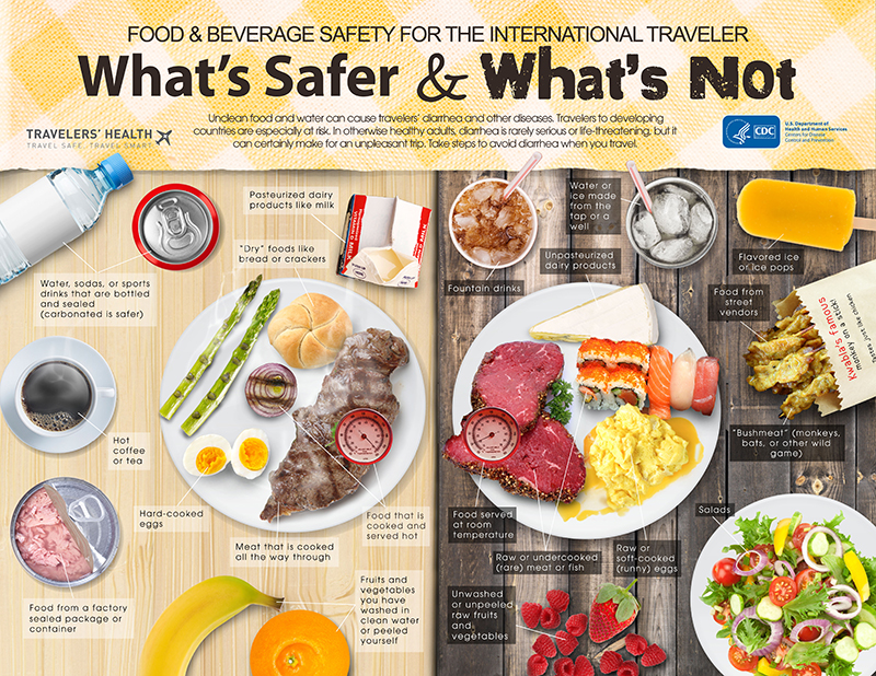
Deborah, Tuyen, Hayley

Following up with our data sculpture, we wanted to see where the retail stores that accept the SNAP are located in the two-dimensional map. We were curious to compare this 2D mapping to the 3D data sculpture: which visualization would feel more trustworthy and give more “authority” to our data and story? which one would more effectively represent the scarcity of the farmer’s markets?

Audience
So, the intended audience of the following map was ourselves. It was created to help us understand the strength and weakness of visualizations in 2D and 3D.

Data & Filtering
We first downloaded the USDA data that contain the list of retail stores which accept SNAP in MA. We then filtered the data to get the lists of stores with the Somerville’s zipcode: 02143, 02144 and 02145. Here is the link to our filtered data. Unlike our data sculpture for which we categorized the stores into four groups (Grocery store, Supermarket, Superstore and Farmer’s market), this time we divided the stores into just two categories: farmer’s market and non-farmer’s market. Non-farmer’s market category includes grocery stores, supermarkets and superstores.  We made this decision in order to highlight the scarcity of the farmer’s markets (that accept SNAP), relatively to the number of other retail stores.

Here is the link to the same map of SNAP-friendly stores in Somerville.

SNAP-friendly stores in Somerville, MA

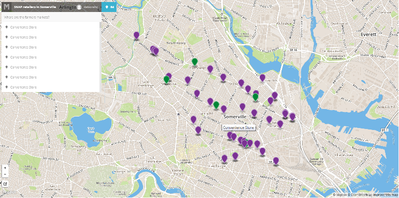
Although this 2D map lost the physicality of the balloon sculpture and the audience did not have a chance to feel the physical challenge of reaching/searching for the farmer’s markets, we found the exploration option using the side pane quite useful. We were able to click on the name on the side pane (that lists all mapped stores by its type), and the map would adjust the center of the view according to the location of the store; it felt as if we are looking around even though the degree was limited. Searching through the long list of non-farmer’s markets in the pane also allowed us to experience how rare the farmer’s markets with SNAP are. We had to scroll down multiple times to encounter a farmer’s market.

Breaking the Stereotype on SNAP Recipients

Tuyen, Deborah, Hayley

Conservative media and lawmakers often perpetuate harmful stereotypes about SNAP recipients, often insinuating they are irresponsible and “undeserving” of the benefits they receive. For example, Donney Furgerson, Republican Senior Stockman’s Senior Communications and Policy Advisor criticized SNAP as a “liberal stunt” of the economic growth while supporting the cut-down of the SNAP benefits. Our goal is to take a closer look at one such stereotype, that SNAP recipients prioritize “junk food” over more nutritious options and show the story is much more nuanced and complicated.

In fact, data from the Food Insecurity Among Somerville SNAP Contingent survey show that people with SNAP want to eat more fruits and vegetables, but that the main barrier is money and access.

Our chart is intended for an audience who is not food insecure – we aim to build understanding and empathy by telling this story. Our visual is a series of pie charts in the shape of various foods. The sentences that accompany the charts describe the data and the reality of SNAP recipients. For example, nearly 50% of the participants in the Somerville survey on SNAP recipients said they rarely or never bought junk food; at the same time, 39.3% of participants said nutrition would be a higher priority “if money were not such a pressing issue.” Finally, there is clear demand for fruits and vegetables – a separate survey, conducted by the Somerville Institute for Community Health showed that 59% of respondents wanted to see more farmer’s markets in their neighborhood, and 30% a “green grocer/produce seller.”

Our first take-on was Google Chart:

junk_food1

However, we felt constrained by the options in Google Chart.     So, we went back to the traditional pens and crayons.

junk_food2

The two different methods helped us organize our presentation ideas.  We decided to create the final version of our data charts by using Picktochart. We also added new data from a national survey on how often Americans buy “junk food” in order to provide some context to compare our Somerville data.

Junk Food Stereotype


Mural Design vs. Code Design

I found the mural design process of our class very different from my previous design processes.  First, let me briefly lay out our mural design process:

  • Introduction to the organization (Food For Free) through the voice of the director
  • Group discussion to find a story based on the follow criteria:
    • importance: impact on the audience
    • relevance: relevant to the organization and to us
    • accuracy: how well-supported by data
  • Summarize the story into a sentence. Add why we want to tell this story -> Sticky!
  • Gather as a class and share each group’s sticky note
  • As a class, write the core sentence of the story we want to tell through the mural
  • Word Web activities with three seed words: security, impact, waste
    • Starting with each seed word, branch out with whatever words that come into mind
  • Collective drawing
    • Each person starts drawing and passes around to next person so that everyone contributes to each other’s drawing in continuation
    • Put on the board and share
  • Decide on the mural design as a class
    • Find repeated imageries/themes from the collective drawings
    • Incorporate them into one design

design_process

Some reflections on this design process helped me to compare it to one of my previous projects.   During the cold and snowy winter of 2014, I  and three other MIT students worked to design an interactive dashboard that analyzes Twitter and Facebook activities of non-profit organizations. Briefly speaking, below is the procedure we followed:

  • Discussion on the basic frame of the dashboard: contents, functions, purposes
  • Analyze data
    • Each team member analyzes same data but work for different goals
    • Push each findings and codes on Github which allow other members to quickly reuse or build upon the code
  • Write a report on the analysis
    • Two members are in charge of the write-up
  • Build interactive dashboard based on the findings
    • Two members are in charge of hosting the byproduct online

This process is similar to the mural design process in that it had modularity and involved group efforts within each module. First, the modularity arose from the step-by-step procedures and several milestones we established as checkpoints: the goal of the project was defined first, and the process was broken down into three smaller steps/milestones.  The difference arises in the way tasks were distributed between the members.  Instead of a group of individuals working together to finish a small module, each person was in charge of a designated task at each step. Each task was discussed after the corresponding milestone was reached, and each code was ready to be reused by other members if needed.  This combination of distribution and code-sharing helped to maintain communication between members while enforcing the modularity in the process.  It was however harder to understand other members’ tasks and thought-process, which required that everyone became an expert in his/her given task.  In comparison, the mural design process did not rely heavily on any particular individual because each module was done in a group.  I definitely felt that the mural process better captured the ideas common and prevalent in our class; it somehow felt more democratic.

The two design processes discussed above share similarities in its step-by-step approach and distributed workload.  However, they are different in the way each step is finished and each task was incorporated into the final design; the design mural process had one more filtering layer in which the entire class decided what to include from each group’s work.  Both of the processes have pros and cons, and it is important to know which path to take according to the goal and circumstances of the work.


A Day of Tracking down Data

Date: 2/11/2015 (Wed)

7am

  • check time using my iphone and go back to sleep

8:45am

  • Waken up by alarm, snoozed the alarm, drank water (~three gulps out of a pitcher)
  • Ate a yogurt, two eggs for breakfast. While eating, look outside through window and realized it started to snow again. i.e. gathered information about today’s weather.
  • Attempted to check the weather/temperature using iphone, but it took too long (perhaps it was also trying to get out of its sleep mode too) and I didn’t really need/want to know the temperature, so I closed my phone.

9:00am

  • check time again and rush down to BC gym for  morning exercise.

9:03am

  • Started biking: the machine kept track of the calories, resistance, speed, heart rate, muscle used throughout my workout.

10:10am

  • Checked the time, logged into gmail using my iphone
  • Took an elevator to get back to 5th floor.

10:19am

  • Used bathroom: some system in the dorm must have been keeping track of how much water I used, the electricity used to light the bathroom and heat up the water.

11:10am

  • Bought a cup of coffee and payed using my credit card.

11:15am

  • Swiped my ID in order to get into the Athena Cluster
  • Logged into the computer using my ID and password

11:30am

  • Logged into my gmail, read emails, filter out spams, added two important events to attend on the google calendar.

12:18pm

  • Create a google doc to record this document

1:10pm

  • Used my BOA online account to make transfer between my accounts
  • Bought lunch from Anna’s and used my credit card to pay
  • Checked my Facebook and replied to messages: FB kept track of not only the messages I wrote but also in which city and at what time I wrote the messages

2:20pm

  • In 6.033 Lecture, I answered an in-class vote

5:00pm

  • Swiped my ID to get into the Margarat Cheney’s room

5:30pm

  • Used an elevator in Rotch
  • Used a printer to print a problem set for 6.045 and readings for 6.033

6:50pm – 9pm

  • Answered an application survey on Piazza Career
  • Emailed a9 interviews and answered their questions
  • Searched on google a bunch of things (such as ‘what is UNIX’, ‘Trailing dot in DNS’, and ‘Regular Expression distributive?’)
  • Logged into Stellar to check psets and readings

10pm-11pm

  • Swiped my ID to get back into my dorm
  • Signed on the “get-better” card for Peggy
  • Set up an alarm for tomorrow morning
  • Practiced some javascript and saved the script on my laptop’s memory
  • Posted a short daily write-up on the blog
  • Listened to Pandora: marked “thumbs-up” or “thumbs-down” to indicate my preference based on which Pandora recommended the subsequent songs

Food Safety For the Travelers

As I started to gather some tips for my trip to France, blogs and guidebooks bombarded me with the pictures of elegant French dishes and long lists of the “Must-Try” restaurants.  Similarly, when I prepared for my trip to China, every resource talked about food–the diverse style of cooking in China, what to try on the Markets, what spices are used, what I must try and what I must not, etc.  It seems like traveling cannot be talked about without talking about food, and I believe that goes pretty much the same with life..!  As an enthusiastic eater and “eye-eater” on food blogs, I recently found this poster that alerts travelers about their food safety.


food-water-whats-safer


This poster categorizes common foods any traveler encounters during their trips into ‘safe’ and ‘not safe’.  It displays actual pictures of the food and successfully grabs its audience’s attention (and appetite).  It must have been hard to skip over this page, if it were on magazines such as ‘Budget Travel’ and ‘Travel & Leisure’.  The poster informs the international travelers that fresh food such as salad, raw fish/sushi and fruits are more dangerous than dry food such as canned tuna and cooked meals such as boiled eggs and grilled vegetables.  It also suggests that while bottled water is reliably safe, tapped water should be avoided or drank with caution, depending on the countries they are travelling.

This poster successful grabs the readers attention by using actual pictures of the food, instead of simply listing the safe and unsafe items.  It also does a good job of pairing the counterparts (for example, bottled water vs. tapped water, cooked steak vs raw meat, boiled egg vs. not-fully cooked scrambled eggs).