Team: Tuyen Bui, Hayley Song, Deborah Chen
Slides: link
Video: link
Team: Tuyen Bui, Hayley Song, Deborah Chen
Our goal was to raise awareness of food insecurity in Somerville and highlight ways in which people can help. We focused on the Somerville Backpack program and the Somerville Growing Center.
We had a discussion around who to target as our audience – either food insecure youth or a more general audience. In the end, we decided we could create a bigger impact by inviting people in Somerville to understand how they can get involved with organizations that work toward alleviating food insecurity. The main impact would be if the video inspired people who didn’t know about these places to get involved or donate. Additionally, one of the organizations we featured, the Somerville Backpack program, emphasized that they wanted to stay very low key to the kids they delivered meals to, as they do not interact with them outside of their teacher, but always needed more private donations and volunteers!
Link to video: https://tuyen.makes.org/popcorn/320m
To evaluate it, we first send a draft of our video to the Backpack program to get their feedback – our criteria for success is if they would find it an effective tool for outreach. They suggested we separate out the footage to make it easier to share. For our opening scene, we inadvertently sent the wrong message by unintentionally showing a “dirty fridge,” which could promote stereotypes of food insecurity. The Somerville Growing center liked the macro introduction to food insecurity at the beginning, but wanted to see a longer, more detailed introduction.
We also surveyed members of our “general audience” to see if the video would inspire them to volunteer. Here is the pre and post survey. In some cases, we recorded the responses in person.
Jay, divorced 45, 2 kids, who does not have enough time to volunteer, but believes in food pantries and shelters for food resources. He liked the video and thought we could be more clear about identifying the type of people that care about food insecurity.
Irene, 70 was willing to volunteer for the Somerville Backpack program after watching our video. However it turned out us introducing the program to her probably played a larger role – perhaps the video is better suited for jumpstarting a conversation in person.
Overall, we believe that the work we’ve done has potential, and initial feedback from the organizations we featured were encouraging. However, there’s work to be done before sending it out to a wider audience.
Team: Tuyen Bui, Hayley Song, Deborah Chen
The goal of our project was to raise awareness of food insecurity in Somerville and highlight ways in which people can help. To this end, we created an interactive video that we hope can be shared and inspire people to volunteer at the organizations we featured, or ones that have similar goals. Our end project has a focus on qualitative data that we collected ourselves, but the story we wanted to tell was motivated by the data.
The first step in our project was to follow-up with Lisa from the Somerville Health Alliance and take a deeper dive into the survey and dataset she brought up in class. The survey asks youth in Somerville about their level of food insecurity, where they get food, and what would help them better access the food they want or need. We also looked at the Rapid Assessment Response and Evaluation of Food Insecurity in Somerville of 2012.
To make sense with this data, we used Excel, Tableau and Google Sheets to make quick visualizations, slicing the answers to various questions by different demographics to see if there were any interesting trends there. By far, the biggest differences were in the responses from food secure and food insecure youth. Using Media Meter’s word counting tool, we analyzed the frequencies of words for questions such as “What foods would you eat more often if you could?” or “If there weren’t enough food to eat at home, what would you do?” This told us there was a gap of understanding between the food secure and insecure.
Here’s the data we worked off: link.
We next met with Lisa and her team at the Somerville Homeless Coalition and talked about our impressions of the data and possible stories. Here, our conversation turned to resources that help address food insecurity. We learned there were many organizations including food pantries, mobile farmers markets, and community meals that were available as resources of the lower-income food insecure population, but many people were either unaware of them, or knew about them but did not go there. For example, 36% of the food insecure youth survey were not aware of food pantries, and 28% were aware, but did not go there. At the same time, many people expressed the desire to help, but did not necessarily know where to go.
In the end, we decided to focus on the raising awareness of food insecurity and Somerville and highlighting ways people can get involved. We believed we could make a bigger impact this way, and one of the organizations we spoke to underscored the need for more volunteers. By making a video, we hoped that visually seeing these resources would inspire people to go there. We chose to use Popcorn Maker, an open source video editor, to allow us to embed pop-ups and links in our video. Our call to action is to learn more about the organizations and ideally volunteer.
We documented our experience and volunteered when possible. We interviewed volunteers at the Backpack program in Somerville who gather every Friday morning to prepare meals. That Friday, there were 6 volunteers and dedicated an hour and a half of their morning to pack the meals at Connexion Church in East Somerville and deliver to the 3 schools around who ordered 75 meals in total. We took video and asked them questions about their experience. We also visited the Somerville Growing Center and talked to youth who were part of an afterschool program.
Goal & Audience
Our goal is to inform the general public about the reality of food insecurity and build empathy and understanding. In particular, our game focuses on how SNAP benefits work and how it “feels” to use them in a real world setting – the grocery store. We acknowledge it is impossible to fully capture and simulate the entire experience of food insecurity, but our hope is that by placing the participant in the setting of a grocery store, which many people take for granted, we can introduce unfamiliar experiences to a familiar setting.
Game
Our game takes place in a small grocery store that we have set up, akin to Shaw’s. When the participants enter, we ask them the following questions:
1.How much food do you buy at a time? (1, 2, 3, or 4 weeks)
2.How many people are you shopping for?
We then ask them to do their shopping based on those answers. When they are ready to “check out,” we total up the prices of what they’ve bought. Then, based on how many weeks of food they are buying and how many people they are shopping for, we tell them how much the USDA Thrifty Food Plan (and by extension, SNAP) allocates for them to use, as well as the average SNAP allotment in Massachusetts. See our data here.
We then ask them, what would you give up to get down to the Thrifty Food Plan allotment? What would you give up if you SNAP was your only budget for money? Based on this, we ask them to put food back. This experience, of consciously deciding what to give up, and physically putting it back, can simulate the budgetary constraints food people on SNAP face daily, and help build empathy.
Finally, we take pictures of the before and after carts. A collection of these pictures will be shown to the participant at the end of the experience.


Notes
We tested out the idea on ourselves at a local Shaws, though given more time, we would have liked to try it out on a general audience and use prices that are not as high as the Cambridge Shaws. If we were to deploy a real version of this game, we would like to set up our own mini grocery store, but if that is not possible, then consider doing it at a real grocery store (though we haven’t thought through the details of that).
Here’s the data for what’s in our carts.
| Weeks of groceries | |||||
| People In Household | Maximum Monthly Allotment (Thrifty Food Plan) | 1 Week | 2 Weeks | 3 Weeks | 4 Weeks |
| 1 | $194 | $49 | $97 | $146 | $194 |
| 2 | $357 | $89 | $179 | $268 | $357 |
| 3 | $511 | $128 | $256 | $383 | $511 |
| 4 | $649 | $162 | $325 | $487 | $649 |
| 5 | $771 | $193 | $386 | $578 | $771 |
| 6 | $925 | $231 | $463 | $694 | $925 |
| 7 | $1,022 | $256 | $511 | $767 | $1,022 |
| 8 | $1,169 | $292 | $585 | $877 | $1,169 |
| Weeks of groceries | |||||
| People in Household | Massachusetts Average Monthly Allotment | 1 Week | 2 Weeks | 3 Weeks | 4 Weeks |
| 1 | $122.86 | $30.72 | $61.43 | $92.15 | $122.86 |
| 2 | $245.72 | $61.43 | $122.86 | $184.29 | $245.72 |
| 3 | $368.58 | $92.15 | $184.29 | $276.44 | $368.58 |
| 4 | $491.44 | $122.86 | $245.72 | $368.58 | $491.44 |
| 5 | $614.30 | $153.58 | $307.15 | $460.73 | $614.30 |
| 6 | $737.16 | $184.29 | $368.58 | $552.87 | $737.16 |
| 7 | $860.02 | $215.01 | $430.01 | $645.02 | $860.02 |
| 8 | $982.88 | $245.72 | $491.44 | $737.16 | $982.88 |
Data & Story
In 2012, roughly 46.6 million people participated in SNAP. According to the 2012 USDA Retailer Policy & Management Division report, 27.66% of the retailers that accepted SNAP were grocery stores, supermarkets, or superstores, while only 0.76% were farmers markets. Additionally, 87.38% of the SNAP benefits were redeemed at grocery stores, supermarkets, or superstores, but only 0.02% at farmers markets.
There is a paucity of farmers markets that accept SNAP, but as we saw in the Rapid Assessment Response and Evaluation of Food Insecurity in Somerville, there is also a demand among those who are food insecure for fresh fruits and vegetables.
We want to highlight this issue for the general public. Our goal is to draw attention to the very small number of farmers markets that accept SNAP nationally show physically how the scarcity makes access to the farmers markets more difficult.
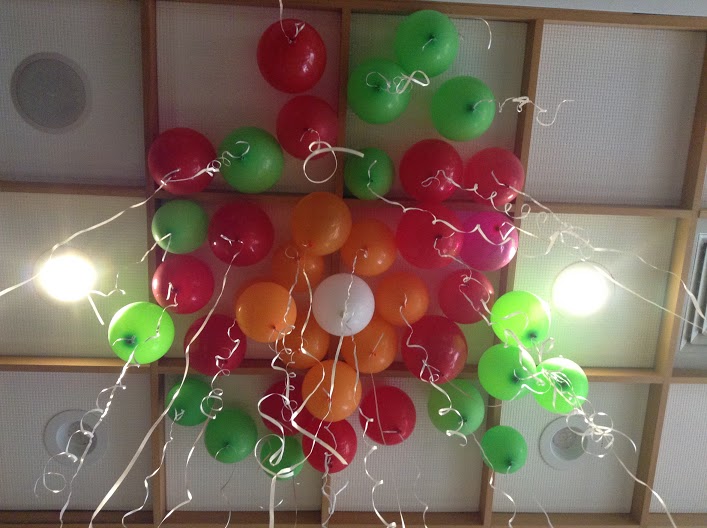
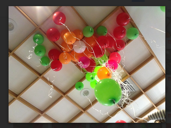
Data sculpture
To do this, we made a data sculpture from balloons. Each balloon of a different color represents 4 major types of stores – grocery stores, superstores, supermarkets, and farmers markets. To show the lack of farmers markets, we have one white balloon to represent farmers markets, and proportionally many of the other categories. For example, superstores are 7.43% of all retailers, so there are 7.43/0.76 = 9 balloons for superstores. We chose these categories because they represent almost 88% of stores where all money was spent.
Arrangement
We arranged the balloons so that the white one (farmers market) was in the middle, while rings of balloons representing the other categories surrounded it. We also played around with different arrangements, such as having the balloons be more “random” and spread out in the 3D space so that they looked more like markers of real locations.
Team: Hayley Song, Tuyen Bui, Deborah Chen
Remix Technique: Map
We used mapping as the visualization remix method to represent various direct and indirect water consumption in a household. To this end, we decided to draw an outline of a house and map different uses of water inside the house.
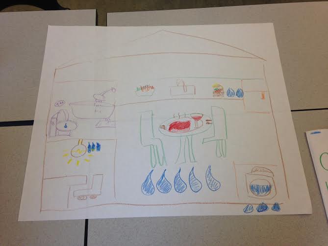
The data shown in the original infographic was for a period of 24 hours, but we decided to construct a story by focusing on our daily actions rather than the flow of time. Additionally, the original visualization shows a comparison of the water usage between appliances with different levels of efficiency (e.g. high efficiency washing machine vs regular), but we’ve chosen to focus just on regular usage and make this the dominant narrative.
The size of each room is proportional to the amount of water that directly or indirectly results in water waste.
Each room shows the key causes of water waste within the room. The kitchen is drawn the biggest and is placed in the center of the house to highlight it produces the most water waste in the house. The steak and wine, in the middle of the kitchen are the major causes of indirect water waste in the kitchen. The bathroom has a bathtub, a shower and a sink; the laundry room contains a washing machine.
We indicated the amount of waste by the size and the number of water drops under each component. Future work would involve adding the numerical quantity of how much water was used.
Hayley Song
Deborah Chen
We are interested in comparing prices at local grocery stores/farmers markets to see how far one’s money can go on food and which ones are the most/least expensive.
We aim to build an interactive web application that allows people to put in their budget for food, select a basket of goods, and compare how much food they can buy in different places. The prices will be from data in various Boston area supermarkets.
Many news outlets and individuals have done their own stories to help readers determine the cheapest place to shop.We’d like to make use of that information, and allow people to find out what the cheapest place to shop for them is based on their own basket of goods. Even if one is committed to shopping where they are, the tool will allow them to quantify how much money one is saving/not saving.
We looked at various sources of data for supermarket prices:
The data shows that for certain defined baskets of goods, some stores are cheaper than others. For example, the report on farmers markets compared the average prices in the farmers markets to those in other supermarkets. The report concluded that, contrary to the common belief that farmers markets would be more expensive, the prices in the farmers markets were competitive to those in the supermarkets.
What can you do? What kind of stories is it good for?
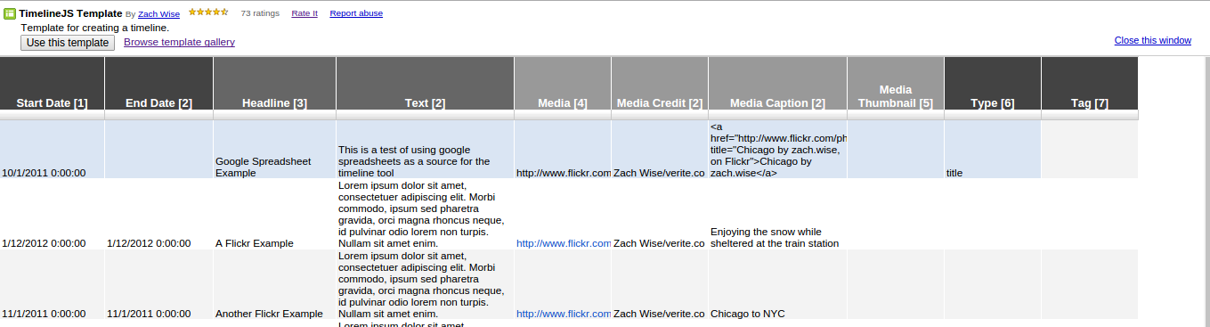
With timeline.js, one can quickly make interactive timelines that contain various types of embedded media, such as images, maps, videos, and tweets. The timeline is automatically generated from a google spreadsheet, so one just needs to enter in the data in the right format.
This tool would be useful for stories where one needs to create a timeline quickly. The creators recommend choosing stories with a “strong chronological narrative,” as opposed to those that involve jumping around in the timeline.
The media ends up being the focus of each event in the timeline, so one should have a lot of media in mind for the timeline; otherwise, it will look bare/repetitive with only text. The creators of timeline.js also recommend that
I can also see a lot of uses for non data story contexts – you could make a timeline of a person’s life, a timeline of a breaking news event, a timeline of government policies, etc. There are many examples of real publications using this tool on the website.
How do you get started?
The documentation on the timeline.js website makes it very easy to get started. I was able to set up their provided template timeline for editing in ~5 minutes.
To publish a new timeline:
1) Open a copy of the template and edit the data in the spreadsheet
2) Publish the spreadsheet to the web
3) Copy the URL of the spreadsheet into the online generator box
4) Imbed the iframe into your website. I was able to make a new timeline.html document, paste the generated code into the document, and open the file locally in chrome to see the timeline.
How easy/hard is it?
The tool is pretty straightforward. There are two main things to learn: the structure of the spreadsheet (i.e. where to paste items, and how the spreadsheet corresponds to the generated UI), and setting up the test html page to see your changes. The example timeline and the corresponding template make this pretty easy to figure out. One thing to note is that there cannot be any empty rows in the spreadsheet.
One nice thing is that once you’ve set up the html document with the iframe, any changes you make in the spreadsheet will be reflected if you refresh the page – no need to generate new iframes/copy paste every time.
No coding is necessary to use this tool (besides pasting the iframe into a webpage). Though the tool is open source, and one can download the source code to further customize timelines, the online interface already provides many options for customization, such as font choice, default zoom level, which slide to start at, etc, making it suitable for most use cases.
Would you recommend this to a friend? Will you consider using it for your final data story?
I’d recommend this tool to a friend! It’s straightforward to set up, and you can embed many different types of media. I’d consider using it for my final data story if there was a need for a timeline.
Also, though this is nominally a tool to make timelines, it’s also a nice slideshow viewer. I can imagine downloading the source code and modifying the display to only show the slideshow parts, while hiding the actual timeline ticker
To create our data mural about Food For Free, we stayed close to the principle of starting with data and finishing with a story. We began by gathering information from Executive Director Sasha Purpura, who spoke about the organization’s history and goals. We then looked at data about Food For Free’s reach, as well as statistics about food security in the United States. Guided by Rahul’s taxonomy of data stories, we came up with multiple stories and chose the one best suited to conveying Food For Free’s mission/impact.
I think this was an effective way to find the story, especially because many of us were unfamiliar with the organization – thus, starting with the data was essential.
From the story, we made rough sketches of potential murals. We identified the common visual themes and incorporated them into the final mural, which allowed many of our ideas to be included. When deciding whether or not to include certain elements, we used the criterion of the story we agreed upon before-hand. I think this gave our discussion a good amount of structure and the process went smoothly.
As for the mural we came up with, its dominant visual structure is the tree. The upward sweep of the roots into the trunk and ultimately the branches is the main storyline through which we communicate Food For Free’s mission, impact and plan for the future. We start at the root, where we immediately see Food For Free trucks beginning to transport food from donor organizations to the rest of the ecosystem/community.Our eyes are then drawn up to the branches, where we see the result of the organization’s work, represented by thriving children and adults in a tree house. Finally, we can examine the messaging interspersed in the mural as fruits and flowers.
In this way, the mural is author driven, which makes sense as our goal is to tell a strong story about Food For Free. This is consistent with Segel and Herr’s suggestion that such approaches are best when the goal is storytelling or efficient communication. There is no interactivity and while there are no linear “scenes” in this single frame, there is a strong linear progression suggested by the tree metaphor, in which you start at the root and make your way up.
The messaging, in addition to being matching the visual metaphor of the tree, is communicated through memorable factoids. This is preferable to overwhelming the audience with large quantities of information – as would likely be the case if we tried to put the raw data and tables we started with onto the mural — and is in line with Segel and Heer’s recommendation that such factoids are often better for a general audience.
Sunday, February 8
11am – 12pm: Check email on phone and laptop, respond to gchats, use water in bathroom
12pm – 1pm: Call two people, check email again.
1pm – 2pm: Check MIT shuttles & Nextbus for grocery shuttle on phone (uses phone location), forward and reply to emails (TA duties)
2pm – 3pm: Eat lunch at grocery store (utensils), use credit card to pay for groceries, obtain grocery receipt, check shuttle app multiple times, read a Medium essay while waiting. When I get home, tap my MIT ID into dorm, send more emails, call my sister, check Facebook, and update Stellar for class I TA.
3p – 4pm: Respond to Doodle poll, copy a google spreadsheet to assign grades, enter them into Stellar.
4pm – 5pm: Catch up on Internet reading – various sites (Atlantic, Wikipedia, HackerNews), call my family
5pm – 6pm: Search artist on Spotify iPad app, put on an album.
6pm – 7pm: Respond to intermittent gchats, check Facebook, look at website for class I’m taking.
7pm – 8pm: Get started on lab1 – lots of google searches, piazza, github, stackoverflow, various blogs. Look at sandwich recipe on AllRecipes, turn on oven, check Facebook, eat.
8pm – 9pm: More gchats, google state of Snowpocalypse, check Twitter.
9pm – 10pm: Look at bread recipes on food blogs, read about various foods (mostly first two pages of Google results)
10pm – 12am: Intermittent gchats, Internet wandering – check my news sites (Atlantic, nytimes, New Yorker, Hacker News, Gawker), watch Youtube, check Piazza, email