Data Game: SNAP Simulation

Background

The average recipient of SNAP in 2015 receives $122 per month. SNAP is meant to supplement, not replace the food budget for a person in a given month – it is intended to cover 30% of that person’s monthly food budget. This means that the projected monthly food budget for a single person is $406.

That leaves about ~$100 a week for groceries. Not every family can afford the extra $70/week though, and as a result some families rely on SNAP to account for more than 30% of their food budget.

The Simulation

  • Construct your family:
    • A player starts by rolling a dice (1-6) to determine the size of his/her family
      • Surrounding players will join that player’s family, depending on the outcome of the dice roll.
    • If family size  > 2, each subsequent person is a child. Each child rolls the dice (1-6) to determine his/her grade: grade=n*2.
    • The head of the family rolls the dice (1-6) to determine starting cash (range $50-$100) for each person.
      • Each member of the family receives $((n x 10) + 40)
        • (a roll of 6 represents the expected budget, where SNAP accounts for 30% of total)
  • Acquire Food:
    • The goal of the game is to plan the most nutritious, delicious, and caloric diet for the week.
      • Each person in your family should consume at least 2000 calories, regardless of nutrition.
    • Go shopping (grocery store/restaurant) and select food and/or meals for purchase.
    • Children receive extra calories from school lunches (5/week) that can be counted towards the family total:
      • K-5: 550-650 Calories
      • 6-8: 600-700 Calories
      • 9-12: 750-850 Calories
  • Winning:
    • A judge will calculate the nutrition of the purchased foods.
    • Round winner is the family whose food  purchases come closest to the daily recommended values for macronutrients (carbohydrates, fats, and protein) and closest to the 2000 calorie/person/day total. Lowest score wins.
  • Scoring:
    • A family’s score is calculated according to:
      • { (|C – 14000*n|/14000*n) + (|SF – 140*n|/140*n) + (|Uf – 315*n|/315*n) + (|Cb – 2100*n|/2100*n) + (|P – 350*n|/350*n) } *100 – 1*(num unique items purchased – more variety!)
      • Where the variables are defined as:
        • C: Calories
        • Sf: Saturated Fats (Recommended 20g per day per person)
        • Uf: Unsaturated Fats (Recommended 45g per day per person)
        • Cb: Carbohydrates (Recommended 300g per day per person)
        • P: Protein (Recommended 50g per day per person)
        • n: size of family

Audience

Our audience is the general public, but we would specifically target middle to upper-class households.

Goals

We aim to invoke empathy from our users by showing them how hard it can be to put together a nutritious, caloric meal on a low-income budget. Our previous research into this subject has shown a correlation between obesity and poverty, and obesity is stereotypically associated with unhealthy eating. As a result, we would like to put the dietary decisions in the hands of those who perpetuate the stereotypes, to see if they would/could make different choices.

Moving Forward

Our game relies heavily on number crunching and calculation. As a result, we would like to turn this into a JavaScript based simulation with a simple user interface, so that our goal of invoking empathy in users will be less shrouded by the sheer amount of spreadsheet lookups and score calculation that the game in its current form requires. Creating a web-based version of the game would not only speed up its pace, but would also allow players/families to explore alternative choices of foods and experience different outcomes.

Data Sources:

Prices taken from Market Basket Somerville Weekly Circular.

https://docs.google.com/spreadsheets/d/11HRyI6HOE-xrhhNYnuA5jJWkKTOiJN8QNsrwBDnWHUY/edit#gid=0

http://www.fns.usda.gov/sites/default/files/pd/18SNAPavg$PP.pdf

Edwin Zhang, Harihar Subramanyam, Tami Forrester, and Danielle Man
Highcharts

Highcharts JS is a complex Javascript tool that helps users create a lot of different types of chart visualizations (plots, pie charts, bar graphs, etc.). It is part of a family of Javascript visualization products produced by Highsoft, a company in Vik i Sogn, Norway. Its sibling products include tools for things like mapping and imaging.

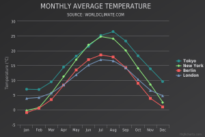
This tool is great if you want to create classic graphs that show trends over time. The types of graphs that it can produce are similar to those that one can produce in Excel, but are much more interactive. This makes for better data exploration, and often times just for a more clear representation of data in general. All of the graphs that you produce with Highcharts have interesting hover effects, such that hovering over particular data points or lines will show specific values which are useful in exploration and probably also outlier analysis. These effects bring a lot of extra life to the graphs.

chart

Since this is a Javascript tool (with great hover effects and interactivity), its graphs are meant to be displayed on the web. Lots of major companies (61/100 of the world’s greatest companies) are already using Highcharts, including Facebook, Twitter, and Yahoo. In fact, exploring most of Highchart’s demo graphs felt very familiar and intuitive to me, likely because I’ve encountered the same types of graphs before on third party websites without realizing it (like the NY Times).

This is an extensive and mature product, and therefore it has support forums in addition to support emails, Github reporting, Stack Overflow help, and a book to reference. It is free to use for non-commercial purposes. Interestingly, all the files are downloadable and therefore customizable. This is something that the company markets in particular, because users can use the existing product as a baseline and alter it to fit their specific needs.

The library can be easily incorporated into websites through simple script tags in the HTML headers and can be used in conjunction with jQuery or as a standalone tool. There are a lot of cool demos on the web, a few of them I’ve linked to here: snow depth v time and population growth by religion.

If you’re looking to create simple, classic plots for a quick visualization, this is the product for you. They have a set of standard graphs that are incredibly easy to plug data in and produce yourself.

This is a Javascript product, so basic proficiency in Javascript is a big plus; however, I don’t think that its necessary because starting from any one of their many demos, it would be easy to plug in your own data and change around label names. It is also possible to make very interesting and complex graphs – the process of moving beyond the basic graphs would be much more involved (and definitely require Javascript proficiency), but it would have a greater value yield and Highcharts has extensive support resources.

I would recommend this to a friend – it is a mature, well documented, and widely used product that can create beautiful and interactive graphs with little effort on the side of the user. I think that it is slightly more intuitive to use than D3.js, though the two products are similar, both being rooted in Javascript. Wether or not I use this tool in my final project will be highly dependent on what I choose my final project visualization to be, because this is definitely a tool for final data presentations, not for intermediate steps or data cleaning.

Design Process

I found our story finding and visual design process fun and surprisingly similar to processes that I have used before for design brainstorming – I guess theres a reason such sticky note techniques are widely used by designers 🙂

Last semester I took a class called Engineering Innovation and Design. As a brainstorming exercise for our final project, we were told to get into groups, grab a bunch of sticky notes, and then write down the first things that came to our mind. We proceeded to put these on the blackboard, cluster them, name our clusters, and work off each others ideas just like we did in our class.

Similarly, over IAP I had the opportunity to brainstorm and prototype a new feature for the company I was working at. In our very first meeting, the head of UI/UX at the company explained the problem, what we were hoping to accomplish with this new feature, and then proceeded to hand me a whiteboard pen. The three of us in the room spent the next hour repeating the process of ‘draw for 5 minutes, talk for 10min,’ and by the time we left the room we had sketches that encompassed about 90% of what the final feature ended up being.

Thinking back now, this process of rapid brainstorming with sticky notes and whiteboard pens is something that I’ve done whenever encountered with a new UI/UX problem. When it comes down to it, I think that data visualization is highly correlated with UI/UX, because you’re taking something that’s otherwise unreadable and trying to make it attainable and emotion eliciting from your readers.

Data Log During the Snow-Pocalypse

How much data can really be logged on a snow day when you spend the whole day in one building and mostly on the same floor? Turns out quite a lot.

8:30 – My alarm goes off. I told someone I would meet them at breakfast by 9:00. I check my phone, read my emails, answer a few messages. The keyboard on my phone (Swift) requested permission to send back data about what I typed to its servers, so presumably it’s doing that the whole time. Google is reading my emails now, since it now shows me my flight information and other ‘convenient’ things, so it was probably doing that all night. I open up Clash of Clans to collect my gold and elixer that accumulated overnight – they’re probably tracking that as you can’t play the game without an internet connection. Apple probably actually collects data about my alarm going off, and wether I turned it off immediately or hit snooze – they already collect data about how far I walk, how many flights of stairs I climb, where I go, etc all day.

9:00 – I take the elevator down to breakfast. The elevator probably made note of the journey and possibly the weight somewhere, for maintenance purposes. I swipe my ID to get into dining – that action was definitely recorded and used by MIT, Bon Appetite, and was stored to prevent me from overeating my share of meals this week. I toast a bagel, as I do every morning. The cafeteria manager is probably keeping track of the total bagels consumed so that she knows how many to order in the next food shipment. I make tea with a Tazo teabag and she probably collects similar data about this too.

9:45 – I’ve finished breakfast and I go to do laundry. The laundry machine records my load, both for maintenance purposes (probably) and to deduct $1.00 from my TechCash account. The water and electricity usage is probably also recorded. I go back to my room to take a nap, not sure how much information about me can be recorded while I’m napping…

10:30 – I switch my clothes to the dryer (similar data is recorded as from the washer).

10:35 – I start working on my 6.046 pset. This includes many internet searches and the occasional facebook (or other form of social media) distraction. The websites that I view undoubtedly record my visit, and probably leave cookies in my computer too. It’s possible that they even recorded my keystrokes while browsing their site.

11:45 – I collect my warm clothes from the dryer. The laundry machine system is aware of this because it will now show that dryer as available in their online interface. I fold my clothes and continue with my pset.

1:00 – Lunch time! Normally I would venture out into Kendall or Central square to buy myself a sandwich with my debit card (while simultaneously contributing to data that the restaurants keep about their daily profit, number of customers, and most popular items), but today I eat a Luna bar and an apple I took from dining while in the company of my pset.

1:30 – I exchange text messages with a friend, asking him if he wants to work on the 6.046 pset with me. The data from that conversation was probably stored somewhere, maybe even by the NSA.

1:35 – My friend arrives and we work on the pset for a solid 2 hours together, talking things out and drawing pictures on paper. I’m not using my computer very much, but I will have to use LaTex to type up the answers at some point, and that will contribute to my computer usage data.

4:00 – It’s time for a break. I pull out my laptop again to watch an episode of Hulu before dinner. Hulu has a list of all of the shows I’ve watched, which ones are my favourites, and what it recommends for me, so my pset break definitely does not go unrecorded. After my episode finishes, I do a bit of internet browsing and get distracted by a cool new belt. Retailers love to collect data about me, so these actions did not go unnoticed either.

5:15 – Dinner time. I normally eat dinner much later, but because of my lackluster lunch, I got hungry early today. Anther elevator ride, another dining swipe, more data about me. During dinner we also get an email from MIT saying that Tuesday will also be a snowday, the dining hall is alight with excitement.

6:15 – I return from dining and open facebook again. I see adds for the belt that I had been viewing earlier, which means that my data went through as many as 3 companies: the original website, a third party advertising company, and now facebook.

6:30 – I return to working, but switch gears to finish up my 6.033 pset. After more googling and consulting a friend, I finish and submit my answers online. My submission was sent to a server somewhere probably in CSAIL so that the course staff can grade my answers.

7:30 – I decide to watch Unbroken with a friend, we’ve been trying to watch all the movies nominated for Best Picture. Since the movie is still in theatres and there’s a Massachusetts State of Emergency declared, we turn to the internet to provide entertainment. The site that we land on is no doubt full of malicious links and is trying to collect data on me for the next 2.5 hours, but it provides video nonetheless and we’re watching it through the incognito window.

10:00 – The night is no longer young, and I turn to reading and internet browsing (more cookies and advertising) for a long time before taking a shower (water usage), setting my alarms (apple data?) for the next morning, and going to bed.

Climate Change: The State of Science

One of the biggest problems facing our generation and those to come is climate change. This topic has sparked political debates, religious debates, industry changes, and is something that I’m particularly interested in because I spent IAP in a city where the pollution causes the visibility on sunny and foggy days to be equivalent.

The data being shown in this video is nothing new, it’s something that our teachers, parents, and peers talk about: the ice caps are melting, the carbon in the air is increasing. What I think the video does well is it provides a visual to this that elicits an emotional response from the watcher. The video shows a time lapse of earth over the next hundred years, where we can actually see what it will look like when our planet is no longer capped with white and when Florida is no longer a dry piece of land.

The video tries hard not to offend watchers and place blame, but at the same time it tries to scare watchers into action. Did you know that the acidity of the ocean has increased 26% since the industrial revolution? Did you know that if nothing changes, the earth will be 4 degrees warmer in 80 years? The video ends with earth being depicted as a ticking time bomb.

The visualization of the data allows even the least technical person to understand. The technique of showing change over time is similar to what Rosling does in his Ted Talk; however, instead of showing past measured data, the video shows projected data if nothing about humanity’s current carbon footprint changes. I think that the presentation is very effective, and that the audience is just your average Joe.