Methodology: Art Crayon Toolkit

Team: Laura Perovich & Desi Gonzalez

presentation

cleaned data

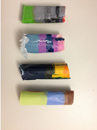
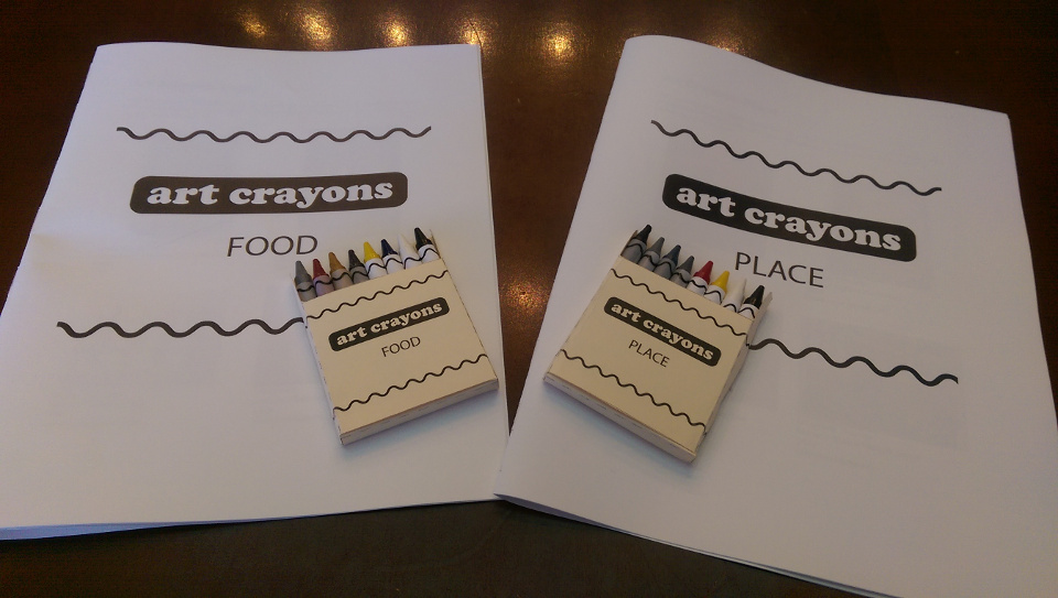
We created the Art Crayon Toolkit, an artistic toolkit that engages kids with famous artworks and gives them opportunities to create their own art. The toolkit consists of: (1) two packs of art crayons, each including four artwork-based crayons and four supplementary colors, (2) crayon packaging (labels & boxes), and (3) an informational creative workbook. The artwork-based crayons serve as physical bar graph of data in each work of art: the height of each color corresponds to the amount of that color found in the painting.

IMAG2641

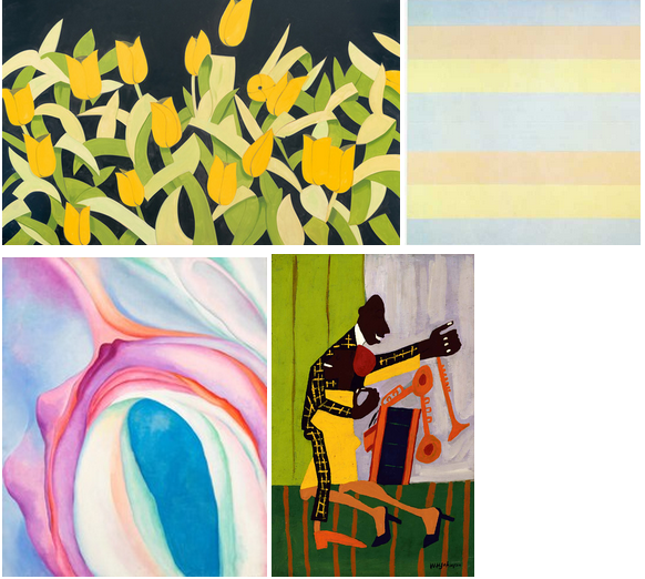
Data for the art crayons came from online sources. We browsed a number of museum repositories to obtain images of the artworks, including Tate, Museum of Modern Art, Whitney Museum of American Art, Brooklyn Museum, Museum of Fine Arts in Boston, Phoenix Museum of Art, and Madison Museum of Contemporary Art, among others. Artworks were initially selected to fit within thematic categorizations, such as food, place, animals, and female artists, that we thought would be a good hook to pique our audience’s interest. We further aimed to include lesser known works, diverse artists, and a variety of artistic styles within each theme.

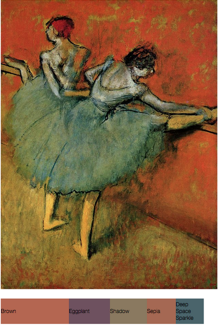
Next, we ran our initial set of artworks through a python script that returned an html file with an image of the artwork and its Crayola color mappings (for example). Many artworks were not well-represented in Crayola color; either the five color limit did not accurately capture the essence of the painting or color mappings seemed to miss the mark (for example, Degas’ Dancers at the Bar [1888, Phillips Collection] yielded brown and sepia colors, while we perceive the background of this image as a bright orange). Based on the color mapping results, we selected four works of art for each of two categories: Place and Food. These categories and artworks suited all of our criteria: the five Crayola colors accurately represented each painting or print, the artwork fit within the thematic category, the artwork had accessible and compelling backstory that would be interesting to children, and the full set of works were diverse in style, fame, and artist demographics. Additional background information on the artists and artworks was found through by researching on museum and artist websites.

Screenshot from 2015-05-14 13:35:53

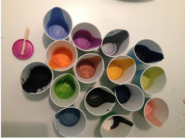
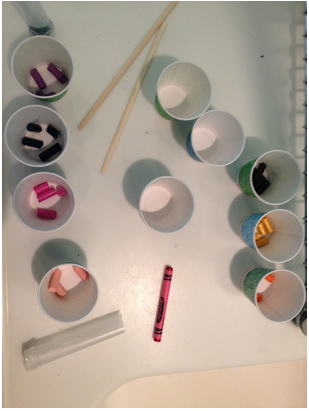
Using this data, we created created the crayons, packaging, and workbooks (Place and Food). To make the crayons, we first created a two-piece mold using Oomoo, silicone rubber compound. We then collected the corresponding crayons colors for each artwork and broken off piece of the appropriate ratios. Each crayon piece was melted with a heat gun and poured into the mold one at a time in decreasing order of color prevalence. Crayon wax had to be fully melted in order to create a structurally sound crayon.

We designed labels and boxes in Adobe Illustrator based on the basic format of existing products so as to be familiar to users. Workbook content and design was based on existing models of art education and engagement for children such as MoMA’s Art Cards, didactic materials for kids to respond to works of art while in the museum’s galleries. We included information such as what the images represent, what style they were made in, and relevant content about the artist. The workbook also includes prompts to draw with the art crayons, both within the context of the corresponding artwork and more freely.

The Art Crayon Toolkit exposes children to artworks of familiar relevant content (e.g the food and place themes), providing short facts, stories, and information that helps deepen their connection to the works, making artworks more accessible by presenting the color deconstruction of artworks, and prompting children to develop a curious eye for art by creating their own pieces. We believe this combination of information and active participation provides a number of diverse routes to increase children’s art engagement.

Data game: color scavenger hunt

Location: Museum (or wing of a museum)

Team size: 3-5 people

Audience: Children and adolescences who may not yet be invested or engaged with art.

Goals: Make the museum experience more active and more goal oriented to engage new populations with art.

Game process:

Each team receives a bag full of everyday objects at the entryway of the museum.  Each object in the bag has a distinct main color that matches to a major color in one of the art pieces in the museum.  Objects also contain a small identifier code.

Once all teams are prepared, they are released into the museum to match their objects to the art pieces.  When they find a piece that they believe matches one of their objects, they scan the identifier code on that object to verify it, and then leave the object by the piece if it is correct.  A system keeps track of the successful matches for each team, and the team that matches all their objects first is the winner.

Data: Color data from artworks and from pictures of the objects of interest.

Team: Laura and Desi

Crayon Art Data Sculpture

Description:  We made “art crayons” for four paintings.  The composite crayons combine the five most prominent colors in a painting into a crayon.  The amount of each color maps to the amount of the color found in the painting.  So you could recreate the painting by coloring with just that crayon!

We made crayons for the four paintings shown below. We used the RoyGBiv python module and Cooper Hewitt’s color mapping python module to find the most prominent colors in the paintings and map them to Crayola colors.  We bought crayons, selected the correct colors, divided them in the appropriate proportions, melted them, and poured them in layers into a mold we created from wax paper, hot glue, and tape.  You can see the results below.

Audience: Kids, adults, people who like art or have a favorite painting.

Goals: Increase engagement with art–you can draw it too!  Make art seem more accessible–tangible and everyday.  Fun and play!

Screenshot from 2015-04-23 14:40:48

(1) Alex Katz, Tulips 4, 2013, Museum of Modern Art

(2) Agnes Martin, With My Back to the World, 1997, Museum of Modern Art

(3) Georgia O’Keeffe, Music, Pink, and Blue No. 2, 1918, Whitney Museum of American Art

(4) William H. Johnson, Jitterbugs (II), ca. 1941, Smithsonian American Art Museum


Screenshot from 2015-04-23 14:40:59

Screenshot from 2015-04-23 14:41:08

Screenshot from 2015-04-23 14:41:18


(Team Artvark: Laura & Desi)

Art data and gender

Members: Desi Gonzalez and Laura Perovich

Topic: museum collection data

Goals: education, increased access to and engagement with museums/art, social change

Techniques: interactive visualizations, physical objects

Story: The data say male artists have a stronger presence than female artists at the Tate.  We want to tell this story because we’re interested in exposing the biases in art museum collections in order to both teach audiences about how women have been historically underrepresented in collections and possibly help shape museum collecting practices in the future.

Data:


I quickly plugged Tate artist data into Tableau and graphed artists birth date by gender. Most of the artists represented in the collection were born more recently. The artists born before 1850 are overwhelmingly male. (“Null” shows up for collectives/groups of artists, but in a few instances it seems like artists weren’t coded; it seems like collectives/collaborative artwork represented in the collection are younger/were born more recently.)


Screenshot from 2015-04-02 14:41:03


We also used R to begin to dig into the data a bit.

Overall, there are 5.6 time more male artists with work at the Tate than female artists.  Male artists at the time have 23.9 times more pieces at the Tate than female artists.  Male artists also occupy more artwork territory in than Tate than female artists: male artwork has 8.2 times more area than female artwork and 9.5 times more volume.

We further considered gender breakdowns by artist century of birth, to see if changes in gender diversity of the profession over time (exact data TBD) may be reflected in the Tate’s collection.  Finds are below:

Representation ratios (M:F) by century of birth

century artists artworks area volume
1600 45 66 252 NA
1700 39 21 186 21.8
1800 24 249 124 789
1900 5.7 9.5 9 23.9
2000 2.2 2.7 2.6 3.4


N.B.  This is an extremely rough and initial analysis of this data.  There is a significant number of NAs in the data that will have to be addressed, as well as some data inconsistencies that require further exploration.  Data has not been fully checked or cleaned.

Additionally, this data would be better understood with further context–such as collections from other museums or overall occupational statistics.

R is for everything

R is a free open-source statistical programming software descendant from S that came out of Bell Labs. Rstudio is a commonly used user interface for R. Both can be downloaded for Mac, Windows, or Linux.  R is widely used and established–it is highly unlikely that it will disappear anytime soon.
R is great for custom data visualizations and advanced statistical analysis.  It also forces you to be structured and repeatable in your data analysis–the process of interacting with your data requires explicitly writing out the steps of interaction, unlike Excel or similar approaches.  Once you have powered through the learning curve you can quickly summarize and visualize your data.
Lots (a majority?) of statisticians use R and share their most recent work through R packages that extend the functionality of “base R” (the initial installation).  Packages that I commonly use include: RColorBrewer, plyr, ggplot2, lattice, stringr, reshape2, and there are many other useful packages out there. Some additional suggestions can be found here and googling will lead to many more results.  R also offers a variety of open source datasets both as a part of a package or the purpose of the package, such as the census data.  R also includes communities supporting particular aims, such as the rOpenGov project.
R does a good job of handling situations common to real data analysis such as missing values or cleaning strings.  It can handle large data (and even Big Data) through a variety of packages such as pbdr.  It can also be used with qualitative or social science data.  It can be used to create maps.  It can be used with LaTex (via, for example, Sweave) and websites (via, for example, shiny) so your analysis can be directly embedded in your output files.  This can be very convenient and reduce errors as your data processes update or your datasets change based on new information.
R is somewhat difficult to learn, though there are extensive online resources the helps the process. Resources include:
  • The R-help mailing list.  A great resource, but use with caution–google first!  Someone has probably asked your question already (especially in the beginning).
  • A collection of R blogs.  Great for keeping up with new work in the area and getting a scan of what’s out there.
  • Blogs for starting off with R, for example or resource lists.
  • Blogs for newer R users, for example, or this, or many others.
  • R FAQ.  Useful, but not the most easily accessible document when you’re first starting.
  • The R Conference.  An intense group, but a lot of fun and very informative.
R does some fun things too, like:
I would (and have!) definitely recommend R to a friend.  I’d like to do something more physical than visual for my final data story, but I plan to use R for the initial data exploration and cleaning…and it’s possible I’ll get so sucked in to that work that I’ll end up staying the visualization space.

Data Mural Process

Our story-finding and visual design process for the Food for Free mural was an interesting contrast to my ongoing data design process for an upcoming environmental health community meeting.

I’m currently in the process of designing data shirts for individuals who participated in an environmental health study and contributing to the overall data story that will be told at a community meeting in the next few weeks.  There are a few notable differences I’ve seen between our processes:

(1) The environmental health process is much slower than the Food for Free design process.  I’d attribute this to the acceleration of the Food for Free process and the complexity of the environmental health data.  much much larger.  The data cleaning and data culling step has been months in the making for the environmental health data.

(2) The environmental health process involves more independent individual work, with occasional reports to the group and group brainstorming sessions.  The balance in the Food for Free process was the reverse: we worked occasionally as individuals, but more often in small groups or as a whole class.

(3) The Food for Free story is more narrative based than the environmental health data story which is more exploratory.  Again, this is partially a function of the data and aims–for the environmental health data we are providing personalized data to each individual while keeping the foundational design static.  The limits the space for individualized storytelling.  But, the community messaging section of the environmental health reportback is more narrative based like the Food for Free story.

(4) The environmental health artifacts land more in the “science” than “story” aesthetic.

There are also a few similarities:

(1) Neither process directly involves “users” (e.g. study participants or Food for Free recipients) for sustained periods of time.  Some user testing was done for the environmental health artifacts, but users were not part of the design team.

(2) Both the mural and the data shirts are static non-interactive single frame designs.  Some of this is a function of the chosen medium (e.g. interactivity is more challenging with physical, not digital, objects).  A second part of the environmental health reportback involves online materials that include many of the components mentioned in Segel (consistent visual platform, multi-messaging, details on demand…)


data log: Laura

My data log for Sunday Feb 8th.  The list includes only “collected” data–does data exist before it is recorded? (if a tree falls in the forest, does it make a sound?).

Some examples of non-recorded/non-observed data that I created include: vital signs, sleep habits, eating habits, actions, trash generation, movement patterns, items in my environment (e.g furniture), time use, products/consumables used, sewing machine use, radio use, newspaper/book reading speed, typing speed.

I also noticed that the amount of data I created on a very quiet weekend day at home was significantly less than the amount of data I created on a weekday working at school. Interacting with society creates more information!

Collected data includes:

–electricity use, gas use in the apartment
–gmail use throughout the day: receivers of messages, contents of messages, timing of receiving/sending/reading messages, amount of time spent per message
–online activities (chrome): sites visited, length of visit, times of visit, content, followed links, recirculated links…analytics blocker stops some of this data from collection?
–gchat conversations: person spoken too, content, timing,
–texting & calling friends & family: time of exchange, length of exchange, contents, rough location? (tracking is off, but cell towers or other methods?)
–google calendar: data of event, reshuffling of events, location of events

Star Wars Inflection Point

I originally was trying to locate a more “data-y” xkcd comic I’d seen recently, but ran into this one first and was struck by the timeline visualization and its context.

http://xkcd.com/1477/


Screenshot from 2015-02-05 14:18:02


I believe the audience of this comic is broader now than when it first launch, but I would suspect it is more science/math oriented, younger, and male that the general population.  I think the intended audience for this particular strip is probably people in their 20s-30s, with the assumption that they follow basic pop culture science fiction.

I think the bigger message of the comic is that we often misread/misestimate the passing of time and the timeline is a visual reinforcement of that message.  The use of present day benchmarks is very effective in conveying this. I suspect most people reading his comic have seen both of this movies (in “real time” or not) and these were fairly memorable benchmarks in their lives.  Additionally, people probably have a notion when these points in their life occurred and the timescales between them, providing perhaps a “shocking” comparison.

I think the combination of text and simple visuals is very effective here.  The inclusion of (basic) people and emotion words make it stronger as well I think.  The timeline was the first thing I saw and read in the comic, which let me “process” the reality of the time gap, before getting hit with the text about it.  I think this let the text have more emotional impact, since I already believed it, and didn’t have to mentally “check the facts.”