We decided to create a twist on the traditional colored map, and literally add depth to our data. Using obesity percentage data at the county level, we carved into the contiguous United States to create valleys that indicate lower obesity and mountains that indicate higher levels of obesity.
Because of the range of possible values, our map delivers sometimes smooth and sometimes abrupt transitions that can be physically felt by moving your fingers across them. One can also observe that there is nowhere that is 0% obesity, which would be a hole through the sculpture.
We created this for a general audience, and had the goal to show the transitions of obesity at a greater resolution than at just the state level and to make that demonstration interactive.
Our group was tasked with taking the original water usage data and providing a way to communicate it by making it interactive.
Looking at the data, we found that while some of the information involving direct water use was more obvious, the amount of water ‘virtually’ used for common products was the most surprising. In one example, an item like steak is illustrated as consuming 1500 ‘virtual’ gallons of water.
Though the virtual gallons of water are not directly used in say, feeding a cow that would later become steak, the the amount of water reported in the sheet is to envision the water used in processes that lead to the end product.
As a way to envision the amount of water involved in both the processes and the actual water used directly, we decided that it would be interesting to have an ‘exhibit.’ By filling up water balloons one at a time and exchanging them for tickets, a person could then exchange those tickets for various items. In doing so, a person could better understand the differences between the amount of water consumed for each item by engaging in an amount of work reflective of the water consumption.
Plotly is an online community that aims to make it easy to create, share, fork, and comment on one another’s plots.
What is it good for?
Plotly can be used at both the beginner and advanced level, offering multiple ways to interact with data and then present it.
At the most basic level, it operates as a web application with a graphical interface for creating plots and stylization. Basic properties like fonts and colors can be easily manipulated, with other options to manipulate margins and padding if one wishes. With very little effort, one can use plotly to quickly create bar charts, line charts, heat maps, and bubble charts, to name a few. Some operations, like adding a line of best fit to a scatter plot, are also convenient with the push of a button.
An example of a plotly workspace
More advanced users can make use of the API libraries, which allow the user to customize their graphs even further by using programming languages like python, matlab, R, node.js, or julia for more in-depth scientific graphing. Excel users can also get in on the action with an Excel plugin. Users can also have their graphs interface with hardware using Arduino, to allow for more interactive
As a data tool, plotly would work best in presenting data for presentations where stories can be told through traditional mediums, like line charts, scatter charts, or heat maps. For basic users without knowledge of programming languages, plotly offers basic charting and plots with the added flash of being easily shareable and interactive at a superficial level, with information available on hover. The community aspect is brought by an activity feed, which allows users to see other published graphs, and make comments or fork that graph and its data.
Basic usage aside, plotly’s hardware interfacing also offers the ability to tell stories that can be updated in real-time as a way of presenting dynamic data.
Getting started:
Plotly offers numerous tutorials on their website, mostly for some more basic chart types and how to create them, in both video and text format. A cursory Youtube search also reveals community-made tutorial videos on specific aspects of plotly, as well as simple introductions.
For basic operation, the web interface can be learned fairly quickly. Running through a tutorial or two will allow a user to quickly familiarize themselves with how to create some simple plots and change some simple properties to add custom styling.
For more advanced data manipulation, knowledge of a programming language may be extremely useful or even necessary. The web interface is mostly limited with static data that a user would import in manually, and does not have ways to easily execute very complex or custom operations on that data. With the API libraries, plots can be generated with a programming language.
Would you recommend this to a friend?
For basic graphs, I would recommend plotly to a friend. Plotly seems to excel in the creation of traditional graphs with the added flair of ease of sharing and interactivity on web. Even for those with programming experience, having an interactive and easily shareable graph that is viewable and publishable on the web is useful. With the documentation and code snippets in the API library documentation, using plotly would not be a very large hassle to learn and use.
However, for those already with programming experience, or those wishing to creating richer data visualizations that don’t involve traditional plots, I would not recommend plotly. It is also for this reason that I will not be considering plotly for my final data presentation.
We began by selecting a dataset on food banks and food pantries in the city of Boston. This data set included the names, addresses, and hours for food pantries throughout the city. In total, it had eighty-three unique food pantries and food banks.
One interesting fact that we noticed in looking at the data is that many of the food pantries were centralized to a few zip codes. Over one-quarter of all the listed food pantries were located in either the 02118 or 02139 zip codes, corresponding to Boston and Cambridge, respectively.
When looking at the data, we sought to answers three questions.
How are food pantries distributed geographically throughout the Boston area?
How do food pantry locations compare with the locations where food is grown?
How does food pantry density compare with the income of an area?
To answer the first question, we only looked at the Food Pantries dataset. We found that the food pantries were distributed among twenty-seven zip codes. However, further examination showed that twenty-three of the eighty-three food pantries are localized to two zip codes, and fourteen zip codes had only one food pantry. On average, there were about three food pantries per zip code.
Answering the second question required finding an additional dataset that contained information about where food is grown. We found this data in the Urban Orchards dataset on the Boston City Data Portal. Urban orchards aren’t intended for large-scale food production, but rather indicate a community emphasis on growing fruit trees for learning or preservation.
We then reduced the data to the number of food banks and the number of urban orchards in each zip code. Using zip code for location revealed that that urban orchards were also largely localized to a few zip codes, much like food pantries were. However, urban orchards and food pantries were centralized in different locations. In addition, five zip codes that contained food pantries did not have any urban orchards.
By graphing the data, we can also see a vague relationship with the number of urban orchards and the number of urban orchards by area. Generally, areas with more food pantries have urban orchards.
This seems to also indicate that food pantries also exist where a sense of community is more prevalent – as the upkeep of both urban orchards and food pantries take the willpower of a community.
We looked at getting income information by zip code from city-data.com, which provides information like median household income and population around Boston and Cambridge. While the page exists as a map, the information is provided also in text form and can be scraped and then compared to both the data on urban orchards and food pantries.
With the topic of food security in mind and the Food for Free organization as our focus, our class set out to tell a story using national and local data, as well as data specific to Food for Free. From these numbers, we were to eventually paint a mural. How were we to turn these facts and figures into something more digestible and visually appealing, while also creating impact?
Our design process began first with finding and understanding the data that we want to present. By talking with a representative from Food for Free, we were able to gain a deeper insight into how the organization fit in with regards to the food security space, to gain a bit more personal connection and context for the data sheets we were provided.
From this data, we entered the process of drawing connections between the sets of data. We focused on finding different story types, like ‘factoids’ that stand out, ‘interactions’ that seem to correlate, ‘comparisons’ that reveal differences, changes’ that are significant, or ‘personal’ stories that connect to people. Here we sought out types of stories similar to those described by Rosenbaum in the Data Journalism Handbook. We didn’t necessarily look for a whole cohesive narrative yet – like Barr, we were simply poking around with our dataset attempting to make connections.
Once our groups put together our final conclusions, we combined our thoughts to determine the ‘story’ that this dataset told: that “Food for Free is growing our work with local partners to have greater impact on food security in Cambridge.”
It was at this point that we moved onto actually visualizing our data-set-turned-story. Through the use of some mapping and drawing exercises, we were able to isolate a few common symbols that we wanted to use to represent our story. From here, we were able to sketch out a rough mural, an image representing growth and reuse, using the symbols we determined.
Notably, as a mural, our process lead to a different type of narrative visualization. Segel and Heer sought to systematically describe and review different forms of data visualization, and even came up with seven ‘genres’ to do so. However, our mural doesn’t really fit into any genre they specify. Most of the case studies they examine contain maps, charts, and graphs, which have their own artistic direction and are designed purposefully to craft an easily digestible visual message.
Our mural instead will not contain graphs or numbers, or even text for that matter. Instead, our process produced a form of data-visualization that leaves more for the viewer to interpret. From here, we can definitely realize that their are many uniquely creative ways to tell stories backed with data – in this case, with art!
When people think of OkCupid, big data isn’t often the first thing that comes to mind. As a free online dating website, it’s certainly easy to dismiss OkCupid as a reputable source of information – yet, the data that comes from the millions of interactions can actually lead to interesting insights on the way certain people interact with certain people.
OkCupid publishes a blog called OkTrends, which seeks to find trends in the way people interact with each other, to both bring out interesting correlations for amusement and to gain insight on how to better connect people romantically. What with the wealth of information that users provide on their own personality and demographics, OkTrends combines humor and data science to produce amusing results, produced in a fairly digestible format for almost all audiences. For example, OkCupid found that “Among all our casual topics, whether someone likes the taste of beer is the single best predictor of if he or she has sex on the first date.” [1].
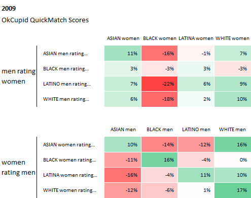
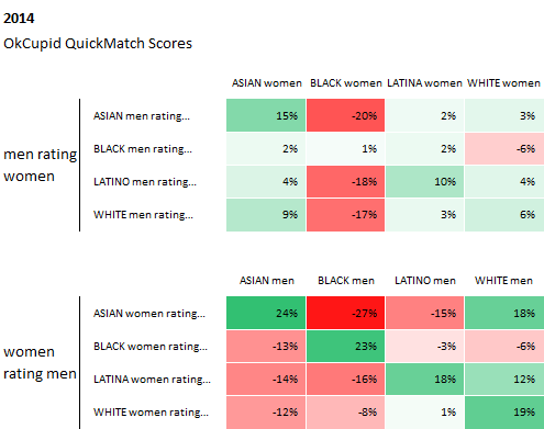
However, the data that OkCupid also possesses has also been used to open a discussion for a more socially impactful topics – like race and how it affects our perceptions of others. In Race and Attraction, OkCupid revisits one of their first analysis of race and attraction from 2009, to see how racial preferences have changed in the last 5 years.
From the graphs below, they found that racial preferences from 2009 through 2014 have actually stayed about the same, and in some cases, “racial bias has intensified a bit.”
These preferences are also checked against the data from another dating website, DateHookup, with “a distinct user base, a distinct user acquisition model, a distinct interface, yet their data reflects the same basic biases.” These racial preferences seem to stay similar, with the common trend of asian men and black people taking the greatest hits in preference.
Curiously enough, while the behavior of people have not changed much, when asked explicitly about certain racial attitudes, users have answered their match questions to as less biased overall.
While the data presented is of course coming from the dating world, it does still have significance in the way we understand the way we perceive others based on race. This article suggests that in the past five years, we have been telling ourselves that our racial attitudes are less biased, but our behavior has remained unchanged. Of course, the data isn’t definitive in any way. However, it does present a launching point for a discussion on racial awareness, to deeper understand the differences between what we believe and how we actually act.