data mural

The process we used to create the data mural was definitely different from the design meetings I attend weekly on visualization projects in my research. Most projects that we visualize are more data heavy and less illustrative because the points we want to include in particular visualizations often dictated the visual forms and complexity we needed to represent. I think that there is a tendency to focus on the quantity and quality of data in my own design processes rather than starting with small snippets of anecdotes and stories.

I am surprised how well and cleanly the ideas for the murals came together given the short amount of time. I think this is the result of following the data journalism handbook’s points. We translated the looking for key terms step into a real time activity by using post-its and were able to construct a story that is true to the preliminary data quickly. We did not pursue a lot of the other more time consuming tasks, such as going through and curating the data ourselves, which if time allowed I would liked to have done.

Painting with Data

While I have prior experience designing data-driven stories, creating the Food For Free data mural was dramatically different from the design processes I was used to. As laid out in the Data Journalism Handbook, my typical process involves querying a data set to answer specific questions or identify outliers and interesting patterns. Brainstorming for the mural felt a lot less structured, more akin to the “blue sky” ideation of early stage product design (what I like to call “brain vomit”). The narratives we created — while derived from a structured typology of different data stories — were distilled to far broader big picture ideas when we translated them into visual language, perhaps because this was presented as a creative artwork rather than a quantitatively-focused chart/graph.

I did like the concept of drawing for a short period of time and then passing it on; not only did this process promote the creative “piggybacking” you see in a typical group brainstorming session, but it also allowed us to see which common thematic strands kept popping up to create a more consensus-driven design. The resulting artwork is more based on visual metaphors and symbolism rather than the design techniques of narrative visualization identified in Segel & Heer’s case studies. However, the mural still uses basic design principles of alignment, sizing, and color to achieve the more general tactics of visual narrative (structure, highlighting, and guidance).

This experience helped expand my definition of what a data visualization could be; there are definitely opportunities to be creative with the data presentation. My one criticism of the medium is that the data doesn’t always feel entirely integrated with its presentation. Sometimes, it felt like we were just adding numbers to the artwork as an afterthought. There is a distinction between the fields of art and design, and to me this mural definitely felt more like data art than data design — and not just because we were painting. That’s not to say that a mural is any less valuable or less informative, but we certainly took more artistic liberties and the result feels far more subjective than I’m used to.

Design Process

I found our story finding and visual design process fun and surprisingly similar to processes that I have used before for design brainstorming – I guess theres a reason such sticky note techniques are widely used by designers 🙂

Last semester I took a class called Engineering Innovation and Design. As a brainstorming exercise for our final project, we were told to get into groups, grab a bunch of sticky notes, and then write down the first things that came to our mind. We proceeded to put these on the blackboard, cluster them, name our clusters, and work off each others ideas just like we did in our class.

Similarly, over IAP I had the opportunity to brainstorm and prototype a new feature for the company I was working at. In our very first meeting, the head of UI/UX at the company explained the problem, what we were hoping to accomplish with this new feature, and then proceeded to hand me a whiteboard pen. The three of us in the room spent the next hour repeating the process of ‘draw for 5 minutes, talk for 10min,’ and by the time we left the room we had sketches that encompassed about 90% of what the final feature ended up being.

Thinking back now, this process of rapid brainstorming with sticky notes and whiteboard pens is something that I’ve done whenever encountered with a new UI/UX problem. When it comes down to it, I think that data visualization is highly correlated with UI/UX, because you’re taking something that’s otherwise unreadable and trying to make it attainable and emotion eliciting from your readers.

Story Finding – Photography vs Murals

As a former photography editor for The Tech, part of my job included taking a series of photos from different event, whether it be a campus performance or a demonstration in Harvard Square, and turning it into a story that makes sense to the general audience. Most events tend to be summed up into just one picture, though there are other instances where multiple photos from the event are run as a “photo spread”. Things I had to consider included the usual what/when/where of the photo, but also (and most importantly) why the event pictured was happening and its relative importance compared to the other photos submitted for the current issue. This is process was repeated on a) all photos submitted for an event and b) all photos that are selected for each event for the issue, to determine placement in the issue. My goal was to create an accurate and relevant presentation of various events that are interesting and relevant to the MIT audience.

Compared with our story finding process for the Food for Free Mural, we were given a dataset with information about Food For Free’s work over the last few years, and an insider perspective on how it works and why it’s important. From this information, we cherrypicked what we considered the most important and formulated sentences that were then joined to create a cohesive story.

These processes, though dealing with different kinds of “data”, were not all that different — both involved some sort of cherrypicking, or narrowing down of the information that was available — while still trying to get a good “picture” of what is going on. Another process not talked about here is the development of the visual design – the designing of photo spreads also has similarities to our process for designing the mural.

Mural Design vs. Code Design

I found the mural design process of our class very different from my previous design processes.  First, let me briefly lay out our mural design process:

  • Introduction to the organization (Food For Free) through the voice of the director
  • Group discussion to find a story based on the follow criteria:
    • importance: impact on the audience
    • relevance: relevant to the organization and to us
    • accuracy: how well-supported by data
  • Summarize the story into a sentence. Add why we want to tell this story -> Sticky!
  • Gather as a class and share each group’s sticky note
  • As a class, write the core sentence of the story we want to tell through the mural
  • Word Web activities with three seed words: security, impact, waste
    • Starting with each seed word, branch out with whatever words that come into mind
  • Collective drawing
    • Each person starts drawing and passes around to next person so that everyone contributes to each other’s drawing in continuation
    • Put on the board and share
  • Decide on the mural design as a class
    • Find repeated imageries/themes from the collective drawings
    • Incorporate them into one design

design_process

Some reflections on this design process helped me to compare it to one of my previous projects.   During the cold and snowy winter of 2014, I  and three other MIT students worked to design an interactive dashboard that analyzes Twitter and Facebook activities of non-profit organizations. Briefly speaking, below is the procedure we followed:

  • Discussion on the basic frame of the dashboard: contents, functions, purposes
  • Analyze data
    • Each team member analyzes same data but work for different goals
    • Push each findings and codes on Github which allow other members to quickly reuse or build upon the code
  • Write a report on the analysis
    • Two members are in charge of the write-up
  • Build interactive dashboard based on the findings
    • Two members are in charge of hosting the byproduct online

This process is similar to the mural design process in that it had modularity and involved group efforts within each module. First, the modularity arose from the step-by-step procedures and several milestones we established as checkpoints: the goal of the project was defined first, and the process was broken down into three smaller steps/milestones.  The difference arises in the way tasks were distributed between the members.  Instead of a group of individuals working together to finish a small module, each person was in charge of a designated task at each step. Each task was discussed after the corresponding milestone was reached, and each code was ready to be reused by other members if needed.  This combination of distribution and code-sharing helped to maintain communication between members while enforcing the modularity in the process.  It was however harder to understand other members’ tasks and thought-process, which required that everyone became an expert in his/her given task.  In comparison, the mural design process did not rely heavily on any particular individual because each module was done in a group.  I definitely felt that the mural process better captured the ideas common and prevalent in our class; it somehow felt more democratic.

The two design processes discussed above share similarities in its step-by-step approach and distributed workload.  However, they are different in the way each step is finished and each task was incorporated into the final design; the design mural process had one more filtering layer in which the entire class decided what to include from each group’s work.  Both of the processes have pros and cons, and it is important to know which path to take according to the goal and circumstances of the work.


Developing a Data Story

Instead of starting directly with data, we began our data story for the Food For Free mural by listening to a verbal narrative of the organization’s history and impact from one of its leaders. We heard about Food For Free’s beginnings, its expansion throughout the greater-Boston area, and its plans for the future. After hearing the story, we were presented with data, some of which was on a global level, some on a local level. Equipped with data and an understanding of the organization, we set out to define a story that we wanted our mural to convey. We started out with verbal stories: sentences about the organization’s history, its impact, and its community partners. These separate ideas were then combined into one cohesive short verbal narrative about Food For Free. In deciding on our narrative, we followed a method similar to that suggested by Colin Ware and sought to “capture the cognitive thread of the audience”. We wanted the audience to feel engaged in our story and compelled to action as a result of encountering it.

Next we set out to transform our words into a picture. However, as Ware points out, verbal narrative “incorporates a form of logic that is quite distinct from the logic of visual representation”. To overcome the challenge of translating words into a picture, we each drew a picture of the data story and combined the common themes. We used both literal depictions, such as trucks and food, and metaphorical depictions, such as a tree and roots, to signify the story of Food For Free. Because we are producing one still image, we are faced with the challenge of telling a narrative history without including multiple time points. In this respect, the symbolism of the growing tree serves as an effective focal point in communicating Food For Free’s story. Finally, as Ware explains the importance of, we decided to use a road to frame our picture, helping to focus the audience’s attention.

Food for Free: Finding the Story

Recently, our class worked to conceptualize our data mural for the organization Food For Free. I was absent for the last class, in which we carried out most of our visual designing of the mural, so I will focus instead on the processes carried out during the previous class.

In this class session, the executive director of Food For Free visited our class to discuss the organization, its purpose, its functions, and its future goals. This visit exposed us first-hand to Food For Free, which was indispensable to our conceptualization of the organization.

In the readings, Segel and Heer emphasize the importance of narrative to the process of data visualization. Narratives draw readers to a story and help readers to understand and internalize the message being conveyed. Though the authors focused on its impact on journalistic practices, their insights on narrative apply well to our situation.

In our process, we first educated ourselves on the mission and practice of Food For Free. Once we felt well-grounded on the topic, we looked at some data about the group provided to us, brainstorming in groups to identify potential stories held within the data. Once each group came up with a viable story, we presented the stories to the rest of the class and combined them into one, consolidated, group story.

Contrary to traditional storytelling, our mural will not have a beginning, middle, and end, nor will it include any verbal or much written content. Instead, it will employ visual cues and symbolism to convey our story about the organization.

Data to Mural: Storytelling through art

With the topic of food security in mind and the Food for Free organization as our focus, our class set out to tell a story using national and local data, as well as data specific to Food for Free. From these numbers, we were to eventually paint a mural. How were we to turn these facts and figures into something more digestible and visually appealing, while also creating impact?

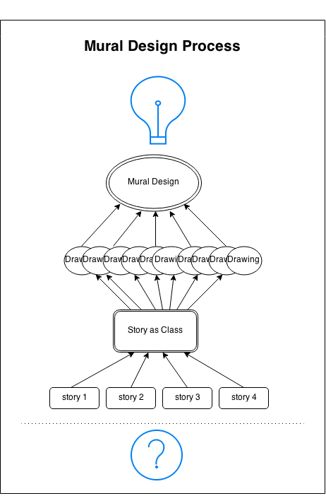
Our design process began first with finding and understanding the data that we want to present. By talking with a representative from Food for Free, we were able to gain a deeper insight into how the organization fit in with regards to the food security space, to gain a bit more personal connection and context for the data sheets we were provided.

From this data, we entered the process of drawing connections between the sets of data. We focused on finding different story types, like ‘factoids’ that stand out, ‘interactions’ that seem to correlate, ‘comparisons’ that reveal differences, changes’ that are significant, or ‘personal’ stories that connect to people. Here we sought out types of stories similar to those described by Rosenbaum in the Data Journalism Handbook. We didn’t necessarily look for a whole cohesive narrative yet – like Barr, we were simply poking around with our dataset attempting to make connections.

Once our groups put together our final conclusions, we combined our thoughts to determine the ‘story’ that this dataset told: that “Food for Free is growing our work with local partners to have greater impact on food security in Cambridge.”

It was at this point that we moved onto actually visualizing our data-set-turned-story. Through the use of some mapping and drawing exercises, we were able to isolate a few common symbols that we wanted to use to represent our story. From here, we were able to sketch out a rough mural, an image representing growth and reuse, using the symbols we determined.

Notably, as a mural, our process lead to a different type of narrative visualization. Segel and Heer sought to systematically describe and review different forms of data visualization, and even came up with seven ‘genres’ to do so. However, our mural doesn’t really fit into any genre they specify. Most of the case studies they examine contain maps, charts, and graphs, which have their own artistic direction and are designed purposefully to craft an easily digestible visual message.

Our mural instead will not contain graphs or numbers, or even text for that matter. Instead, our process produced a form of data-visualization that leaves more for the viewer to interpret. From here, we can definitely realize that their are many uniquely creative ways to tell stories backed with data – in this case, with art!

Finding our story for Food for Free

To create our data mural about Food For Free, we stayed close to the principle of starting with data and finishing with a story. We began by gathering information from Executive Director Sasha Purpura, who spoke about the organization’s history and goals. We then looked at data about Food For Free’s reach, as well as statistics about food security in the United States. Guided by Rahul’s taxonomy of data stories, we came up with multiple stories and chose the one best suited to conveying Food For Free’s mission/impact.

I think this was an effective way to find the story, especially because many of us were unfamiliar with the organization – thus, starting with the data was essential.

From the story, we made rough sketches of potential murals. We identified the common visual themes and incorporated them into the final mural, which allowed many of our ideas to be included. When deciding whether or not to include certain elements, we used the criterion of the story we agreed upon before-hand. I think this gave our discussion a good amount of structure and the process went smoothly.

As for the mural we came up with, its dominant visual structure is the tree. The upward sweep of the roots into the trunk and ultimately the branches is the main storyline through which we communicate Food For Free’s mission, impact and plan for the future. We start at the root, where we immediately see Food For Free trucks beginning to transport food from donor organizations to the rest of the ecosystem/community.Our eyes are then drawn up to the branches, where we see the result of the organization’s work, represented by thriving children and adults in a tree house. Finally, we can examine the messaging interspersed in the mural as fruits and flowers.

In this way, the mural is author driven, which makes sense as our goal is to tell a strong story about Food For Free. This is consistent with Segel and Herr’s suggestion that such approaches are best when the goal is storytelling or efficient communication. There is no interactivity and while there are no linear “scenes” in this single frame, there is a strong linear progression suggested by the tree metaphor, in which you start at the root and make your way up.

The messaging, in addition to being matching the visual metaphor of the tree, is communicated through memorable factoids. This is preferable to overwhelming the audience with large quantities of information – as would likely be the case if we tried to put the raw data and tables we started with onto the mural — and is in line with Segel and Heer’s recommendation that such factoids are often better for a general audience.

From Data to Story : on our way to Food For Free Mural.

Our project for FOOD FOR FREE started with identifying a possible story based of the dataset provided by the association.
Not only the data was backed up by a short presentation by their director, which gave a helpful insight and personal experience as well as stressing out some key elements of their story.

As stated in the Segel & Heer reading, traditional narrative visualizations are usually based out of the data itself. The data reveals the story. In our case it was slightly different, as it was great to get an insider perspective and the director’s testimonial as a start.

How to turn the dataset into a story? Our methodology was a mix of different techniques and broken down into different steps. First, we found different storylines and then identified keywords, and from keywords then created mind maps that circled those latter.

The Director’s speech gave us some hints for our storylines: some focus on the City of Cambridge, the results of their labor, the impact of the association on the food served, the increase of produced food, etc.
We translated data into one or three sentences for most and then merged it into one paragraph. Our word webs became rough drawings, and we got our mural skeleton : a tree-like with trucks making connections between buildings as donors and people as recipients.

The story we came up with is simple as we are doing a mural, limited interaction and minimum messaging. And we didn’t not use the common comparative techniques as mentioned in the Data Journalism handbook eg as proportion example, internal or external comparison or change or over time.

The goal of our visualization is to “engage with reader in finding and telling their own stories in the data”. So the story we came up for FFF is not only reader-driver or author-driven it stays in the middle of this spectrum. Our messaging is clear, engage with the reader. However there is no direct interactivity unless there is a “call to action” in our mural something like a “contact us” for instance.