SNAPSim: Game Testing

Our game was hosted at http://ehzhang.me/snap-sim. Game testers were given a random family size and weekly food budget, and were told to select food items within their budget that would allow them to eat healthy.

snapsim


After playing, they were directed to a google form that recorded their food budget, family size, resulting score, and the amount of money they had leftover. They were also asked to answer the following questions:

  • Did your score surprise you? If so, why?
  • Did you have to make any sacrifices (ex. not getting a food you wanted) because of your budget?
  • How much money do you think a person needs per week in order to eat healthy?

Feedback

Average given family size: 3.5

Average given food budget: $185

Average final score: 48.98

Average money leftover:  $59.97

Many people found that our game was fairly easy, though people who ended up with bigger families and smaller budgets tended to find the game more difficult. There were many testers who were surprised at their final score at the end, since they purchased food they would normally eat.

Responses to how much money a person needs per week were across the board, though more people tended to think that less was best.

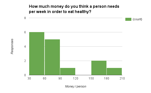
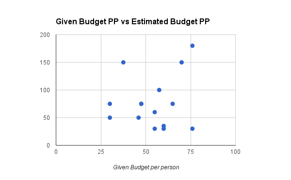
The estimates didn’t seem particularly correlated with their given family sizes. So we decided to look if there was any correlation between the tester’s given budget per person in the family, vs their final response:

Given vs Estimated Budget pp

Some responses to sacrifices focused on food items that were not a part of the game, such as rice, wheats, condiments, and beverages like coffee or tea. Other testers mentioned that they had to cut out fast food or junk food and snacks for the sake of their budget. One tester mentioned that while they would have loved to buy more fruits and vegetables, because they don’t provide a lot of calories, they would be a bad choice with a very limited budget.

For the testers that received a lot of money, they felt that the game was so easy that they didn’t have to make any sacrifices.

Changes

If we had more time to work on this, we would play around with different ways of displaying the game to make it more engaging, as well as adding more food items that people have mentioned that weren’t there. We would also make the game more difficult, since the goal is to start a conversation with how hard it is for some SNAP users to eat healthy. Other changes include not allowing people to enter negative amounts to gain money, and adding discussion about how the score is calculated. Something else to include is more familial context — grocery shopping is very different with children or expectant mothers in the midst, and these situations can make the experience more realistic and thought-provoking.


RaphaelJS

RaphaelJS is a small JavaScript library used for work with vector graphics on the web.

raphaeljs-banner


This library can be used to create responsive and interactive animations and representations of data such as pie charts, maps, timelines, and many more. It is great for custom visualizations that allow for different types of user interaction (mousing over, clicking, etc), and offers great flexibility for implementing your ideas.

Because everything is rendered using SVG, browser compatibility is a big plus, which is pretty important depending on your target audience.

Raphael does not have a huge focus on datasets, however. Developers have built an extension to the library named gRaphael that allows for easy creation of charts, such as line charts, pie charts, etc, as shown in the following image.

gRaphael examples

How do you get started using it?

To get started, you can download the JavaScript file hosted on http://raphaeljs.com/, include it in your HTML page, and then start coding! Here’s an example taken from the site:

// Creates canvas 320 × 200 at 10, 50
var paper = Raphael(10, 50, 320, 200);

// Creates circle at x = 50, y = 40, with radius 10
var circle = paper.circle(50, 40, 10);
// Sets the fill attribute of the circle to red (#f00)
circle.attr("fill", "#f00");

// Sets the stroke attribute of the circle to white
circle.attr("stroke", "#fff");

The website also shows a few demos as shown in the picture above, and you can inspect the code used to create them by loading the page source for each demo.

A few tutorials:

– http://www.varunpant.com/posts/raphael-js-tutorial-part-i

– http://code.tutsplus.com/tutorials/an-introduction-to-the-raphael-js-library–net-7186

– http://www.lynda.com/HTML-tutorials/Real-world-example-Raphal-JavaScript-Library/80782/85035-4.html

How easy or hard is it? What skills do you need to become proficient in it?

Raphael is a bit more hands-on because it is so flexible. All you are given is a library of methods to use, and a few examples of how they are used to produce various visualizations. However, you will need to implement anything you want to show using javaScript. For that reason, knowledge or experience with coding, especially with using JavaScript in HTML5 websites, is necessary to become proficient with the library.

Running through a few tutorials will give you the basic familiarity needed to hit the ground running, but if you have little to no programming experience, you might have a bit more difficulty. The developers do provide documentation for the methods, as well as examples of the syntax, so while it shouldn’t be extremely difficult to pick up, the difficulty lies in putting the methods together to create what you want.

Would you recommend this to a friend?

Yes and no! If you a friend has an idea for a fairly complicated interactive (animations and custom charts, for example), or a clear design for what they want, but also has experience programming, then I would recommend it. However, if they don’t necessarily have the time or experience, I would recommend other WYSIWYG tools, which are much quicker to use, albeit with less flexibility.

Depending on what the friend is trying to do, I would strongly recommend using gRaphael in addition, to make it easier for working with datasets.

Will you consider using it for your final data story?

If i decide to make a web interactive, then I would likely consider it! It seems relatively simple to work with, and I’ve always been partial to creating things on my own to learn about different libraries. I also have experience working with javaScript libraries, so it wouldn’t take too long to familiarize myself with it.


Demographics of Boston Districts and Neighborhoods

Author: Tami Forrester

I chose to look at one dataset that showed the race distribution by city council districts in 2010, based on information from the census. Unfortunately, it was presented in pdf form, which limited interactivity, though I found it interesting that of a total population of 6.5 million, white people accounted for around 81 percent of them, and led the population totals in all but three districts – Districts 4, 5 and 7. After looking at the dataset, I thought of the following questions

  1. Neighborhoods vs Districts? Could these be mapped out?

Looking through this table and other datasets left me confused as to how city council districts compared or related to neighborhoods. According to a link on the City of Boston website, the districts are mapped out as so:

Screen Shot 2015-03-10 at 1.33.17 AM


I was also able to find another map showing crowdsourced neighborhood boundaries based on a survey.

I tried to overlay the two images to see if it would make for an easy comparison, though it it mostly confusing to look at.

overlaymaps
Dark black lines refer to city council district boundaries, and shadings refer to the crowdsourced neighborhoods


I also searched through datasets on the City of Boston site, but most only contained data about neighborhoods, and didn’t show relationships between them and districts. I was able to find a document on the City of Boston site, which compared the racial distribution over both districts and neighborhoods. However, trying to convert this data into an interactive form proved very tedious because it was locked in a pdf. Even after using an online tool to convert pdfs to excel spreadsheets, the formatting made it difficult to work with in Tableau.

  1. How have these demographics changed over time?

Another google search led me to yet another pdf of data showing how racial demographics have changed for specific years 1990, 1993 and 2002. I wasn’t sure why the specific years were chosen, and I didn’t try to analyze this in tableau, but was able to look over and see trends. I found it interesting that the amount of people identifying as various races in 1993 and 2002 was exactly the same both years, though the distribution over all districts in each time were different. For example, 140,305 people identified as black in both 1993 and 2002. The amount of black people per district was not the same between both years, however.

  1. What are some characteristics of the different districts?

Two characteristics I looked at specifically listed the public schools in Boston, and the crime incidents as reported by Boston police in 2012. Unfortunately, the schools were not mapped to their zones, but the crime incidents also included the zip-code and region area they were reported in. Using Tableau, I mapped the number of incidents that were reported in a particular region, and created a pie chart with neighborhoods mapped to the percentage or incidents reported.

Screen Shot 2015-03-09 at 11.58.10 PM
Mapping of zip-codes colored by the number of crime incidents from Tableau. Regions that were more “green” had the most reports.


Pie chart as generated in Tableau. I couldn't figure out how to place the unlabeled sections (which did actually have regions)
Pie chart as generated in Tableau. I couldn’t figure out how to place the labels for the currently unlabeled sections (which did actually have neighborhoods)

The crime incident reports also had a field called “reptdistrict”, which was presumably another metric used to characterize a particular region, though it was unclear what it meant.

Story Finding – Photography vs Murals

As a former photography editor for The Tech, part of my job included taking a series of photos from different event, whether it be a campus performance or a demonstration in Harvard Square, and turning it into a story that makes sense to the general audience. Most events tend to be summed up into just one picture, though there are other instances where multiple photos from the event are run as a “photo spread”. Things I had to consider included the usual what/when/where of the photo, but also (and most importantly) why the event pictured was happening and its relative importance compared to the other photos submitted for the current issue. This is process was repeated on a) all photos submitted for an event and b) all photos that are selected for each event for the issue, to determine placement in the issue. My goal was to create an accurate and relevant presentation of various events that are interesting and relevant to the MIT audience.

Compared with our story finding process for the Food for Free Mural, we were given a dataset with information about Food For Free’s work over the last few years, and an insider perspective on how it works and why it’s important. From this information, we cherrypicked what we considered the most important and formulated sentences that were then joined to create a cohesive story.

These processes, though dealing with different kinds of “data”, were not all that different — both involved some sort of cherrypicking, or narrowing down of the information that was available — while still trying to get a good “picture” of what is going on. Another process not talked about here is the development of the visual design – the designing of photo spreads also has similarities to our process for designing the mural.

Snowday-pocalypse Data Log: 2/9/15

12am~3am

I tooled at my computer from midnight to ~2:59am doing the following:

– visited Stellar to download materials

– updated google calendar to account for snow day

– checked Tumblr several times

– checked emails

– created this document in google docs

– watched 10 videos of dance performance consecutively on youtube

3am ~ 11:30am

sleeep zzz

11:30am

Woke up after snoozing two alarms

Skip breakfast in the dining hall,

eat a bowl of instant oatmeal

All on iPhone:

– manually update apps

– download three apps after browsing the app store

– check FB messenger, Groupme

– check Gmail, calendar

Wore glasses instead of contacts

12pm ~ 2:45pm

Played Hay Day (real-time “farming” iOS game) for most of this time, but I also played a few rounds of Bejeweled Blitz and Two Dots. I also responded immediately to messages on Groupme and Messenger that were received on my phone

2:45pm ~ 7pm

This time is spent almost continuously on my laptop using the internet. Sites/activities included:

– Gmail

– Google Calendar

– Atlas

– reading Stellar assignments

– Re-enable Facebook News Feed and scroll through for the first time in several days (was previously using Kill News Feed on Chrome to block it)

– reblog a few posts on Tumblr

– respond to text messages on laptop

I received about 10 notifications from Hay Day, and checked the game each time. I eventually disabled the app from sending notifications, and did not play it for the rest of the evening.

9pm ~ 11pm

Download and watch movie for a HASS assignment

Update google calendar to reflect Tuesday school closing

Check facebook and tumblr before going to bed


A few totals:

– emails sent: 5

– emails received: 117

– emails trashed: 45

– text messages sent/received: around 50

– time spent online: ~10 hours


Mapping Poverty in America

Data from the Census Bureau show where the poor live.

Mapping Poverty in America is an interactive recently published by the New York Times that visualizes data about poverty from the Census Bureau. It does so by presenting it on an interactive map that colors regions based on the percent of people that live below poverty thresholds, which is quantified for people that don’t know what the poverty threshold is.

Upon loading, the site asks for your location, and (if given) displays the data for your general location, as well as previews of other major cities in the US. Hovering over a colored region will display an info-box with that region’s poverty rate and the amount of poor people in that region. The interactive also has two different views, which visualize either regions colored by poverty rate or circles representing the amount of poor people in a region.

(source: New York Times)

This interactive aims to visualize data that would otherwise not be seen by the general public, especially since the NYT has such a large readership. Though the interactive makes no politically charged statements, you can’t help but think that this was made with the intention of sparking conversation about poverty in the US. This interactive shows that poverty is indeed still a problem that is faced by many regions of the US, and by making this information available, easy to understand/visualize, and localized to each individual reader, hopefully this problem will no longer be ignored.