SnapSim Impact

Danielle, Edwin, Harihar, Tami

SnapSim is an interactive text-based narrative in which a player takes on the role of a single parent on SNAP shopping for food for themself and their two children. Each food item has a story indicating its importance to the family, and the narrative forces the player to forgo some foods in order to stay within budget.

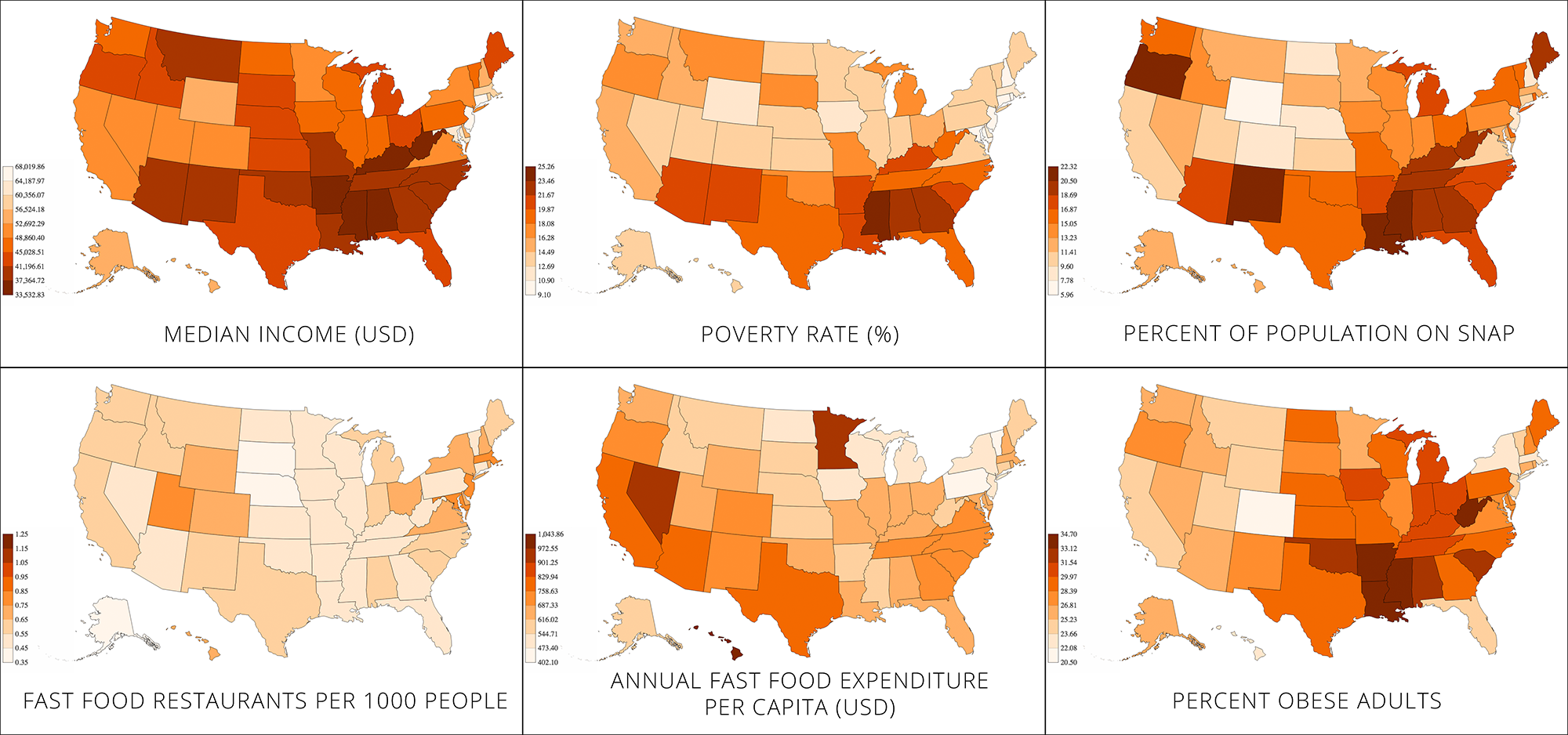
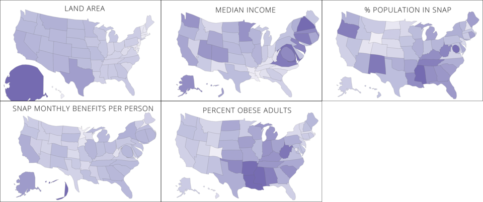
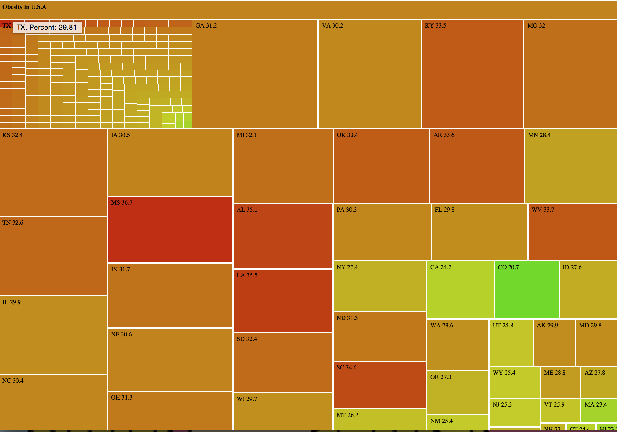
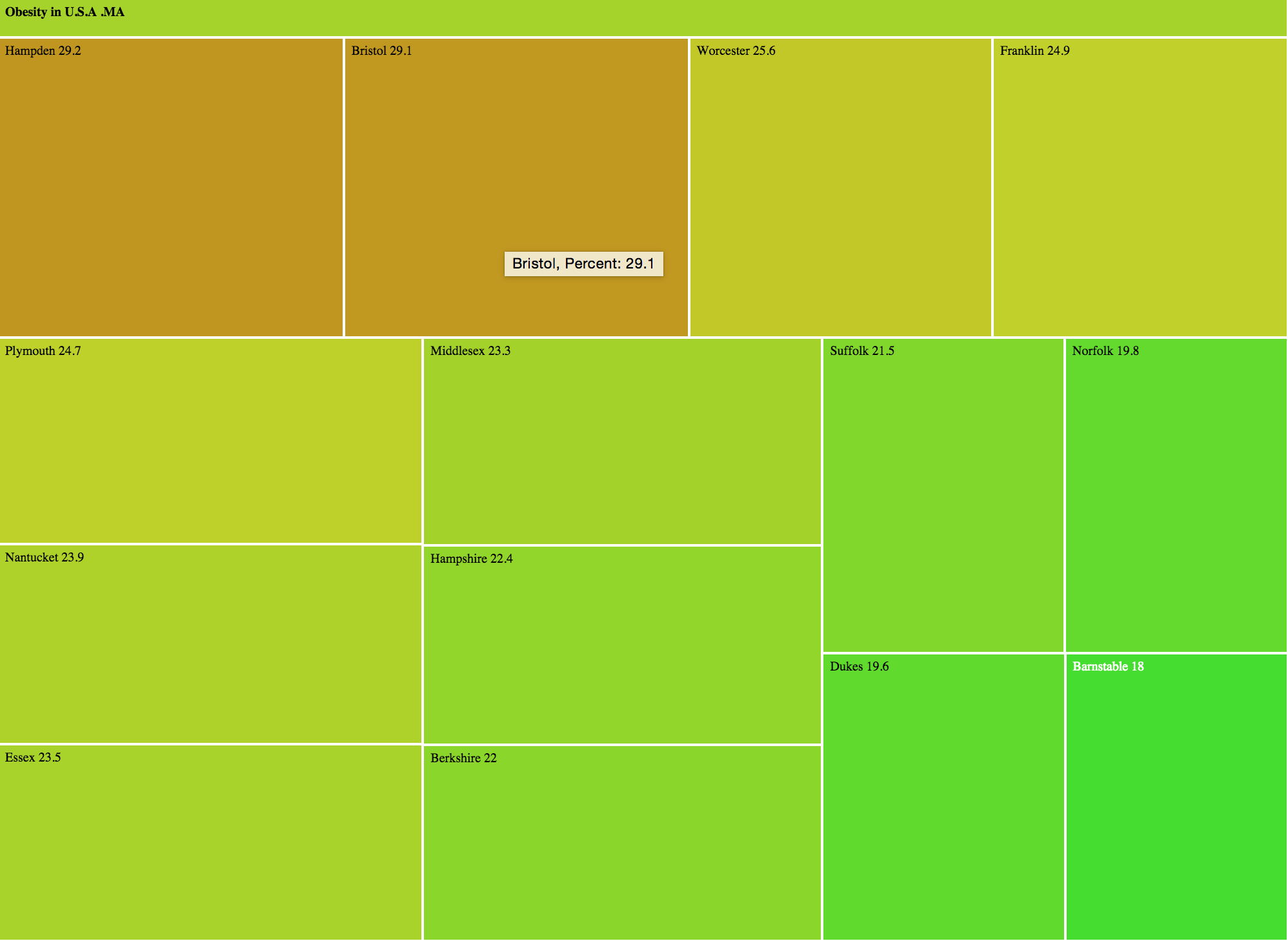
The goal of the project is to evoke empathy in our audience by simulating some of the challenges faced by a family shopping on SNAP. We chose this goal because, as we did our weekly mini-assignments, we found that publicly available datasets and visualizations failed to capture the challenges faced by the individual family on SNAP, but instead focused on aggregates (ex. obesity percentages by state). Therefore, we aimed to make a data story which would humanize the data and effectively illustrate the sacrifices that families on SNAP make in a way that numbers could not. We hoped that such a data story would cause the player to feel empathy for such families.

Our target audience was people who were not SNAP participants and who were from middle-class or rich households because they were least likely to be experiencing the same challenges as those faced by families on SNAP. Because MIT students were readily accessible participants, our study focused on them.

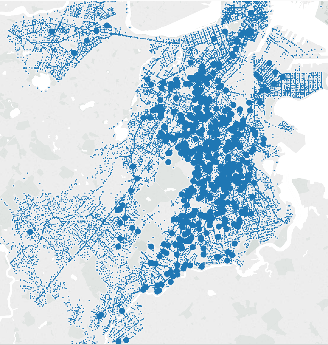
We created two variants of our interactive narrative. We tested each variant with four different players. We each sat with the players and guided the experience. At the end of the narrative, we tied it back to reality by showing the player a map indicating SNAP participation around the country. Then, each player completed a survey giving feedback on the experience.

Based on interaction with players and the feedback in the surveys, we made a number of observations. First, all of the players remarked that SNAP does not give enough money to families (see quotes below). However, some of the player responses may have been due to prior belief rather than SnapSim.

“I have always been pretty skeptical of SNAP as giving people enough money to eat “

“Just learned about SNAP. its a good idea but [it] doesn’t seem like a lot of money to buy groceries”

“86 dollars is really low for three people”

Six of the players indicated that $100-$150 (rather than the allotted $86) would be more reasonable to buy groceries.

In addition, all but one player indicated that SNAP requires sacrifices.

“Yes. I felt bad buying things that were unhealthy because I knew that I wouldn’t have enough money to buy both. At the same time, I didn’t want to buy food that would go bad because the kids won’t eat it.”

“Well I had to get rid of half of my groceries soooo. I didn’t like having to get rid of all the things my kids like. I also didn’t like that I had to choose all or nothing on each item – I couldn’t alter the amounts or exchange chicken breast for thighs, etc.”

“When I started I added lots of stuff to cart because I thought I needed them. I spent over 100 dollars and had to give up a lot of stuff”

Finally, after showing the map of SNAP participation rates and food banks, every player said that they would be interested in volunteering or donating to a local food bank some time in the future. While showing players how they can help is valuable, we can’t know whether they actually will volunteer.

It is difficult to measure empathy, but the results of our testing seem promising. The players were able to recognize that shopping on SNAP requires some difficult sacrifices,, and that they would be interested in helping out a food bank.

SnapSim Presentation

Danielle, Edwin, Harihar, Tami

We have created a Google slideshow

We have two variants of our SnapSim.

The first one takes the player through the grocery store experience.

The second one focuses on the difficulties of removing items from the grocery cart.

Both variants use a map.

SnapSim is designed as a guided experience. That is, the researcher (one of the four members on our team) takes the player through the narrative and talks to them as they make their way through.

SnapSim Methodology

Danielle, Edwin, Harihar, Tami

Our project goal was to make our audience feel empathy for families on SNAP who must make sacrifices when shopping. We implemented this goal by creating an interactive text-based narrative.

Our first prototype was a game that utilized food price data from the Market Basket circular over 10 weeks. The dataset presents the data as scanned images, so we manually transcribed the items and prices. It also used nutrition information from the National Nutrient Database and restaurant websites (ex. McDonalds). In the game, the player aimed to buy a healthy week of food while staying under budget. However, we found that the addition of nutrition data did not help foster empathy (based on responses to our post-game survey), so we omitted nutrition in our final project.

For our next iteration, we learned about other connections people have to food and used that to tell a story to evoke empathy. To understand the demographics of SNAP families, we studied the examined the income data and SNAP benefit data from the the Food Environment Atlas and read the “Characteristics of SNAP Households” report from the USDA. To understand people’s connection to food, we created a survey and received about 20 responses from friends. These responses illustrated some reasons that people eat the foods that they do.

With that, we moved from a game structure to an interactive narrative. Rather than using data to evoke empathy, we chose to use stories. We built a character fitting the demographic data and we created stories around food which captured some of the connections we observed in our survey responses. To determine the character’s budget, we used income and monthly SNAP benefit data from the USDA Food Environment Atlas. We supported our numbers by looking up salaries on the Bureau of Labor Statistics and using a SNAP benefit calculator.

We aimed to conclude the narrative by connecting it back to reality. To do this, we created a map indicating SNAP participation rates (hoping that a user’s connection to their state or country would help them identify with the data) and the locations of food banks around the country (as a call to action). Getting data on food bank locations was very time consuming. We fetched HTML from Feeding America and wrote a Python script to clean it. We then used Google’s geocoding service to convert the addresses to latitudes and longitudes.

We had four total iterations of our interactive narrative – each had a different user experience. The changes were guided by questionnaires given to our testers and feedback from games expert Prof. Sara Zaidan.

Our final product is an interactive text-based narrative. The player is a single mother grocery shopping for herself and her two children. Each food item has a story indicating its importance to the family. In order to stay within budget, the player must forgo buying some of the foods. At the end, we show the player a map of SNAP participation around the country to illustrate that for some families, this game may be a reality. The map also displays food banks (and links to their websites), encouraging the user to act on their empathy by donating or volunteering.

We created two variants of our project: one focusing on removing items to the grocery cart, and the other focusing on adding items to the grocery cart.

We have a number of repositories for our project:

data

first prototype

second prototype

final project (variant 1)

final project (variant 2)

Small multiple choropleths – income and obesity

MergedChoro2

You can see the choropleths here as well.

NOTE: We inverted the axis on the median income map because we wanted to make use of the people’s tendency to associate red with danger. Had we not inverted the axis, the wealthiest states would be dark red, which may be confusing (we hope that the inverted axis is less confusing than the dark red on wealthy states would have been).

Audience

General public, especially people from middle-class or rich households.

Goals

While other sources have pointed out the link between obesity and poverty, we wanted to see it for ourselves and illustrate it geographically using multiple metrics.

The maps are geared towards people from middle-class or rich households, because they may not be aware of this connection.

We aim to show that the poorest states are also the ones most prone to obesity. In addition, we aim to identify the states in which the poverty/obesity link is most severe. To do this, we generated a number of choropleths and presented them in the “small multiple” style.

Extra

We also tried making some cartograms, but they were a bit confusing to read. Here’s what they looked like.

cartograms

Creative Chart: Adult Obesity in the U.S.

Danielle Man, Edwin Zhang, Harihar Subramanyam, Tami Forrester

treemap

View the chart here

Data

We looked at the USDA Food Environment Atlas, which provides various metrics about food availability, health, and more for each county in the U.S. Specifically, we aimed to understand the severity of obesity around the U.S. and identify the states/counties in which obesity is particularly severe.

Chart

For each county, we looked at the percentage of obese adults (in 2010). We turned this into a nested treemap using d3. The advantage of the nested treemap is that we can quickly glance to see the percentages by state, and we can drill down to see the percentages by county. One way a treemap is better than a geographic map is that in the treemap counties/states are similar in size, whereas in a geographic map small counties/states may not be noticeable.

Audience

While the visual can be understood by a general audience, we are particularly interested in people from counties/states with high obesity levels. We hope they are interested by their county/state’s location on the chart and try to learn why some places have higher obesity levels than others (a question that we hope to address in our project).

Goals

Our goals with this chart are to

  1. Show how obesity is spread throughout the U.S.
  2. Allow viewers to see the prevalence of obesity within their county
  3. Have a tool our group can use when we investigate the link between poor neighborhoods and food insecurity

Treemap drilldown
treemap_drilldown

Map Remix

Tami Forrester
Harihar Subramanyam

We remixed the water usage visual as a map (please excuse the upside-down text – we did it just so we could both write at the same time).

It is a floorplan of the home. All water-consuming appliances or food are drawn in blue. Each room is overlaid with a water drop. The water drop would contain the total water usage of that room (by aggregating the counts in the original visual). The area of the water drop is proportional to the water usage in gallons.

WaterMap

Game/Visualization about Food Supplies

Team

Danielle Man
Edwin Zhang
Harihar Subramanyam
Tami Forrester

Topic

We are interested in the makeup of food supplies (ex. meat, produce) in countries around the world.

Technique

We aim to build a data game or an interactive visualization to teach people how countries’ food supplies are structured and to encourage them to improve their diets.

Data

We look at the following dataset by the Food and Agriculture organization of the United Nations.

http://faostat3.fao.org/download/FB/FBS/E

Story

The ratio of the supply of meat to vegetables is 0.97 in the U.S., 0.14 in China, and 0.05 in India – the food supply makeups of the three most popular countries are quite different! We want to food policymaking to consider these differences and we want readers to observe how this is reflected in the diets of people around the world.

RAW: Create Simple Visualizations Quickly

What is it?

RAW is an online drag-and-drop tool for uploading csv data and creating common visualizations such as scatterplots, treemaps, and circle packing diagrams.

RAW is open source and provides guides for adding your own visualization types (using D3.js).

What is it good for?

RAW has 16 visualization types which are built using drag-and-drop and can be customized to a minor degree. If you need to generate several common visualizations to support your data story, RAW can make them very quickly.

Be warned that RAW runs in a web browser and cannot handle large datasets (i.e. more than a few MB). Furthermore, since many of the visualizations display all the data points, a visualization produced from a large dataset will be cluttered and unreadable.

Thus, RAW is good for stories that require several simple visualizations built on a dataset consisting of small to medium sized csv files.

How do you get started?

Since RAW is simple to learn, you can jump right in and start using it. For a quick intro, consult the video tutorial. For further information, consult the Github wiki.

If you are a developer trying to add a new chart type to RAW, consult the developer guide.

Is it easy? What skills do you need?

RAW guides you step-by-step through building the visualization. Therefore, it’s easy to learn. Beyond understanding what each visualization means, RAW requires no additional skillset, which makes it very easy to use.

The primary challenge in using RAW is understanding each type of visualization. For example, if you don’t know what a Voronoi Tessellation is, then RAW gives you no guidance on how to interpret the visualization.

For developers, extending RAW requires a knowledge of the JavaScript language and the D3.js library. Familiarity with Scalable Vector Graphics (SVG) and Angular.js may also be useful.

Would I recommend it?

I would highly recommend RAW as a tool for building visualizations to support a data story or for finding possible stories. Visualizations can be built quickly with RAW, so it’s useful for exploring your dataset by building visualizations. Furthermore, since the visualizations can be exported as SVG, HTML, PNG, and JSON, it’s easy to embed them into an article or similar data story.

If you are working with a large dataset (ex. several MB or more), RAW may not be able to handle all your data. Furthermore, the visualizations may be too cluttered.

If you want precise control over your visualization, RAW may be too restrictive for you. Although it’s possible to add features to the code, it may be quicker to build the visualization using a different tool.

Would I use it?

I think I will use RAW to help me generate ideas as I peruse my datasets. Since I am interested in maps, games, and interactive data stories, I don’t think I will use RAW to create my final product.

Usage

Here’s how RAW can make a circle packing diagram using a dataset about the 2014 Global Hunger Index around the world.

raw1

raw2

raw3

raw4

International Food Policy Research Institute (IFPRI); Welthungerhilfe (WHH); Concern Worldwide, 2014, “2014 Global Hunger Index Data”, doi:10.7910/DVN/27557 International Food Policy Research Institute [Distributor] V1 [Version]

Boston Police Data

Harihar Subramanyam & Danielle Man

We examined a number of datasets about police, shooting crimes crime, and emergency services in Boston. We primarily used the Crime Incident Reports dataset, which indicates the type and location of crimes in Boston. We cleaned the .csv data, separating the latitude and longitude into separate columns, with Python scripts.

We have three questions:

  1. How is shooting crime distributed around Boston?
  2. Do the locations of the police stations and hospitals make sense given the crime distribution?
  3. How does police violence (especially towards minorities) in Boston compare to other countries?

Question 1: Crime Distribution

Let’s look at the shooting crime distribution over time and location.

Let’s plot the shooting crimes on the map.

map_of_crimes
Map of crimes around Boston. Large blue circles are shooting crimes. Small blue circles are other crimes. See full visualization here

We notice that shooting crimes are not small in number and that they are clustered in central Boston. Now let’s map shooting crimes by year.

Map of shooting crimes by year. See the full visualization here.

It appears that the distribution has not changed much year to year.

Question 2: Police Stations and Hospitals

Now that we know where the shooting crimes are, let’s see if police stations and hospitals are optimally positioned to respond to them. To answer this question, we need more datasets. The Boston Police District Station and Hospitals Locations datasets give the names and locations of the Boston police stations and hospitals, respectively.

The map below shows that the hospitals (red) and police stations (blue) form a ring around the cluster of shooting crimes and are within one mile of almost every shooting crime.

Hospitals are red and police stations are blue. They form a ring around the crime cluster. See the website here.

Hospitals are red and police stations are blue. They form a ring around the crime cluster. See the website here.

Question 3: Police Violence

Finally, given that police violence is a growing concern in the U.S., let’s look at how Boston compares to other cities. Again, we need more data, so let’s look at Fatal Encounters.

Killings by state. For the full visualizations see here.

Killings by state. For the full visualizations see here.

We notice that Massachusetts does not stand out compared to other states. Looking at counties shows that Boston has fewer killings than almost all other large cities – see here.

Finally, we focus on Boston and look at the number of killings based on race, gender, and symptoms of mental illness.

Distribution of fatal encounters.

Notice that primarily men are killed, but that the distributions seem to be similar over the races.

Conclusion

We started with the crime incident dataset and combined it with other data (hospitals, police stations, and Fatal Encounters) to pose questions about crime distribution, police/hospital response, and police violence. With some visualizations, we explored the questions and discovered some interesting factoids. For example, hospitals and police stations form a ring around the cluster of crimes and police violence in Boston is not as extreme as in other cities.

Further exploration of these datasets, and perhaps other datasets, can help answer our questions.

Story Finding and Visual Design

Interestingly, our story-finding began with Sasha Purpura telling us the mission of Food For Free. The goal here was not to have a story given to us, but to help us find a story in the data. “Start With the Data, Finish With a Story” mentions the importance of of having a “clearly defined objective in querying the data”. After understanding the context from Sasha’s story, we could pose questions and see if they were supported by the data. In this way, the data guided the mural’s story.

By going through Rahul’s taxonomy for data stories, our approach was similar to that laid out in “Data Stories”. Specifically, we looked at changes over time, associations, and comparisons. While it was not as common, we also used the “blacklist” approach described in “Start With the Data, Finish With a Story”. For example, my group looked at the quotes, which were quite positive, trying to identify something that recipients still needed. Our examination indicated that there isn’t much dairy rescued, which could be an interesting story to pursue.

At the end of story-finding, we wrote the story in a couple short sentences. “Start With the Data, Finish With a Story” says that a data story should “hit [readers] with a headline figure that makes them sit up and take notice”. By writing the story so concisely, we were able to make our mural communicate the “headline” of the story.

Since it is not interactive, our data mural is primarily author-driven. However, as ceriley mentioned in the post below, it is partly reader-driven because the reader may choose what to focus on. The mural design contains a number of small components (ex. trucks coming up roots, donor names on the buildings on bottom, actions of individual people) that are not as immediately noticeable as the tree itself. Unlike other visual narrative styles, such as infographics, the mural does not prescribe an order for the reader to follow. Instead, the reader is free to examine each component in any order. In this way, we can argue that it is partially reader-driven.

Although it is not a video, since our design contains several components, we need a way to preserve continuity as the user looks at different parts of the mural. Continuity is maintained through the tree – all the components (ex. trucks, donors, people) are interacting with the tree in some way.