Data Sculpture – SNAP TV Dinners

One common misconception among SNAP (Supplemental Nutrition Assistance Program) participants is that food stamps are supposed to cover one’s entire food budget. However, as its name suggests, SNAP is only meant to be supplemental — the program assumes that participants are spending 30% of their net income on food. SNAP makes up the difference between that 30% and the cost of the Thrifty Food Plan, what the USDA defines as the bare minimum diet for adequate nutrition. Our data sculpture seeks to address this misconception by tangibly demonstrating the difference (both in terms of quantity and nutritional value) between subsisting on SNAP benefits and supplementing them with a portion of net income.

The primary audience of this data sculpture is SNAP participants living in Middlesex County, specifically those under-spending on food. With this data sculpture, our goal was to illustrate what a “proper” meal under SNAP should look like and convince participants who are not spending any additional money on food to do so. On another level, we also wanted to engage people who are not eligible for SNAP and show them what sorts of meals the food insecure are eating on a regular basis. With this audience, the goal was to build empathy and put them in the shoes of a SNAP participant.

In order to create the data sculpture, we used a number of datasets — first, we used the USDA’s SNAP Data System in order to determine the average monthly SNAP benefits for residents of Middlesex county: $132.29 (or $4.41 per day). This was contrasted with the 2015 projected cost of the Thrifty Food Plan, estimated at $194 per month (or $6.47 per day). Using these daily amounts, we created some sample meal plans within those monetary constraints, using data from the Thrifty Food Plan as well as Peapod/Instacart for up-to-date food prices. These represent typical meals for those who only spend SNAP benefits on food and those who use SNAP benefits as intended — as a supplement to 30% of their net income.

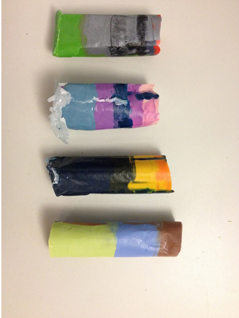
The data sculpture itself would take these meal plans and present them in TV dinner-style packaging. With this presentation method, we can make visible the relative sizes of a SNAP-only and a SNAP + 30% income meal. Moreover, price tags and nutrition facts on these packages further drive home the comparison — with an incremental increase in food spending, SNAP participants can drastically improve their nutritional intake. Using the visual language of the TV dinner — a symbol of unhealthy eating — also foregrounds the nutrition question. While we did not actually prepare said meals for this assignment, this data sculpture could be fully interactive (i.e. edible), allowing the audience to experience the difference between the two meals in the most visceral way possible: by eating them.

For the purposes of this assignment, we have mocked up an example of what the packaging might look like, and constructed three meals (breakfast/lunch/dinner) for each of the two food budgets:
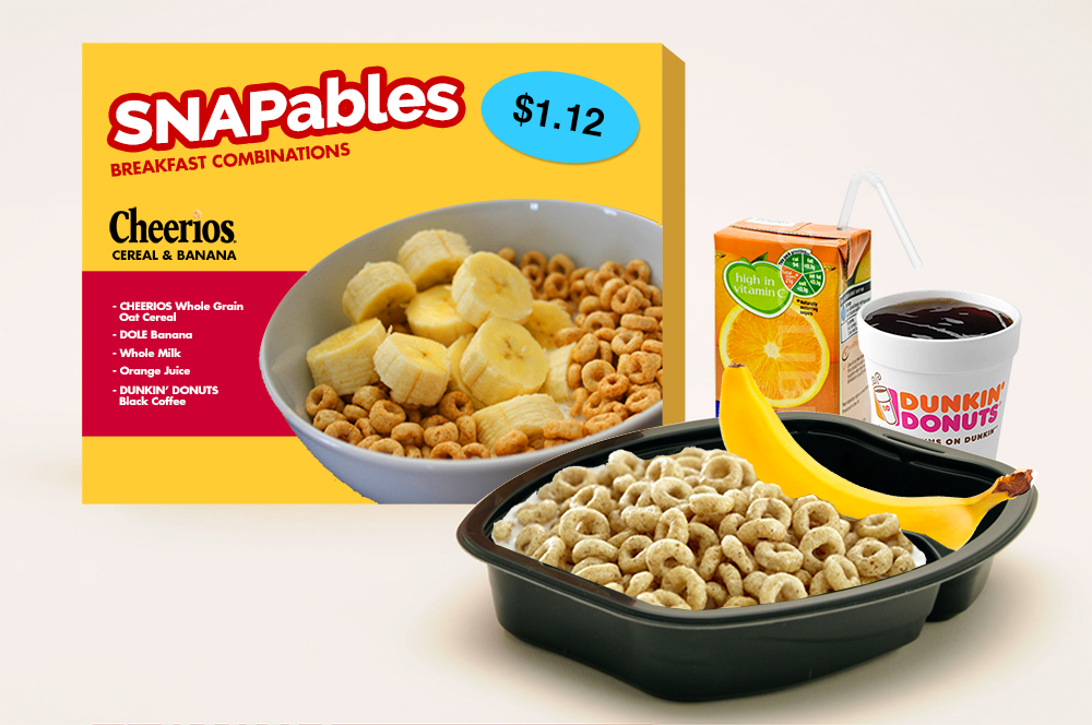
snapables

SNAPables

Breakfast (Cheerios & milk, orange juice, banana, coffee)

Cost per serving 1.12
Calories 373
Fat (g) 3.7
Cholesterol (mg) 8
Sodium (mg) 206.2
Potassium (mg) 1227.4
Carbs (g) 85
Fiber (g) 6.1
Sugar (g) 49.4
Protein (g) 14.3

Lunch (PB&J, apple, water)

Cost per serving 1.53
Calories 475
Fat (g) 17.8
Cholesterol (mg) 0
Sodium (mg) 346.8
Potassium (mg) 194.7
Carbs (g) 73.1
Fiber (g) 8.4
Sugar (g) 39.9
Protein (g) 11.5

Dinner (spaghetti & meatballs, green beans, water)

Cost per serving 1.77
Calories 730
Fat (g) 23.5
Cholesterol (mg) 60
Sodium (mg) 1460
Potassium (mg) 320
Carbs (g) 103
Fiber (g) 8
Sugar (g) 13
Protein (g) 31

Daily Total (vs. recommended values)

Cost per day 4.42
Calories 1578 1500
Fat (g) 45 48.75
Cholesterol (mg) 68 225
Sodium (mg) 2013 1800
Potassium (mg) 1742.1 2625
Carbs (g) 261.1 225
Fiber (g) 22.5 18.75
Sugar (g) 102.3 28.125
Protein (g) 56.8 37.5

SNAPables Selects
(now with 30% more income!)

Breakfast (Cheerios & milk, orange juice, banana, coffee)

Cost per serving 1.12
Calories 373
Fat (g) 3.7
Cholesterol (mg) 8
Sodium (mg) 206.2
Potassium (mg) 1227.4
Carbs (g) 85
Fiber (g) 6.1
Sugar (g) 49.4
Protein (g) 14.3

Lunch (turkey, cheese & tomato sandwich, apple, water)

Cost per serving 2.91
Calories 386
Fat (g) 13.4
Cholesterol (mg) 25
Sodium (mg) 784.9
Potassium (mg) 340.7
Carbs (g) 61.5
Fiber (g) 9.2
Sugar (g) 24.5
Protein (g) 14.1

Dinner (chicken breast, green beans, carrots, rice, water)

Cost per serving 2.45
Calories 236
Fat (g) 2.3
Cholesterol (mg) 65
Sodium (mg) 563.3
Potassium (mg) 429.6
Carbs (g) 26.3
Fiber (g) 4.6
Sugar (g) 8.1
Protein (g) 29.2

Daily Total (vs. recommended values)

Cost per serving 6.48
Calories 995 1000
Fat (g) 19.4 32.5
Cholesterol (mg) 98 150
Sodium (mg) 1554.4 1200
Potassium (mg) 1997.7 1750
Carbs (g) 172.8 150
Fiber (g) 19.9 12.5
Sugar (g) 82 18.75
Protein (g) 57.6 25

See the full meal plans and nutritional data here:
https://docs.google.com/spreadsheets/d/12LvOiceZjH0smXqZlN7vZhmCwCU32xsE6_treVmatQM/edit#gid=0

Crayon Art Data Sculpture

Description:  We made “art crayons” for four paintings.  The composite crayons combine the five most prominent colors in a painting into a crayon.  The amount of each color maps to the amount of the color found in the painting.  So you could recreate the painting by coloring with just that crayon!

We made crayons for the four paintings shown below. We used the RoyGBiv python module and Cooper Hewitt’s color mapping python module to find the most prominent colors in the paintings and map them to Crayola colors.  We bought crayons, selected the correct colors, divided them in the appropriate proportions, melted them, and poured them in layers into a mold we created from wax paper, hot glue, and tape.  You can see the results below.

Audience: Kids, adults, people who like art or have a favorite painting.

Goals: Increase engagement with art–you can draw it too!  Make art seem more accessible–tangible and everyday.  Fun and play!

Screenshot from 2015-04-23 14:40:48

(1) Alex Katz, Tulips 4, 2013, Museum of Modern Art

(2) Agnes Martin, With My Back to the World, 1997, Museum of Modern Art

(3) Georgia O’Keeffe, Music, Pink, and Blue No. 2, 1918, Whitney Museum of American Art

(4) William H. Johnson, Jitterbugs (II), ca. 1941, Smithsonian American Art Museum


Screenshot from 2015-04-23 14:40:59

Screenshot from 2015-04-23 14:41:08

Screenshot from 2015-04-23 14:41:18


(Team Artvark: Laura & Desi)

Drought Data Curtain

Ceri Riley and Val Healy

For our data sculpture, we decided to make a beaded curtain to visualize data on percentage of cattle affected by drought in the past year. Our goal was to design a data-centric piece of home decor that will showcase this data, while also acting as an attractive decoration. Our audience is anyone looking to incorporate data-driven design into their home space.

To decrease the number of strands and beads we needed, we first modified the data by averaging the values of the total percentage of cattle affected by drought for each month in the graph. We rounded these values to zero decimal places. These values translate to the percentage of red beads placed on the bottom of the strand, as shown in the table below. One flawed outcome of this method is that the first and final strands represent less than a full month’s worth of data, as we made the curtain in the middle of this month, and our data set only includes data from the past year.

To design the curtain itself, we researched typical dimensions of pony beads and settled on using 300 beads per strand; thus, three beads would represent one percent, and we would need 3900 beads in total. The number of each type of bead on each strand is listed in the table below.

Lastly, we decided to use red beads to represent the drought data due to the color’s association with danger, fire, and generally bad things. We chose to use blue beads to represent the percentage of cattle not affected by drought due to the color’s association with water and generally good things.


(picture coming soon)


Date Percentage red beads blue beads
April 2014 44.3333333333 133 167
May 2014 45.75 137 163
June 2014 39.75 119 181
July 2014 35.8 107 193
August 2014 34.75 104 196
September 2014 30.4 91 209
October 2014 28.25 85 215
November 2014 27.75 83 217
December 2014 28.6 86 214
January 2015 25.75 77 223
February 2015 27 81 219
March 2015 30.2 91 209
April 2015 36 108 192
1303 2597
drought beads “empty” beads

Mapping Obesity in 3D

map2

map1map3


We decided to create a twist on the traditional colored map, and literally add depth to our data. Using obesity percentage data at the county level, we carved into the contiguous United States to create valleys that indicate lower obesity and mountains that indicate higher levels of obesity.

Because of the range of possible values, our map delivers sometimes smooth and sometimes abrupt transitions that can be physically felt by moving your fingers across them. One can also observe that there is nowhere that is 0% obesity, which would be a hole through the sculpture.

We created this for a general audience, and had the goal to show the transitions of obesity at a greater resolution than at just the state level and to make that demonstration interactive.

Team: Danielle Man, Edwin Zhang, Harihar Subramanyam, Tami Forrester


Data sculpture

Data & Story

In 2012, roughly 46.6 million people participated in SNAP. According to the 2012 USDA  Retailer Policy & Management Division report, 27.66% of the retailers that accepted SNAP were grocery stores, supermarkets, or superstores, while only 0.76% were farmers markets. Additionally, 87.38% of the SNAP benefits were redeemed at grocery stores, supermarkets, or superstores, but only 0.02% at farmers markets.

There is a paucity of farmers markets that accept SNAP, but as we saw in the Rapid Assessment Response and Evaluation of Food Insecurity in Somerville, there is also a demand among those who are food insecure for fresh fruits and vegetables.

We want to highlight this issue for the general public. Our goal is to draw attention to the very small number of farmers markets that accept SNAP nationally show physically how the scarcity makes access to the farmers markets more difficult.


Data sculpture

To do this, we made a data sculpture from balloons. Each balloon of a different color represents 4 major types of stores – grocery stores, superstores, supermarkets, and farmers markets. To show the lack of farmers markets, we have one white balloon to represent farmers markets, and proportionally many of the other categories. For example, superstores are 7.43% of all retailers, so there are 7.43/0.76 = 9 balloons for superstores. We chose these categories because they represent almost 88% of stores where all money was spent.

Arrangement

We arranged the balloons so that the white one (farmers market) was in the middle, while rings of balloons representing the other categories surrounded it. We also played around with different arrangements, such as having the balloons be more “random” and spread out in the 3D space so that they looked more like markers of real locations.

data_sculpture


data_sculpture3d