Price of Recommended Fruit/Vegetable Consumption, 2010

Screen Shot 2015-04-28 at 3.23.05 PM

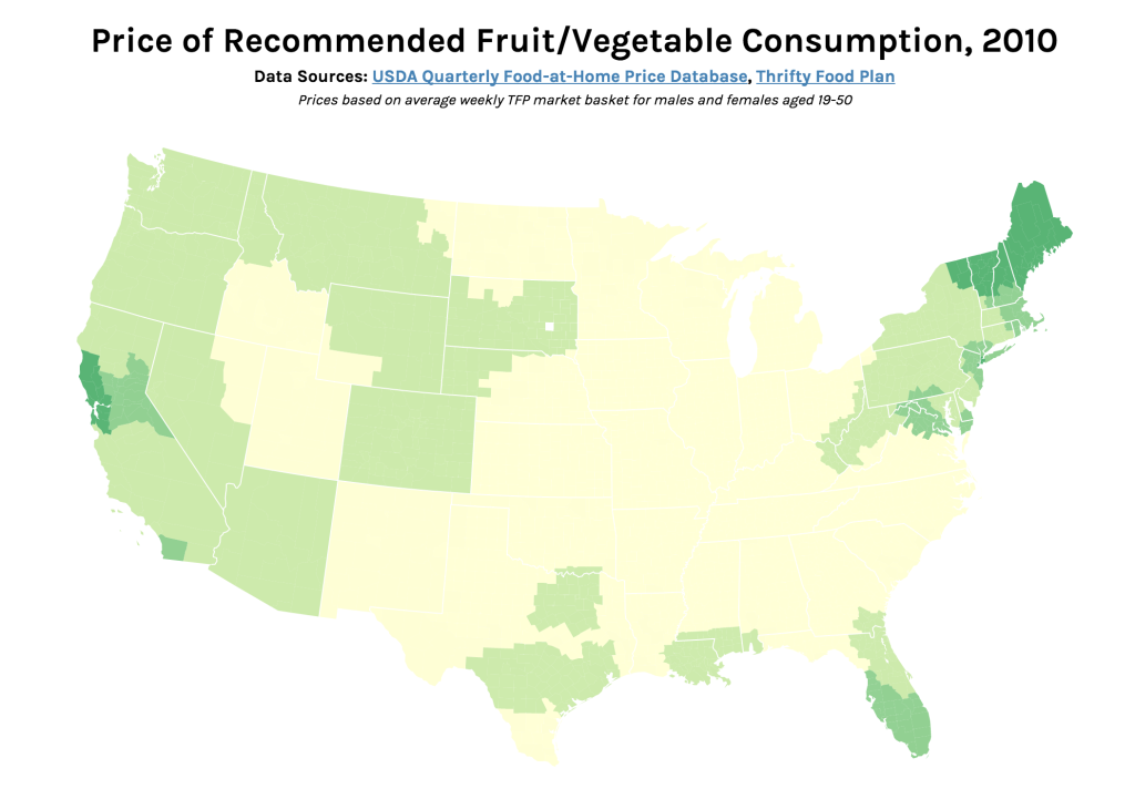
Interactive version: http://s2tephen.github.io/qfahpd/map/

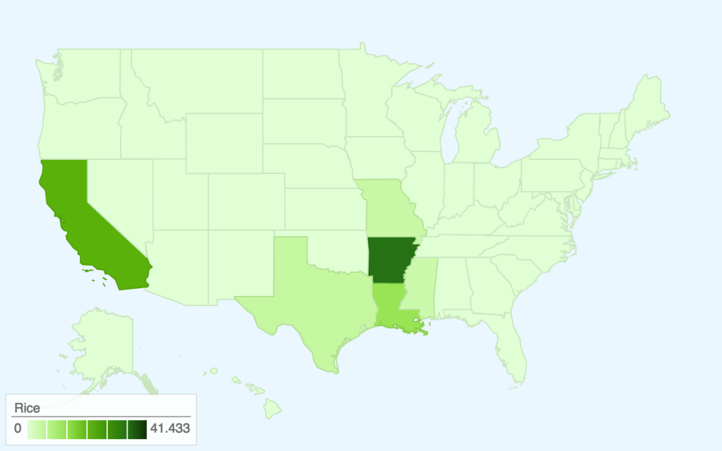
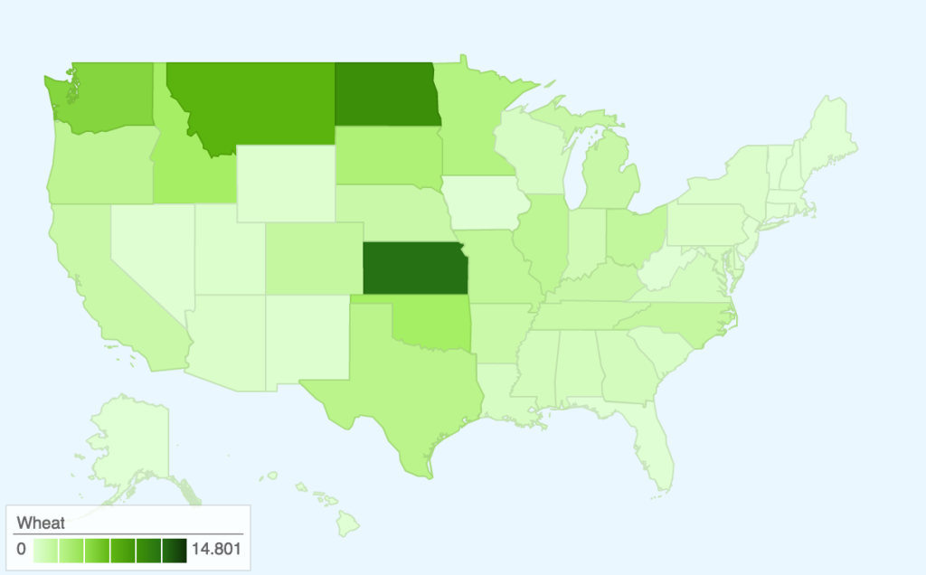
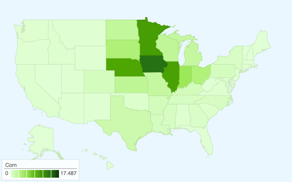
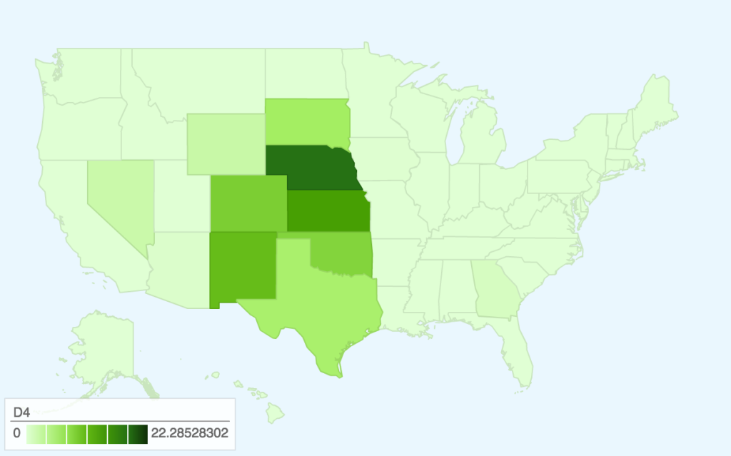
This map takes the two data sets we worked with previously — the Quarterly Food-at-Home Price Database (for the small multiples of fruit/vegetable prices) and the Thrifty Food Plan (for the SNAPables data sculpture) — and attempts to synthesize them to tell a single data story. In our presentation of the food price data, one of the criticisms we received was that price per 100g of food was not an intuitive way to think about food consumption. The Thrifty Food Plan, the bare minimum of an adequate diet (and the basis for calculating SNAP benefits), actually includes the breakdowns of its market baskets by weight (pounds). This meant that we could actually calculate the real price of the Thrifty Food Plan around the United States, factoring in regional price differences.

Most of our time was spent cleaning and synthesizing multiple data sets, so once again we only had time to focus on the fruit/vegetable food group. However, the next step for this map would be to calculate the combined price of all food groups (i.e. the entire Thrifty Food Plan market basket) and compare this to the SNAP amount. This is because the cost of the Thrifty Food Plan is based on the assumption of uniform food prices across the nation — however, as the Quarterly Food-at-Home Price Database shows, this is simply not the case. We could then identify which regions’ SNAP benefits may be over- and underestimated.

As such, the audience for this graphic would be the researchers and policymakers responsible for creating the Thrifty Food Plan and setting the SNAP benefits. The goal of the combined map would be to advocate for a new SNAP benefit methodology, based on actual local food prices. For this iteration, we only included data for those from age 19-50, but one could imagine an even more interactive version of this graphic, where someone might specify their age/sex and weekly spending on food — the map could show them the weekly required spending for an adequate healthy diet, allowing them to compare those numbers.

In terms of data visualization, this choropleth was created in D3.js/TopoJSON and uses quantile classification to subdivide the different weekly spending amounts on fruit and vegetables. ColorBrewer was used to generate the colors, but the large area of yellow is kind of hard to see (perhaps we could have used a different color ramp or adjusted the classification buckets to improve this). Furthermore, the map would be a lot more readable (i.e. as a static graphic) with a legend — as it is currently, you only get a broad comparative view of the country and can only really zoom in on actual prices if you use the interactive version. Another minor thing is, because the data is regional and not at the county-level, having each county as an individual entity is kind of useless (the counties don’t conform to traditional political boundaries, so this was the best we could do). The other question is whether a map is actually the most appropriate visualization method — even if there are significant differences in food prices based on geography, we might need to make some hypotheses or incorporate additional data sets to explain how geography might be affecting variation in prices.

Mapping Artists Around the World

Artists in Tate's Collection by Country of Birth

*this embed isn’t working well so go here to view its full interactivity!

For this assignment, we used Tableau to map where artists in the Tate collection were born. First, we made maps that show in which countries artists were born in by century (1500s, 1600s, 1700s, 1800s, and 1900s). Scrolling through these maps reveals how the scope of what the Tate collects changes over time: while art works by artists born in the 1500s and 1600s are limited to Europe, we see that the Tate represents artists born in the 1700s from the U.S., Canada, and Russia; that artists from the southern hemisphere begin to emerge in the 1800s; and that artists born in the 1900s represent countries from all over the world and from every continent. A final chloropleth map shows artists born in all centuries. The darker countries indicates those with more artists represented (the United Kingdom, unsurprisingly, is the most represented country in Tate’s collection); the lighter ones might only have a handful of artists in the collection.

Goals

Our goal is to give a macro-view of what is in the Tate’s collection. Often, when people are visiting museums, they focus on one object at a time; a visualization likes this can help visitors understand the larger scope of what a collection represents. Another goal is to reveal how a museum like the Tate represents the world and what biases they have toward certain geographic areas. Most of their holdings stem from the Western world (especially the United Kingdom and the United States), but we do see that more modern and contemporary art has begun to accept artists from all over the world.

Audience

People who are interested in art and artists. Visitors to the Tate (many of them international) might be interested in seeing if their country is represented in the collection.

Next steps?

We brainstormed other maps that we could undertake with our data sets but unfortunately did not have the time to fully clean the data, run scripts, and make new maps. On a very basic level, it would be great if the labels could allow you to dig into artists names per country (and possibly link you to information about them). It would be interesting to write some code that would allow users to type where they were born and be given an artist born close to them. Considering our team’s interest in analyzing color in works of art, we were thinking of finding the average or most dominant color per country and making a map that represents countries by these colors.

Mapping the SNAP-friendly Stores in Somerville

Deborah, Tuyen, Hayley

Following up with our data sculpture, we wanted to see where the retail stores that accept the SNAP are located in the two-dimensional map. We were curious to compare this 2D mapping to the 3D data sculpture: which visualization would feel more trustworthy and give more “authority” to our data and story? which one would more effectively represent the scarcity of the farmer’s markets?

Audience
So, the intended audience of the following map was ourselves. It was created to help us understand the strength and weakness of visualizations in 2D and 3D.

Data & Filtering
We first downloaded the USDA data that contain the list of retail stores which accept SNAP in MA. We then filtered the data to get the lists of stores with the Somerville’s zipcode: 02143, 02144 and 02145. Here is the link to our filtered data. Unlike our data sculpture for which we categorized the stores into four groups (Grocery store, Supermarket, Superstore and Farmer’s market), this time we divided the stores into just two categories: farmer’s market and non-farmer’s market. Non-farmer’s market category includes grocery stores, supermarkets and superstores.  We made this decision in order to highlight the scarcity of the farmer’s markets (that accept SNAP), relatively to the number of other retail stores.

Here is the link to the same map of SNAP-friendly stores in Somerville.

SNAP-friendly stores in Somerville, MA

Although this 2D map lost the physicality of the balloon sculpture and the audience did not have a chance to feel the physical challenge of reaching/searching for the farmer’s markets, we found the exploration option using the side pane quite useful. We were able to click on the name on the side pane (that lists all mapped stores by its type), and the map would adjust the center of the view according to the location of the store; it felt as if we are looking around even though the degree was limited. Searching through the long list of non-farmer’s markets in the pane also allowed us to experience how rare the farmer’s markets with SNAP are. We had to scroll down multiple times to encounter a farmer’s market.

Choropleth Maps: US Agriculture and Drought

Ceri Riley and Val Healy

For our map project, we decided to make several small choropleth maps to illustrate where selected foods are grown and compare them to where drought is located. Unfortunately, Google Fusion Tables maps do not allow for changes in color, so all of our maps are green, though we would, if allowed, choose to use brown for the farmed animal maps, green for the crop maps, and red for the drought map.

These maps were produced using 2013 USDA Datasets on Cash Receipts for crops and averaged 2013 Weekly Drought Data. Drought conditions have since become more serious, but the data on agricultural production by state is only confirmed through 2013 so we chose to focus on this year.

Cattle and CalvesHogsBroilersRiceWheatCornD0-D4D4

Here are links to the maps for interactivity:

Agriculture: Cattle and calvesHogsBroilersRiceWheatCorn

Drought: D0-D4D4

As you can see, there is a moderate amount of drought throughout the central/western part of the United States, with the most severe drought focused in the midwest around Nebraska.

The majority of the cattle industry is located in a region where there are more serious levels of drought, while chickens (the ‘broilers’ map) are located further East. Cattle farming also requires more water than chicken farming, though, so perhaps this correlation is partially due to the large water footprint that feeding/watering cattle leaves.

Rice, wheat, and corn are three of the most prevalent grains in the United States, and the maps show areas where the drought regions overlap with the agricultural regions in addition to states that were relatively unaffected by drought. This allows an audience to explore different states’ contribution to US agriculture, beyond what is normally reported in mass media (recently, California agriculture). For example, the more serious drought in California might affect 26% of the rice crops, but 41% of rice is also grown in Arkansas. However, a lot of the states that grow corn are also affected by some level of drought.

Audience

Our audience is those who wish to see which types of crops or animal agriculture might be most affected by drought.

Goals

Our goal for this project is primarily internal; we wanted to make these maps to aid us in finding areas of food production most affected by drought. We hope we can use information gleaned from this small project in our final project, as our datasets covered more information than shown here.

In addition, these maps could demonstrate that there are significant levels of drought and crop production in the United States outside of California, even though most of the media focus is on the one state.

Small multiple choropleths – income and obesity

MergedChoro2

You can see the choropleths here as well.

NOTE: We inverted the axis on the median income map because we wanted to make use of the people’s tendency to associate red with danger. Had we not inverted the axis, the wealthiest states would be dark red, which may be confusing (we hope that the inverted axis is less confusing than the dark red on wealthy states would have been).

Audience

General public, especially people from middle-class or rich households.

Goals

While other sources have pointed out the link between obesity and poverty, we wanted to see it for ourselves and illustrate it geographically using multiple metrics.

The maps are geared towards people from middle-class or rich households, because they may not be aware of this connection.

We aim to show that the poorest states are also the ones most prone to obesity. In addition, we aim to identify the states in which the poverty/obesity link is most severe. To do this, we generated a number of choropleths and presented them in the “small multiple” style.

Extra

We also tried making some cartograms, but they were a bit confusing to read. Here’s what they looked like.

cartograms

Data Sculpture – SNAP TV Dinners

One common misconception among SNAP (Supplemental Nutrition Assistance Program) participants is that food stamps are supposed to cover one’s entire food budget. However, as its name suggests, SNAP is only meant to be supplemental — the program assumes that participants are spending 30% of their net income on food. SNAP makes up the difference between that 30% and the cost of the Thrifty Food Plan, what the USDA defines as the bare minimum diet for adequate nutrition. Our data sculpture seeks to address this misconception by tangibly demonstrating the difference (both in terms of quantity and nutritional value) between subsisting on SNAP benefits and supplementing them with a portion of net income.

The primary audience of this data sculpture is SNAP participants living in Middlesex County, specifically those under-spending on food. With this data sculpture, our goal was to illustrate what a “proper” meal under SNAP should look like and convince participants who are not spending any additional money on food to do so. On another level, we also wanted to engage people who are not eligible for SNAP and show them what sorts of meals the food insecure are eating on a regular basis. With this audience, the goal was to build empathy and put them in the shoes of a SNAP participant.

In order to create the data sculpture, we used a number of datasets — first, we used the USDA’s SNAP Data System in order to determine the average monthly SNAP benefits for residents of Middlesex county: $132.29 (or $4.41 per day). This was contrasted with the 2015 projected cost of the Thrifty Food Plan, estimated at $194 per month (or $6.47 per day). Using these daily amounts, we created some sample meal plans within those monetary constraints, using data from the Thrifty Food Plan as well as Peapod/Instacart for up-to-date food prices. These represent typical meals for those who only spend SNAP benefits on food and those who use SNAP benefits as intended — as a supplement to 30% of their net income.

The data sculpture itself would take these meal plans and present them in TV dinner-style packaging. With this presentation method, we can make visible the relative sizes of a SNAP-only and a SNAP + 30% income meal. Moreover, price tags and nutrition facts on these packages further drive home the comparison — with an incremental increase in food spending, SNAP participants can drastically improve their nutritional intake. Using the visual language of the TV dinner — a symbol of unhealthy eating — also foregrounds the nutrition question. While we did not actually prepare said meals for this assignment, this data sculpture could be fully interactive (i.e. edible), allowing the audience to experience the difference between the two meals in the most visceral way possible: by eating them.

For the purposes of this assignment, we have mocked up an example of what the packaging might look like, and constructed three meals (breakfast/lunch/dinner) for each of the two food budgets:

snapables

SNAPables

Breakfast (Cheerios & milk, orange juice, banana, coffee)

Cost per serving 1.12
Calories 373
Fat (g) 3.7
Cholesterol (mg) 8
Sodium (mg) 206.2
Potassium (mg) 1227.4
Carbs (g) 85
Fiber (g) 6.1
Sugar (g) 49.4
Protein (g) 14.3

Lunch (PB&J, apple, water)

Cost per serving 1.53
Calories 475
Fat (g) 17.8
Cholesterol (mg) 0
Sodium (mg) 346.8
Potassium (mg) 194.7
Carbs (g) 73.1
Fiber (g) 8.4
Sugar (g) 39.9
Protein (g) 11.5

Dinner (spaghetti & meatballs, green beans, water)

Cost per serving 1.77
Calories 730
Fat (g) 23.5
Cholesterol (mg) 60
Sodium (mg) 1460
Potassium (mg) 320
Carbs (g) 103
Fiber (g) 8
Sugar (g) 13
Protein (g) 31

Daily Total (vs. recommended values)

Cost per day 4.42
Calories 1578 1500
Fat (g) 45 48.75
Cholesterol (mg) 68 225
Sodium (mg) 2013 1800
Potassium (mg) 1742.1 2625
Carbs (g) 261.1 225
Fiber (g) 22.5 18.75
Sugar (g) 102.3 28.125
Protein (g) 56.8 37.5

SNAPables Selects
(now with 30% more income!)

Breakfast (Cheerios & milk, orange juice, banana, coffee)

Cost per serving 1.12
Calories 373
Fat (g) 3.7
Cholesterol (mg) 8
Sodium (mg) 206.2
Potassium (mg) 1227.4
Carbs (g) 85
Fiber (g) 6.1
Sugar (g) 49.4
Protein (g) 14.3

Lunch (turkey, cheese & tomato sandwich, apple, water)

Cost per serving 2.91
Calories 386
Fat (g) 13.4
Cholesterol (mg) 25
Sodium (mg) 784.9
Potassium (mg) 340.7
Carbs (g) 61.5
Fiber (g) 9.2
Sugar (g) 24.5
Protein (g) 14.1

Dinner (chicken breast, green beans, carrots, rice, water)

Cost per serving 2.45
Calories 236
Fat (g) 2.3
Cholesterol (mg) 65
Sodium (mg) 563.3
Potassium (mg) 429.6
Carbs (g) 26.3
Fiber (g) 4.6
Sugar (g) 8.1
Protein (g) 29.2

Daily Total (vs. recommended values)

Cost per serving 6.48
Calories 995 1000
Fat (g) 19.4 32.5
Cholesterol (mg) 98 150
Sodium (mg) 1554.4 1200
Potassium (mg) 1997.7 1750
Carbs (g) 172.8 150
Fiber (g) 19.9 12.5
Sugar (g) 82 18.75
Protein (g) 57.6 25

See the full meal plans and nutritional data here:
https://docs.google.com/spreadsheets/d/12LvOiceZjH0smXqZlN7vZhmCwCU32xsE6_treVmatQM/edit#gid=0

Crayon Art Data Sculpture

Description:  We made “art crayons” for four paintings.  The composite crayons combine the five most prominent colors in a painting into a crayon.  The amount of each color maps to the amount of the color found in the painting.  So you could recreate the painting by coloring with just that crayon!

We made crayons for the four paintings shown below. We used the RoyGBiv python module and Cooper Hewitt’s color mapping python module to find the most prominent colors in the paintings and map them to Crayola colors.  We bought crayons, selected the correct colors, divided them in the appropriate proportions, melted them, and poured them in layers into a mold we created from wax paper, hot glue, and tape.  You can see the results below.

Audience: Kids, adults, people who like art or have a favorite painting.

Goals: Increase engagement with art–you can draw it too!  Make art seem more accessible–tangible and everyday.  Fun and play!

Screenshot from 2015-04-23 14:40:48

(1) Alex Katz, Tulips 4, 2013, Museum of Modern Art

(2) Agnes Martin, With My Back to the World, 1997, Museum of Modern Art

(3) Georgia O’Keeffe, Music, Pink, and Blue No. 2, 1918, Whitney Museum of American Art

(4) William H. Johnson, Jitterbugs (II), ca. 1941, Smithsonian American Art Museum


Screenshot from 2015-04-23 14:40:59

Screenshot from 2015-04-23 14:41:08

Screenshot from 2015-04-23 14:41:18


(Team Artvark: Laura & Desi)

Drought Data Curtain

Ceri Riley and Val Healy

For our data sculpture, we decided to make a beaded curtain to visualize data on percentage of cattle affected by drought in the past year. Our goal was to design a data-centric piece of home decor that will showcase this data, while also acting as an attractive decoration. Our audience is anyone looking to incorporate data-driven design into their home space.

To decrease the number of strands and beads we needed, we first modified the data by averaging the values of the total percentage of cattle affected by drought for each month in the graph. We rounded these values to zero decimal places. These values translate to the percentage of red beads placed on the bottom of the strand, as shown in the table below. One flawed outcome of this method is that the first and final strands represent less than a full month’s worth of data, as we made the curtain in the middle of this month, and our data set only includes data from the past year.

To design the curtain itself, we researched typical dimensions of pony beads and settled on using 300 beads per strand; thus, three beads would represent one percent, and we would need 3900 beads in total. The number of each type of bead on each strand is listed in the table below.

Lastly, we decided to use red beads to represent the drought data due to the color’s association with danger, fire, and generally bad things. We chose to use blue beads to represent the percentage of cattle not affected by drought due to the color’s association with water and generally good things.


(picture coming soon)


Date Percentage red beads blue beads
April 2014 44.3333333333 133 167
May 2014 45.75 137 163
June 2014 39.75 119 181
July 2014 35.8 107 193
August 2014 34.75 104 196
September 2014 30.4 91 209
October 2014 28.25 85 215
November 2014 27.75 83 217
December 2014 28.6 86 214
January 2015 25.75 77 223
February 2015 27 81 219
March 2015 30.2 91 209
April 2015 36 108 192
1303 2597
drought beads “empty” beads

Mapping Obesity in 3D

map2

map1map3


We decided to create a twist on the traditional colored map, and literally add depth to our data. Using obesity percentage data at the county level, we carved into the contiguous United States to create valleys that indicate lower obesity and mountains that indicate higher levels of obesity.

Because of the range of possible values, our map delivers sometimes smooth and sometimes abrupt transitions that can be physically felt by moving your fingers across them. One can also observe that there is nowhere that is 0% obesity, which would be a hole through the sculpture.

We created this for a general audience, and had the goal to show the transitions of obesity at a greater resolution than at just the state level and to make that demonstration interactive.

Team: Danielle Man, Edwin Zhang, Harihar Subramanyam, Tami Forrester


Data sculpture

Data & Story

In 2012, roughly 46.6 million people participated in SNAP. According to the 2012 USDA  Retailer Policy & Management Division report, 27.66% of the retailers that accepted SNAP were grocery stores, supermarkets, or superstores, while only 0.76% were farmers markets. Additionally, 87.38% of the SNAP benefits were redeemed at grocery stores, supermarkets, or superstores, but only 0.02% at farmers markets.

There is a paucity of farmers markets that accept SNAP, but as we saw in the Rapid Assessment Response and Evaluation of Food Insecurity in Somerville, there is also a demand among those who are food insecure for fresh fruits and vegetables.

We want to highlight this issue for the general public. Our goal is to draw attention to the very small number of farmers markets that accept SNAP nationally show physically how the scarcity makes access to the farmers markets more difficult.


Data sculpture

To do this, we made a data sculpture from balloons. Each balloon of a different color represents 4 major types of stores – grocery stores, superstores, supermarkets, and farmers markets. To show the lack of farmers markets, we have one white balloon to represent farmers markets, and proportionally many of the other categories. For example, superstores are 7.43% of all retailers, so there are 7.43/0.76 = 9 balloons for superstores. We chose these categories because they represent almost 88% of stores where all money was spent.

Arrangement

We arranged the balloons so that the white one (farmers market) was in the middle, while rings of balloons representing the other categories surrounded it. We also played around with different arrangements, such as having the balloons be more “random” and spread out in the 3D space so that they looked more like markers of real locations.

data_sculpture


data_sculpture3d