COWBIRD, a public library of human experience

cowbird

WHAT?
Cowbird claims in its “about” section that it is a multimedia storytelling tool.
It is a free tool and gathers a library of human experience under a simple set of storytelling tools. What they mean by tool is a combination of pictures, text, and sound to create a beautiful record of your human experience.

The idea originated from Jonathan Harris, an artist and a computer scientist. I have known the artist from this great project called The Whale Hunt.
It started in his former project called Today, as a ritual of taking a picture a day, writing a short story and posting it online before bed. From that initial project, it took Harris and a small team 2 years to build up what now has become a real library of human stories. From a personal project Cowbird has become a small company.

WHAT FOR?
So, Cowbird is a platform where you can go to tell a story that you think is worth sharing with a wider community of lovers of good stories. Good but also deep and at personal level.

The idea is for people to tell short location-tagged stories based on their own experience using text, photos and sound or a mix thereof.
The more personal and authentic your story, the more it will resonate with the still relatively small Cowbird community. They claim on the website as of today March 30th 2015: 43,654 authors from 183 countries have told 79,493 stories on 27,721 topics.

Harris claims to Cowbird have 3 objectives
+ Create a space for a deeper, longer-lasting kind of self-expression than you’re likely to find anywhere else on the Web.
+ Pioneer a new form of participatory journalism, grounded in the simple human stories behind major news events.
+ Build a public library of human experience — a kind of Wikipedia for life experience.

Capture d’écran 2015-03-30 à 15.19.14

HOW TO GET STARTED?
Well there are, I think, two types of users who can experience Cowbird.
You will have the active participant or the passive one. Being a witness for life as the tagline says. The active participant will be the one who created an account and share some information about himself/herself and start to share the kind of stories they want to tell or curate. The active user will bethe one documenting with his personal stories.

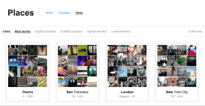
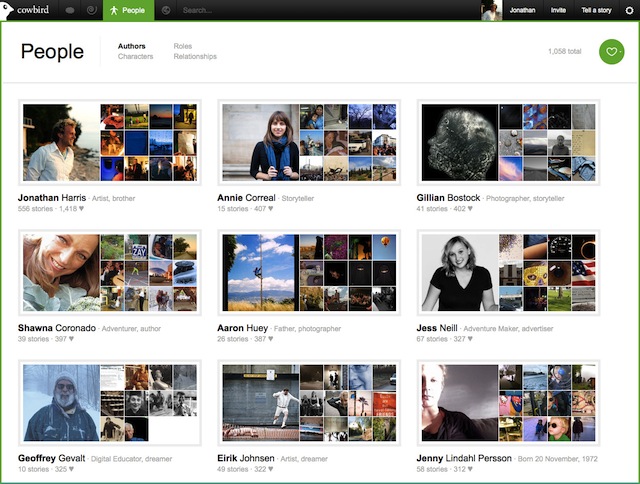
As for the passive participant, he is the one who will browse and discover, experience the perspectives through the different possible paths: search, stories, seeds, topics, places, dates, etc.

Capture d’écran 2015-03-30 à 15.21.31

cowbird1

HOW EASY?
Cowbird provides « a warm and welcoming environment » for storytelling, which is home to a global community of storytellers.
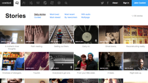
No particular skill needed to use it. I just created an account and confirmed my email. The website is beautifully designed and provides its community of users with typography, infographics and the possibility to upload photos.

The difficult part for an ‘active’ user would be the approach and the commitment. What approach to have? Finding some kind of balance between the personal and journalist challenge. It is a editorial question. How do you curate your story?
Cowbird takes time and invite people to reflect on themselves. Cowbird is “more of you than dashing off tweets from a cell phone, but we think it gives back a lot more, too” said Harris.

Capture d’écran 2015-03-30 à 17.09.23

WOULD I RECOMMEND IT?
Of course. As a passive participants first. Browse and discover the stories, is an easy and simple way to get inspiration.

WOULD I USE IT?
Yes, if I like to tell stories and share them in another platform than a blog for instance.

USAGE
I think for journalists to be, it is a great platform to help improve and connect with an authentic audience. Through the most viewed, or loved sections you can see your story becoming popular.

Personally, hearing the stories with audio with the photo is more compelling and helps to better understand the translation of the experience.

I am not sure if I would use Cowbird in my final project, but definitely to get stories and inspiration as I would consider Cowbird more like a library.

R is for everything

R is a free open-source statistical programming software descendant from S that came out of Bell Labs. Rstudio is a commonly used user interface for R. Both can be downloaded for Mac, Windows, or Linux.  R is widely used and established–it is highly unlikely that it will disappear anytime soon.
R is great for custom data visualizations and advanced statistical analysis.  It also forces you to be structured and repeatable in your data analysis–the process of interacting with your data requires explicitly writing out the steps of interaction, unlike Excel or similar approaches.  Once you have powered through the learning curve you can quickly summarize and visualize your data.
Lots (a majority?) of statisticians use R and share their most recent work through R packages that extend the functionality of “base R” (the initial installation).  Packages that I commonly use include: RColorBrewer, plyr, ggplot2, lattice, stringr, reshape2, and there are many other useful packages out there. Some additional suggestions can be found here and googling will lead to many more results.  R also offers a variety of open source datasets both as a part of a package or the purpose of the package, such as the census data.  R also includes communities supporting particular aims, such as the rOpenGov project.
R does a good job of handling situations common to real data analysis such as missing values or cleaning strings.  It can handle large data (and even Big Data) through a variety of packages such as pbdr.  It can also be used with qualitative or social science data.  It can be used to create maps.  It can be used with LaTex (via, for example, Sweave) and websites (via, for example, shiny) so your analysis can be directly embedded in your output files.  This can be very convenient and reduce errors as your data processes update or your datasets change based on new information.
R is somewhat difficult to learn, though there are extensive online resources the helps the process. Resources include:
  • The R-help mailing list.  A great resource, but use with caution–google first!  Someone has probably asked your question already (especially in the beginning).
  • A collection of R blogs.  Great for keeping up with new work in the area and getting a scan of what’s out there.
  • Blogs for starting off with R, for example or resource lists.
  • Blogs for newer R users, for example, or this, or many others.
  • R FAQ.  Useful, but not the most easily accessible document when you’re first starting.
  • The R Conference.  An intense group, but a lot of fun and very informative.
R does some fun things too, like:
I would (and have!) definitely recommend R to a friend.  I’d like to do something more physical than visual for my final data story, but I plan to use R for the initial data exploration and cleaning…and it’s possible I’ll get so sucked in to that work that I’ll end up staying the visualization space.

Timeline.js – creating interactive timelines

What can you do? What kind of stories is it good for? 

With timeline.js, one can quickly make interactive timelines that contain various types of embedded media, such as images, maps, videos, and tweets. The timeline is automatically generated from a google spreadsheet, so one just needs to enter in the data in the right format.

This tool would be useful for stories where one needs to create a timeline quickly. The creators recommend choosing stories with a “strong chronological narrative,” as opposed to those that involve jumping around in the timeline.

The media ends up being the focus of each event in the timeline, so one should have a lot of media in mind for the timeline; otherwise, it will look bare/repetitive with only text. The creators of timeline.js also recommend that

I can also see a lot of uses for non data story contexts – you could make a timeline of a person’s life, a timeline of a breaking news event, a timeline of government policies, etc. There are many examples of real publications using this tool on the website.

spreadsheet_screenshot
Timeline.js template with examples


houston-example
Timeline of Whitney Houston’s life. Source: http://timeline.knightlab.com/examples/houston/

How do you get started? 

The documentation on the timeline.js website makes it very easy to get started. I was able to set up their provided template timeline for editing in ~5 minutes.

To publish a new timeline:

1) Open a copy of the template and edit the data in the spreadsheet
2) Publish the spreadsheet to the web
3) Copy the URL of the spreadsheet into the online generator box
4) Imbed the iframe into your website. I was able to make a new timeline.html document, paste the generated code into the document, and open the file locally in chrome to see the timeline.

How easy/hard is it? 

The tool is pretty straightforward. There are two main things to learn: the structure of the spreadsheet (i.e. where to paste items, and how the spreadsheet corresponds to the generated UI), and setting up the test html page to see your changes. The example timeline and the corresponding template make this pretty easy to figure out. One thing to note is that there cannot be any empty rows in the spreadsheet.

One nice thing is that once you’ve set up the html document with the iframe, any changes you make in the spreadsheet will be reflected if you refresh the page – no need to generate new iframes/copy paste every time.

No coding is necessary to use this tool (besides pasting the iframe into a webpage). Though the tool is open source, and one can download the source code to further customize timelines, the online interface already provides many options for customization, such as font choice, default zoom level, which slide to start at, etc, making it suitable for most use cases.

 Would you recommend this to a friend? Will you consider using it for your final data story?

I’d recommend this tool to a friend! It’s straightforward to set up, and you can embed many different types of media. I’d consider using it for my final data story if there was a need for a timeline.

Also, though this is nominally a tool to make timelines, it’s also a nice slideshow viewer. I can imagine downloading the source code and modifying the display to only show the slideshow parts, while hiding the actual timeline ticker


spring_break_example
A card I made: spring break


nltk: all the computational linguistics you could ever want, and then some

What can you do? 

nltk is a Python module that contains probably every text processing module you’ve ever had a vague inkling of a need for.  It contains corpuses of language for machine learning/training; word tokenizers (splits sentences into individual words or ngrams); part-of-speech taggers; parse parts of speech in sentences (with trees!); and much, much more.  It’s good for analyzing lots of text for sentiment analysis, text classification, and tagging mentions of named entities (people, places, and companies).

How do you get started?

The creators of nltk have published a book for free online that explains how to use many of the features nltk has.  It explains how to do things like access the corpora that nltk has; categorize words; classify text; and even build grammars.  Basically, the best way to get started is install nltk, then go through the book and try the examples they present.  They include code examples in the book so you can follow along and practice using different functions and corpuses.  There’s also a wiki attached to the github and stackoverflow, where programmers go when they’re lost, is of course a useful (but often very specific) resource.  The learning curve required to become comfortable leveraging the different functions available is fairly steep because they are so many and so specialized, and in my opinion the best way to gain that comfort level is to simply play around with nltk and build cool things to gain experience.  Simply reading the book, while interesting, won’t be enough to become good at using nltk.

How easy or hard is it?

Well, it’s certainly easier than writing all of this from scratch, no matter how competent a programmer you are.  The one thing that can be difficult with Python modules is that you’re not entirely sure what’s under the hood unless you get cozy with the source code.  That means you might not be sure what’s causing a performance issue, why it doesn’t like your input, or why your output looks a certain way.  Also, figuring out exactly which function to use for a specific task might be somewhat confusing as well unless you have a certain amount of experience in machine learning or know exactly what you want (it’s hard to go wrong with tokenization).  For example, the built-in classifier is only as good as the features you feed it; giving it too many high-dimensionality items might result in overfitting or just horrendously slow code, and giving it low-dimensionality items might mean it can’t classify the items effectively.  Experience with Python datatypes and object-oriented programming is also very, very important; if you don’t understand what a function is, what list comprehensions look like, and how Python dictionaries work, the example code given in the book will be incomprehensible.  Even though the printouts from the example code look very nice and fancy and clean, the knowledge behind their creation (how do you print things that look nice? what is a development set? how do you use/leverage helper functions like tokenizer and the nltk function that gets the n most common words/letters? how do decision trees work?) is far from simple.  Anyone with programming experience can use the simpler functions very effectively and the less simple functions with probable success, but in my opinion knowing how classifiers and parsers work is important to use them well.  The bottom line is that they’re only as good as what you feed them, and understanding how definitive or accurate their output is requires a degree of understanding of what’s under the hood.

Would I recommend this to a friend?

If that friend had a similar programming background to me (can write Python code pretty well; knows a little bit about machine learning) I’d recommend it with little reservations other than a warning about the learning curve and the overwhelming abundance of options.  I’d still suggest they at least skim the book and keep stackoverflow close at hand (although that’s true for most programming projects that venture into unknown territory).  If my friend wasn’t comfortable with machine learning, I’d suggest they read up on Wikipedia about whatever classifiers they use so they have an idea of why the classifier misbehaves, if it does, or what errors it’s likely to make.  And if they weren’t comfortable with programming, I’d suggest they look into other natural language processing tools.  This is a tool that’s made by programmers and scientists, and it shows in the documentation, the resources, and the wealth of options available to those who know how to use them.

tl;dr: nltk has a ton of really cool natural language processing tools.  However, they are by no means idiot-proof, and you will be sad if you don’t know Python.  One does not simply download nltk and spit out useful results in five minutes.  


RAW: Create Simple Visualizations Quickly

What is it?

RAW is an online drag-and-drop tool for uploading csv data and creating common visualizations such as scatterplots, treemaps, and circle packing diagrams.

RAW is open source and provides guides for adding your own visualization types (using D3.js).

What is it good for?

RAW has 16 visualization types which are built using drag-and-drop and can be customized to a minor degree. If you need to generate several common visualizations to support your data story, RAW can make them very quickly.

Be warned that RAW runs in a web browser and cannot handle large datasets (i.e. more than a few MB). Furthermore, since many of the visualizations display all the data points, a visualization produced from a large dataset will be cluttered and unreadable.

Thus, RAW is good for stories that require several simple visualizations built on a dataset consisting of small to medium sized csv files.

How do you get started?

Since RAW is simple to learn, you can jump right in and start using it. For a quick intro, consult the video tutorial. For further information, consult the Github wiki.

If you are a developer trying to add a new chart type to RAW, consult the developer guide.

Is it easy? What skills do you need?

RAW guides you step-by-step through building the visualization. Therefore, it’s easy to learn. Beyond understanding what each visualization means, RAW requires no additional skillset, which makes it very easy to use.

The primary challenge in using RAW is understanding each type of visualization. For example, if you don’t know what a Voronoi Tessellation is, then RAW gives you no guidance on how to interpret the visualization.

For developers, extending RAW requires a knowledge of the JavaScript language and the D3.js library. Familiarity with Scalable Vector Graphics (SVG) and Angular.js may also be useful.

Would I recommend it?

I would highly recommend RAW as a tool for building visualizations to support a data story or for finding possible stories. Visualizations can be built quickly with RAW, so it’s useful for exploring your dataset by building visualizations. Furthermore, since the visualizations can be exported as SVG, HTML, PNG, and JSON, it’s easy to embed them into an article or similar data story.

If you are working with a large dataset (ex. several MB or more), RAW may not be able to handle all your data. Furthermore, the visualizations may be too cluttered.

If you want precise control over your visualization, RAW may be too restrictive for you. Although it’s possible to add features to the code, it may be quicker to build the visualization using a different tool.

Would I use it?

I think I will use RAW to help me generate ideas as I peruse my datasets. Since I am interested in maps, games, and interactive data stories, I don’t think I will use RAW to create my final product.

Usage

Here’s how RAW can make a circle packing diagram using a dataset about the 2014 Global Hunger Index around the world.

raw1

raw2

raw3

raw4

International Food Policy Research Institute (IFPRI); Welthungerhilfe (WHH); Concern Worldwide, 2014, “2014 Global Hunger Index Data”, doi:10.7910/DVN/27557 International Food Policy Research Institute [Distributor] V1 [Version]

Demographics of Boston Districts and Neighborhoods

Author: Tami Forrester

I chose to look at one dataset that showed the race distribution by city council districts in 2010, based on information from the census. Unfortunately, it was presented in pdf form, which limited interactivity, though I found it interesting that of a total population of 6.5 million, white people accounted for around 81 percent of them, and led the population totals in all but three districts – Districts 4, 5 and 7. After looking at the dataset, I thought of the following questions

  1. Neighborhoods vs Districts? Could these be mapped out?

Looking through this table and other datasets left me confused as to how city council districts compared or related to neighborhoods. According to a link on the City of Boston website, the districts are mapped out as so:

Screen Shot 2015-03-10 at 1.33.17 AM


I was also able to find another map showing crowdsourced neighborhood boundaries based on a survey.

I tried to overlay the two images to see if it would make for an easy comparison, though it it mostly confusing to look at.

overlaymaps
Dark black lines refer to city council district boundaries, and shadings refer to the crowdsourced neighborhoods


I also searched through datasets on the City of Boston site, but most only contained data about neighborhoods, and didn’t show relationships between them and districts. I was able to find a document on the City of Boston site, which compared the racial distribution over both districts and neighborhoods. However, trying to convert this data into an interactive form proved very tedious because it was locked in a pdf. Even after using an online tool to convert pdfs to excel spreadsheets, the formatting made it difficult to work with in Tableau.

  1. How have these demographics changed over time?

Another google search led me to yet another pdf of data showing how racial demographics have changed for specific years 1990, 1993 and 2002. I wasn’t sure why the specific years were chosen, and I didn’t try to analyze this in tableau, but was able to look over and see trends. I found it interesting that the amount of people identifying as various races in 1993 and 2002 was exactly the same both years, though the distribution over all districts in each time were different. For example, 140,305 people identified as black in both 1993 and 2002. The amount of black people per district was not the same between both years, however.

  1. What are some characteristics of the different districts?

Two characteristics I looked at specifically listed the public schools in Boston, and the crime incidents as reported by Boston police in 2012. Unfortunately, the schools were not mapped to their zones, but the crime incidents also included the zip-code and region area they were reported in. Using Tableau, I mapped the number of incidents that were reported in a particular region, and created a pie chart with neighborhoods mapped to the percentage or incidents reported.

Screen Shot 2015-03-09 at 11.58.10 PM
Mapping of zip-codes colored by the number of crime incidents from Tableau. Regions that were more “green” had the most reports.


Pie chart as generated in Tableau. I couldn't figure out how to place the unlabeled sections (which did actually have regions)
Pie chart as generated in Tableau. I couldn’t figure out how to place the labels for the currently unlabeled sections (which did actually have neighborhoods)

The crime incident reports also had a field called “reptdistrict”, which was presumably another metric used to characterize a particular region, though it was unclear what it meant.

Snow and Icy Sidewalks of Cambridge

Authors: Desi Gonzalez, Stephen Suen

One interesting finding from looking at the data:

We choose to look at two open datasets from the city of Cambridge: the first documented unshoveled and icy sidewalk complaints since January 1, 2008, and the second recorded snow and ice sidewalk ordinance violations since December 1, 2007. Looking at the datasets, we noticed that snowfall complaints seem to be grouped around a day or a span of a few days. This made sense, considering that these entries likely correspond to major snowfalls. However, we noticed a few entries that are unusually out of the season—one in September here, one in May there—which might be due to human error when entering data.

Are schools more likely to be closed when there are more unshoveled/icy sidewalks?

Public school closures – We found this data by using Twitter search (which was recently updated to include all historical tweets) on the Cambridge Public Schools account for “Cambridge Public Schools will be closed,” the boilerplate language the CPSD uses to announce school closings. However, these results only go as far back as the Twitter account and do not cover the entire range of the sidewalk data set.

  • (2015) Jan 27-28; Feb 2-3, 9-10
  • (2014) Jan 3, 22; Feb 5
  • (2013) Feb 8, 11
  • (2012) Oct 29 – Hurricane Sandy (not relevant)

University closures – Once again, we used Twitter search on @MIT, but this time there was no standard template so we just searched for “closed” and manually went through the tweets to include/exclude dates as appropriate. This process could be repeated for every university; another option would be to use the Twitter API to automate this given a list of university Twitter handles.

  • (2015) Jan 27-28; Feb 9-10
  • (2014) Jan 2
  • (2013) Feb 8
  • (2012) Oct 29 – Hurricane Sandy (not relevant)

How does the frequency of unshoveled/icy sidewalks relate to weather data (temperature/precipitation)?

Weather Underground has tables of temperature, precipitation, and events (e.g. “snow”) going back to 1920. The maximum query is about 13 months from the specified start date, so 7 different queries would be required to get all the data since 12/1/2007. The tables can be downloaded as CSVs and combined into a single table. At this link, we tracked down a query from 12/1/2007 to 1/1/2009.

Are the major roadways that are deemed “snow emergency routes” more or less likely than smaller streets to have snow or icy sidewalk complaints or violations?The City of Cambridge has identified several major arteries on which, during a snow emergency, cars are not allowed to park. A quick Google search led to cambridgema.gov’s map of snow emergency parking restrictions. We also found a PDF of that lists the streets from the intersection where the restriction starts until the intersection where it ends as well as whether the sides affected are the odd-numbered buildings, the evening-numbered buildings, or both sides of the streets. Neither data is easy to access or plug into visualization tools like Tableau, so we would have to do some creative copy-and-paste work or research which building numbers are included within these parameters.

Boston’s Urban Orchards

The dataset we looked at was a record of fruit-bearing trees available for urban foraging (with the caveat that you should ask for permission before foraging). The dataset included the GPS coordinates of the tree and the address near where it was found, as well as the organization responsible for the tree in cases where such an organization existed; the species of the tree; and its condition.

The data questions we came up with were primarily about the characterization of neighborhoods containing more fruit trees. One interesting thing we noticed was that many of the trees were near schools (the location label included a school name); maybe this was a consequence of many schools having gardens. We found the following school locations and school gardens datasets (from data.cityofboston.gov) that would help answer this question- we could color or highlight the locations of school trees, or use overlaid heat maps of school density and tree density in order to show these relationships. We also wondered whether there was a correlation between fruit tree density and income, specifically whether higher income neighborhoods were more likely to have more fruit trees, and found the following economic characteristics of Boston dataset. However, we discovered an even easier way to get economic and population data within the Tableau Public app.

TreesIncome

We mapped the Urban Orchards data using Tableau Public, coloring the trees by fruit and overlaying maps of per capita income and also the density of housing units. We found, surprisingly, that per capita income appeared to be negatively correlated with the presence of fruit trees; this could be a result of selection bias, or the that schools and other public community buildings in Boston are not in high income residential neighborhoods, or other reasons we have not thought of. As expected, we see few fruit trees in very densely populated residential areas, and we see that the areas with lower income and fewer trees appear to have lower housing density as well, suggesting neighborhoods that may have been designed to be low-cost public housing.

TreesDensity


Data Hunt: Food Pantries

Team: Mary Delaney, Edwin Zhang

We began by selecting a dataset on food banks and food pantries in the city of Boston. This data set included the names, addresses, and hours for food pantries throughout the city. In total, it had eighty-three unique food pantries and food banks.

One interesting fact that we noticed in looking at the data is that many of the food pantries were centralized to a few zip codes. Over one-quarter of all the listed food pantries were located in either the 02118 or 02139 zip codes, corresponding to Boston and Cambridge, respectively.

When looking at the data, we sought to answers three questions.

  1. How are food pantries distributed geographically throughout the Boston area?
  2. How do food pantry locations compare with the locations where food is grown?
  3. How does food pantry density compare with the income of an area?

To answer the first question, we only looked at the Food Pantries dataset. We found that the food pantries were distributed among twenty-seven zip codes. However, further examination showed that twenty-three of the eighty-three food pantries are localized to two zip codes, and fourteen zip codes had only one food pantry. On average, there were about three food pantries per zip code.

Answering the second question required finding an additional dataset that contained information about where food is grown. We found this data in the Urban Orchards dataset on the Boston City Data Portal. Urban orchards aren’t intended for large-scale food production, but rather indicate a community emphasis on growing fruit trees for learning or preservation.

We then reduced the data to the number of food banks and the number of urban orchards in each zip code. Using zip code for location revealed that that urban orchards were also largely localized to a few zip codes, much like food pantries were. However, urban orchards and food pantries were centralized in different locations. In addition, five zip codes that contained food pantries did not have any urban orchards.

By graphing the data, we can also see a vague relationship with the number of urban orchards and the number of urban orchards by area. Generally, areas with more food pantries have urban orchards.


Screenshot 2015-03-03 12.58.08


This seems to also indicate that food pantries also exist where a sense of community is more prevalent – as the upkeep of both urban orchards and food pantries take the willpower of a community.

We looked at getting income information by zip code from city-data.com, which provides information like median household income and population around Boston and Cambridge. While the page exists as a map, the information is provided also in text form and can be scraped and then compared to both the data on urban orchards and food pantries.


Sources:

Food Pantries (https://data.cityofboston.gov/Health/Food-Pantries/vjvb-2kg6)

Urban Orchards (https://data.cityofboston.gov/Health/Urban-Orchards/c7cz-29ak)

Boston Income (http://www.city-data.com/zipmaps/Boston-Massachusetts.html)


Data Hunt

Group: Val Healy, Tuyen Bui, Hayley Song

    For our data hunt, we chose to examine the 2013 Boston Employee Earnings dataset (https://data.cityofboston.gov/Finance/Employee-Earnings-Report-2013/54s2-yxpg). This dataset includes city workers’ names, title, department, earnings (broken down by type), and zip code.

One interesting finding is the seeming correlation between department and earnings. We (tentatively) found, by looking at the data, that Boston Police workers tend to be the highest paid city employees overall, with 44/50 of the highest paid workers being from that department. However, much of their earnings came from sources other than their regular pay, such as overtime, ‘other’, ‘detail’, and ‘quinn’.

We came up with three questions of the data, which are detailed below:

  1. How is the budget earnings allocation per department? Where is the money spent on people? Even though we noticed Boston Police workers seemed to be the “better paid”, when we look closer at the dataset, we can see that the Boston earnings budget is spent on Public Schools employees with over $600M VS $345M for the Boston Police Department. One way to understand it is that the Public Schools budget is high because it has to pay a higher number of employees (over 50,000 people).
  2. We were also curious about the relationship between the incomes and places of residency.  We conjectured that different income levels would contribute to where people choose to live; we would like to see the distribution of locations of residency grouped by the income levels.  The report provides us enough information to answer this question: total earnings and zip codes.  First we need to sort the data by income and group them into four income levels: low, low-middle, middle-high, high.  We need to have some context in order to set the breakpoints for these four categories. We realized that it would be helpful to have data on Massachusetts’s annual average or median income in 2013.  We were able to find the data by querying U.S. Census Bureau’s database. Using the data, we can establish the range for each category. Then, we can scatter-plot the distribution of each group on the map of Greater Boston Area.  The map can be easily found online, but we prefer to use python’s Basemap and Matlibplot libraries with the appropriate longitude and latitude to display the distribution.
  3. Lastly, we were interested in visualizing the breakdown of the Boston Police employees’ wages, as much of their earnings were comprised of earnings outside of their regular pay. What percentage of their pay is due to overtime or other sources? Does this percentage vary by position? How do they compare? To accomplish this, we would take the data from all police employees, add up the numbers in each category, and produce a pie chart of the results. If we wished to break the numbers down further, we could separate the data by position and create a set of pie charts. All of this data can be sourced in the original data sheet.