Timeline.js – creating interactive timelines

What can you do? What kind of stories is it good for? 

With timeline.js, one can quickly make interactive timelines that contain various types of embedded media, such as images, maps, videos, and tweets. The timeline is automatically generated from a google spreadsheet, so one just needs to enter in the data in the right format.

This tool would be useful for stories where one needs to create a timeline quickly. The creators recommend choosing stories with a “strong chronological narrative,” as opposed to those that involve jumping around in the timeline.

The media ends up being the focus of each event in the timeline, so one should have a lot of media in mind for the timeline; otherwise, it will look bare/repetitive with only text. The creators of timeline.js also recommend that

I can also see a lot of uses for non data story contexts – you could make a timeline of a person’s life, a timeline of a breaking news event, a timeline of government policies, etc. There are many examples of real publications using this tool on the website.

spreadsheet_screenshot
Timeline.js template with examples


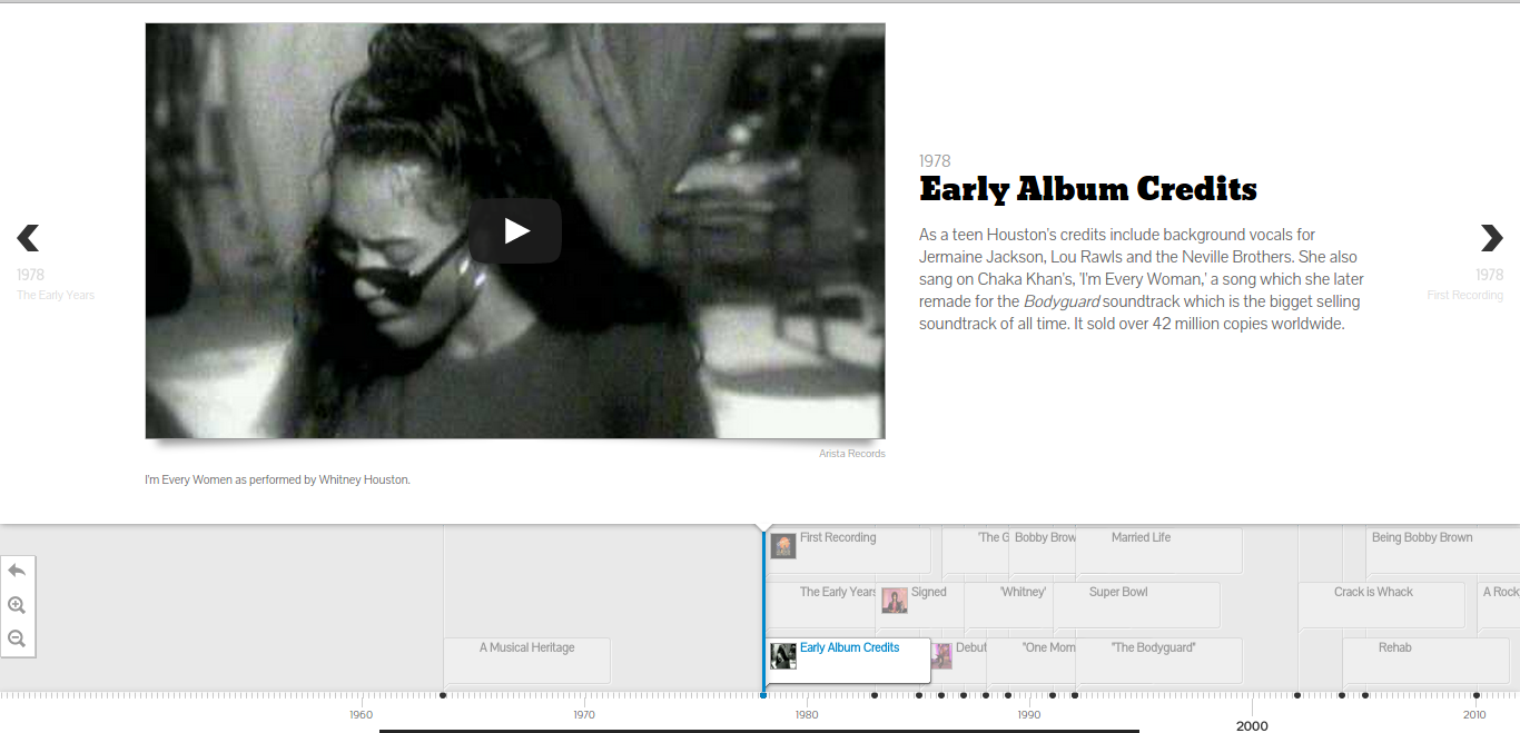
houston-example
Timeline of Whitney Houston’s life. Source: http://timeline.knightlab.com/examples/houston/

How do you get started? 

The documentation on the timeline.js website makes it very easy to get started. I was able to set up their provided template timeline for editing in ~5 minutes.

To publish a new timeline:

1) Open a copy of the template and edit the data in the spreadsheet
2) Publish the spreadsheet to the web
3) Copy the URL of the spreadsheet into the online generator box
4) Imbed the iframe into your website. I was able to make a new timeline.html document, paste the generated code into the document, and open the file locally in chrome to see the timeline.

How easy/hard is it? 

The tool is pretty straightforward. There are two main things to learn: the structure of the spreadsheet (i.e. where to paste items, and how the spreadsheet corresponds to the generated UI), and setting up the test html page to see your changes. The example timeline and the corresponding template make this pretty easy to figure out. One thing to note is that there cannot be any empty rows in the spreadsheet.

One nice thing is that once you’ve set up the html document with the iframe, any changes you make in the spreadsheet will be reflected if you refresh the page – no need to generate new iframes/copy paste every time.

No coding is necessary to use this tool (besides pasting the iframe into a webpage). Though the tool is open source, and one can download the source code to further customize timelines, the online interface already provides many options for customization, such as font choice, default zoom level, which slide to start at, etc, making it suitable for most use cases.

 Would you recommend this to a friend? Will you consider using it for your final data story?

I’d recommend this tool to a friend! It’s straightforward to set up, and you can embed many different types of media. I’d consider using it for my final data story if there was a need for a timeline.

Also, though this is nominally a tool to make timelines, it’s also a nice slideshow viewer. I can imagine downloading the source code and modifying the display to only show the slideshow parts, while hiding the actual timeline ticker
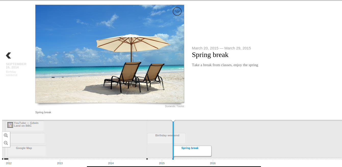
 

spring_break_example
A card I made: spring break


nltk: all the computational linguistics you could ever want, and then some

What can you do? 

nltk is a Python module that contains probably every text processing module you’ve ever had a vague inkling of a need for.  It contains corpuses of language for machine learning/training; word tokenizers (splits sentences into individual words or ngrams); part-of-speech taggers; parse parts of speech in sentences (with trees!); and much, much more.  It’s good for analyzing lots of text for sentiment analysis, text classification, and tagging mentions of named entities (people, places, and companies).

How do you get started?

The creators of nltk have published a book for free online that explains how to use many of the features nltk has.  It explains how to do things like access the corpora that nltk has; categorize words; classify text; and even build grammars.  Basically, the best way to get started is install nltk, then go through the book and try the examples they present.  They include code examples in the book so you can follow along and practice using different functions and corpuses.  There’s also a wiki attached to the github and stackoverflow, where programmers go when they’re lost, is of course a useful (but often very specific) resource.  The learning curve required to become comfortable leveraging the different functions available is fairly steep because they are so many and so specialized, and in my opinion the best way to gain that comfort level is to simply play around with nltk and build cool things to gain experience.  Simply reading the book, while interesting, won’t be enough to become good at using nltk.

How easy or hard is it?

Well, it’s certainly easier than writing all of this from scratch, no matter how competent a programmer you are.  The one thing that can be difficult with Python modules is that you’re not entirely sure what’s under the hood unless you get cozy with the source code.  That means you might not be sure what’s causing a performance issue, why it doesn’t like your input, or why your output looks a certain way.  Also, figuring out exactly which function to use for a specific task might be somewhat confusing as well unless you have a certain amount of experience in machine learning or know exactly what you want (it’s hard to go wrong with tokenization).  For example, the built-in classifier is only as good as the features you feed it; giving it too many high-dimensionality items might result in overfitting or just horrendously slow code, and giving it low-dimensionality items might mean it can’t classify the items effectively.  Experience with Python datatypes and object-oriented programming is also very, very important; if you don’t understand what a function is, what list comprehensions look like, and how Python dictionaries work, the example code given in the book will be incomprehensible.  Even though the printouts from the example code look very nice and fancy and clean, the knowledge behind their creation (how do you print things that look nice? what is a development set? how do you use/leverage helper functions like tokenizer and the nltk function that gets the n most common words/letters? how do decision trees work?) is far from simple.  Anyone with programming experience can use the simpler functions very effectively and the less simple functions with probable success, but in my opinion knowing how classifiers and parsers work is important to use them well.  The bottom line is that they’re only as good as what you feed them, and understanding how definitive or accurate their output is requires a degree of understanding of what’s under the hood.

Would I recommend this to a friend?

If that friend had a similar programming background to me (can write Python code pretty well; knows a little bit about machine learning) I’d recommend it with little reservations other than a warning about the learning curve and the overwhelming abundance of options.  I’d still suggest they at least skim the book and keep stackoverflow close at hand (although that’s true for most programming projects that venture into unknown territory).  If my friend wasn’t comfortable with machine learning, I’d suggest they read up on Wikipedia about whatever classifiers they use so they have an idea of why the classifier misbehaves, if it does, or what errors it’s likely to make.  And if they weren’t comfortable with programming, I’d suggest they look into other natural language processing tools.  This is a tool that’s made by programmers and scientists, and it shows in the documentation, the resources, and the wealth of options available to those who know how to use them.

tl;dr: nltk has a ton of really cool natural language processing tools.  However, they are by no means idiot-proof, and you will be sad if you don’t know Python.  One does not simply download nltk and spit out useful results in five minutes.  


RAW: Create Simple Visualizations Quickly

What is it?

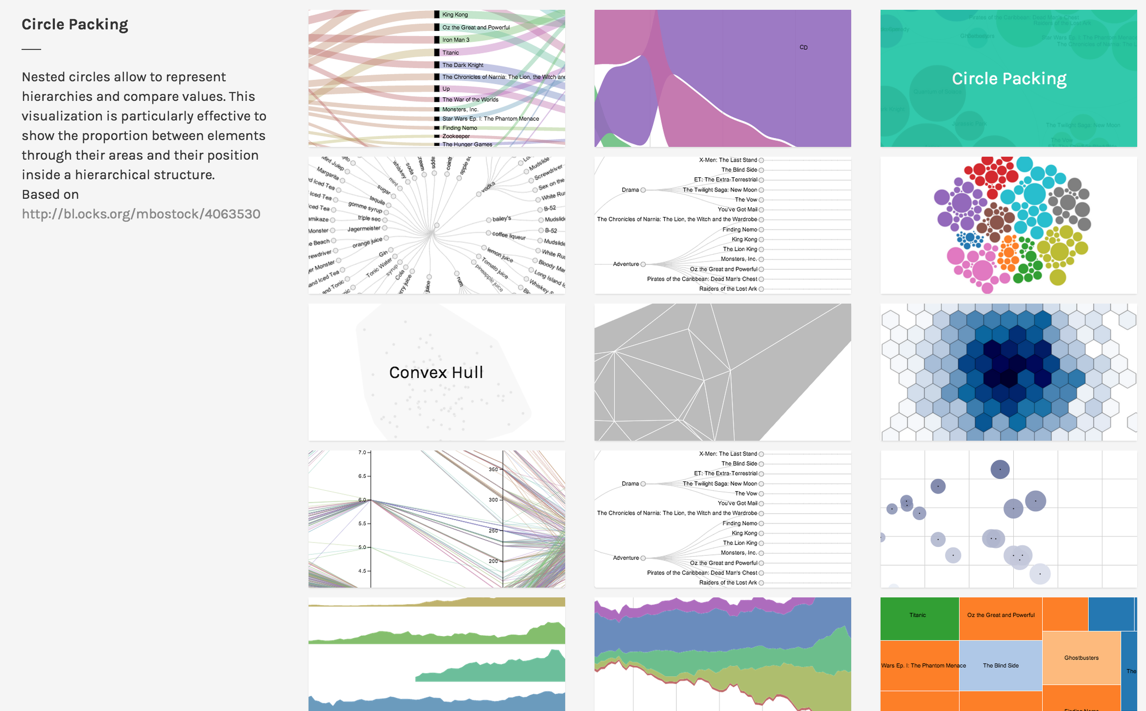
RAW is an online drag-and-drop tool for uploading csv data and creating common visualizations such as scatterplots, treemaps, and circle packing diagrams.

RAW is open source and provides guides for adding your own visualization types (using D3.js).

What is it good for?

RAW has 16 visualization types which are built using drag-and-drop and can be customized to a minor degree. If you need to generate several common visualizations to support your data story, RAW can make them very quickly.

Be warned that RAW runs in a web browser and cannot handle large datasets (i.e. more than a few MB). Furthermore, since many of the visualizations display all the data points, a visualization produced from a large dataset will be cluttered and unreadable.

Thus, RAW is good for stories that require several simple visualizations built on a dataset consisting of small to medium sized csv files.

How do you get started?

Since RAW is simple to learn, you can jump right in and start using it. For a quick intro, consult the video tutorial. For further information, consult the Github wiki.

If you are a developer trying to add a new chart type to RAW, consult the developer guide.

Is it easy? What skills do you need?

RAW guides you step-by-step through building the visualization. Therefore, it’s easy to learn. Beyond understanding what each visualization means, RAW requires no additional skillset, which makes it very easy to use.

The primary challenge in using RAW is understanding each type of visualization. For example, if you don’t know what a Voronoi Tessellation is, then RAW gives you no guidance on how to interpret the visualization.

For developers, extending RAW requires a knowledge of the JavaScript language and the D3.js library. Familiarity with Scalable Vector Graphics (SVG) and Angular.js may also be useful.

Would I recommend it?

I would highly recommend RAW as a tool for building visualizations to support a data story or for finding possible stories. Visualizations can be built quickly with RAW, so it’s useful for exploring your dataset by building visualizations. Furthermore, since the visualizations can be exported as SVG, HTML, PNG, and JSON, it’s easy to embed them into an article or similar data story.

If you are working with a large dataset (ex. several MB or more), RAW may not be able to handle all your data. Furthermore, the visualizations may be too cluttered.

If you want precise control over your visualization, RAW may be too restrictive for you. Although it’s possible to add features to the code, it may be quicker to build the visualization using a different tool.

Would I use it?

I think I will use RAW to help me generate ideas as I peruse my datasets. Since I am interested in maps, games, and interactive data stories, I don’t think I will use RAW to create my final product.

Usage

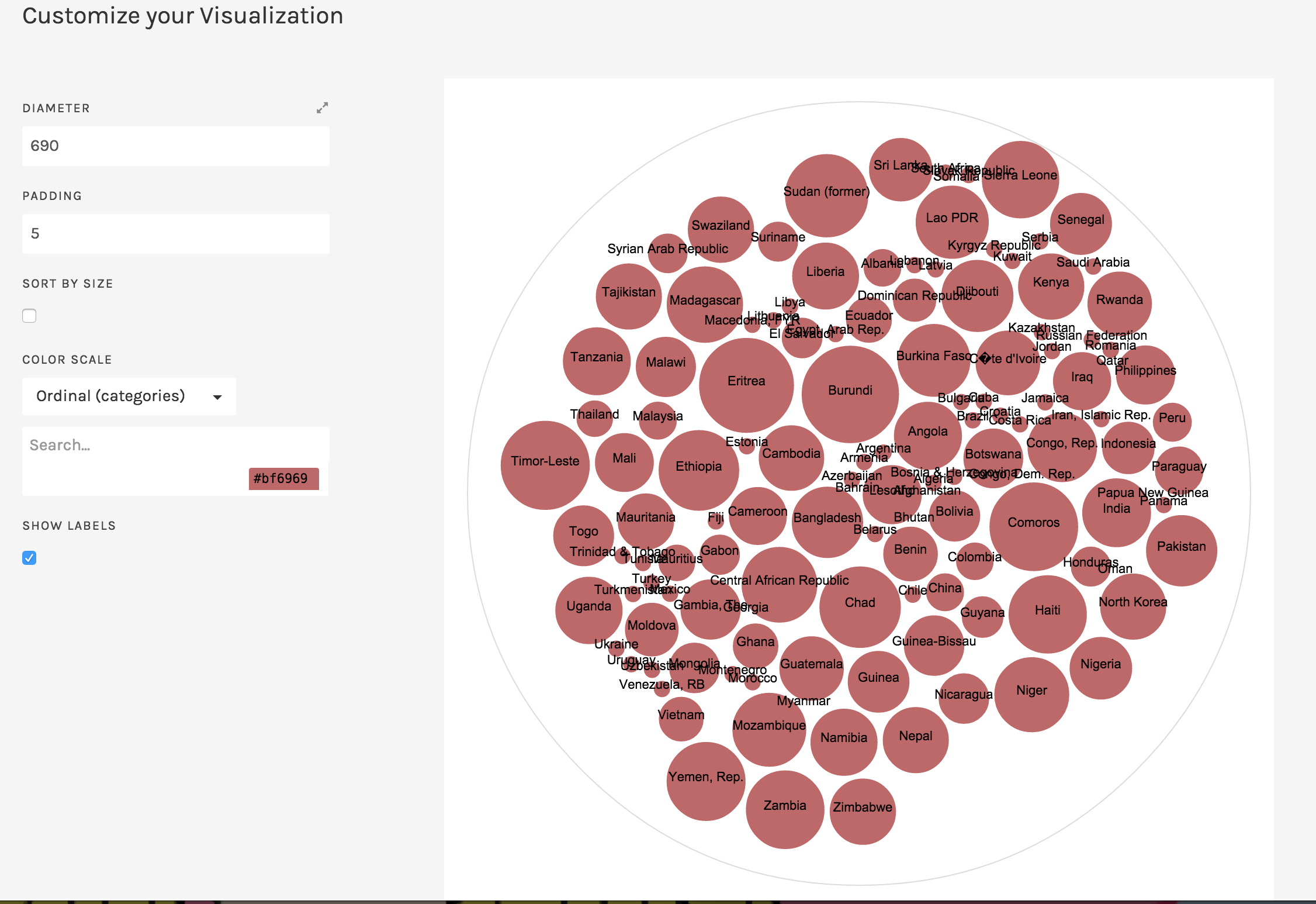
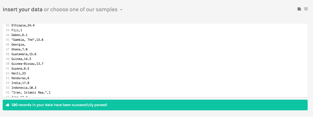
Here’s how RAW can make a circle packing diagram using a dataset about the 2014 Global Hunger Index around the world.

raw1

raw2

raw3

raw4

International Food Policy Research Institute (IFPRI); Welthungerhilfe (WHH); Concern Worldwide, 2014, “2014 Global Hunger Index Data”, doi:10.7910/DVN/27557 International Food Policy Research Institute [Distributor] V1 [Version]