To kick off our class, we’ve been creating a data mural for Food for Free, a fantastic local non-profit with a large food-rescue program. Once we turned their data into a story, we spent a class turning that story into a visual design to paint as a mural! This was a fairly standard data dural process, though very short on time, and I tried some new things to connect the visual back to the data it started from!
The Story
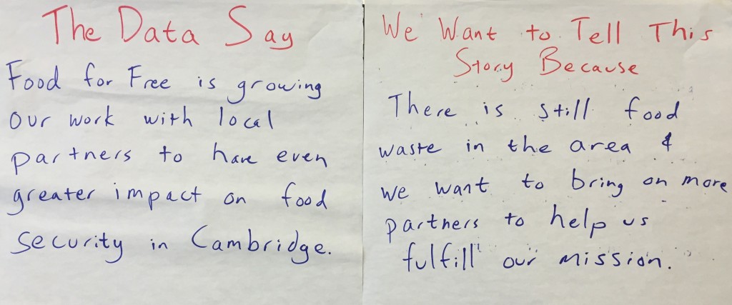
We started off by reminding ourselves of the story we found in the data:
Seeding the Visual Design
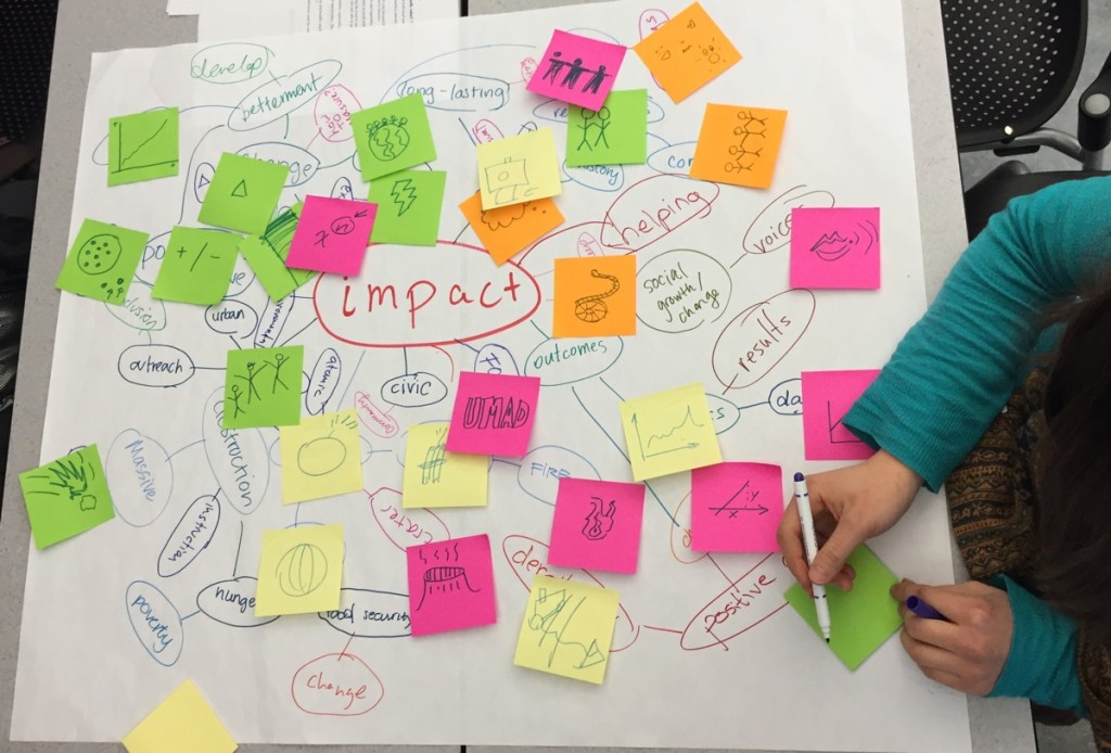
First we did some word-webs to try and make some of the more abstract words concrete. This activity helps by giving us a visual vocabulary we can pull from while designing a image-based narrative. For this story, I choose to pull out the words impact, partner, waste, and security – we made a word web for each. Here’s the one the students made for impact:
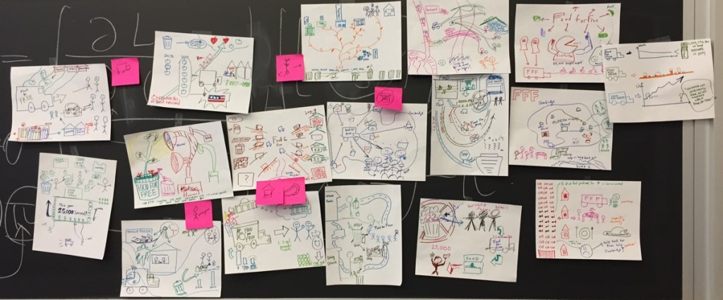
Then we did our pass-around drawing exercise, to try and turn the data-driven story intro a visual narrative. The students made a ton of great drawings:
I introduced a few new wrinkles to this activity this time around. On the second-to-last pass, I asked students to look back at the word-webs and see if each of those key concepts was incorporated in the drawing in front of them. If one wasn’t, I asked them to try and add it. In addition, on the last pass, I asked students to look at the design and back a the initial data handout. If there was a piece of the narrative that could be linked-to and supported-by some of the data easily I asked them to add it. This change brought us back full-circle to the data we started with, and helped us keep the visual narrative connected well to the qualitative and quantitative data it came from.
Synthesizing a Mural Design
Looking at these all together, we saw some commonalities that we really liked:
- Food for Free was represented by a truck a lot
- the recipients of their services were almost always drawn as people, while the donors were drawn as buildings
- there were a lot of roads being used a scaffolding to connect visual elements
- there were a number of drawings that used plants to symbolize growing
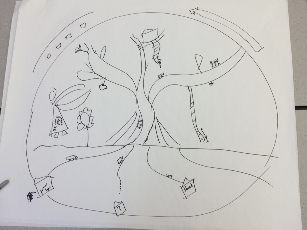
After discussing these, and other observations, we decided to go with a tree as the central visual metaphor. The roots would be the donors; the trunk would bring food to the leaves where recipients could pick off fruit and eat it. Food for Free trucks would be like little ants, moving up and down the roots and tree. Here’s the super-rough sketch I put together during the discussion in class:
Next Steps
Over the next few days, my collaborator Emily will turn this into a polished design and we’ll prep a canvas for it. In the next class, we’ll paint it! We only have an hour and a half, so the design won’t be too complicated.


One thought on “Designing a Food for Free Data Mural”