Highcharts JS is a complex Javascript tool that helps users create a lot of different types of chart visualizations (plots, pie charts, bar graphs, etc.). It is part of a family of Javascript visualization products produced by Highsoft, a company in Vik i Sogn, Norway. Its sibling products include tools for things like mapping and imaging.
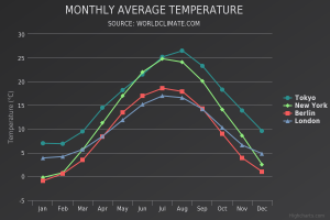
This tool is great if you want to create classic graphs that show trends over time. The types of graphs that it can produce are similar to those that one can produce in Excel, but are much more interactive. This makes for better data exploration, and often times just for a more clear representation of data in general. All of the graphs that you produce with Highcharts have interesting hover effects, such that hovering over particular data points or lines will show specific values which are useful in exploration and probably also outlier analysis. These effects bring a lot of extra life to the graphs.
Since this is a Javascript tool (with great hover effects and interactivity), its graphs are meant to be displayed on the web. Lots of major companies (61/100 of the world’s greatest companies) are already using Highcharts, including Facebook, Twitter, and Yahoo. In fact, exploring most of Highchart’s demo graphs felt very familiar and intuitive to me, likely because I’ve encountered the same types of graphs before on third party websites without realizing it (like the NY Times).
This is an extensive and mature product, and therefore it has support forums in addition to support emails, Github reporting, Stack Overflow help, and a book to reference. It is free to use for non-commercial purposes. Interestingly, all the files are downloadable and therefore customizable. This is something that the company markets in particular, because users can use the existing product as a baseline and alter it to fit their specific needs.
The library can be easily incorporated into websites through simple script tags in the HTML headers and can be used in conjunction with jQuery or as a standalone tool. There are a lot of cool demos on the web, a few of them I’ve linked to here: snow depth v time and population growth by religion.
If you’re looking to create simple, classic plots for a quick visualization, this is the product for you. They have a set of standard graphs that are incredibly easy to plug data in and produce yourself.
This is a Javascript product, so basic proficiency in Javascript is a big plus; however, I don’t think that its necessary because starting from any one of their many demos, it would be easy to plug in your own data and change around label names. It is also possible to make very interesting and complex graphs – the process of moving beyond the basic graphs would be much more involved (and definitely require Javascript proficiency), but it would have a greater value yield and Highcharts has extensive support resources.
I would recommend this to a friend – it is a mature, well documented, and widely used product that can create beautiful and interactive graphs with little effort on the side of the user. I think that it is slightly more intuitive to use than D3.js, though the two products are similar, both being rooted in Javascript. Wether or not I use this tool in my final project will be highly dependent on what I choose my final project visualization to be, because this is definitely a tool for final data presentations, not for intermediate steps or data cleaning.
