Val Healy & Ceri Riley
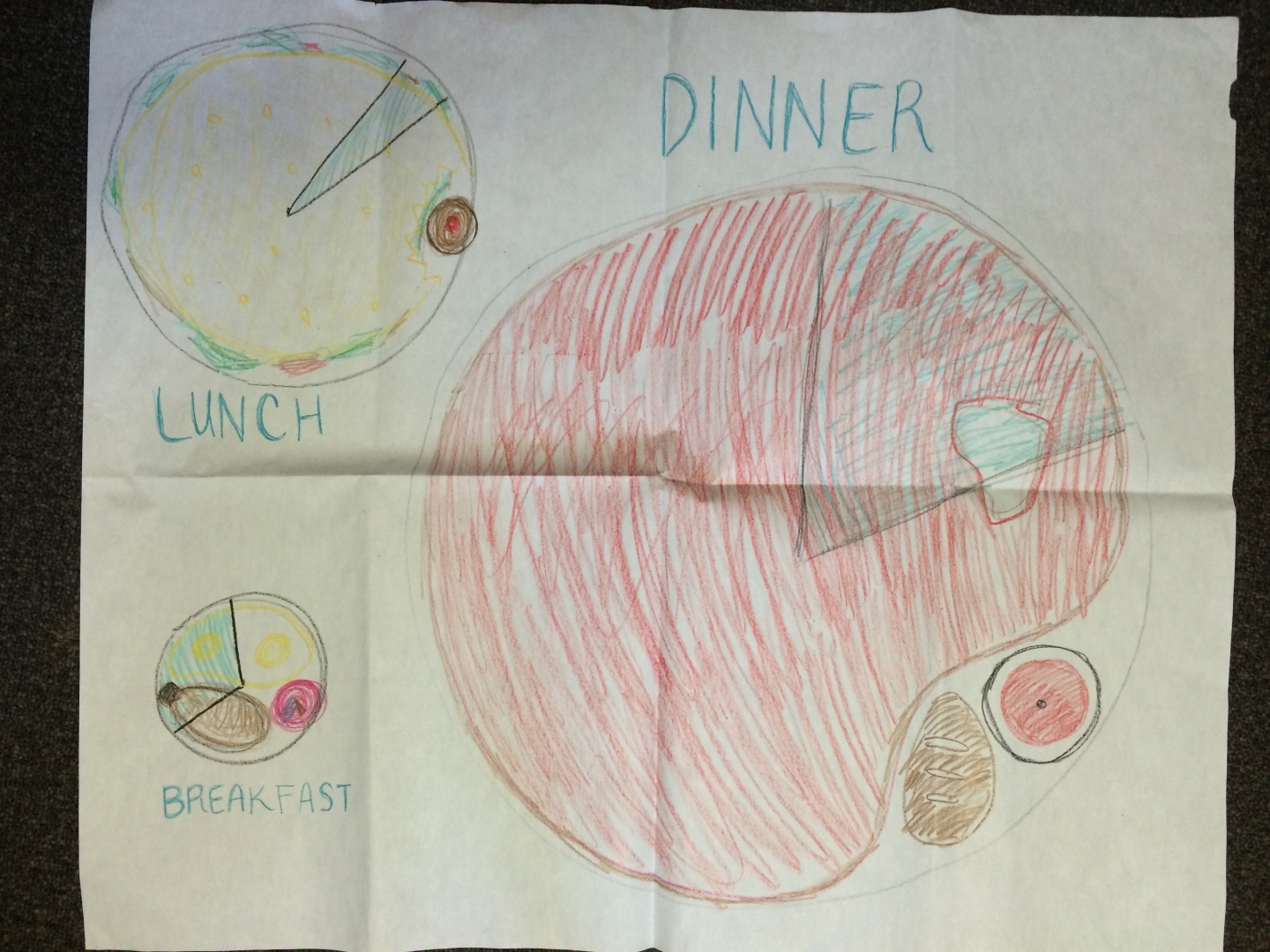
We remixed the water usage infographic into a map, specifically focusing on the food components rather than the appliances.
This map shows one’s breakfast, lunch, and dinner plates, scaled to represent the relative amounts of water these meals virtually use. In addition to the plates themselves being proportional to water use, the foods and drinks on the plates are also proportional to their respective water footprints. The blue pie slice of the plate represents how much water you would use if you chose the “better” option for your meal — for example, the chicken, beer, and baked potato dinner would only use about 20% of the virtual water that the steak, wine, and bread dinner would.
If we were to actually develop this visualization rather than just sketch it out, we hoped to show the old vs new plate maps for each meal. If you hovered over the blue region of a given plate, you would be shown a proportionally smaller plate with the new foods arranged on it by virtual water use. This would allow for quick visual comparison between two meal options. And, if you hovered over any given food, you would be shown the amount of virtual water (in gallons) that was required to grow it and/or its percent contribution to the total virtual water use of the meal. So our food map visualization would look simple at first, but ultimately contain a lot of the same numerical data that the original dataset included.