Val Healy & Ceri Riley
Here’s a link to the online version of this infographic (it has an interactive bit that doesn’t show up in the .png version).
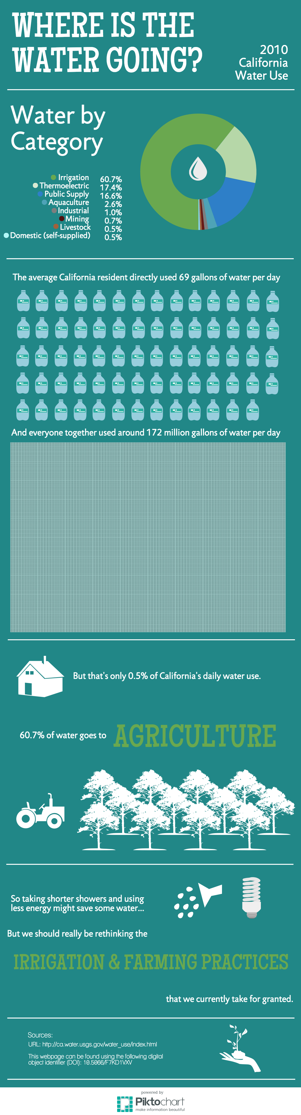
Our targeted audience for this infographic was around a high school age, but also understandable and relevant to adults. The goals were to communicate how much water individuals use on a daily basis but also trying to put in perspective the massive amount of water that the agricultural industry uses. Our ‘call to action,’ although it’s a little weaker/implied here rather than well-developed, is that rather than advocating solely for lifestyle changes, we should think about ways to change the institutions that take up the most water — such as by working on more efficient irrigation systems and revised farming practices (like the times at which certain crops are planted).
Essentially, we tried to use one of the online infographic tools (Piktochart) to visually represent the different ways water was used by the state of California in 2010, show what an individual’s daily water use (minus food) would look like, and then connect to the larger idea that agriculture uses tons of water and the practices should be revised.