Wealth Inequality in America

Wealth Inequality in America is a popular YouTube video by author “politizane” with a simple message:

Not only is the problem of wealth inequality in America worse than ideal, it’s worse than you could imagine

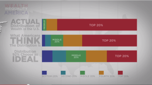
The video shows three wealth distributions from a Harvard study about what Americans think an ideal wealth distribution should be, what they think the true distribution looks like, and what it actually looks like.
hsubrama_bars
politizane’s wealth distributions represented as stacked bars.

I believe what makes the video so captivating (over 16 million views) is the way politizane turns his data into a story about the victimization of his audience (lower and middle class Americans).

Politizane begins by displaying three stacked bars with overlaid animation to show that the ideal, expected, and actual wealth distributions are vastly different. In doing so, he makes it clear that wealth inequality is far worse than imagined. But he does not stop there. Instead, he animates a 100 small stick figures and places stacks of money on top of them. As he explains how the actual wealth distribution is worse than expected distribution, dollar bills fly from the poor stick figures to the rich stick figures. Although he’s ultimately just presenting histograms, politizane builds a story – we begin in a world of wealth equality until the rich take most of money away from the poor and middle class.

hsubrama_money_histogram
politizane’s “money histogram” showing dollar bills flying from the the poor to the rich and illustrating the difference between an ideal wealth distribution and the expected distribution

In this video, we see the difference between presenting charts and data storytelling. Stacked bars give us distributions and the main point, but politizane’s stick figures give us a protagonist (poor and middle class), an antagonist (the rich), and a plot (the rich have taken money from the poor) while utilizing a simple histogram as the basis. In about 5 minutes, politizane has shown his audience the data, made them feel victimized, and given them an enemy, thanks to his storytelling.
 

Source: https://www.youtube.com/watch?v=QPKKQnijnsM

Visualizing What the World Eats

hungryplanet1

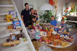
Norway: The Ottersland Dahl Family of Gjettum. Food Expenditure for One Week: 2211.97 Norwegian Kroner ($379.41 USD). Favorite foods: fresh baked bread with butter and sugar, pancakes, tomato soup with macaroni and cold milk, yoghurt. Photograph by Peter Menzel (source)

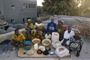
Husband-and-wife team Peter Menzel and Faith D’Aluisio traveled around the globe to 30 homes in 24 countries, investigating what families eat over the course of a week and how much it costs. The result was Hungry Planet: What the World Eats, a book published in 2006. With the turn of each page we see each family photographed where they dine, flanked by their week’s worth of food products.

This project came to mind when we were discussing food security during Tuesday’s class. The photos probe questions both about health and economic access to food—a perfect fit for the theme we’ll be exploring this semester.

The photographs are geared toward a generalist audience: the Hungry Planet book has had mass and viral appeal, and has been highlighted in media such as TIME and NPR. (In fact, I’m pretty certain I first heard about these photographs when an acquaintance posted a link on Facebook.) The project aims to get people thinking about what they eat, where they get their food, and how much money they spend. It illuminates the disparity of food access and health choices around the world—from the Norwegian family of five that spend almost $400 on food, much of it processed and packaged, to the family of 15 in Mali that prefers to cook traditional rice dishes and spends $26 a week.

I choose to write about these photos because of the questions they bring up about data visualization. What does it mean to present data? Here, we see the photographer present data about food consumption in the most literal form, by documenting the actual families and food. For me, eschewing the language of graphs and charts in favor of this approach is effective, leveraging the visual power of raw foodstuffs and colorful packaging to pack a visual punch.

hungryplanet2

Mali: The Natomos of Kouakourou – Food expenditure for one week: 17,670 francs or $26.39. Family Recipe: Natomo Family Rice Dish. Photograph by Peter Menzel (source)

What do “Data”, “Storytelling” and “Studio” mean?

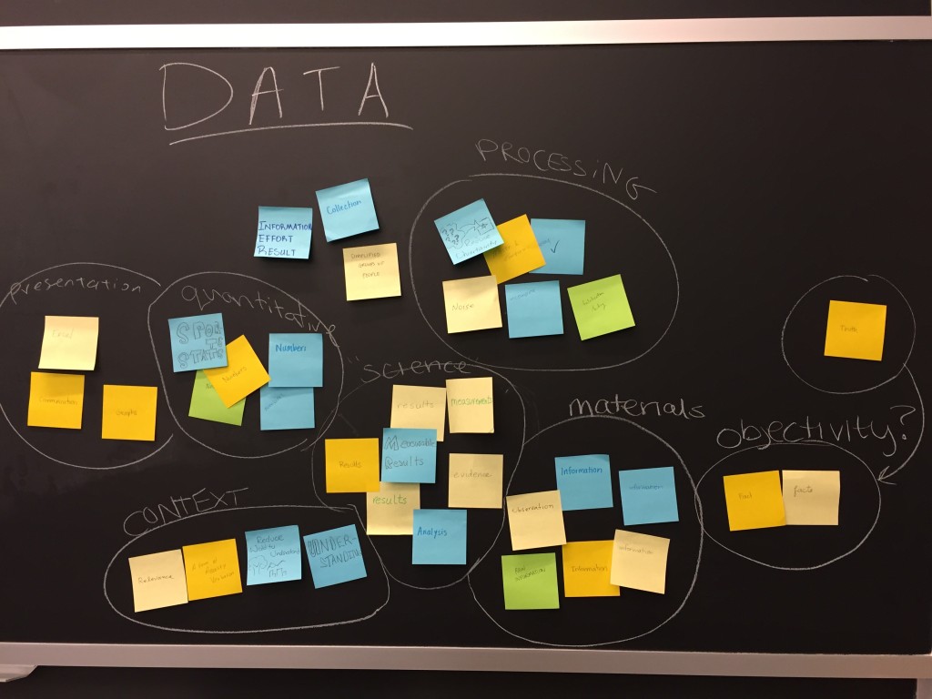
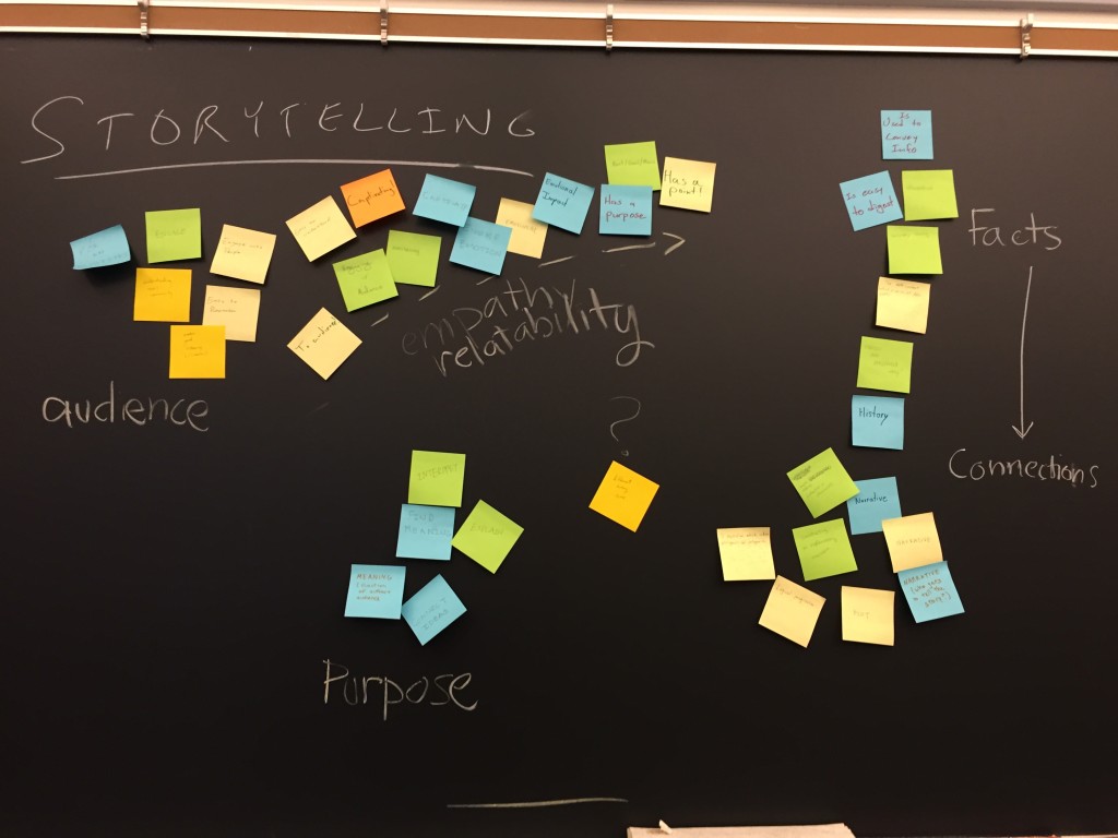
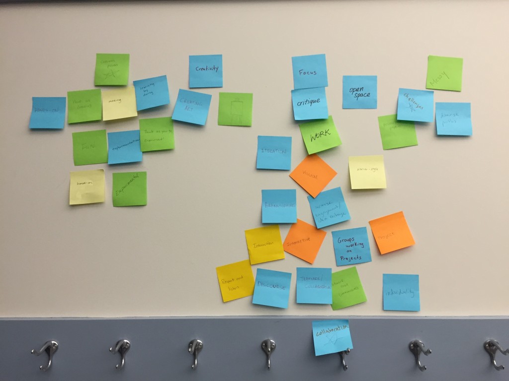
One of our first exercises focused on creating a shared definition of the title of this course.  The words “data”, “storytelling” and “studio” are all kind of nebulous!  In order to figure out what we all think they mean, we created sticky notes about what each of those words meant to us.  After clustering them, we ended up with a better shared sense of the course’s title.

data

Data: presentation, quantitative, processing, objectivity, materials, science, context

storytelling

Storytelling: audience, empathy, relate-ability, facts/connections, purpose

studio

Studio: creativity, groups work on projects, open space

I was pleased to see that these matched my own expectations and plans fairly well!

Welcome

This is the shared class blog for the CMS.631 / CMS.831 Data Storytelling Studio course at MIT (Spring 2015).  Many of your homework assignments will require you to submit blog posts here.  Feel free to cross-post them to your own blog.  Much of the conversation about data, finding stories, creating presentations, and creating change happens online; you need to add your voice to that conversation if you plan to do this type of work.