Mike Bostock: Visualizing Algorithms

Mike Bostock’s algorithm visualizations were not my first thought in response to the phrase “data presentation.” He also does a lot of standard data presentations, too, that I could have chosen to talk about. But his algorithm visualizations are among my favorite things to look at, and arguably highlight (as well as leave out) aspects of data presentation that might merit some meta-inspection, so I thought they’d be worth examining anyway.

Algorithms are often used to process data, but also to generate it. There are quite a few algorithms featured in the essay, but my favorites are the three described for generating a uniform-looking random sampling of points throughout a space. So, it’s definitely geared towards computer science enthusiasts in its content, but still attractive enough to engage the less geeky among us. It’s able to paint a less technical macro picture as well as a more detailed micro picture.

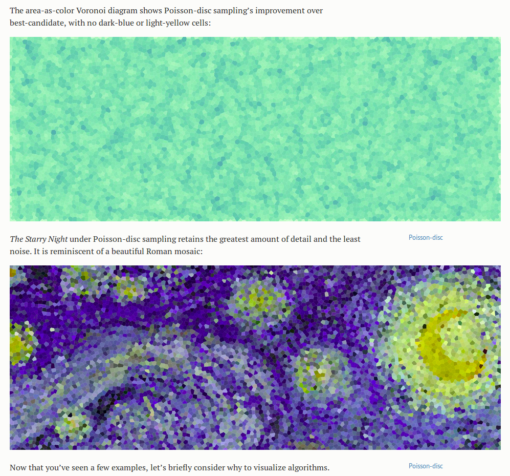
The motivating illustrative examples are the three versions of Starry Night, produced by using each algorithm to sample points, and then coloring the area closest to each point the same color as the point- a kind of compression of the image. This division of the space into cells defined by the point they are closest to is called a Voronoi diagram. But even without knowing precisely what that means, from the pictures it is easy to get an intuitive sense both for what the sampling does to the image, and why we would want to do it. The point of the article and the images is not to teach the reader what a Voronoi diagram is, especially when they are likely to already know or look it up if they care, but to give insight into the algorithms, and perhaps more importantly, to describe by example how visualizations can be used to teach and learn about algorithms.

starry1

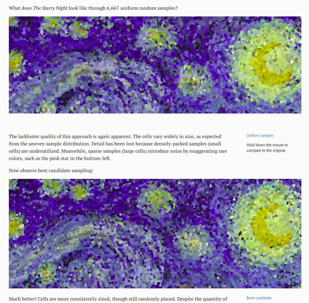
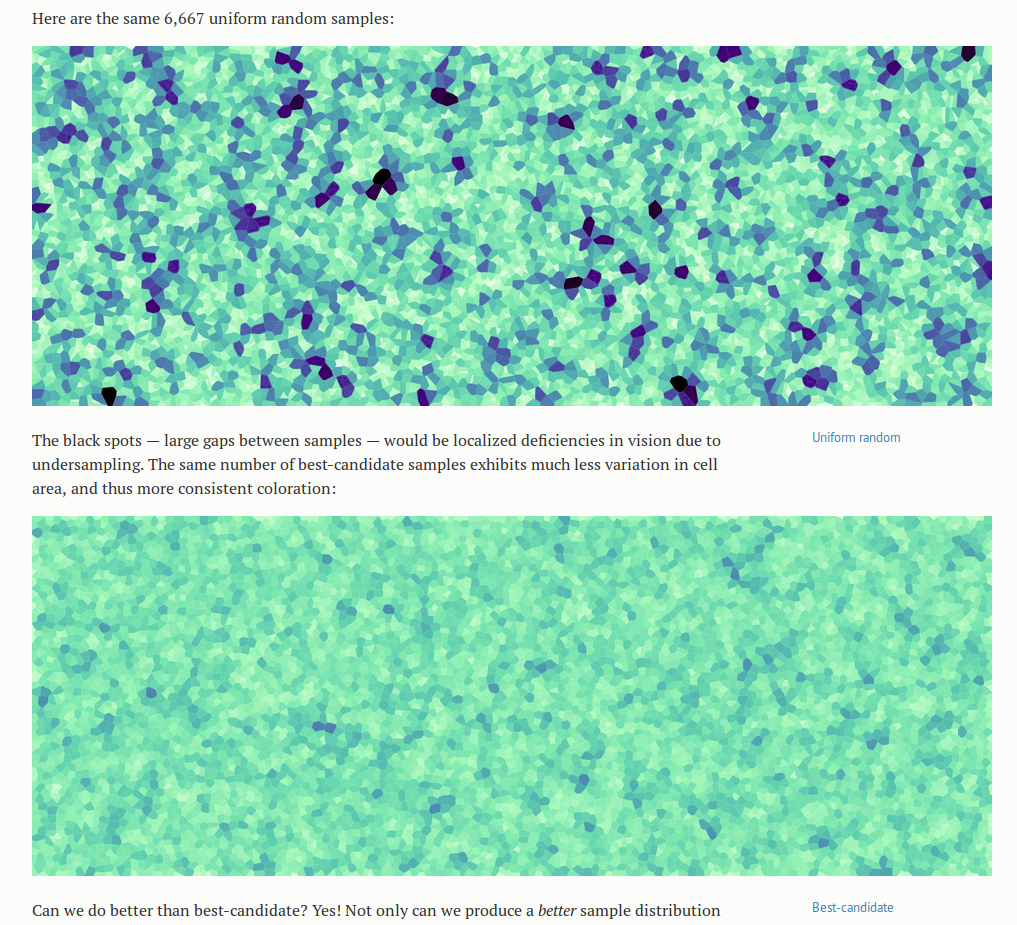
What thrills me more than the Starry Nights though, as an engineer interested in ways to make important details obvious, is the set of blue-green Voronoi diagrams below that compare the performance of the three algorithms. The cells in these diagrams are a lighter color when smaller and darker when larger, to accentuate the non-uniformities in size between cells- details already in the image, but that would otherwise have been much harder to see. It shortens the search our eyes have to make for those much larger or smaller cells. It immediately makes clear which of the algorithms creates the most uniform sampling.

green1

starry2

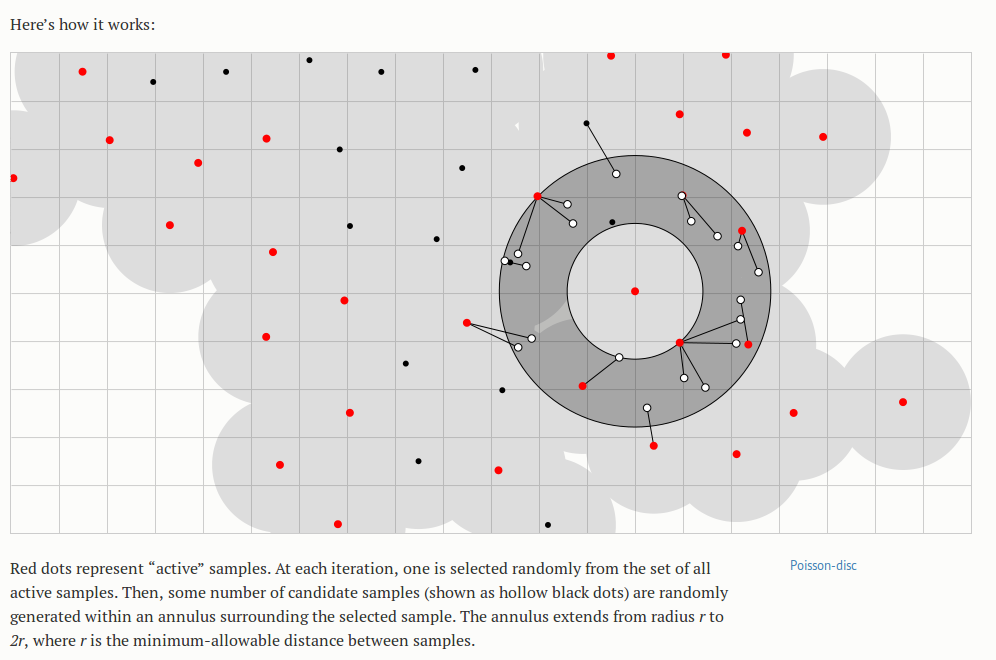
Of the animations in the essay, the Poisson disc is my favorite- not just because it is the best-performing algorithm, but because of its mesmerizing beauty. I stared at it for a long while before beginning to understand what it did, and the color cues were the most helpful at the start. I noticed that there were nodes that started out red and turned black, or “off,” and the process of discovering the algorithm amounted to answering the question “under what conditions does that happen?” It stimulated all the right questions, and then answered them. I also liked that the animation had processes noticeable at different time scales; I felt that the animation was a bit fast for me at first (without reading the accompanying text), and perhaps I latched onto the color change because it was occurring at a speed that allowed me to think in between changes. Being familiar with the algorithm now, all of the processes appear to be happening at a nice pace- but only because I know what to look for.


poisson-disc2

Finally, another note on relevance: the data that these algorithms generate are clean; there is little noise in the typical sense and relatively few confounding factors involved. However, the visuals help us realize the flaws and patterns that are there. The visibly inferior demonstrations of the completely random algorithm highlight the important fact that a “uniformly random” probability distribution does not lead to a uniform result, but also suggests the powerful role of the random number generator in creating any patterns that do appear in the set of generated points. Bostock later describes the role and idiosyncrasies of various random number generators, in the context of sorting algorithms, but I feel he could have done this earlier; or maybe the long foreshadowing was an intentional device to create more of an aha moment at the end for the learner.

Food Safety For the Travelers

As I started to gather some tips for my trip to France, blogs and guidebooks bombarded me with the pictures of elegant French dishes and long lists of the “Must-Try” restaurants.  Similarly, when I prepared for my trip to China, every resource talked about food–the diverse style of cooking in China, what to try on the Markets, what spices are used, what I must try and what I must not, etc.  It seems like traveling cannot be talked about without talking about food, and I believe that goes pretty much the same with life..!  As an enthusiastic eater and “eye-eater” on food blogs, I recently found this poster that alerts travelers about their food safety.


food-water-whats-safer


This poster categorizes common foods any traveler encounters during their trips into ‘safe’ and ‘not safe’.  It displays actual pictures of the food and successfully grabs its audience’s attention (and appetite).  It must have been hard to skip over this page, if it were on magazines such as ‘Budget Travel’ and ‘Travel & Leisure’.  The poster informs the international travelers that fresh food such as salad, raw fish/sushi and fruits are more dangerous than dry food such as canned tuna and cooked meals such as boiled eggs and grilled vegetables.  It also suggests that while bottled water is reliably safe, tapped water should be avoided or drank with caution, depending on the countries they are travelling.

This poster successful grabs the readers attention by using actual pictures of the food, instead of simply listing the safe and unsafe items.  It also does a good job of pairing the counterparts (for example, bottled water vs. tapped water, cooked steak vs raw meat, boiled egg vs. not-fully cooked scrambled eggs).

Climate Change: The State of Science

One of the biggest problems facing our generation and those to come is climate change. This topic has sparked political debates, religious debates, industry changes, and is something that I’m particularly interested in because I spent IAP in a city where the pollution causes the visibility on sunny and foggy days to be equivalent.

The data being shown in this video is nothing new, it’s something that our teachers, parents, and peers talk about: the ice caps are melting, the carbon in the air is increasing. What I think the video does well is it provides a visual to this that elicits an emotional response from the watcher. The video shows a time lapse of earth over the next hundred years, where we can actually see what it will look like when our planet is no longer capped with white and when Florida is no longer a dry piece of land.

The video tries hard not to offend watchers and place blame, but at the same time it tries to scare watchers into action. Did you know that the acidity of the ocean has increased 26% since the industrial revolution? Did you know that if nothing changes, the earth will be 4 degrees warmer in 80 years? The video ends with earth being depicted as a ticking time bomb.

The visualization of the data allows even the least technical person to understand. The technique of showing change over time is similar to what Rosling does in his Ted Talk; however, instead of showing past measured data, the video shows projected data if nothing about humanity’s current carbon footprint changes. I think that the presentation is very effective, and that the audience is just your average Joe.

Mapping Poverty in America

Data from the Census Bureau show where the poor live.

Mapping Poverty in America is an interactive recently published by the New York Times that visualizes data about poverty from the Census Bureau. It does so by presenting it on an interactive map that colors regions based on the percent of people that live below poverty thresholds, which is quantified for people that don’t know what the poverty threshold is.

Upon loading, the site asks for your location, and (if given) displays the data for your general location, as well as previews of other major cities in the US. Hovering over a colored region will display an info-box with that region’s poverty rate and the amount of poor people in that region. The interactive also has two different views, which visualize either regions colored by poverty rate or circles representing the amount of poor people in a region.

(source: New York Times)

This interactive aims to visualize data that would otherwise not be seen by the general public, especially since the NYT has such a large readership. Though the interactive makes no politically charged statements, you can’t help but think that this was made with the intention of sparking conversation about poverty in the US. This interactive shows that poverty is indeed still a problem that is faced by many regions of the US, and by making this information available, easy to understand/visualize, and localized to each individual reader, hopefully this problem will no longer be ignored.

Racial Awareness in Dating

When people think of OkCupid, big data isn’t often the first thing that comes to mind. As a free online dating website, it’s certainly easy to dismiss OkCupid as a reputable source of information – yet, the data that comes from the millions of interactions can actually lead to interesting insights on the way certain people interact with certain people.

OkCupid publishes a blog called OkTrends, which seeks to find trends in the way people interact with each other, to both bring out interesting correlations for amusement and to gain insight on how to better connect people romantically. What with the wealth of information that users provide on their own personality and demographics, OkTrends combines humor and data science to produce amusing results, produced in a fairly digestible format for almost all audiences. For example, OkCupid found that “Among all our casual topics, whether someone likes the taste of beer is the single best predictor of if he or she has sex on the first date.” [1].

However, the data that OkCupid also possesses has also been used to open a discussion for a more socially impactful topics – like race and how it affects our perceptions of others. In Race and Attraction, OkCupid revisits one of their first analysis of race and attraction from 2009, to see how racial preferences have changed in the last 5 years.

From the graphs below, they found that racial preferences from 2009 through 2014 have actually stayed about the same, and in some cases, “racial bias has intensified a bit.”

source: http://blog.okcupid.com/index.php/race-attraction-2009-2014/

source: http://blog.okcupid.com/index.php/race-attraction-2009-2014/

source: http://blog.okcupid.com/index.php/race-attraction-2009-2014/

source: http://blog.okcupid.com/index.php/race-attraction-2009-2014/

These preferences are also checked against the data from another dating website, DateHookup, with “a distinct user base, a distinct user acquisition model, a distinct interface, yet their data reflects the same basic biases.” These racial preferences seem to stay similar, with the common trend of asian men and black people taking the greatest hits in preference.

Curiously enough, while the behavior of people have not changed much, when asked explicitly about certain racial attitudes, users have answered their match questions to as less biased overall.

match-questions

source: http://blog.okcupid.com/index.php/race-attraction-2009-2014/

While the data presented is of course coming from the dating world, it does still have significance in the way we understand the way we perceive others based on race. This article suggests that in the past five years, we have been telling ourselves that our racial attitudes are less biased, but our behavior has remained unchanged. Of course, the data isn’t definitive in any way. However, it does present a launching point for a discussion on racial awareness, to deeper understand the differences between what we believe and how we actually act.

Invalid Arguments: Climate Change

This Vlogbrothers video was published in September 2013 and is one in which Hank Green provides counterarguments to common ideas that people who don’t believe in climate change use to defend their standpoint. He begins the video by describing what climate change is and why it’s a problem that we, as humans currently living on this earth, should care about. And then he contextualizes his arguments with data and figures from peer-reviewed scientific papers. All of these papers are linked in the video description, so viewers can read about The Myth of the 70s Cooling Consensus or A Reconciled Estimate of Ice-Sheet Mass Balance, showing that the land ice mass (as opposed to the sea ice mass) of Antarctica is decreasing with time.

Papers

Antarctica

The audience is primarily the Nerdfighter community (those who regularly watch Vlogbrothers videos), which vary from teenagers to adults in their 40s who accept Hank Green as a reliable host and generally are open to listening to his opinions. As with all YouTube videos, though, his ideal target audience is anyone on the website. This video is accessible and well-made enough for many types of people to find it at least somewhat engaging, from those who are familiar with vlogs and many formats of online video, to those looking solely for entertainment, to those who use YouTube for educational videos, etc.

Overall, I think the video is effective for an audience that either 1) agrees with climate change 2) slightly disagrees with climate change for no really strong reasons or 3) a casual audience who has very little knowledge about the subject. The fact that he uses figures from scientific papers to back up his verbal claims and summarizes the rest of the literature in his argument works for this medium, a <4 minute YouTube video for people (especially younger audiences) who just want to get more informed.

However, this video will probably fail to persuade firm believers in “global cooling” that climate change exists. I’m assuming that these types of people are less likely to do further reading in the suggested papers and might not even listen to the entire video before starting discussions, productive or otherwise, in the comments. At best, this video might persuade them to doubt one or two of the misconceptions they have about climate change, which might count as having successful impact.

Social Mapping the City

In this TED talk, Dave Troy presents some social maps of cities that he created by analyzing users’ Twitter data and locations. He analyzed the primary interests of each user, color coded it, and mapped it to their location, drawing lines between any connection between two users. What he found was that, in each city, primary interests of users tended to clump geographically; in a way, the primary interests of users created interest boroughs, of sorts.

Given that his map of Baltimore specifically designated the “Geek” area as also the “TEDx” area of the city, it seems that his intended audience for the TED talk is comprised of other data geeks and TED enthusiasts. In addition, I think that the maps could be useful for urban sociologists and those who study the connections between online social behavior and offline location, culture, and behavior.

Troy’s research and presentation aim to examine the social separation within cities, which he views as a social construct which we could choose not to do. While I feel that the data visualizations, taken without comment, provide useful information, I do not agree with his conclusion. Though he mentions gentrification in his talk, he does not seem to acknowledge that many of the people in the cities he examines (specifically, those being pushed out due to gentrification) literally cannot afford to move into other areas of the city because it is too expensive. His presentation is not effective in explaining for this.

I do, however, feel that the data visualizations themselves do effectively show the separations of and connections between different interest bubbles in the cities. It would be interesting if he could somehow incorporate income distribution into the visualizations, as I feel there may be significant correlation and may help show some of the economic underpinnings of these bubbles.

Feeding the World

This article takes a data-driven approach to tell the story behind addressing the global challenge of sustainably feeding the growing world population. The presentation is geared toward both educating general audiences about the food challenges connected with population growth, and persuading policy makers to adopt certain strategies for mediating the global supply and demand for food.

The data presentation uses both qualitative and quantitative data – using photos to document the diversity of food producers around the world and the impact of our agricultural footprint, and visualizations to convey key statistics that are central to the story – namely, mapping the global agricultural footprint and visualizing the projected need based on population growth.

Screen Shot 2015-02-05 at 1.02.55 AM


Screen Shot 2015-02-05 at 1.01.27 AM

In general, this data presentation uses a blend of techniques to effectively meet the goals of both educating a general audience, and conveying a set of high level strategies for policy makers to consider in the context of addressing this global food challenge. The use of interactive visualizations encourages the audience to explore the data, while the curated images and static charts depict very deliberate and specific data points that help to support the narrative of the article. The types of visuals are intuitive to interpret and do not require a high level of audience data literacy, and they can be taken both within the context of the article, or as standalone pieces. The structure and techniques employed within this data presentation are effective in empowering the audience to engage with the data presented while also reinforcing the key strategies proposed within the article.

The Good News on Poverty

Bono’s TEDTalk aims to inspire its audience to address extreme global poverty and explain the history of anti-poverty campaigning. He motivates his audience, who are primarily people interested in addressing poverty but skeptical of the impact that is being made, largely be presenting data. His TEDTalk includes graphs that highlight the impact that previous interventions have had on poverty, AIDS, malaria, and child mortality.

One way in which he makes his presentation of data particularly effective is that he manipulates it to show statistics over short- and long time-scales. For example, when discussing child mortality rates, Bono presents the statistics on number of lives saved on a daily basis, making the impact seem much larger and much more tangible. However, when discussing the progress that can be made in reducing extreme global poverty, he shows data over large time-scales and includes projections, making it seem realistic that extreme global poverty could be ended by 2030.

The goal of showing this data seems to be to revitalize efforts to eliminate extreme global poverty. In particular, Bono aims to show that elimination of extreme global poverty is a realistic possibility within our lifetimes. In general, the way he presented his data seemed very effective. The data presentation made it clear that significant progress had already been made, and that based on what has already been done, elimination of extreme global poverty, which at first seems unrealistic, may be possible. However, the presentation could also be more effective because the examples he gives in the medical field show the amount of people whose quality of life has improved, but does not give a sense of to what extent the problem as a whole has been addressed.

the gini coefficient

Over the past month, I’ve done an unholy amount of work with demographic data from the U.S. Census API.  Specifically, I was looking at what characteristics of a community affect broadband access in that community.  One of the features I looked at was economic inequality, which can be measured by the Gini coefficient.  Briefly, the Gini coefficient measures how equally incomes are distributed across a population.  The visual presentation is pretty intuitive, as you can see here:

(image source: wikipedia)

A perfectly equal community (everyone’s income is the same) will essentially trace the line of equality, and the greater the difference between the area under the line of equality and the cumulative share of income (y is the share of total income earned by the bottom x% of earners), the greater the inequality.


News organizations seem to love using the Gini Index to talk about the effects of taxation and relative economic inequality worldwide, just to name a few. It’s a really universal, powerful way to talk about inequality.  Here’s an example from the Washington Post, presumably for the internationally curious.

This is pretty interesting; since the countries and continents aren’t labeled, the authors of the map likely assumed basic geographic and historic knowledge; if you don’t know that the big dark red landmass in Asia is China and China is ostensibly a Communist country, for example, you won’t have the “huh” moment where you reflect on the way China’s brand of Communism has evolved to its present-day capitalist form.  Similarly, someone without a grasp of the history of colonialism in Africa, particularly the social woes of Southern Africa, might find the incredible economic inequality there anomalous. This map would succeed best in telling its story with expert commentary, some level of mathematical competence (to know what the Gini index is), and historical context; for that reason it’s probably speaking to a well-educated audience with the patience to pore over the map for at least a few minutes.  The problem, though, is that the map by itself places the onus on the audience to tell the story.  Sure, the Gini index is a powerful measure of inequality, but inequality is the result of many forces, both cultural and historical.  Without that context, and with so many stories, anonymous here, waiting to be told, the data isn’t as compelling as it can be, and that’s really a shame.


(source: http://organizingentropy.typepad.com/blog/)

Now here’s our old friend the bar graph.  One of the things taxation can do is even out the distribution of wealth a little bit.  Scandinavian countries and, to a lesser extent, Western Europe, appear to employ taxation as an equalizing method.  Again, without being conversant with the paradigm a country uses to govern itself, this doesn’t mean much.  Nor do we know what the effects of this policy–which countries have a better quality of life? how many people live in poverty?  This is just one picture in a story about inequality that is rich in detail and nuance, all written in the same language thanks to the Gini coefficient.