Wealth Inequality in America is a popular YouTube video by author “politizane” with a simple message:
Not only is the problem of wealth inequality in America worse than ideal, it’s worse than you could imagine
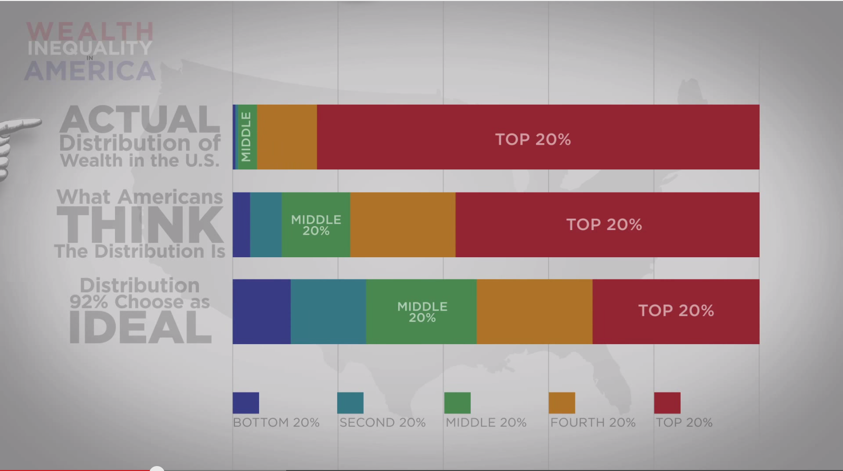
The video shows three wealth distributions from a Harvard study about what Americans think an ideal wealth distribution should be, what they think the true distribution looks like, and what it actually looks like.
I believe what makes the video so captivating (over 16 million views) is the way politizane turns his data into a story about the victimization of his audience (lower and middle class Americans).
Politizane begins by displaying three stacked bars with overlaid animation to show that the ideal, expected, and actual wealth distributions are vastly different. In doing so, he makes it clear that wealth inequality is far worse than imagined. But he does not stop there. Instead, he animates a 100 small stick figures and places stacks of money on top of them. As he explains how the actual wealth distribution is worse than expected distribution, dollar bills fly from the poor stick figures to the rich stick figures. Although he’s ultimately just presenting histograms, politizane builds a story – we begin in a world of wealth equality until the rich take most of money away from the poor and middle class.

In this video, we see the difference between presenting charts and data storytelling. Stacked bars give us distributions and the main point, but politizane’s stick figures give us a protagonist (poor and middle class), an antagonist (the rich), and a plot (the rich have taken money from the poor) while utilizing a simple histogram as the basis. In about 5 minutes, politizane has shown his audience the data, made them feel victimized, and given them an enemy, thanks to his storytelling.