Goals
Our major goals in designing this game is to make the museum visit a more active experience and to engage visitors who may otherwise not be invested in art. To that effect, we had two main questions we wanted to find out during our playtesting session:
1. How does the color matching game engage you in looking at works of art?
2. How might color data (and other kinds of art data!) enhance the experience of visiting art museums, especially for people who find art intimidating or uninteresting?
Process
As we described in our last post, we intended for our game to be played in a museum gallery. Visitors receive colorful objects that match with one of the top five colors in the paintings on view. They are asked to match the objects to the colors in the paintings, using a scanner to verify their matches.

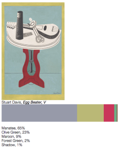
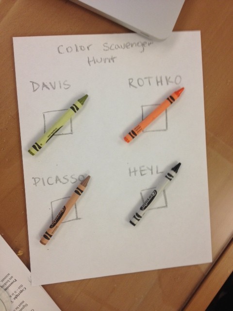
Since we didn’t have time to build out the infrastructure for this game, I prototyped the game in HTML page, which included images of four artworks. I gave playtesters four colors that are found in each work of art; they were asked to match these colors to the paintings. They could then click the “get results” hyperlink to be directed to a website that reveals the top five Crayola colors in the work, including the name of the colors and the percentages of each color in the painting.
One of the major challenges in designing the game was balancing the difficulty level. We had initially included seven works of art, several of which had repeat colors (“Eggplant,” for example, showed up in three paintings). For the purposes of the playtest, we decided to simplify the game so that each color a player was given would correspond to one painting. I also tried to avoid including really ambiguous or similar colors, so one person wouldn’t feel frustrated trying to differentiate between “brown” and “raw sienna.”
Findings
Playtesters enjoyed the game, and reported that it made them look closely at the paintings and had them think about art in new ways. One tester said that the color matching element made them think about how a work of art is made; he would have liked to have matched multiple colors to a work of art in order to think about color in combination with others. He could imagine seeing the bar graph representing the breakdown of colors underneath a painting in a museum. Another tester enjoyed seeing the percentages of colors in each painting.

If we were to continue building out this game, we recommend testing out different difficulty levels with different audience groups. A next step would be to think about how to engage visitors in learning about the art beyond just matching colors. How might this game serve as a gateway into learning about art and artists?