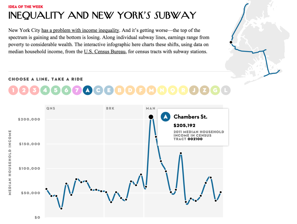
Jia Zhang and Laura Perovich
The primary dataset we chose to investigate is the “School Gardens” (https://data.cityofboston.gov/Facilities/School-Gardens/cxb7-aa9j) dataset from the boston data portal. This dataset lists all schools in the Boston area that has a school garden.
1. What is a school garden?(Rahul)
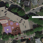
We were wondering this ourselves. What does this dataset actually mean? It is helpful to created a visual dictionary of what school gardens are and for this we created a google map to zoom in on the different schools. It is hard to locate gardens, but what we found instead is that while the visual setting of these schools are diverse, we see a particular pattern. High schools are surrounded by parking spaces, middle schools by colorful markings on concrete. With few exceptions, schools are enclosed buildings very much separated from the outside communities, they look protective. Some are even shaped so that buildings surround an inner outdoor play place.
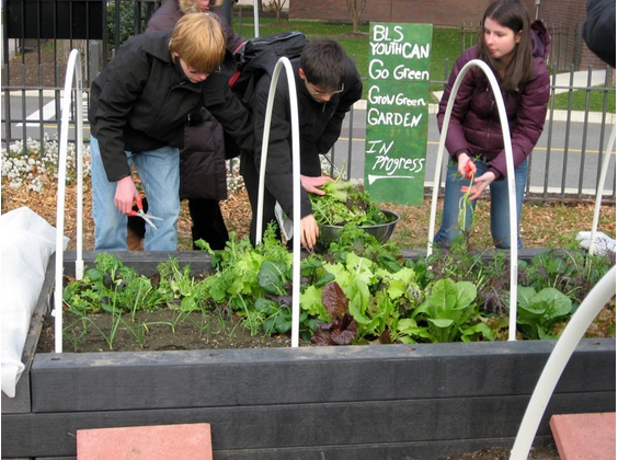
A set of ground-level Images of the listed school gardens would further enhance the visual dictionary of school gardens. These images could be requested from the schools, collected in person, or acquired online through school blogs, Google Image search, new articles, or Google street view. For example images of the Boston Latin School garden are available through a google images search leading to a press article:
Without cleaning the data much, we made this preliminary map to better see the schools:  http://www.mapcustomizer.com/map/schools%20with%20gardens
This map includes some obvious mistakes, but it is still very helpful for us to navigate and understand the data quickly. We have highlighted some of the interesting landscapes surrounding schools in the post itself.
Some interesting data/images(all from google maps):
At Boston Arts Academy, school gardens and community gardens are the most prominent in the school’s surroundings.

At other school garden locations, the larger environment makes the schools look more isolated. Overall schools are L or U shaped concrete buildings with playgrounds for middle and elementary schools, parking lots for high schools and a line of trees at the borders of the property.


Potentially we could analyze these images if we standardize the scale and zoom level to measure the percentage of greenery and gray concrete in each school’s environment. We could go beyond the idea of school gardens to address school settings in general.
2. Context – What % of schools have gardens and how do school gardens relate to other urban planting?
We saw right away that many of the schools on this list were elementary schools. We decided that it would helpful to get the context of school gardens by comparing our list to the list of public schools in Boston found at http://bostonpublicschools.org/.
We also thought it would be helpful to find how school gardens fit into the other urban planting around the city. Both community gardens (https://data.cityofboston.gov/Health/Community-Gardens/cr3i-jj7v) and urban orchards (https://data.cityofboston.gov/Health/Urban-Orchards/c7cz-29ak) are listed in the data portal and could provide context in how school gardens fit into the city’s greenery landscape. Information on environmentally or ecologically focused businesses and non-profits in the area would also provide interesting contextual information. A list of non-profits sorted by category can be found at
http://www.mass.gov/anf/docs/hrd/policies/leave/nonprofit/approved-nonprofit.pdf.
3. Is a school garden an useful indicator of quality of education in a school?
In order to see if school gardens are built in schools with particular economic and academic profiles, we felt that it is helpful to compare the garden locations with both standardized testing scores and income data for the areas the schools are located. Although standardized testing is a heavily disputed measurement of the quality of education, we felt that it did offer a reasonable comparison to the garden data we found because of its comprehensive coverage. MCAS results by school can be procured online at: http://profiles.doe.mass.edu/. This site also provides detailed information on the student demographics (race, gender), class sizes, student to teacher ratio, and teacher qualifications. It also sorts schools by type–public, charter, private, etc. This brings up an interesting question as to whether school gardens are useful indicators of the type of education offered at a school; from an initial scan it seemed that a number of schools on the list are charter schools.
Similarly with income data, we felt the coverage and standardization of the census data on area income could be a helpful complementary dataset. The American Fact Finder’s (http://factfinder.census.gov/) income data by houshold can be found by selecting by area, and then by category at it’s data portal.
These datasets, starting with school gardens, but expanding to school environments in general would be helpful in potentially determining whether there was a correlation between the quality of education, wealth, and the quality of the school environment.