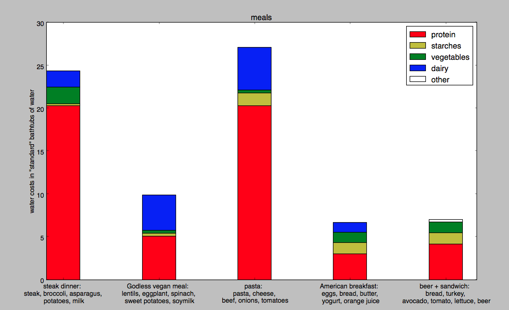
a super awesome chart by Alyssa and Nolan
DATA: We looked at a spreadsheet from a LA Times article on the amount of water consumed or polluted in the creation of many different kinds of food. We then transferred that data into another Excel spreadsheet to turn the original data, presented in cubic meters of water per ton of food, into a more easily conceptualized metric: bathtubs of water per serving. For the sake of expedience we estimated a 100-gram serving, which is reasonable for most foods, and determined that a “standard” bathtub was about 25 gallons.
CHART: For a few example meals that a college student might eat, we wanted to show what foods consumed the most water. Unsurprisingly, meat consumes quite a lot of water, but so do dairy products in some cases. Vegetables, however, don’t really need that much water for the most part. We generated this graphic using Python’s numpy and matplotlib modules.
GOALS:
-Make people realize what the environmental impact of their dietary choices is.
-Help them understand where the bulk of their environmental impact is (meat and dairy products)
-Hopefully the visual impact of this chart will make them think a bit when shopping for food.
AUDIENCE: This might be useful to post in a grocery store or dining hall so people buying food can pause to reflect as they are planning meals for the week. Since we explain water use in terms of bathtubs and the graph is helpfully color-coded and labeled, and since most Americans are fairly chart-literate, the barrier to understanding what this chart says is not great. For greatest impact, it might be most useful to show to college students, who are still building their food purchasing and meal planning habits, so they have that in the back of their minds as they plan meals and form their dietary habits.