Racial Awareness in Dating

When people think of OkCupid, big data isn’t often the first thing that comes to mind. As a free online dating website, it’s certainly easy to dismiss OkCupid as a reputable source of information – yet, the data that comes from the millions of interactions can actually lead to interesting insights on the way certain people interact with certain people.

OkCupid publishes a blog called OkTrends, which seeks to find trends in the way people interact with each other, to both bring out interesting correlations for amusement and to gain insight on how to better connect people romantically. What with the wealth of information that users provide on their own personality and demographics, OkTrends combines humor and data science to produce amusing results, produced in a fairly digestible format for almost all audiences. For example, OkCupid found that “Among all our casual topics, whether someone likes the taste of beer is the single best predictor of if he or she has sex on the first date.” [1].

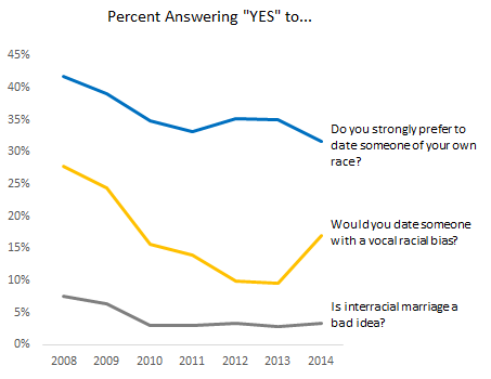
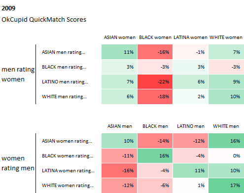
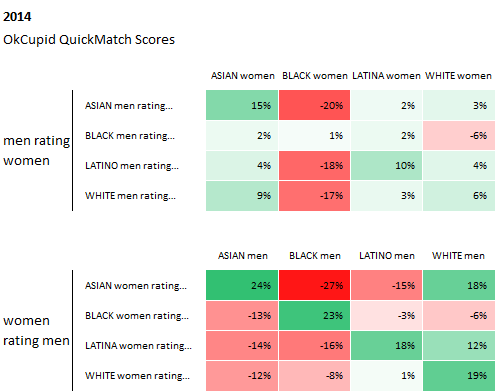
However, the data that OkCupid also possesses has also been used to open a discussion for a more socially impactful topics – like race and how it affects our perceptions of others. In Race and Attraction, OkCupid revisits one of their first analysis of race and attraction from 2009, to see how racial preferences have changed in the last 5 years.

From the graphs below, they found that racial preferences from 2009 through 2014 have actually stayed about the same, and in some cases, “racial bias has intensified a bit.”

source: http://blog.okcupid.com/index.php/race-attraction-2009-2014/

source: http://blog.okcupid.com/index.php/race-attraction-2009-2014/

source: http://blog.okcupid.com/index.php/race-attraction-2009-2014/

source: http://blog.okcupid.com/index.php/race-attraction-2009-2014/

These preferences are also checked against the data from another dating website, DateHookup, with “a distinct user base, a distinct user acquisition model, a distinct interface, yet their data reflects the same basic biases.” These racial preferences seem to stay similar, with the common trend of asian men and black people taking the greatest hits in preference.

Curiously enough, while the behavior of people have not changed much, when asked explicitly about certain racial attitudes, users have answered their match questions to as less biased overall.

match-questions

source: http://blog.okcupid.com/index.php/race-attraction-2009-2014/

While the data presented is of course coming from the dating world, it does still have significance in the way we understand the way we perceive others based on race. This article suggests that in the past five years, we have been telling ourselves that our racial attitudes are less biased, but our behavior has remained unchanged. Of course, the data isn’t definitive in any way. However, it does present a launching point for a discussion on racial awareness, to deeper understand the differences between what we believe and how we actually act.
Invalid Arguments: Climate Change

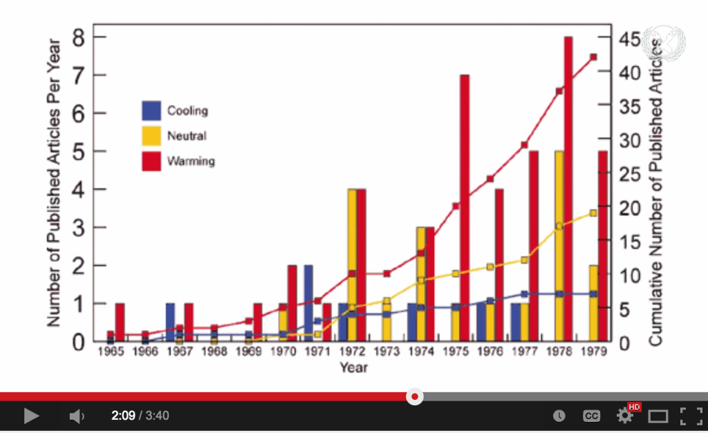
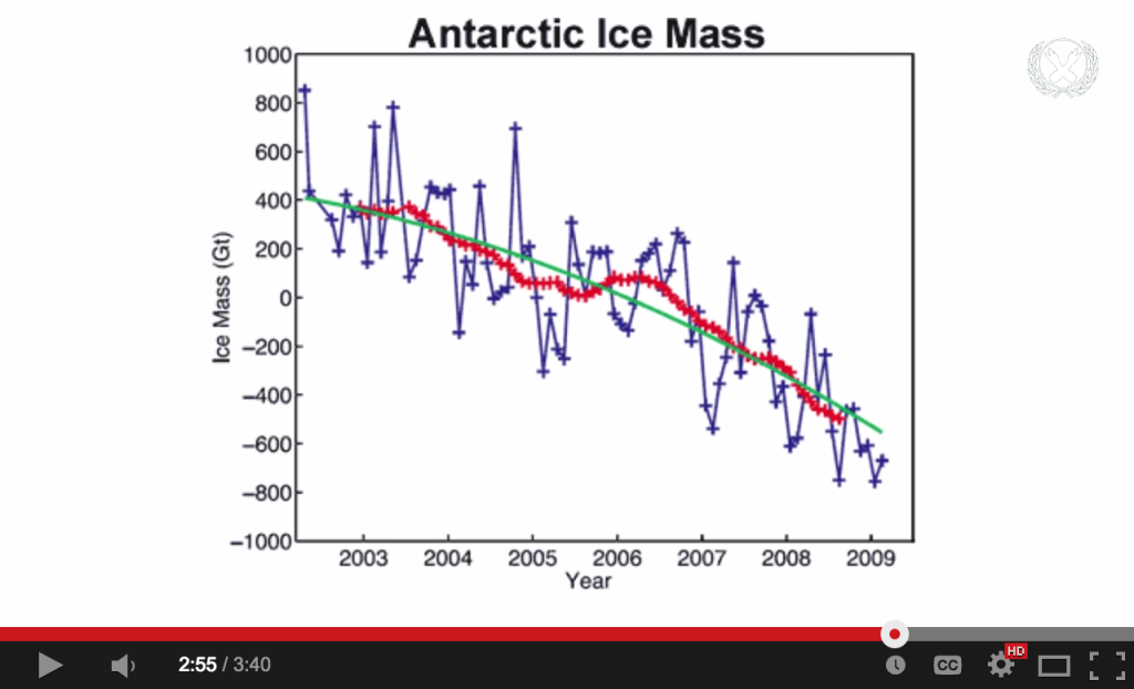
This Vlogbrothers video was published in September 2013 and is one in which Hank Green provides counterarguments to common ideas that people who don’t believe in climate change use to defend their standpoint. He begins the video by describing what climate change is and why it’s a problem that we, as humans currently living on this earth, should care about. And then he contextualizes his arguments with data and figures from peer-reviewed scientific papers. All of these papers are linked in the video description, so viewers can read about The Myth of the 70s Cooling Consensus or A Reconciled Estimate of Ice-Sheet Mass Balance, showing that the land ice mass (as opposed to the sea ice mass) of Antarctica is decreasing with time.

Papers

Antarctica

The audience is primarily the Nerdfighter community (those who regularly watch Vlogbrothers videos), which vary from teenagers to adults in their 40s who accept Hank Green as a reliable host and generally are open to listening to his opinions. As with all YouTube videos, though, his ideal target audience is anyone on the website. This video is accessible and well-made enough for many types of people to find it at least somewhat engaging, from those who are familiar with vlogs and many formats of online video, to those looking solely for entertainment, to those who use YouTube for educational videos, etc.

Overall, I think the video is effective for an audience that either 1) agrees with climate change 2) slightly disagrees with climate change for no really strong reasons or 3) a casual audience who has very little knowledge about the subject. The fact that he uses figures from scientific papers to back up his verbal claims and summarizes the rest of the literature in his argument works for this medium, a <4 minute YouTube video for people (especially younger audiences) who just want to get more informed.

However, this video will probably fail to persuade firm believers in “global cooling” that climate change exists. I’m assuming that these types of people are less likely to do further reading in the suggested papers and might not even listen to the entire video before starting discussions, productive or otherwise, in the comments. At best, this video might persuade them to doubt one or two of the misconceptions they have about climate change, which might count as having successful impact.

Social Mapping the City

In this TED talk, Dave Troy presents some social maps of cities that he created by analyzing users’ Twitter data and locations. He analyzed the primary interests of each user, color coded it, and mapped it to their location, drawing lines between any connection between two users. What he found was that, in each city, primary interests of users tended to clump geographically; in a way, the primary interests of users created interest boroughs, of sorts.

Given that his map of Baltimore specifically designated the “Geek” area as also the “TEDx” area of the city, it seems that his intended audience for the TED talk is comprised of other data geeks and TED enthusiasts. In addition, I think that the maps could be useful for urban sociologists and those who study the connections between online social behavior and offline location, culture, and behavior.

Troy’s research and presentation aim to examine the social separation within cities, which he views as a social construct which we could choose not to do. While I feel that the data visualizations, taken without comment, provide useful information, I do not agree with his conclusion. Though he mentions gentrification in his talk, he does not seem to acknowledge that many of the people in the cities he examines (specifically, those being pushed out due to gentrification) literally cannot afford to move into other areas of the city because it is too expensive. His presentation is not effective in explaining for this.

I do, however, feel that the data visualizations themselves do effectively show the separations of and connections between different interest bubbles in the cities. It would be interesting if he could somehow incorporate income distribution into the visualizations, as I feel there may be significant correlation and may help show some of the economic underpinnings of these bubbles.

Feeding the World

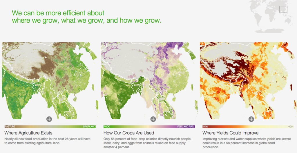
This article takes a data-driven approach to tell the story behind addressing the global challenge of sustainably feeding the growing world population. The presentation is geared toward both educating general audiences about the food challenges connected with population growth, and persuading policy makers to adopt certain strategies for mediating the global supply and demand for food.

The data presentation uses both qualitative and quantitative data – using photos to document the diversity of food producers around the world and the impact of our agricultural footprint, and visualizations to convey key statistics that are central to the story – namely, mapping the global agricultural footprint and visualizing the projected need based on population growth.

Screen Shot 2015-02-05 at 1.02.55 AM


Screen Shot 2015-02-05 at 1.01.27 AM

In general, this data presentation uses a blend of techniques to effectively meet the goals of both educating a general audience, and conveying a set of high level strategies for policy makers to consider in the context of addressing this global food challenge. The use of interactive visualizations encourages the audience to explore the data, while the curated images and static charts depict very deliberate and specific data points that help to support the narrative of the article. The types of visuals are intuitive to interpret and do not require a high level of audience data literacy, and they can be taken both within the context of the article, or as standalone pieces. The structure and techniques employed within this data presentation are effective in empowering the audience to engage with the data presented while also reinforcing the key strategies proposed within the article.

The Good News on Poverty

Bono’s TEDTalk aims to inspire its audience to address extreme global poverty and explain the history of anti-poverty campaigning. He motivates his audience, who are primarily people interested in addressing poverty but skeptical of the impact that is being made, largely be presenting data. His TEDTalk includes graphs that highlight the impact that previous interventions have had on poverty, AIDS, malaria, and child mortality.

One way in which he makes his presentation of data particularly effective is that he manipulates it to show statistics over short- and long time-scales. For example, when discussing child mortality rates, Bono presents the statistics on number of lives saved on a daily basis, making the impact seem much larger and much more tangible. However, when discussing the progress that can be made in reducing extreme global poverty, he shows data over large time-scales and includes projections, making it seem realistic that extreme global poverty could be ended by 2030.

The goal of showing this data seems to be to revitalize efforts to eliminate extreme global poverty. In particular, Bono aims to show that elimination of extreme global poverty is a realistic possibility within our lifetimes. In general, the way he presented his data seemed very effective. The data presentation made it clear that significant progress had already been made, and that based on what has already been done, elimination of extreme global poverty, which at first seems unrealistic, may be possible. However, the presentation could also be more effective because the examples he gives in the medical field show the amount of people whose quality of life has improved, but does not give a sense of to what extent the problem as a whole has been addressed.

the gini coefficient

Over the past month, I’ve done an unholy amount of work with demographic data from the U.S. Census API.  Specifically, I was looking at what characteristics of a community affect broadband access in that community.  One of the features I looked at was economic inequality, which can be measured by the Gini coefficient.  Briefly, the Gini coefficient measures how equally incomes are distributed across a population.  The visual presentation is pretty intuitive, as you can see here:

(image source: wikipedia)

A perfectly equal community (everyone’s income is the same) will essentially trace the line of equality, and the greater the difference between the area under the line of equality and the cumulative share of income (y is the share of total income earned by the bottom x% of earners), the greater the inequality.


News organizations seem to love using the Gini Index to talk about the effects of taxation and relative economic inequality worldwide, just to name a few. It’s a really universal, powerful way to talk about inequality.  Here’s an example from the Washington Post, presumably for the internationally curious.

This is pretty interesting; since the countries and continents aren’t labeled, the authors of the map likely assumed basic geographic and historic knowledge; if you don’t know that the big dark red landmass in Asia is China and China is ostensibly a Communist country, for example, you won’t have the “huh” moment where you reflect on the way China’s brand of Communism has evolved to its present-day capitalist form.  Similarly, someone without a grasp of the history of colonialism in Africa, particularly the social woes of Southern Africa, might find the incredible economic inequality there anomalous. This map would succeed best in telling its story with expert commentary, some level of mathematical competence (to know what the Gini index is), and historical context; for that reason it’s probably speaking to a well-educated audience with the patience to pore over the map for at least a few minutes.  The problem, though, is that the map by itself places the onus on the audience to tell the story.  Sure, the Gini index is a powerful measure of inequality, but inequality is the result of many forces, both cultural and historical.  Without that context, and with so many stories, anonymous here, waiting to be told, the data isn’t as compelling as it can be, and that’s really a shame.


(source: http://organizingentropy.typepad.com/blog/)

Now here’s our old friend the bar graph.  One of the things taxation can do is even out the distribution of wealth a little bit.  Scandinavian countries and, to a lesser extent, Western Europe, appear to employ taxation as an equalizing method.  Again, without being conversant with the paradigm a country uses to govern itself, this doesn’t mean much.  Nor do we know what the effects of this policy–which countries have a better quality of life? how many people live in poverty?  This is just one picture in a story about inequality that is rich in detail and nuance, all written in the same language thanks to the Gini coefficient.

Wealth Inequality in America

Wealth Inequality in America is a popular YouTube video by author “politizane” with a simple message:

Not only is the problem of wealth inequality in America worse than ideal, it’s worse than you could imagine

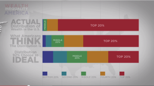
The video shows three wealth distributions from a Harvard study about what Americans think an ideal wealth distribution should be, what they think the true distribution looks like, and what it actually looks like.

hsubrama_bars
politizane’s wealth distributions represented as stacked bars.

I believe what makes the video so captivating (over 16 million views) is the way politizane turns his data into a story about the victimization of his audience (lower and middle class Americans).

Politizane begins by displaying three stacked bars with overlaid animation to show that the ideal, expected, and actual wealth distributions are vastly different. In doing so, he makes it clear that wealth inequality is far worse than imagined. But he does not stop there. Instead, he animates a 100 small stick figures and places stacks of money on top of them. As he explains how the actual wealth distribution is worse than expected distribution, dollar bills fly from the poor stick figures to the rich stick figures. Although he’s ultimately just presenting histograms, politizane builds a story – we begin in a world of wealth equality until the rich take most of money away from the poor and middle class.

hsubrama_money_histogram
politizane’s “money histogram” showing dollar bills flying from the the poor to the rich and illustrating the difference between an ideal wealth distribution and the expected distribution

In this video, we see the difference between presenting charts and data storytelling. Stacked bars give us distributions and the main point, but politizane’s stick figures give us a protagonist (poor and middle class), an antagonist (the rich), and a plot (the rich have taken money from the poor) while utilizing a simple histogram as the basis. In about 5 minutes, politizane has shown his audience the data, made them feel victimized, and given them an enemy, thanks to his storytelling.


Source: https://www.youtube.com/watch?v=QPKKQnijnsM

Visualizing What the World Eats

hungryplanet1

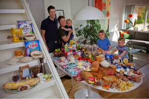
Norway: The Ottersland Dahl Family of Gjettum. Food Expenditure for One Week: 2211.97 Norwegian Kroner ($379.41 USD). Favorite foods: fresh baked bread with butter and sugar, pancakes, tomato soup with macaroni and cold milk, yoghurt. Photograph by Peter Menzel (source)

Husband-and-wife team Peter Menzel and Faith D’Aluisio traveled around the globe to 30 homes in 24 countries, investigating what families eat over the course of a week and how much it costs. The result was Hungry Planet: What the World Eats, a book published in 2006. With the turn of each page we see each family photographed where they dine, flanked by their week’s worth of food products.

This project came to mind when we were discussing food security during Tuesday’s class. The photos probe questions both about health and economic access to food—a perfect fit for the theme we’ll be exploring this semester.

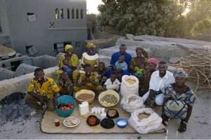
The photographs are geared toward a generalist audience: the Hungry Planet book has had mass and viral appeal, and has been highlighted in media such as TIME and NPR. (In fact, I’m pretty certain I first heard about these photographs when an acquaintance posted a link on Facebook.) The project aims to get people thinking about what they eat, where they get their food, and how much money they spend. It illuminates the disparity of food access and health choices around the world—from the Norwegian family of five that spend almost $400 on food, much of it processed and packaged, to the family of 15 in Mali that prefers to cook traditional rice dishes and spends $26 a week.

I choose to write about these photos because of the questions they bring up about data visualization. What does it mean to present data? Here, we see the photographer present data about food consumption in the most literal form, by documenting the actual families and food. For me, eschewing the language of graphs and charts in favor of this approach is effective, leveraging the visual power of raw foodstuffs and colorful packaging to pack a visual punch.

hungryplanet2

Mali: The Natomos of Kouakourou – Food expenditure for one week: 17,670 francs or $26.39. Family Recipe: Natomo Family Rice Dish. Photograph by Peter Menzel (source)