Rethinking Water Consumption

waterremix

For this assignment, we were challenged to remix the Good magazine water infographic into an interactive, participatory experience. In our design, users can visualize their own water usage by selecting the activities they undertook that day.

20090318-wateruse

We found that the original infographic, organized in columns with options like “apple” vs. “orange,” or “toilet” vs. “low-flow toilet,” could serve as the interface from which a user select items. On another screen or window, a bar graph would dynamically fluctuate as the participant indicates his or her water consumption. The height of each bar is proportional to how much water each activity or product requires. We also maintained the color-coding from the original chart: bars with blue indicate direct use of water, while green indicates the water used to make that item the user the consumed. By recreating this infographic into an interactive chart, we personalize the understanding of water consumption, allowing users to apply the information in the original infographic to their own lives.

Water Visualization Map Remix

Team: Hayley Song, Tuyen Bui, Deborah Chen

Remix Technique: Map

We used mapping as the visualization remix method to represent various direct and indirect water consumption in a household.  To this end, we decided to draw an outline of a house and map different uses of water inside the house.

water_remix


The data shown in the original infographic was for a period of 24 hours, but we decided to construct a story by focusing on our daily actions rather than the flow of time.  Additionally, the original visualization shows a comparison of the water usage between appliances with different levels of efficiency (e.g. high efficiency washing machine vs regular), but we’ve chosen to focus just on regular usage and make this the dominant narrative.

The size of each room is proportional to the amount of water that directly or indirectly results in water waste.

Each room shows the key causes of water waste within the room. The kitchen is drawn the biggest and is placed in the center of the house to highlight it produces the most water waste in the house.  The steak and wine, in the middle of the kitchen are the major causes of indirect water waste in the kitchen.  The bathroom has a bathtub, a shower and a sink; the laundry room contains a washing machine.

We indicated the amount of waste by the size and the number of water drops under each component. Future work would involve adding the numerical quantity of how much water was used.


Water Remix

Val Healy & Ceri Riley

Optimized-waterremix

We remixed the water usage infographic into a map, specifically focusing on the food components rather than the appliances.

This map shows one’s breakfast, lunch, and dinner plates, scaled to represent the relative amounts of water these meals virtually use. In addition to the plates themselves being proportional to water use, the foods and drinks on the plates are also proportional to their respective water footprints. The blue pie slice of the plate represents how much water you would use if you chose the “better” option for your meal — for example, the chicken, beer, and baked potato dinner would only use about 20% of the virtual water that the steak, wine, and bread dinner would.

If we were to actually develop this visualization rather than just sketch it out, we hoped to show the old vs new plate maps for each meal. If you hovered over the blue region of a given plate, you would be shown a proportionally smaller plate with the new foods arranged on it by virtual water use. This would allow for quick visual comparison between two meal options. And, if you hovered over any given food, you would be shown the amount of virtual water (in gallons) that was required to grow it and/or its percent contribution to the total virtual water use of the meal. So our food map visualization would look simple at first, but ultimately contain a lot of the same numerical data that the original dataset included.

Water Remix


2015-04-07 16.30.48


Team Members:

Edwin Zhang

Danielle Man


Water Data Remix!

Our group was tasked with taking the original water usage data and providing a way to communicate it by making it interactive.

Looking at the data, we found that while some of the information involving direct water use was more obvious, the amount of water ‘virtually’ used for common products was the most surprising. In one example, an item like steak is illustrated as consuming 1500 ‘virtual’ gallons of water.

Though the virtual gallons of water are not directly used in say, feeding a cow that would later become steak, the the amount of water reported in the sheet is to envision the water used in processes that lead to the end product.

As a way to envision the amount of water involved in both the processes and the actual water used directly, we decided that it would be interesting to have an ‘exhibit.’ By filling up water balloons one at a time and exchanging them for tickets, a person could then exchange those tickets for various items. In doing so, a person could better understand the differences between the amount of water consumed for each item by engaging in an amount of work reflective of the water consumption.

Water Remix

Mary Delaney

Stephen Suen


We worked on a physical way of depicting the data from the water infographic. The amount of water used in the production of some foods as compared to others, especially in the production of steak immediately jumped out to us. However, we quickly realized that neither of us knew how much the 1,500 gallons of water necessary to produce a pound of beef actually was. After some quick calculations, we figured out that 7.5 gal is about equal to 1 cubic foot, meaning that 1,500 gallons of water is about the amount of water needed to fill at 25’-long lap pool. By contrast, the amount of water needed to produce one serving of chicken, is about a bathtub-full. To emphasize the huge amount of water necessary to produce a steak dinner as compared to a chicken one, we proposed having a bathtub and a lap pool next to each other to help people really understand how much water, in absolute terms, goes into a relatively small piece of meat.


photo-40

Map Remix

Tami Forrester
Harihar Subramanyam

We remixed the water usage visual as a map (please excuse the upside-down text – we did it just so we could both write at the same time).

It is a floorplan of the home. All water-consuming appliances or food are drawn in blue. Each room is overlaid with a water drop. The water drop would contain the total water usage of that room (by aggregating the counts in the original visual). The area of the water drop is proportional to the water usage in gallons.

WaterMap

Final Project

Team

Hayley Song

Deborah Chen

Topic

We are interested in comparing prices at local grocery stores/farmers markets to see how far one’s money can go on food and which ones are the most/least expensive.

Technique

We aim to build an interactive web application that allows people to put in their budget for food, select a basket of goods, and compare how much food they can buy in different places. The prices will be from data in various Boston area supermarkets.

Goals

Many news outlets and individuals have done their own stories to help readers determine the cheapest place to shop.We’d like to make use of that information, and allow people to find out what the cheapest place to shop for them is based on their own basket of goods. Even if one is committed to shopping where they are, the tool will allow them to quantify how much money one is saving/not saving.

Data/Story

We looked at various sources of data for supermarket prices:

  • Instacart
  • NH Public Radio: http://nhpr.org/post/how-low-are-market-basket-prices-really
  • Farmers markets: http://thefoodproject.org/sites/default/files/lightner-2011.pdf

The data shows that for certain defined baskets of goods, some stores are cheaper than others. For example, the report on farmers markets compared the average prices in the farmers markets to those in other supermarkets.  The report concluded that, contrary to the common belief that farmers markets would be more expensive, the prices in the farmers markets were competitive to those in the supermarkets.


Final Project Proposal – Food Security Game

Members
Stephen Suen
Mary Delaney
(…looking for more! A digital game may be out of scope for a team of two)

Topics
Economic circumstances/challenges of those faced with food insecurity and how that affects other aspects of their lives (e.g. health/nutrition)

Goals
To increase awareness and empathy around the issue of food security
To educate the food insecure on how to make better dietary choices within their economic means

Techniques
Web-based digital game, in the vein of “empathy simulators” like Cart Life or Depression Quest

Story

Our initial story pitch is based on this article from the US Department of Agriculture’s Economic Research Service, which took dietary intake data from the 2003-10 waves of the National Health and Nutrition Examination Survey and measured it against the Healthy Eating Index, a measurement of how closely one’s diet conforms to recommended daily intake. This analysis specifically focuses on SNAP participants, who are lagging behind in multiple HEI components (notably fruit and vegetables) compared to other Americans.

nov14_feature_mancino_fig01

In addition to these findings, the article explains how this different in dietary consumption is having real effects on SNAP participants’ health — adults enrolled in SNAP are “more likely to be overweight and suffer from diet-related health problems.” To summarize: The data say that low-income Americans are unable to eat healthy due to price, access, and storage concerns. We want to tell this story because food security is a struggle for so many people but is not tangibly understood by those not affected by it.

Expanding the story beyond the initial article, there are a number of things we could do with the data:

  • Recreate the HEI analysis using the most up-to-date NHANES data
  • Facet NHANES data by other dimensions (e.g. geography, specific income brackets) to make the game even more personal/relatable
  • Combine other USDA data sets, such as Food CPI or the Quarterly Food-at-Home Price Database to relate the HEI components to actual prices

More brainstorming will have to be done in terms of the actual game mechanics to determine what data sets might be pertinent to the final product.

Art data and gender

Members: Desi Gonzalez and Laura Perovich

Topic: museum collection data

Goals: education, increased access to and engagement with museums/art, social change

Techniques: interactive visualizations, physical objects

Story: The data say male artists have a stronger presence than female artists at the Tate.  We want to tell this story because we’re interested in exposing the biases in art museum collections in order to both teach audiences about how women have been historically underrepresented in collections and possibly help shape museum collecting practices in the future.

Data:


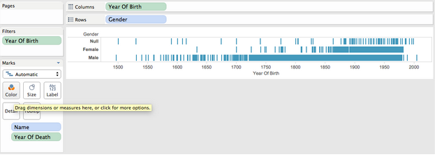
I quickly plugged Tate artist data into Tableau and graphed artists birth date by gender. Most of the artists represented in the collection were born more recently. The artists born before 1850 are overwhelmingly male. (“Null” shows up for collectives/groups of artists, but in a few instances it seems like artists weren’t coded; it seems like collectives/collaborative artwork represented in the collection are younger/were born more recently.)


Screenshot from 2015-04-02 14:41:03


We also used R to begin to dig into the data a bit.

Overall, there are 5.6 time more male artists with work at the Tate than female artists.  Male artists at the time have 23.9 times more pieces at the Tate than female artists.  Male artists also occupy more artwork territory in than Tate than female artists: male artwork has 8.2 times more area than female artwork and 9.5 times more volume.

We further considered gender breakdowns by artist century of birth, to see if changes in gender diversity of the profession over time (exact data TBD) may be reflected in the Tate’s collection.  Finds are below:

Representation ratios (M:F) by century of birth

century artists artworks area volume
1600 45 66 252 NA
1700 39 21 186 21.8
1800 24 249 124 789
1900 5.7 9.5 9 23.9
2000 2.2 2.7 2.6 3.4


N.B.  This is an extremely rough and initial analysis of this data.  There is a significant number of NAs in the data that will have to be addressed, as well as some data inconsistencies that require further exploration.  Data has not been fully checked or cleaned.

Additionally, this data would be better understood with further context–such as collections from other museums or overall occupational statistics.

Final Project Ideas

Members

Val Healy, Ceri Riley

Topics

Current environmental/human influences on agriculture (urbanization, desertification, industrial farming/animal agriculture) and how this impacts food security

Goals

Changing behavior, educating people about agricultural impacts — both food choices and environmental/land use choices — without sensationalizing the information

Techniques

Simple interactive/web visualization or infographic

Data/Story

Food Environment Atlas – USDA

This dataset contains a lot of information, but we chose to look at the fact that 50.54% of Farmers Markets in the United States sell fruits & vegetables, while 46.94% sell animal products, and 50.66% sell ‘other’ (presumably flowers and other non-edible products). We wanted to look at the story surrounding farmers markets nationwide to see how local farms/agriculture might help provide different types of food choices to people.