Couples Text Messages are Decoded

In a recent newsletter article sent by the Parisian website Merci Alfred, Les SMS des couples déchiffrés (can be translated by Couples Text Messages are Decoded) shows within a few infographics how texts as part of the couple new language. It gives stats and possible trends on couples texting behaviors in a humorous way. Over 100 millions text messages of couples have been analyzed with the help of Tx.to a website that allows you to print your SMS conversations.

The figures are split in Gender behaviors and questions asked are : % of sent texts according to the status of the relationship, the day of the week, length of sent texts, most frequently used words in texts, most used emojis, first ” I love you” and “make love” are said, time of response between texts, etc.

The goal of the data presentation seems to show that you will have a different behavior in your relationship according to your gender. Even though they claim a study with over 100 millions texts, the audience understands that the point is not to run a scientific study but rather show stats in a funny way. As each graph is almost always annotated to highlight that difference. For instance, when we see the time of response between texts of 2:30min for Women VS 4:30min for Men the annotation says : c‘est parce qu’on s’applique ( it is because we try harder)

The data presentation is effective because it distinguishes Gender with a different color code and show simple binear comparisons with only a limited figures per graph. Males and Females behave differently. We all know that.

Those who saw the article are the recipients of a newsletter that targets urban males living in Paris city. But it is also shown on their website. So it really aims at not a specific male audience but mostly an urban audience,  fairly young 18-35yo.

Val’s Data Log (2/8/15)

  • woke up, notified sleep tracking app on my Android phone device
  • checked email, social media (replied to several emails and one Facebook message)
  • checked my living group’s meal plan signup Google spreadsheet
  • looked at Google Calendar for the upcoming week
  • checked CMS.619 syllabus (Google Doc) for clarification on assignment
  • clicked hyperlink to class blog (to read others’ blogs)
  • checked wunderground.com in anticipation of the snowstorm (data on website sourced from many measurement sites, my visit logged)
  • read several articles posted on Facebook.com by friends (clicks and likes logged by Facebook, views of articles logged by their respective websites)
  • logged 2 books in my goodreads.com “to-read” queue
  • showered (total water use measured by City of Cambridge)
  • brushed teeth several times during the day (water use)
  • used the bathroom several times throughout day (water use)
  • ate communal food at living group (all communal food purchased with house card, logged by financial services corporation (ie: Visa/AmEx/etc.), total food use measured weekly by “stewards” who purchase food)
  • heated food on gas stove (amount used measured by gas supplier)
  • used various electronic devices (electricity used is measured by electricity supplier)
  • logged TA work hours for this week on MIT’s Atlas website
  • listened to music on Bandcamp.com (plays logged by site)
  • listened to music on Grooveshark (data both logged by site and sent to my Last.fm account)
  • worked on several assignments on LibreOffice (data stored on my computer)
  • reblogged 2 Tumblr posts, added 14 to queue, liked 5 (data logged by Tumblr)
  • printed assignments and readings for lab class (documents downloaded to computer from course site and data sent to printer)
  • spent most of the day with my cell phone in my pocket (data usage and location tracked)
  • spent time with housemates, most of whom also have data and location-tracking phones
  • notified sleep tracking phone app that I was going to bed

Data Log (ceriley)

Sunday, February 8th 12:00am to Monday, February 9th 12:00am

Italicized are the activities that didn’t produce data that were recorded digitally, but they’re activities that I would report if someone asked me to fill a survey about my day. Everything is chronological but times are approximate.

  • 12:00am — used computer, connected to MIT wifi (Tumblr, Gmail)
  • 12:20am — read Yes, Please 
  • 1:20am — used water to brush teeth, etc.
  • 1:30am — went to bed
  • 10:15am — woke up without an alarm
  • 10:30am — used water to brush teeth, etc.
  • 11:20am — made a 33 minute phone call home
  • 12:00pm — used water and electric stove to cook lunch
  • 12:30pm — mobile google search: amazon hamburger earmuffs
  • 1:00pm — used computer, connected to MIT wifi (Stellar, MIT Admissions Blogs, Gmail)
  • 1:00pm — sent an email
  • 1:10pm — new Adobe InDesign document
  • 1:30pm — google search: worldview
  • 1:30pm — replied to an email
  • 2:00pm — used water to wash dishes
  • 3:00pm — used computer, connected to MIT wifi (Tumblr, Twitter)
  • 3:00pm — sent an email
  • 3:05pm — skimmed Wikipedia article (Japanese mobile phone culture)
  • 3:10pm — google search: prerecorded
  • 3:10pm — google search: ENT
  • 4:00pm — mobile google search: how much milk in a milk shake
  • 4:05pm — called dorm elevator and rode it down 11 floors
  • 4:10pm — paid for ice cream and milk with TechCash
  • 4:15pm — scanned my MIT ID at 2 card readers to gain access to dorm, called dorm elevator and rode it up
  • 4:20pm — used electric blender to make milkshakes
  • 4:30pm — sent 4 text messages
  • 4:30pm — sent a snapchat
  • 5:00pm — used computer, connected to MIT wifi (Stellar, Meyer Lab, MIT+K12 Videos)
  • 5:30pm — updated InDesign document and saved
  • 6:00pm — exported a video from Adobe Premiere and uploaded to shared Dropbox folder
  • 6:15pm — replied to an email
  • 6:20pm — read printed book chapters and took notes
  • 8:45pm — used computer, connected to MIT wifi (Tumblr, YouTube, Facebook, Twitter, MIT Emergency)
  • 9:00pm — watched 4 new YouTube videos in my subscriptions
  • 9:20pm — watched and liked a video on Facebook
  • 9:30pm — read printed articles and took notes
  • 10:00pm — used computer, connected to MIT wifi (Gmail)
  • 10:05pm — replied to 2 emails
  • 10:10pm — google search: academic calendar 2015
  • 10:15pm — wrote in 2 events in my planner, checked off to-do list items
  • 10:20pm — wrote in notebook
  • 10:30pm — checked mailbox, read letter
  • 10:35pm — mobile: sent an email
  • 10:40pm — baked cupcakes using water, oven, and electric mixer
  • 11:20pm — played Bananagrams (in Spanish and English) and Blockus

In total: received 36 emails and deleted 20; reblogged 2 Tumblr posts (7 more were posted from queue), liked 9, queued 16

Desi’s Daily Data

Sunday, February 8, 2014

I wake up to my alarm clock at 8:45am.

I receive text messages from a friend in the Netherlands and from my family. These texts include words and images; the phone also tracks the date and time that these messages were sent and read.

I take my daily birth control pill; the empty slots in the case demarcate which pills have already been taken.

I jot down my to-do list for the next few days, and mark items as I complete them.

I read and write emails. Gmail archives these sent messages and tracks the date and time sent and who received the emails.

I write a cover letter on Microsoft Word. My computer tracks the last time this document are saved.

I  read many articles on the internet. Various websites maintain analytics about my visit, including information such as timestamp, my location, length of visit, and IP address.

Through out the day, I blow-dry my hair, turn light switches on and off, power my laptop—just some of the many ways I use electricity. My apartment’s electric company keeps track of electrical expenditure in my apartment.

I go to a coffee shop and pay for tea. The cashier hands me a receipt, which is a record of the amount I spend (and pay in cash) and the time and date of my transaction.

Back at home, I check my email and see an alert that my bank has charged me for an ATM fee from two days ago.

I transcribe interviews for my thesis, making sure to include periodic timestamps in the transcript.

I browse on Twitter, marking certain tweets as “favorites.”

I call a good friend who lives several states away; my phone keeps a record of the date, time, and length of our conversation (57:26).

I input recent shared apartment expenses into Splitwise, a website that allows for easy tracking of bills amongst roommates and friends.

I update a few upcoming meetings and events in my calendar, noting time, date, location, and brief description of each engagement.

I write up this blog post, recording the happenings of my day. As soon as I click “publish,” WordPress will generate data about visits to this post.

Data Log (hsubrama)

This log runs from 7AM Saturday, 02/07/2015 to 7AM Sunday, 02/08/2015.

  • Snoozed alarm once and then woke up
    • My alarm clock app keeps track of my sleep schedule
  • Responded to a text message
    • My text conversations are stored in the iOS Messages app
  • Exercised
    • Treadmill recorded calories burned, speed, distance, etc.
    • Recorded exercise in fitness app, which collects data about my exercising and my meals
  • Showered and got ready
    • Water usage is recorded Cambridge Water Department
  • Did laundry and paid with MIT Tech Cash
    • Electric company records power consumption (of various electronic devices)
    • MIT records tech cash balance and transactions
  • Went to brunch and ate
    • Bon Appétit (provides MIT dining) records consumed food so they know what to cook and what to charge
    • MIT records that my ID card was used for food
    • I wrote a comment card because they served a brunch meal that I liked, Bon Appétit collects this information
  • Filled up water at filtered water fountain on campus
    • Fountain has LED display indicating total gallons of water poured
  • Worked on homework
    • MIT records connection to wireless networks (ex. MIT SECURE, MIT GUEST)
    • Google records some data from searches, calendar events, documents, email, etc.
    • Amazon Web Services monitors my running servers and collects various statistics on them
    • GitHub records my activity history
    • and all the other websites record information about my visit
  • Downloaded new podcast episodes
    • iTunes records my podcast downloads
  • Sent a few emails
    • Emails were archived
  • Left to go pick up gift for loved one, called a car to take me there
    • App records each time I call a car, and my location
    • Credit card company records charge when I pay
  • Picked up gift
    • Store security cameras record activity
    • Store records sales
  • Returned back to dorm and called brother
    • Phone company records call history
    • Swiped ID to enter dorm and use elevator, this is recorded by MIT
  • Worked on homework
    • Websites track my activity
    • Answered Piazza (MIT classes use this Q&A service) question and asked Piazza question – these were archived on Piazza
  • Factory reset corrupted tablet and reconfigured
    • Configuration info was sent to both HP and Microsoft
    • Downloaded apps are tracked by Microsoft
  • Listened to music
    • Spotify records my songs and various other data about my visit
  • Watched movie with friends
    • Netflix recorded our place in the video, when we started watching, and what we watched
  • Visited another MIT dorm
    • Front desk required ID, MIT recorded the access
  • Worked on homework
    • By downloading new C++ library, the hosting website recorded the download
  • Got ready for bed and made calendar events for next day
    • Google calendar recorded my calendar event and other data from my visit

Daily Data Log

Data log, starting at 12:20 am on February 6, 2015 and ending at 2:13 pm on February 6, 2015.

I am currently generating this document.
You are currently reading this document, probably in a browser which is keeping track of all of the sites you have visited in a while, on a computer that is continuing to send packets to a router to stay connected to the internet, and even more packets to a server when you refresh/load/interact with a page. This page is probably keeping track of how many visitors it has seen. Through you, I am generating data.

Before going to sleep, I wrote the following in a note (another generated document) on my phone’s S Memo app:
I charged my phone, consuming a fairly small amount of power that was recorded by Nstar, which provides my apartment with electricity.
I turned up the heat before going to bed; the gas used is also being recorded by Nstar.
Sleep time and duration could have been observed (by myself or an outsider) and recorded; before sleep, I set an alarm. Upon wake, I turned off an alarm after it rang twice. The music it emitted was also data that could have been collected.

I used an amount of water to brush my teeth.
I followed a schedule that exists online, using Google Calendar.
It took me a certain amount of time to walk to campus; my cell phone sent GPS requests to GPS satellites as I walked.
There may have been a cell tower handoff if I switched coverage zones; it is always possible to track me to within some radius if my cell phone is on.

I used a credit card to purchase a quesadilla for lunch at Anna’s.
My bank statement records most meals I have, and also most meals I miss.
My Firefox browsing history keeps track of all of the sites I have visited in the past year.
My current tabs (which are also available on my phone) keep track of what I’ve been interested in over the past week.
I googled some queries, which was recorded by Google.
I scribbled my homework solutions in a green notebook.

The Science Checks Out

A recent article from FiveThirtyEight, “Americans And Scientists Agree More On Vaccines Than On Other Hot Button Issues,” highlighted data from a 2014 Pew Research Center study on public attitudes towards science-related issues. In the graphic below, we can see how Democrats, Independents, and Republicans’ views compare with one another — and with those of scientists from the American Association for the Advancement of Science. This story was released in the wake of controversial statements made by Republican presidential hopefuls Chris Christie and Rand Paul that reignited the debate over whether or not children should be vaccinated. The public has much more of a (positive) consensus — both across the political aisle and with the scientific community — on the topic of vaccination compared to global warming, evolution, and GMOs.

Scientist Public-Split On Science-Related Issues

In the original opinion polls, approximately 65% of Independent and Republican respondents and 75% of Democratic respondents believed that all children should be required to be vaccinated, compared to about 85% of AAAS members. Given FiveThirtyEight’s brand of reporting, I would expect the intended audience of this graphic to be highly data-literate, and most likely closer to the scientific side of the spectrum. While the graphic isn’t explicitly partisan, it does highlight data suggesting that Republicans are less in agreement with the scientific establishment (though the responses to the GMO question invert this). As such, the graphic alone might play into a narrative about how Republican politicians like Christie and Paul are trying to pander to extremist, science-denying voters.

However, the article itself points out that plenty of the other potential Republican presidential candidates are pro-vaccination. Most voters, regardless of political affiliation, agree with science. The goal of this data presentation, then, might be to show how we’re not so different after all across the aisle — and with the exception of global warming, members of the public are more often in agreement with each other than with scientists. The graphics shown on the Pew summary and even their interactive tool doesn’t even mention politics, combining all respondents into a single group. If the goal was to show how far off Christie and Paul were in relation to the broader public (and science!), then this data presentation is effective. It demonstrates that their comments were anomalies and not representative of Republican voters.

One criticism I do have is that the line used to denote the scientists’ views is too bold, overpowering the actual tick lines. It might be misinterpreted as the 100% mark, making all the numbers seem higher than they really are. Even though there is a relative public consensus around vaccination, there is still a large number of people — a third of Republicans/Independents, a quarter of Democrats, and even a good number of scientists — who don’t believe that they should be mandatory. Another point is that there is a difference between believing that vaccinations are beneficial and believing that vaccinations should be mandatory — there are certainly other factors, such as one’s philosophy about the role of government, that are also operating in this data set.

Gender diversity at tech companies

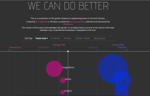
Though several large tech companies like Google and Facebook have released numbers on gender and racial diversity in its workforce, there is comparatively little data about the workforces of smaller, fast growing companies, such as AirBnb and Github. To remedy this, last October, Pinterest engineer Tracy Chou surveyed employees at these companies directly, asking them to self-submit their data. Chou collected and aggregated the information into a public spreadsheet.

Chou’s data forms the basis of this visualization, titled “We can do better,” created by Ri Lu. Each company is represented by two circles, whose size is proportional to the number of men and women in its engineering workforce. The circles, colored pink (women) and blue (men), are placed on a horizontal axis, where a 100% female workforce is on the leftmost end, and a 100% male workforce on the rightmost end.

wecandobetter

Based on the title, “We can do better” and the use of the term “gender disparity,” it’s clear that the goal of this visualization is not only to highlight the gender imbalance in engineering teams at these tech companies, but also to suggest the companies do something about it.

The visualization is effective at achieving the first goal. There is a noticeable difference in sizes of the two circles and most of them are closer to the right side of the axis, showing a clear skew in the number and percentage of men.

However, I think this visualization lacks context around why this gender imbalance occurs and what people can do to help. In the absence of clear, persuasive advocacy, perhaps with supplementary text, people may walk away with the idea that this imbalance is not a real problem, or that there is no solution.

Additionally, because the data was self reported, it may not be 100% accurate, but this fact is mitigated by the clear trend that manifests. The visualization also acknowledges the limitation that gender is not binary, though it only displays a M/F breakdown at this time. Finally, gender is only one aspect of diversity of a company. A more complete visualization, or set of visualizations could include information about race, class, etc.

Star Wars Inflection Point

I originally was trying to locate a more “data-y” xkcd comic I’d seen recently, but ran into this one first and was struck by the timeline visualization and its context.

http://xkcd.com/1477/


Screenshot from 2015-02-05 14:18:02


I believe the audience of this comic is broader now than when it first launch, but I would suspect it is more science/math oriented, younger, and male that the general population.  I think the intended audience for this particular strip is probably people in their 20s-30s, with the assumption that they follow basic pop culture science fiction.

I think the bigger message of the comic is that we often misread/misestimate the passing of time and the timeline is a visual reinforcement of that message.  The use of present day benchmarks is very effective in conveying this. I suspect most people reading his comic have seen both of this movies (in “real time” or not) and these were fairly memorable benchmarks in their lives.  Additionally, people probably have a notion when these points in their life occurred and the timescales between them, providing perhaps a “shocking” comparison.

I think the combination of text and simple visuals is very effective here.  The inclusion of (basic) people and emotion words make it stronger as well I think.  The timeline was the first thing I saw and read in the comic, which let me “process” the reality of the time gap, before getting hit with the text about it.  I think this let the text have more emotional impact, since I already believed it, and didn’t have to mentally “check the facts.”

Wind Map

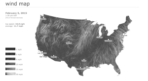
Wind is a source of energy that is readily available worldwide. When harnessed properly, it can provide continuous energy to households irrespective of the time of day (as is the case with solar power.) The limiting factor to the utility of wind power is wind availability at certain geographic locations. In some locations wind is abundant, while in other locations, it is not. Moreover, the velocity of the wind at a given location greatly affects the operating speed at which wind turbines are functional, as high wind speeds can damage the generators in the rotors of these machines. The figure below shows a visualization of the location and speed of surface winds in the US, in real-time. The surface wind data is from the National Digital Forecast Database (NDFD.) The authors specifically state that the data is not to be used to fly planes, sail boats or fight wildfires!

Screen Shot 2015-02-05 at 2.24.59 PM

This information is crucial in the planning, siting, and sizing of wind farms. Wind farms are useless if they are located in areas with intermittent or variable wind patterns. This data visualization can also play an important role in city planning. For example, city planners could utilize such data in determining where to, locate a new high-rise development or park, as wind speeds can be detrimental to development.

This visualization communicates the overall picture in a meaningful way; however, a better picture can be depicted. For instance, the addition of color scale could immediately communicate where best suited sites for wind farms based on location.


Source: http://hint.fm/wind/