SNAP at the Grocery Store

Goal & Audience

Our goal is to inform the general public about the reality of food insecurity and build empathy and understanding. In particular, our game focuses on how SNAP benefits work and how it “feels” to use them in a real world setting – the grocery store. We acknowledge it is impossible to fully capture and simulate the entire experience of food insecurity, but our hope is that by placing the participant in the setting of a grocery store, which many people take for granted, we can introduce unfamiliar experiences to a familiar setting.

Game

Our game takes place in a small grocery store that we have set up, akin to Shaw’s. When the participants enter, we ask them the following questions:

1.How much food do you buy at a time? (1, 2, 3, or 4 weeks)

2.How many people are you shopping for?

We then ask them to do their shopping based on those answers. When they are ready to “check out,” we total up the prices of what they’ve bought. Then, based on how many weeks of food they are buying and how many people they are shopping for, we tell them how much the USDA Thrifty Food Plan (and by extension, SNAP) allocates for them to use, as well as the average SNAP allotment in Massachusetts. See our data here.

We then ask them, what would you give up to get down to the Thrifty Food Plan allotment? What would you give up if you SNAP was your only budget for money? Based on this, we ask them to put food back. This experience, of consciously deciding what to give up, and physically putting it back, can simulate the budgetary constraints food people on SNAP face daily, and help build empathy.

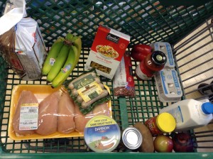
Finally, we take pictures of the before and after carts. A collection of these pictures will be shown to the participant at the end of the experience.
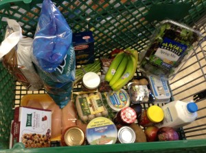
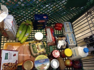
IMG_0364
Original food basket for 1 person: $83
IMG_0367
Version after we tried to cull to $45, was actually $51.


Final version - still only got down to $42, trying to get to $30.
Final version – still only got down to $42, trying to get to $30.


Notes

We tested out the idea on ourselves at a local Shaws, though given more time, we would have liked to try it out on a general audience and use prices that are not as high as the Cambridge Shaws. If we were to deploy a real version of this game, we would like to set up our own mini grocery store, but if that is not possible, then consider doing it at a real grocery store (though we haven’t thought through the details of that).

Here’s the data for what’s in our carts.


Weeks of groceries
People In Household Maximum Monthly Allotment (Thrifty Food Plan) 1 Week 2 Weeks 3 Weeks 4 Weeks
1 $194 $49 $97 $146 $194
2 $357 $89 $179 $268 $357
3 $511 $128 $256 $383 $511
4 $649 $162 $325 $487 $649
5 $771 $193 $386 $578 $771
6 $925 $231 $463 $694 $925
7 $1,022 $256 $511 $767 $1,022
8 $1,169 $292 $585 $877 $1,169


Weeks of groceries
People in Household Massachusetts Average Monthly Allotment 1 Week 2 Weeks 3 Weeks 4 Weeks
1 $122.86 $30.72 $61.43 $92.15 $122.86
2 $245.72 $61.43 $122.86 $184.29 $245.72
3 $368.58 $92.15 $184.29 $276.44 $368.58
4 $491.44 $122.86 $245.72 $368.58 $491.44
5 $614.30 $153.58 $307.15 $460.73 $614.30
6 $737.16 $184.29 $368.58 $552.87 $737.16
7 $860.02 $215.01 $430.01 $645.02 $860.02
8 $982.88 $245.72 $491.44 $737.16 $982.88


Data game: color scavenger hunt

Location: Museum (or wing of a museum)

Team size: 3-5 people

Audience: Children and adolescences who may not yet be invested or engaged with art.

Goals: Make the museum experience more active and more goal oriented to engage new populations with art.

Game process:

Each team receives a bag full of everyday objects at the entryway of the museum.  Each object in the bag has a distinct main color that matches to a major color in one of the art pieces in the museum.  Objects also contain a small identifier code.

Once all teams are prepared, they are released into the museum to match their objects to the art pieces.  When they find a piece that they believe matches one of their objects, they scan the identifier code on that object to verify it, and then leave the object by the piece if it is correct.  A system keeps track of the successful matches for each team, and the team that matches all their objects first is the winner.

Data: Color data from artworks and from pictures of the objects of interest.

Team: Laura and Desi

Data Game: SNAP Simulation

Background

The average recipient of SNAP in 2015 receives $122 per month. SNAP is meant to supplement, not replace the food budget for a person in a given month – it is intended to cover 30% of that person’s monthly food budget. This means that the projected monthly food budget for a single person is $406.

That leaves about ~$100 a week for groceries. Not every family can afford the extra $70/week though, and as a result some families rely on SNAP to account for more than 30% of their food budget.

The Simulation

  • Construct your family:
    • A player starts by rolling a dice (1-6) to determine the size of his/her family
      • Surrounding players will join that player’s family, depending on the outcome of the dice roll.
    • If family size  > 2, each subsequent person is a child. Each child rolls the dice (1-6) to determine his/her grade: grade=n*2.
    • The head of the family rolls the dice (1-6) to determine starting cash (range $50-$100) for each person.
      • Each member of the family receives $((n x 10) + 40)
        • (a roll of 6 represents the expected budget, where SNAP accounts for 30% of total)
  • Acquire Food:
    • The goal of the game is to plan the most nutritious, delicious, and caloric diet for the week.
      • Each person in your family should consume at least 2000 calories, regardless of nutrition.
    • Go shopping (grocery store/restaurant) and select food and/or meals for purchase.
    • Children receive extra calories from school lunches (5/week) that can be counted towards the family total:
      • K-5: 550-650 Calories
      • 6-8: 600-700 Calories
      • 9-12: 750-850 Calories
  • Winning:
    • A judge will calculate the nutrition of the purchased foods.
    • Round winner is the family whose food  purchases come closest to the daily recommended values for macronutrients (carbohydrates, fats, and protein) and closest to the 2000 calorie/person/day total. Lowest score wins.
  • Scoring:
    • A family’s score is calculated according to:
      • { (|C – 14000*n|/14000*n) + (|SF – 140*n|/140*n) + (|Uf – 315*n|/315*n) + (|Cb – 2100*n|/2100*n) + (|P – 350*n|/350*n) } *100 – 1*(num unique items purchased – more variety!)
      • Where the variables are defined as:
        • C: Calories
        • Sf: Saturated Fats (Recommended 20g per day per person)
        • Uf: Unsaturated Fats (Recommended 45g per day per person)
        • Cb: Carbohydrates (Recommended 300g per day per person)
        • P: Protein (Recommended 50g per day per person)
        • n: size of family

Audience

Our audience is the general public, but we would specifically target middle to upper-class households.

Goals

We aim to invoke empathy from our users by showing them how hard it can be to put together a nutritious, caloric meal on a low-income budget. Our previous research into this subject has shown a correlation between obesity and poverty, and obesity is stereotypically associated with unhealthy eating. As a result, we would like to put the dietary decisions in the hands of those who perpetuate the stereotypes, to see if they would/could make different choices.

Moving Forward

Our game relies heavily on number crunching and calculation. As a result, we would like to turn this into a JavaScript based simulation with a simple user interface, so that our goal of invoking empathy in users will be less shrouded by the sheer amount of spreadsheet lookups and score calculation that the game in its current form requires. Creating a web-based version of the game would not only speed up its pace, but would also allow players/families to explore alternative choices of foods and experience different outcomes.

Data Sources:

Prices taken from Market Basket Somerville Weekly Circular.

https://docs.google.com/spreadsheets/d/11HRyI6HOE-xrhhNYnuA5jJWkKTOiJN8QNsrwBDnWHUY/edit#gid=0

http://www.fns.usda.gov/sites/default/files/pd/18SNAPavg$PP.pdf

Edwin Zhang, Harihar Subramanyam, Tami Forrester, and Danielle Man

Human Rain Storm Game

Val Healy and Ceri Riley

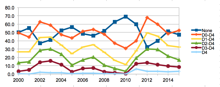
For this assignment, we used averaged weekly drought data from 2000-2015 to modify a camp game where people make sounds to mimic a rain storm.

Audience 

A large group of people (the more people, the greater the effect of the game), either children or adults, who are interested in producing a sonic representation of drought over several years. This game can communicate the effects of drought to people in a more interesting/engaging way than looking at different colors on a map.

Goals

The goals of designing this game was to link the long-term impact of drought on the United States to an auditory/participatory experience, which would ideally be more memorable than looking at one of the many choropleth maps online. It sums up a large amount of data on drought (~783 weeks) in a short activity. And the activity represents how drought changes over the years, with various levels of drought (lack of water) correlating to different types of water-sound-producing actions in our game.

Game

This game works better with more people and no ambient noise/talking — the only noise should be coming from your actions.

The leader will distribute notecards to each person. These notecards will have 15 years (2000-2015) and an action next to each one that corresponds to a level of drought.

Optimized-explaincard Optimized-notecards

Then, the leader will stand at the center of the circle and have a sheet of paper with the year “2000” on it. They will walk around the inside of the circle, holding up the year, and point to each member of the circle in turn. When the leader points at you, you perform the action that your card says for that year.

After the leader will continue to walk around the circle, increasing the year by one each time, until everyone is performing their “2015” action.

Then the leader will walk around the circle one last time, pointing at everyone individually to stop performing their action. This signifies the end of the rainstorm and the activity.

Because there are only 14 people in our class, we scaled the activity to 14 notecards for the demonstration. However, we also did calculations to see what the different sound/action distributions would be if we included the “No Drought” category and if we had a larger group of 100 people all doing the activity.

14spreadsheet 100spreadsheet
Screen Shot 2015-04-30 at 3.45.24 PM


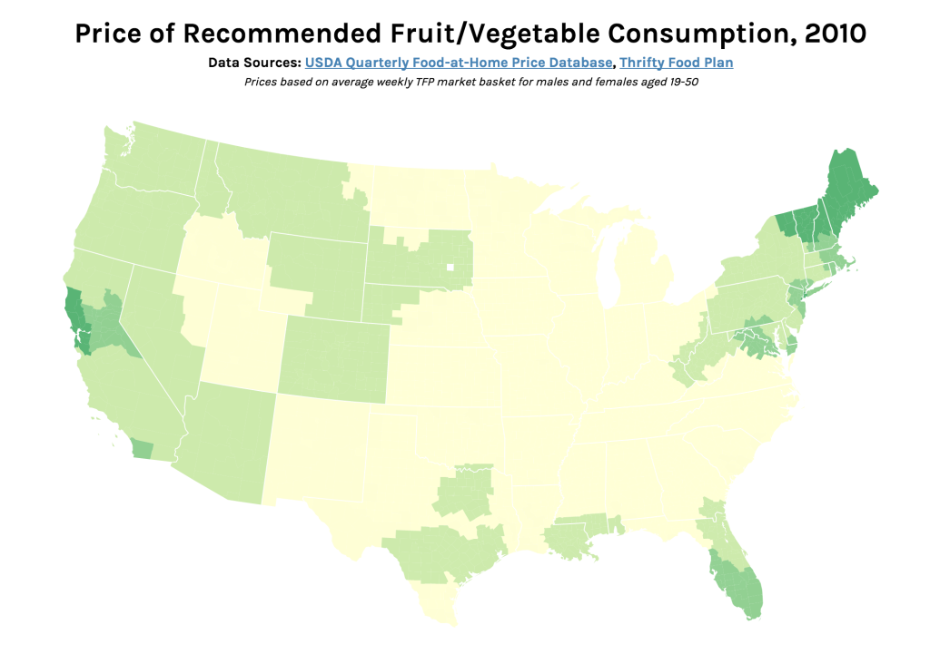
Price of Recommended Fruit/Vegetable Consumption, 2010

Screen Shot 2015-04-28 at 3.23.05 PM

Interactive version: http://s2tephen.github.io/qfahpd/map/

This map takes the two data sets we worked with previously — the Quarterly Food-at-Home Price Database (for the small multiples of fruit/vegetable prices) and the Thrifty Food Plan (for the SNAPables data sculpture) — and attempts to synthesize them to tell a single data story. In our presentation of the food price data, one of the criticisms we received was that price per 100g of food was not an intuitive way to think about food consumption. The Thrifty Food Plan, the bare minimum of an adequate diet (and the basis for calculating SNAP benefits), actually includes the breakdowns of its market baskets by weight (pounds). This meant that we could actually calculate the real price of the Thrifty Food Plan around the United States, factoring in regional price differences.

Most of our time was spent cleaning and synthesizing multiple data sets, so once again we only had time to focus on the fruit/vegetable food group. However, the next step for this map would be to calculate the combined price of all food groups (i.e. the entire Thrifty Food Plan market basket) and compare this to the SNAP amount. This is because the cost of the Thrifty Food Plan is based on the assumption of uniform food prices across the nation — however, as the Quarterly Food-at-Home Price Database shows, this is simply not the case. We could then identify which regions’ SNAP benefits may be over- and underestimated.

As such, the audience for this graphic would be the researchers and policymakers responsible for creating the Thrifty Food Plan and setting the SNAP benefits. The goal of the combined map would be to advocate for a new SNAP benefit methodology, based on actual local food prices. For this iteration, we only included data for those from age 19-50, but one could imagine an even more interactive version of this graphic, where someone might specify their age/sex and weekly spending on food — the map could show them the weekly required spending for an adequate healthy diet, allowing them to compare those numbers.

In terms of data visualization, this choropleth was created in D3.js/TopoJSON and uses quantile classification to subdivide the different weekly spending amounts on fruit and vegetables. ColorBrewer was used to generate the colors, but the large area of yellow is kind of hard to see (perhaps we could have used a different color ramp or adjusted the classification buckets to improve this). Furthermore, the map would be a lot more readable (i.e. as a static graphic) with a legend — as it is currently, you only get a broad comparative view of the country and can only really zoom in on actual prices if you use the interactive version. Another minor thing is, because the data is regional and not at the county-level, having each county as an individual entity is kind of useless (the counties don’t conform to traditional political boundaries, so this was the best we could do). The other question is whether a map is actually the most appropriate visualization method — even if there are significant differences in food prices based on geography, we might need to make some hypotheses or incorporate additional data sets to explain how geography might be affecting variation in prices.

Mapping Artists Around the World

Artists in Tate's Collection by Country of Birth

*this embed isn’t working well so go here to view its full interactivity!

For this assignment, we used Tableau to map where artists in the Tate collection were born. First, we made maps that show in which countries artists were born in by century (1500s, 1600s, 1700s, 1800s, and 1900s). Scrolling through these maps reveals how the scope of what the Tate collects changes over time: while art works by artists born in the 1500s and 1600s are limited to Europe, we see that the Tate represents artists born in the 1700s from the U.S., Canada, and Russia; that artists from the southern hemisphere begin to emerge in the 1800s; and that artists born in the 1900s represent countries from all over the world and from every continent. A final chloropleth map shows artists born in all centuries. The darker countries indicates those with more artists represented (the United Kingdom, unsurprisingly, is the most represented country in Tate’s collection); the lighter ones might only have a handful of artists in the collection.

Goals

Our goal is to give a macro-view of what is in the Tate’s collection. Often, when people are visiting museums, they focus on one object at a time; a visualization likes this can help visitors understand the larger scope of what a collection represents. Another goal is to reveal how a museum like the Tate represents the world and what biases they have toward certain geographic areas. Most of their holdings stem from the Western world (especially the United Kingdom and the United States), but we do see that more modern and contemporary art has begun to accept artists from all over the world.

Audience

People who are interested in art and artists. Visitors to the Tate (many of them international) might be interested in seeing if their country is represented in the collection.

Next steps?

We brainstormed other maps that we could undertake with our data sets but unfortunately did not have the time to fully clean the data, run scripts, and make new maps. On a very basic level, it would be great if the labels could allow you to dig into artists names per country (and possibly link you to information about them). It would be interesting to write some code that would allow users to type where they were born and be given an artist born close to them. Considering our team’s interest in analyzing color in works of art, we were thinking of finding the average or most dominant color per country and making a map that represents countries by these colors.

Mapping the SNAP-friendly Stores in Somerville

Deborah, Tuyen, Hayley

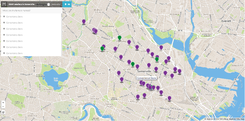
Following up with our data sculpture, we wanted to see where the retail stores that accept the SNAP are located in the two-dimensional map. We were curious to compare this 2D mapping to the 3D data sculpture: which visualization would feel more trustworthy and give more “authority” to our data and story? which one would more effectively represent the scarcity of the farmer’s markets?

Audience
So, the intended audience of the following map was ourselves. It was created to help us understand the strength and weakness of visualizations in 2D and 3D.

Data & Filtering
We first downloaded the USDA data that contain the list of retail stores which accept SNAP in MA. We then filtered the data to get the lists of stores with the Somerville’s zipcode: 02143, 02144 and 02145. Here is the link to our filtered data. Unlike our data sculpture for which we categorized the stores into four groups (Grocery store, Supermarket, Superstore and Farmer’s market), this time we divided the stores into just two categories: farmer’s market and non-farmer’s market. Non-farmer’s market category includes grocery stores, supermarkets and superstores.  We made this decision in order to highlight the scarcity of the farmer’s markets (that accept SNAP), relatively to the number of other retail stores.

Here is the link to the same map of SNAP-friendly stores in Somerville.

SNAP-friendly stores in Somerville, MA

Although this 2D map lost the physicality of the balloon sculpture and the audience did not have a chance to feel the physical challenge of reaching/searching for the farmer’s markets, we found the exploration option using the side pane quite useful. We were able to click on the name on the side pane (that lists all mapped stores by its type), and the map would adjust the center of the view according to the location of the store; it felt as if we are looking around even though the degree was limited. Searching through the long list of non-farmer’s markets in the pane also allowed us to experience how rare the farmer’s markets with SNAP are. We had to scroll down multiple times to encounter a farmer’s market.

Choropleth Maps: US Agriculture and Drought

Ceri Riley and Val Healy

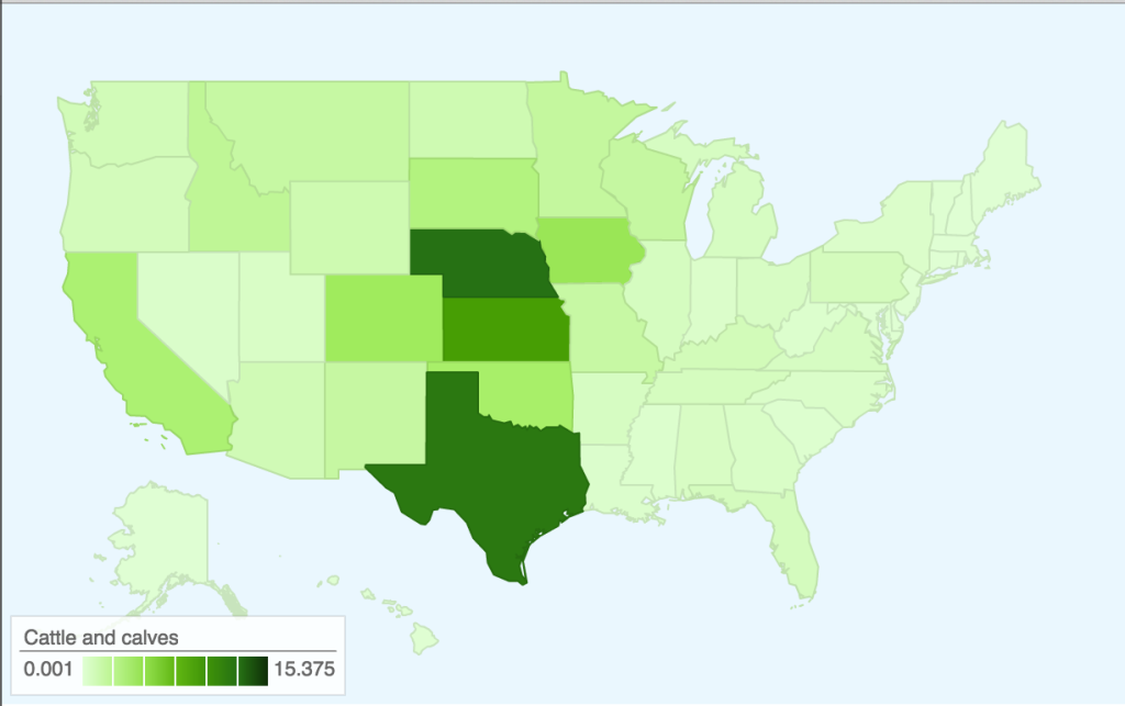
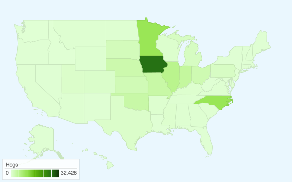
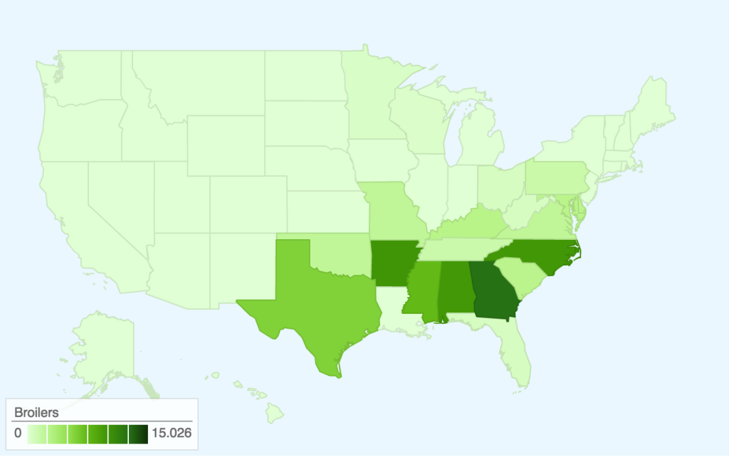
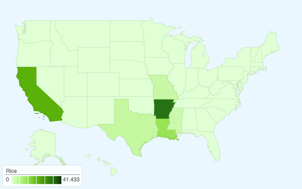
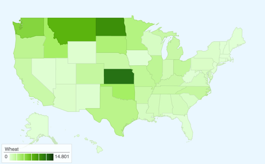
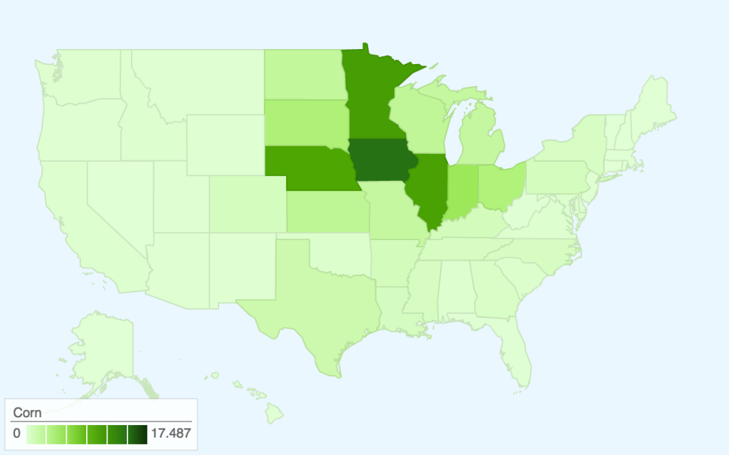
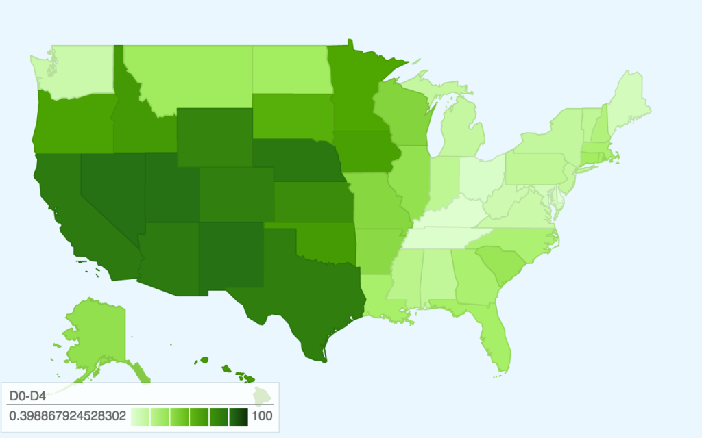
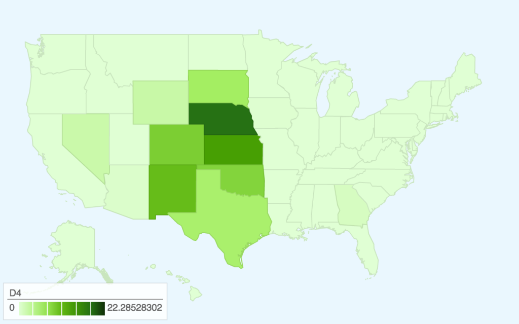
For our map project, we decided to make several small choropleth maps to illustrate where selected foods are grown and compare them to where drought is located. Unfortunately, Google Fusion Tables maps do not allow for changes in color, so all of our maps are green, though we would, if allowed, choose to use brown for the farmed animal maps, green for the crop maps, and red for the drought map.

These maps were produced using 2013 USDA Datasets on Cash Receipts for crops and averaged 2013 Weekly Drought Data. Drought conditions have since become more serious, but the data on agricultural production by state is only confirmed through 2013 so we chose to focus on this year.

Cattle and CalvesHogsBroilersRiceWheatCornD0-D4D4

Here are links to the maps for interactivity:

Agriculture: Cattle and calvesHogsBroilersRiceWheatCorn

Drought: D0-D4D4

As you can see, there is a moderate amount of drought throughout the central/western part of the United States, with the most severe drought focused in the midwest around Nebraska.

The majority of the cattle industry is located in a region where there are more serious levels of drought, while chickens (the ‘broilers’ map) are located further East. Cattle farming also requires more water than chicken farming, though, so perhaps this correlation is partially due to the large water footprint that feeding/watering cattle leaves.

Rice, wheat, and corn are three of the most prevalent grains in the United States, and the maps show areas where the drought regions overlap with the agricultural regions in addition to states that were relatively unaffected by drought. This allows an audience to explore different states’ contribution to US agriculture, beyond what is normally reported in mass media (recently, California agriculture). For example, the more serious drought in California might affect 26% of the rice crops, but 41% of rice is also grown in Arkansas. However, a lot of the states that grow corn are also affected by some level of drought.

Audience

Our audience is those who wish to see which types of crops or animal agriculture might be most affected by drought.

Goals

Our goal for this project is primarily internal; we wanted to make these maps to aid us in finding areas of food production most affected by drought. We hope we can use information gleaned from this small project in our final project, as our datasets covered more information than shown here.

In addition, these maps could demonstrate that there are significant levels of drought and crop production in the United States outside of California, even though most of the media focus is on the one state.

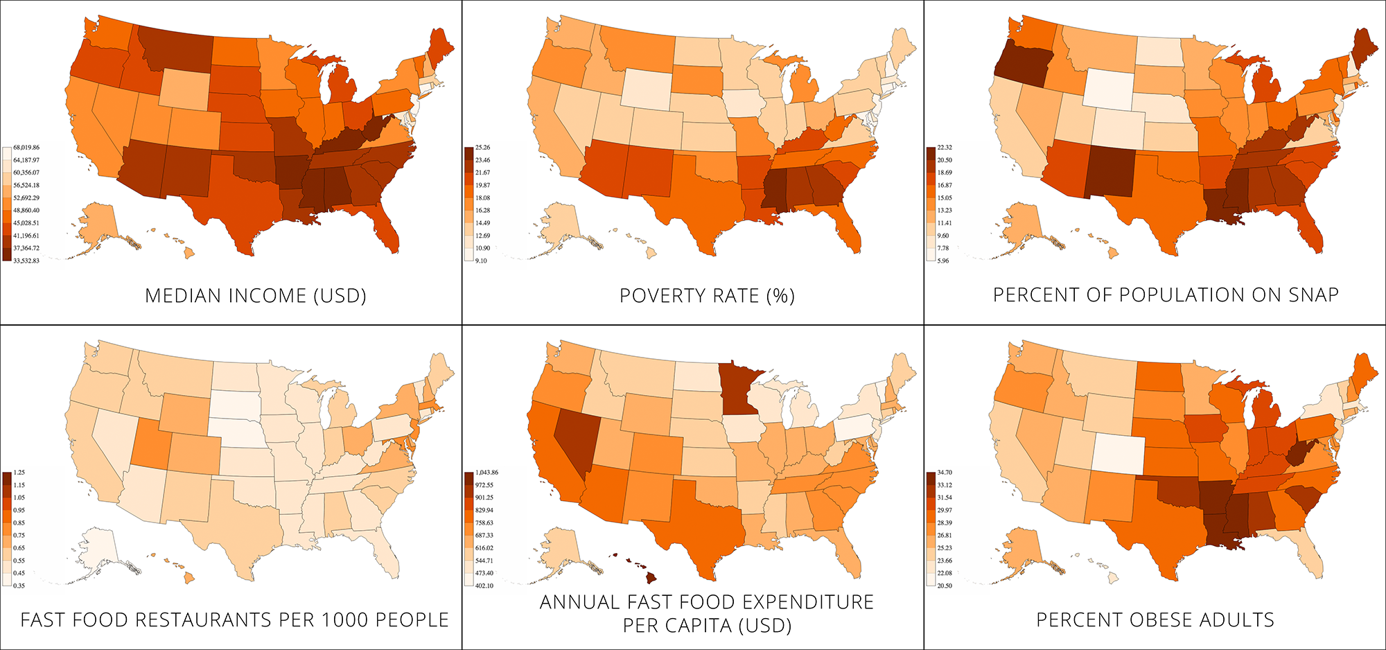
Small multiple choropleths – income and obesity

MergedChoro2

You can see the choropleths here as well.

NOTE: We inverted the axis on the median income map because we wanted to make use of the people’s tendency to associate red with danger. Had we not inverted the axis, the wealthiest states would be dark red, which may be confusing (we hope that the inverted axis is less confusing than the dark red on wealthy states would have been).

Audience

General public, especially people from middle-class or rich households.

Goals

While other sources have pointed out the link between obesity and poverty, we wanted to see it for ourselves and illustrate it geographically using multiple metrics.

The maps are geared towards people from middle-class or rich households, because they may not be aware of this connection.

We aim to show that the poorest states are also the ones most prone to obesity. In addition, we aim to identify the states in which the poverty/obesity link is most severe. To do this, we generated a number of choropleths and presented them in the “small multiple” style.

Extra

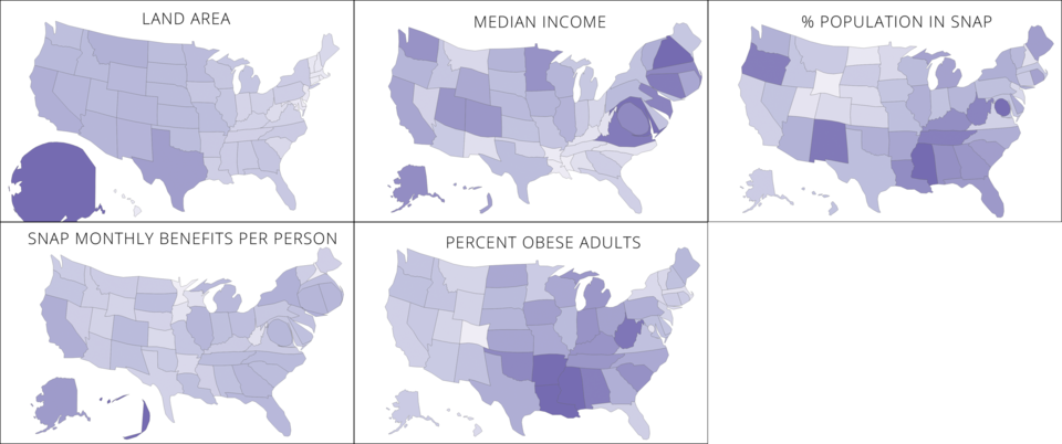
We also tried making some cartograms, but they were a bit confusing to read. Here’s what they looked like.

cartograms

Data Sculpture – SNAP TV Dinners

One common misconception among SNAP (Supplemental Nutrition Assistance Program) participants is that food stamps are supposed to cover one’s entire food budget. However, as its name suggests, SNAP is only meant to be supplemental — the program assumes that participants are spending 30% of their net income on food. SNAP makes up the difference between that 30% and the cost of the Thrifty Food Plan, what the USDA defines as the bare minimum diet for adequate nutrition. Our data sculpture seeks to address this misconception by tangibly demonstrating the difference (both in terms of quantity and nutritional value) between subsisting on SNAP benefits and supplementing them with a portion of net income.

The primary audience of this data sculpture is SNAP participants living in Middlesex County, specifically those under-spending on food. With this data sculpture, our goal was to illustrate what a “proper” meal under SNAP should look like and convince participants who are not spending any additional money on food to do so. On another level, we also wanted to engage people who are not eligible for SNAP and show them what sorts of meals the food insecure are eating on a regular basis. With this audience, the goal was to build empathy and put them in the shoes of a SNAP participant.

In order to create the data sculpture, we used a number of datasets — first, we used the USDA’s SNAP Data System in order to determine the average monthly SNAP benefits for residents of Middlesex county: $132.29 (or $4.41 per day). This was contrasted with the 2015 projected cost of the Thrifty Food Plan, estimated at $194 per month (or $6.47 per day). Using these daily amounts, we created some sample meal plans within those monetary constraints, using data from the Thrifty Food Plan as well as Peapod/Instacart for up-to-date food prices. These represent typical meals for those who only spend SNAP benefits on food and those who use SNAP benefits as intended — as a supplement to 30% of their net income.

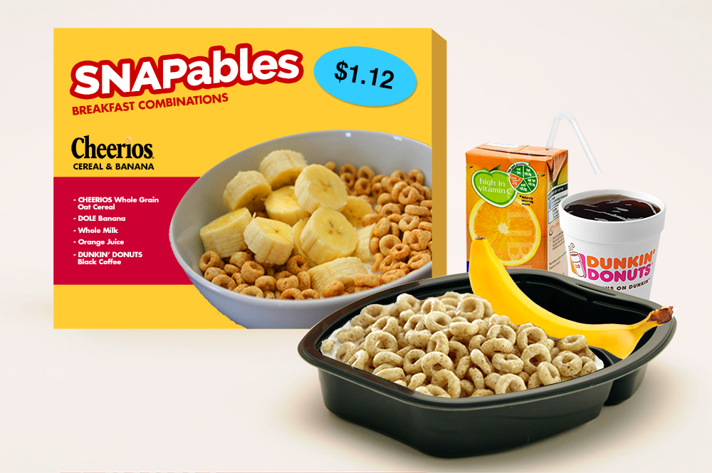
The data sculpture itself would take these meal plans and present them in TV dinner-style packaging. With this presentation method, we can make visible the relative sizes of a SNAP-only and a SNAP + 30% income meal. Moreover, price tags and nutrition facts on these packages further drive home the comparison — with an incremental increase in food spending, SNAP participants can drastically improve their nutritional intake. Using the visual language of the TV dinner — a symbol of unhealthy eating — also foregrounds the nutrition question. While we did not actually prepare said meals for this assignment, this data sculpture could be fully interactive (i.e. edible), allowing the audience to experience the difference between the two meals in the most visceral way possible: by eating them.

For the purposes of this assignment, we have mocked up an example of what the packaging might look like, and constructed three meals (breakfast/lunch/dinner) for each of the two food budgets:

snapables

SNAPables

Breakfast (Cheerios & milk, orange juice, banana, coffee)

Cost per serving 1.12
Calories 373
Fat (g) 3.7
Cholesterol (mg) 8
Sodium (mg) 206.2
Potassium (mg) 1227.4
Carbs (g) 85
Fiber (g) 6.1
Sugar (g) 49.4
Protein (g) 14.3

Lunch (PB&J, apple, water)

Cost per serving 1.53
Calories 475
Fat (g) 17.8
Cholesterol (mg) 0
Sodium (mg) 346.8
Potassium (mg) 194.7
Carbs (g) 73.1
Fiber (g) 8.4
Sugar (g) 39.9
Protein (g) 11.5

Dinner (spaghetti & meatballs, green beans, water)

Cost per serving 1.77
Calories 730
Fat (g) 23.5
Cholesterol (mg) 60
Sodium (mg) 1460
Potassium (mg) 320
Carbs (g) 103
Fiber (g) 8
Sugar (g) 13
Protein (g) 31

Daily Total (vs. recommended values)

Cost per day 4.42
Calories 1578 1500
Fat (g) 45 48.75
Cholesterol (mg) 68 225
Sodium (mg) 2013 1800
Potassium (mg) 1742.1 2625
Carbs (g) 261.1 225
Fiber (g) 22.5 18.75
Sugar (g) 102.3 28.125
Protein (g) 56.8 37.5

SNAPables Selects
(now with 30% more income!)

Breakfast (Cheerios & milk, orange juice, banana, coffee)

Cost per serving 1.12
Calories 373
Fat (g) 3.7
Cholesterol (mg) 8
Sodium (mg) 206.2
Potassium (mg) 1227.4
Carbs (g) 85
Fiber (g) 6.1
Sugar (g) 49.4
Protein (g) 14.3

Lunch (turkey, cheese & tomato sandwich, apple, water)

Cost per serving 2.91
Calories 386
Fat (g) 13.4
Cholesterol (mg) 25
Sodium (mg) 784.9
Potassium (mg) 340.7
Carbs (g) 61.5
Fiber (g) 9.2
Sugar (g) 24.5
Protein (g) 14.1

Dinner (chicken breast, green beans, carrots, rice, water)

Cost per serving 2.45
Calories 236
Fat (g) 2.3
Cholesterol (mg) 65
Sodium (mg) 563.3
Potassium (mg) 429.6
Carbs (g) 26.3
Fiber (g) 4.6
Sugar (g) 8.1
Protein (g) 29.2

Daily Total (vs. recommended values)

Cost per serving 6.48
Calories 995 1000
Fat (g) 19.4 32.5
Cholesterol (mg) 98 150
Sodium (mg) 1554.4 1200
Potassium (mg) 1997.7 1750
Carbs (g) 172.8 150
Fiber (g) 19.9 12.5
Sugar (g) 82 18.75
Protein (g) 57.6 25

See the full meal plans and nutritional data here:
https://docs.google.com/spreadsheets/d/12LvOiceZjH0smXqZlN7vZhmCwCU32xsE6_treVmatQM/edit#gid=0