Mural Design vs. Code Design

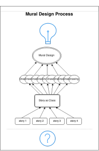
I found the mural design process of our class very different from my previous design processes.  First, let me briefly lay out our mural design process:

  • Introduction to the organization (Food For Free) through the voice of the director
  • Group discussion to find a story based on the follow criteria:
    • importance: impact on the audience
    • relevance: relevant to the organization and to us
    • accuracy: how well-supported by data
  • Summarize the story into a sentence. Add why we want to tell this story -> Sticky!
  • Gather as a class and share each group’s sticky note
  • As a class, write the core sentence of the story we want to tell through the mural
  • Word Web activities with three seed words: security, impact, waste
    • Starting with each seed word, branch out with whatever words that come into mind
  • Collective drawing
    • Each person starts drawing and passes around to next person so that everyone contributes to each other’s drawing in continuation
    • Put on the board and share
  • Decide on the mural design as a class
    • Find repeated imageries/themes from the collective drawings
    • Incorporate them into one design

design_process

Some reflections on this design process helped me to compare it to one of my previous projects.   During the cold and snowy winter of 2014, I  and three other MIT students worked to design an interactive dashboard that analyzes Twitter and Facebook activities of non-profit organizations. Briefly speaking, below is the procedure we followed:

  • Discussion on the basic frame of the dashboard: contents, functions, purposes
  • Analyze data
    • Each team member analyzes same data but work for different goals
    • Push each findings and codes on Github which allow other members to quickly reuse or build upon the code
  • Write a report on the analysis
    • Two members are in charge of the write-up
  • Build interactive dashboard based on the findings
    • Two members are in charge of hosting the byproduct online

This process is similar to the mural design process in that it had modularity and involved group efforts within each module. First, the modularity arose from the step-by-step procedures and several milestones we established as checkpoints: the goal of the project was defined first, and the process was broken down into three smaller steps/milestones.  The difference arises in the way tasks were distributed between the members.  Instead of a group of individuals working together to finish a small module, each person was in charge of a designated task at each step. Each task was discussed after the corresponding milestone was reached, and each code was ready to be reused by other members if needed.  This combination of distribution and code-sharing helped to maintain communication between members while enforcing the modularity in the process.  It was however harder to understand other members’ tasks and thought-process, which required that everyone became an expert in his/her given task.  In comparison, the mural design process did not rely heavily on any particular individual because each module was done in a group.  I definitely felt that the mural process better captured the ideas common and prevalent in our class; it somehow felt more democratic.

The two design processes discussed above share similarities in its step-by-step approach and distributed workload.  However, they are different in the way each step is finished and each task was incorporated into the final design; the design mural process had one more filtering layer in which the entire class decided what to include from each group’s work.  Both of the processes have pros and cons, and it is important to know which path to take according to the goal and circumstances of the work.
 

Developing a Data Story

Instead of starting directly with data, we began our data story for the Food For Free mural by listening to a verbal narrative of the organization’s history and impact from one of its leaders. We heard about Food For Free’s beginnings, its expansion throughout the greater-Boston area, and its plans for the future. After hearing the story, we were presented with data, some of which was on a global level, some on a local level. Equipped with data and an understanding of the organization, we set out to define a story that we wanted our mural to convey. We started out with verbal stories: sentences about the organization’s history, its impact, and its community partners. These separate ideas were then combined into one cohesive short verbal narrative about Food For Free. In deciding on our narrative, we followed a method similar to that suggested by Colin Ware and sought to “capture the cognitive thread of the audience”. We wanted the audience to feel engaged in our story and compelled to action as a result of encountering it.

Next we set out to transform our words into a picture. However, as Ware points out, verbal narrative “incorporates a form of logic that is quite distinct from the logic of visual representation”. To overcome the challenge of translating words into a picture, we each drew a picture of the data story and combined the common themes. We used both literal depictions, such as trucks and food, and metaphorical depictions, such as a tree and roots, to signify the story of Food For Free. Because we are producing one still image, we are faced with the challenge of telling a narrative history without including multiple time points. In this respect, the symbolism of the growing tree serves as an effective focal point in communicating Food For Free’s story. Finally, as Ware explains the importance of, we decided to use a road to frame our picture, helping to focus the audience’s attention.

Food for Free: Finding the Story

Recently, our class worked to conceptualize our data mural for the organization Food For Free. I was absent for the last class, in which we carried out most of our visual designing of the mural, so I will focus instead on the processes carried out during the previous class.

In this class session, the executive director of Food For Free visited our class to discuss the organization, its purpose, its functions, and its future goals. This visit exposed us first-hand to Food For Free, which was indispensable to our conceptualization of the organization.

In the readings, Segel and Heer emphasize the importance of narrative to the process of data visualization. Narratives draw readers to a story and help readers to understand and internalize the message being conveyed. Though the authors focused on its impact on journalistic practices, their insights on narrative apply well to our situation.

In our process, we first educated ourselves on the mission and practice of Food For Free. Once we felt well-grounded on the topic, we looked at some data about the group provided to us, brainstorming in groups to identify potential stories held within the data. Once each group came up with a viable story, we presented the stories to the rest of the class and combined them into one, consolidated, group story.

Contrary to traditional storytelling, our mural will not have a beginning, middle, and end, nor will it include any verbal or much written content. Instead, it will employ visual cues and symbolism to convey our story about the organization.

Data to Mural: Storytelling through art

With the topic of food security in mind and the Food for Free organization as our focus, our class set out to tell a story using national and local data, as well as data specific to Food for Free. From these numbers, we were to eventually paint a mural. How were we to turn these facts and figures into something more digestible and visually appealing, while also creating impact?

Our design process began first with finding and understanding the data that we want to present. By talking with a representative from Food for Free, we were able to gain a deeper insight into how the organization fit in with regards to the food security space, to gain a bit more personal connection and context for the data sheets we were provided.

From this data, we entered the process of drawing connections between the sets of data. We focused on finding different story types, like ‘factoids’ that stand out, ‘interactions’ that seem to correlate, ‘comparisons’ that reveal differences, changes’ that are significant, or ‘personal’ stories that connect to people. Here we sought out types of stories similar to those described by Rosenbaum in the Data Journalism Handbook. We didn’t necessarily look for a whole cohesive narrative yet – like Barr, we were simply poking around with our dataset attempting to make connections.

Once our groups put together our final conclusions, we combined our thoughts to determine the ‘story’ that this dataset told: that “Food for Free is growing our work with local partners to have greater impact on food security in Cambridge.”

It was at this point that we moved onto actually visualizing our data-set-turned-story. Through the use of some mapping and drawing exercises, we were able to isolate a few common symbols that we wanted to use to represent our story. From here, we were able to sketch out a rough mural, an image representing growth and reuse, using the symbols we determined.

Notably, as a mural, our process lead to a different type of narrative visualization. Segel and Heer sought to systematically describe and review different forms of data visualization, and even came up with seven ‘genres’ to do so. However, our mural doesn’t really fit into any genre they specify. Most of the case studies they examine contain maps, charts, and graphs, which have their own artistic direction and are designed purposefully to craft an easily digestible visual message.

Our mural instead will not contain graphs or numbers, or even text for that matter. Instead, our process produced a form of data-visualization that leaves more for the viewer to interpret. From here, we can definitely realize that their are many uniquely creative ways to tell stories backed with data – in this case, with art!

Finding our story for Food for Free

To create our data mural about Food For Free, we stayed close to the principle of starting with data and finishing with a story. We began by gathering information from Executive Director Sasha Purpura, who spoke about the organization’s history and goals. We then looked at data about Food For Free’s reach, as well as statistics about food security in the United States. Guided by Rahul’s taxonomy of data stories, we came up with multiple stories and chose the one best suited to conveying Food For Free’s mission/impact.

I think this was an effective way to find the story, especially because many of us were unfamiliar with the organization – thus, starting with the data was essential.

From the story, we made rough sketches of potential murals. We identified the common visual themes and incorporated them into the final mural, which allowed many of our ideas to be included. When deciding whether or not to include certain elements, we used the criterion of the story we agreed upon before-hand. I think this gave our discussion a good amount of structure and the process went smoothly.

As for the mural we came up with, its dominant visual structure is the tree. The upward sweep of the roots into the trunk and ultimately the branches is the main storyline through which we communicate Food For Free’s mission, impact and plan for the future. We start at the root, where we immediately see Food For Free trucks beginning to transport food from donor organizations to the rest of the ecosystem/community.Our eyes are then drawn up to the branches, where we see the result of the organization’s work, represented by thriving children and adults in a tree house. Finally, we can examine the messaging interspersed in the mural as fruits and flowers.

In this way, the mural is author driven, which makes sense as our goal is to tell a strong story about Food For Free. This is consistent with Segel and Herr’s suggestion that such approaches are best when the goal is storytelling or efficient communication. There is no interactivity and while there are no linear “scenes” in this single frame, there is a strong linear progression suggested by the tree metaphor, in which you start at the root and make your way up.

The messaging, in addition to being matching the visual metaphor of the tree, is communicated through memorable factoids. This is preferable to overwhelming the audience with large quantities of information – as would likely be the case if we tried to put the raw data and tables we started with onto the mural — and is in line with Segel and Heer’s recommendation that such factoids are often better for a general audience.

From Data to Story : on our way to Food For Free Mural.

Our project for FOOD FOR FREE started with identifying a possible story based of the dataset provided by the association.
Not only the data was backed up by a short presentation by their director, which gave a helpful insight and personal experience as well as stressing out some key elements of their story.

As stated in the Segel & Heer reading, traditional narrative visualizations are usually based out of the data itself. The data reveals the story. In our case it was slightly different, as it was great to get an insider perspective and the director’s testimonial as a start.

How to turn the dataset into a story? Our methodology was a mix of different techniques and broken down into different steps. First, we found different storylines and then identified keywords, and from keywords then created mind maps that circled those latter.

The Director’s speech gave us some hints for our storylines: some focus on the City of Cambridge, the results of their labor, the impact of the association on the food served, the increase of produced food, etc.
We translated data into one or three sentences for most and then merged it into one paragraph. Our word webs became rough drawings, and we got our mural skeleton : a tree-like with trucks making connections between buildings as donors and people as recipients.

The story we came up with is simple as we are doing a mural, limited interaction and minimum messaging. And we didn’t not use the common comparative techniques as mentioned in the Data Journalism handbook eg as proportion example, internal or external comparison or change or over time.

The goal of our visualization is to “engage with reader in finding and telling their own stories in the data”. So the story we came up for FFF is not only reader-driver or author-driven it stays in the middle of this spectrum. Our messaging is clear, engage with the reader. However there is no direct interactivity unless there is a “call to action” in our mural something like a “contact us” for instance.

design process

I really enjoyed the emphasis we placed on narrative throughout the data mural design process; I think Colin Ware is correct when he says the purpose of a visualization should be to “capture the cognitive thread of the audience” (12).  Our mural does so by combining simple visual language (people receiving food; trucks carrying food), which conveys concrete ideas best explained through pictures, with the more complicated language of metaphor.  Some ideas are hard to illustrate from first principles but easily explained using figurative language; the tree metaphor we use, with suppliers at the roots and Food For Free trucks delivering food to people at the tree’s leaves, uses a universal visual symbol (the tree) to explain Food For Free’s business model.  As with regular language, the grammar of visual metaphor is generative-we can combine it with other units of meaning to make a larger, still meaningful structure. As in the example on p. 7, we combine spatial logic (food moving from roots to leaves) with visual logic (the roots and leaves are linked by the roads the trucks travel) to explain how the food is transported from suppliers to those who need it.  We are using a single-frame narrative for our mural, with the result that we, the authors, are responsible for indicating a narrative thread within the finished product as we would not need to do with a film, slideshow, or comic strip.  However, we also have the freedom to include elements outside a single narrative without creating subsequent frames; we can add framing elements to fill in details of the story so the reader can explore the mural on their own terms once they have familiarized themselves with its overall arc, as Segel and Heer suggest.  Overall, our mural incorporates many elements of good visual design and, I hope, will be able to capture people’s attention and understanding.

Data Mural Process

Our story-finding and visual design process for the Food for Free mural was an interesting contrast to my ongoing data design process for an upcoming environmental health community meeting.

I’m currently in the process of designing data shirts for individuals who participated in an environmental health study and contributing to the overall data story that will be told at a community meeting in the next few weeks.  There are a few notable differences I’ve seen between our processes:

(1) The environmental health process is much slower than the Food for Free design process.  I’d attribute this to the acceleration of the Food for Free process and the complexity of the environmental health data.  much much larger.  The data cleaning and data culling step has been months in the making for the environmental health data.

(2) The environmental health process involves more independent individual work, with occasional reports to the group and group brainstorming sessions.  The balance in the Food for Free process was the reverse: we worked occasionally as individuals, but more often in small groups or as a whole class.

(3) The Food for Free story is more narrative based than the environmental health data story which is more exploratory.  Again, this is partially a function of the data and aims–for the environmental health data we are providing personalized data to each individual while keeping the foundational design static.  The limits the space for individualized storytelling.  But, the community messaging section of the environmental health reportback is more narrative based like the Food for Free story.

(4) The environmental health artifacts land more in the “science” than “story” aesthetic.

There are also a few similarities:

(1) Neither process directly involves “users” (e.g. study participants or Food for Free recipients) for sustained periods of time.  Some user testing was done for the environmental health artifacts, but users were not part of the design team.

(2) Both the mural and the data shirts are static non-interactive single frame designs.  Some of this is a function of the chosen medium (e.g. interactivity is more challenging with physical, not digital, objects).  A second part of the environmental health reportback involves online materials that include many of the components mentioned in Segel (consistent visual platform, multi-messaging, details on demand…)


Devising a Visual Vocabulary

Colin Ware opens chapter 7 of his book Visual Design for Thinking with a thought experiment. He asks the reader to try to imagine the following sentence with only images: “If halibut is more than ten euros a kilo at Good Food, go to the fish market on 5th Street.” Some things are best said with words, while others are said more aptly with pictures.

Murals have to be easy and quick to read in order to get a message across to its audience. When class met on Thursday, February 19, we had already identified the story we needed our data mural would convey, focusing on the impact that Food for Free has on food security in the Cambridge community due to the organization’s partnerships with local businesses. Our challenge, then, was how to tell this story visually.

The word web activity—in which we added words onto a network and then devised icons to represent these words—was useful in devising images to be used in our final mural. Next, the pass around activity helped us weave the imagery together. These two exercises were useful in identifying a common visual vocabulary to convey our message.

The imagery we were most drawn to was a plant metaphor, with the roots referring to the locations Food for Free rescues from, and the branches or leaves indicating the organizations that the food gets distributed to. According the Colin Ware, this is pattern perception, in which meaning is made by the relationships between the visual elements, from the roots to the leaves.

Data mural process

The data mural we designed was, in the words of Colin Ware, a “single-frame narrative.” It did not have to deal with information flow across multiple panels, and the complex and agonizing layout and continuity concerns described in the Segel & Heer article. We seem to have skipped over many of the most challenging aspects of narrative design by choosing to portray snapshots of data rather than a process that has a beginning and end.

It’s not that we didn’t try to tell stories of change over time; we wanted to show the growth of FFF, its impact in the community, and the flow of food from sources to sinks. But we did this by overlaying information into a single image, rather than trying to represent different states with arrows or other flow control tools. For example, we overlaid increasing widths of the central trunk of the road-tree to show the flow of food increasing over the years.

I thought this was appropriate for a few reasons: 1) because we were trying to convey a symbolic message more than to explain the details of a technical process, which might have been done more clearly with panels, arrows, etc., and 2) (much more wishy-washily) because dividing up our space with barriers or blanks seemed out of line with the themes of togetherness/community/cyclic-ness we were trying to cultivate. Our goal did not have to explicitly include simplicity/good pedagogy, since we picked a pretty small set of data to represent, and the process we were representing was also not a complicated one. Therefore, we could pack information quite densely into the space allotted to us without fearing confusion or loss of our audience, and make a single image meant to spin out all of the desired cognitive threads in our viewers.

We ended up focusing most of our energies on integrating symbols with each other in an intuitive and evocative way, working at least one level of abstraction up from the actual creation of symbols; designing symbols is a hard problem in itself, and we had limited time and artistic skills. For a few-hour design exercise, I thought we did a good job of creating an image that conveys positive and pertinent messages at all levels of viewer attention; the tree in a circle, visible at a glance, evokes sustainability; the trucks traveling up the tree trunk convey succinctly what the organization does; and the people benefiting from the tree (picking fruit, playing in its branches) evoke community.