Crayon Art Data Sculpture

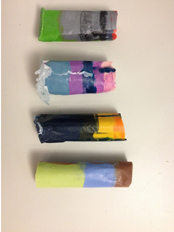
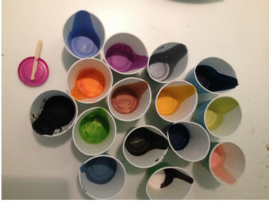
Description:  We made “art crayons” for four paintings.  The composite crayons combine the five most prominent colors in a painting into a crayon.  The amount of each color maps to the amount of the color found in the painting.  So you could recreate the painting by coloring with just that crayon!

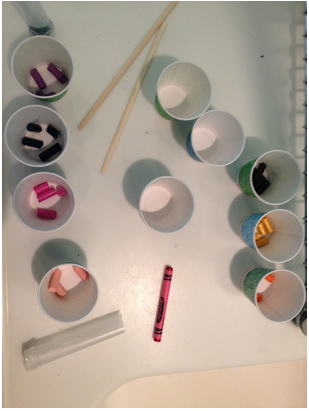
We made crayons for the four paintings shown below. We used the RoyGBiv python module and Cooper Hewitt’s color mapping python module to find the most prominent colors in the paintings and map them to Crayola colors.  We bought crayons, selected the correct colors, divided them in the appropriate proportions, melted them, and poured them in layers into a mold we created from wax paper, hot glue, and tape.  You can see the results below.

Audience: Kids, adults, people who like art or have a favorite painting.

Goals: Increase engagement with art–you can draw it too!  Make art seem more accessible–tangible and everyday.  Fun and play!

Screenshot from 2015-04-23 14:40:48

(1) Alex Katz, Tulips 4, 2013, Museum of Modern Art

(2) Agnes Martin, With My Back to the World, 1997, Museum of Modern Art

(3) Georgia O’Keeffe, Music, Pink, and Blue No. 2, 1918, Whitney Museum of American Art

(4) William H. Johnson, Jitterbugs (II), ca. 1941, Smithsonian American Art Museum


Screenshot from 2015-04-23 14:40:59

Screenshot from 2015-04-23 14:41:08

Screenshot from 2015-04-23 14:41:18


(Team Artvark: Laura & Desi)

Drought Data Curtain

Ceri Riley and Val Healy

For our data sculpture, we decided to make a beaded curtain to visualize data on percentage of cattle affected by drought in the past year. Our goal was to design a data-centric piece of home decor that will showcase this data, while also acting as an attractive decoration. Our audience is anyone looking to incorporate data-driven design into their home space.

To decrease the number of strands and beads we needed, we first modified the data by averaging the values of the total percentage of cattle affected by drought for each month in the graph. We rounded these values to zero decimal places. These values translate to the percentage of red beads placed on the bottom of the strand, as shown in the table below. One flawed outcome of this method is that the first and final strands represent less than a full month’s worth of data, as we made the curtain in the middle of this month, and our data set only includes data from the past year.

To design the curtain itself, we researched typical dimensions of pony beads and settled on using 300 beads per strand; thus, three beads would represent one percent, and we would need 3900 beads in total. The number of each type of bead on each strand is listed in the table below.

Lastly, we decided to use red beads to represent the drought data due to the color’s association with danger, fire, and generally bad things. We chose to use blue beads to represent the percentage of cattle not affected by drought due to the color’s association with water and generally good things.


(picture coming soon)


Date Percentage red beads blue beads
April 2014 44.3333333333 133 167
May 2014 45.75 137 163
June 2014 39.75 119 181
July 2014 35.8 107 193
August 2014 34.75 104 196
September 2014 30.4 91 209
October 2014 28.25 85 215
November 2014 27.75 83 217
December 2014 28.6 86 214
January 2015 25.75 77 223
February 2015 27 81 219
March 2015 30.2 91 209
April 2015 36 108 192
1303 2597
drought beads “empty” beads

Mapping Obesity in 3D

map2

map1map3


We decided to create a twist on the traditional colored map, and literally add depth to our data. Using obesity percentage data at the county level, we carved into the contiguous United States to create valleys that indicate lower obesity and mountains that indicate higher levels of obesity.

Because of the range of possible values, our map delivers sometimes smooth and sometimes abrupt transitions that can be physically felt by moving your fingers across them. One can also observe that there is nowhere that is 0% obesity, which would be a hole through the sculpture.

We created this for a general audience, and had the goal to show the transitions of obesity at a greater resolution than at just the state level and to make that demonstration interactive.

Team: Danielle Man, Edwin Zhang, Harihar Subramanyam, Tami Forrester


Data sculpture

Data & Story

In 2012, roughly 46.6 million people participated in SNAP. According to the 2012 USDA  Retailer Policy & Management Division report, 27.66% of the retailers that accepted SNAP were grocery stores, supermarkets, or superstores, while only 0.76% were farmers markets. Additionally, 87.38% of the SNAP benefits were redeemed at grocery stores, supermarkets, or superstores, but only 0.02% at farmers markets.

There is a paucity of farmers markets that accept SNAP, but as we saw in the Rapid Assessment Response and Evaluation of Food Insecurity in Somerville, there is also a demand among those who are food insecure for fresh fruits and vegetables.

We want to highlight this issue for the general public. Our goal is to draw attention to the very small number of farmers markets that accept SNAP nationally show physically how the scarcity makes access to the farmers markets more difficult.


Data sculpture

To do this, we made a data sculpture from balloons. Each balloon of a different color represents 4 major types of stores – grocery stores, superstores, supermarkets, and farmers markets. To show the lack of farmers markets, we have one white balloon to represent farmers markets, and proportionally many of the other categories. For example, superstores are 7.43% of all retailers, so there are 7.43/0.76 = 9 balloons for superstores. We chose these categories because they represent almost 88% of stores where all money was spent.

Arrangement

We arranged the balloons so that the white one (farmers market) was in the middle, while rings of balloons representing the other categories surrounded it. We also played around with different arrangements, such as having the balloons be more “random” and spread out in the 3D space so that they looked more like markers of real locations.

data_sculpture


data_sculpture3d


How much do fruits/vegetables cost in Boston?

small-multiples

In this chart, we chose to explore the concept of small multiples — inspired by this Quartz chart of alcohol consumption around the globe, we wanted to compare the prices of different food groups over time. To accomplish this, we used the USDA’s Quarterly Food-at-Home Price Database, which measures how much each food group costs to Americans. We specifically focused on the Boston demographic (due to time constraints we were only able to process the data for the first subset — fruits and vegetables). Using csvkit we cleaned and extracted the data we needed, then visualized everything using the D3 charting library, though the graphs are not interactive at the moment.

The audience for this graphic is people in Boston who are the primary grocery shoppers in their households — we wanted to give a perspective on how food prices changed over the 2004-2010 period (there was an invalid data point that made it through on the “canned select nutrients” graph). We can see that the price of fruits and vegetables in Boston have been increasing gradually. There are a few areas for improvement: first of all, the graphs aren’t adjusted for inflation, so we don’t have the right context for the graphic. In retrospect, we probably should not have used the same axes for all the graphs since the per unit price is pretty different between them and it’s hard to see the actual change. Moreover, 100g is kind of an arbitrary amount and might not be an intuitive unit to think about food consumption in.

See the graphic in full size: http://s2tephen.github.io/qfahpd/

Women Artists at the Tate

By Team Aartvark (Desi + Laura)

For the chart assignment, we made a infographic with two types of charts. On the top of the infographic, we includes rows of pie charts that demonstrate the men and women artists represented in the Tate’s collection by decade of birth. This visualization was inspired by the “small multiples” that Tufte recommends (and that Rahul showed in class). The second chart is a traditional line graph that shows how the ratio of artists represented in the Tate’s collection changes over time. The chart is intended for a general audience that is interested in art. Our goal was to reveal how museum collections are biased toward male artists, but that their biases are slowly changing, and that museums today are now endeavoring to have a more equitable gender distribution in their collections.

womenartistsattate

How much water goes into a meal?

a super awesome chart by Alyssa and Nolan

DATA: We looked at a spreadsheet from a LA Times article on the amount of water consumed or polluted in the creation of many different kinds of food.   We then transferred that data into another Excel spreadsheet to turn the original data, presented in cubic meters of water per ton of food, into a more easily conceptualized metric: bathtubs of water per serving.  For the sake of expedience we estimated a 100-gram serving, which is reasonable for most foods, and determined that a “standard” bathtub was about 25 gallons.

CHART: For a few example meals that a college student might eat, we wanted to show what foods consumed the most water.  Unsurprisingly, meat consumes quite a lot of water, but so do dairy products in some cases.  Vegetables, however, don’t really need that much water for the most part.  We generated this graphic using Python’s numpy and matplotlib modules.

Screen Shot 2015-04-16 at 1.59.07 PM


GOALS: 

-Make people realize what the environmental impact of their dietary choices is.

-Help them understand where the bulk of their environmental impact is (meat and dairy products)

-Hopefully the visual impact of this chart will make them think a bit when shopping for food.


AUDIENCE: This might be useful to post in a grocery store or dining hall so people buying food can pause to reflect as they are planning meals for the week.  Since we explain water use in terms of bathtubs and the graph is helpfully color-coded and labeled, and since most Americans are fairly chart-literate, the barrier to understanding what this chart says is not great.  For greatest impact, it might be most useful to show to college students, who are still building their food purchasing and meal planning habits, so they have that in the back of their minds as they plan meals and form their dietary habits.

Breaking the Stereotype on SNAP Recipients

Tuyen, Deborah, Hayley

Conservative media and lawmakers often perpetuate harmful stereotypes about SNAP recipients, often insinuating they are irresponsible and “undeserving” of the benefits they receive. For example, Donney Furgerson, Republican Senior Stockman’s Senior Communications and Policy Advisor criticized SNAP as a “liberal stunt” of the economic growth while supporting the cut-down of the SNAP benefits. Our goal is to take a closer look at one such stereotype, that SNAP recipients prioritize “junk food” over more nutritious options and show the story is much more nuanced and complicated.

In fact, data from the Food Insecurity Among Somerville SNAP Contingent survey show that people with SNAP want to eat more fruits and vegetables, but that the main barrier is money and access.

Our chart is intended for an audience who is not food insecure – we aim to build understanding and empathy by telling this story. Our visual is a series of pie charts in the shape of various foods. The sentences that accompany the charts describe the data and the reality of SNAP recipients. For example, nearly 50% of the participants in the Somerville survey on SNAP recipients said they rarely or never bought junk food; at the same time, 39.3% of participants said nutrition would be a higher priority “if money were not such a pressing issue.” Finally, there is clear demand for fruits and vegetables – a separate survey, conducted by the Somerville Institute for Community Health showed that 59% of respondents wanted to see more farmer’s markets in their neighborhood, and 30% a “green grocer/produce seller.”

Our first take-on was Google Chart:

junk_food1

However, we felt constrained by the options in Google Chart.     So, we went back to the traditional pens and crayons.

junk_food2

The two different methods helped us organize our presentation ideas.  We decided to create the final version of our data charts by using Picktochart. We also added new data from a national survey on how often Americans buy “junk food” in order to provide some context to compare our Somerville data.

Junk Food Stereotype


Creative Chart: Adult Obesity in the U.S.

Danielle Man, Edwin Zhang, Harihar Subramanyam, Tami Forrester

treemap

View the chart here

Data

We looked at the USDA Food Environment Atlas, which provides various metrics about food availability, health, and more for each county in the U.S. Specifically, we aimed to understand the severity of obesity around the U.S. and identify the states/counties in which obesity is particularly severe.

Chart

For each county, we looked at the percentage of obese adults (in 2010). We turned this into a nested treemap using d3. The advantage of the nested treemap is that we can quickly glance to see the percentages by state, and we can drill down to see the percentages by county. One way a treemap is better than a geographic map is that in the treemap counties/states are similar in size, whereas in a geographic map small counties/states may not be noticeable.

Audience

While the visual can be understood by a general audience, we are particularly interested in people from counties/states with high obesity levels. We hope they are interested by their county/state’s location on the chart and try to learn why some places have higher obesity levels than others (a question that we hope to address in our project).

Goals

Our goals with this chart are to

  1. Show how obesity is spread throughout the U.S.
  2. Allow viewers to see the prevalence of obesity within their county
  3. Have a tool our group can use when we investigate the link between poor neighborhoods and food insecurity

Treemap drilldown
treemap_drilldown

Creative Chart: Where is the Water Going?

Val Healy & Ceri Riley

Here’s a link to the online version of this infographic (it has an interactive bit that doesn’t show up in the .png version).

Our targeted audience for this infographic was around a high school age, but also understandable and relevant to adults. The goals were to communicate how much water individuals use on a daily basis but also trying to put in perspective the massive amount of water that the agricultural industry uses. Our ‘call to action,’ although it’s a little weaker/implied here rather than well-developed, is that rather than advocating solely for lifestyle changes, we should think about ways to change the institutions that take up the most water — such as by working on more efficient irrigation systems and revised farming practices (like the times at which certain crops are planted).

Essentially, we tried to use one of the online infographic tools (Piktochart) to visually represent the different ways water was used by the state of California in 2010, show what an individual’s daily water use (minus food) would look like, and then connect to the larger idea that agriculture uses tons of water and the practices should be revised.

Creative Chart 4.16